Visualizing data provides better understanding in exploratory data analysis. Frequencies, correlations, proportions of data can be interpreted easily. These statistics also play an important role in deciding machine learning methods. Especially understanding relations between variables. Therefore, scatter-plot is one of the most used techniques to understand the distributions or relations of one or more variables on certain locations. The challenge of scatter-plot is visualizing high dimensional data. Understandable dimension by humans can only be maximum 3 as x, y and z. It means that we can only visualize three variables in the same plot as points. Besides, interpreting 3D plots is harder than 2D plots. Therefore, we might try to add colors, shapes and sizes as other dimensions to 2D plots. However, another solution for this problem is scatter-plot matrix. Scatter-plot matrix is a method that creates 2D scatter-plots with each pair of variables and displays them on matrix structure. Thanks to that we can see all scatter-plots in the same visual.
There is also one more option for visualizing high dimensional data on 2D called “circle segments” which is suggested by Ankerst, M. et al. in 2001 [1]. In this article I am going to explain; what is Circle Segments Visualization and how to apply it on “matplotlib”. We will see following sections;
- What is Circle Segments visualization
- How Circle Segments Algorithms Works
- Application of Circle Segments with “matplotlib”
What is Circle Segments Visualization
As it’s known, color is one of the major components of visualization. It can be used for visualizing another dimension of data without adding any axis to plotting. Circle Segments visualization technique mostly depends on colors. It basically slices the circle to amounts of variables (dimensions). Every slice represents variable values as pixels from first observation to last observation. Algorithms assign colors to every pixel according to the observed value. For instance; we set the highest value of the variable as blue and lowest value as red. Let’s suppose, values of X variable increase from first observation to last observation and values of Y variable decrease from first observation to last observation. Therefore, colors of pixels in slice X will start from blue and will turn to red at the end of the slice and colors in slice Y will start from red and will turn to blue at the end. Plus, we can add more slices (variable) and compare them on 2D plotting.
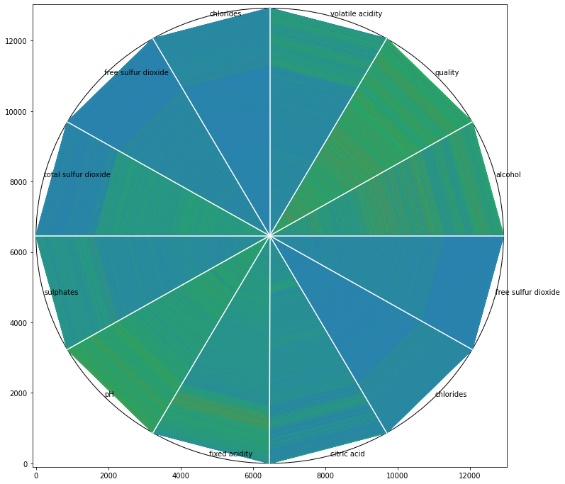
An example Circle Segment visualization output that we are going to create in this article (visual by author)
#data-science #circle-segments #data-visualization #matplotlib #exploratory-data-analysis
