Learn how to create a 12-column CSS grid layout! This tutorial will show you how to use CSS grid to create a responsive layout that will look great on all devices. You'll also learn how to add custom styles to your grid layout to make it look unique. By the end of this tutorial, you'll be able to create a 12-column CSS grid layout that will be the envy of your friends and colleagues.
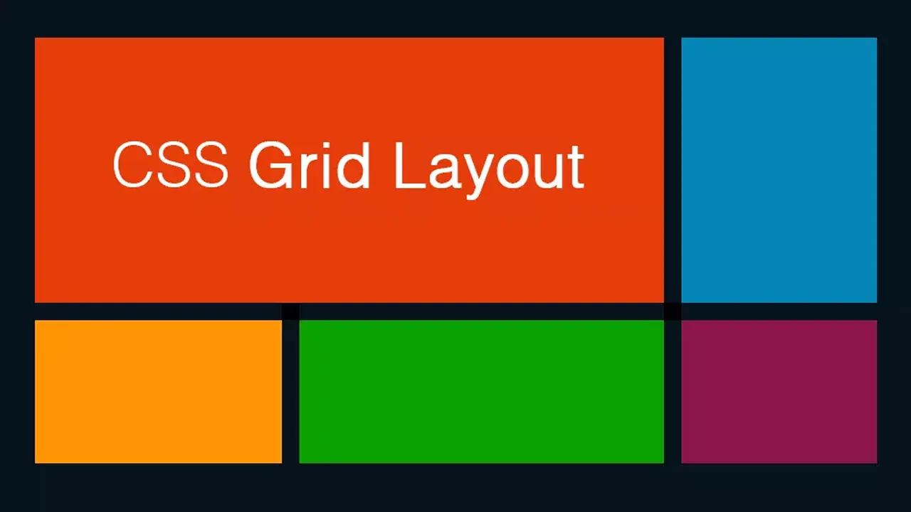
Grids have long been a staple for any developer who aspires to make beautiful, responsive sites that are easy to navigate and maintain. In this tutorial, I'll discuss creating a 12-column grid using CSS grid layout.
⏰ TIMESTAMPS ⏰
Full-Width 12-Column Grid: 0:00
Column Span: 1:14
Max-Width 12-Column Grid: 2:11
1.45 GEEK