Transitions are a nice way to remove, change, or update data in an application because their occurrence adds a nice effect and is good for the user experience. In this tutorial, we’ll look at the different ways to apply transitions in both Vue.js and Nuxt.js applications.
Transitions are a module of CSS that lets you create gradual transitions between the values of specific CSS properties. The behavior of these transitions can be controlled by specifying their timing function, duration, and other attributes. Using these transitions in your applications and websites create a better visual experience and sometimes draws and holds the user’s attention while a piece of information is being introduced to or leaving the screen. According to Can I Use, transitions are supported by most browsers, although there are some minor issues with Internet Explorer and Safari.
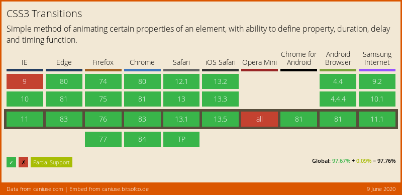
Source: caniuse.com. (Large preview)
Vue.js is an open-source JavaScript framework for building client-facing web applications and single-page applications (SPA). One of the features of this framework is the ability to add transitions to an app seamlessly, to switch between either pages or components, and we’re going to look at how to do that in this tutorial.
Nuxt.js is also a JavaScript framework, built on top of Vue.js (and often referred to as a framework of a framework), for building server-side web applications, static-generated websites, as well as SPAs. It works the same as Vue.js, so if you know Vue.js, you shouldn’t have many issues getting started with Nuxt.js. Nuxt.js comes with two properties for adding transitions to an app, and we’re going to cover those as well in this tutorial.
This tutorial requires basic knowledge of either Vue.js or Nuxt.js. All of the code snippets in this tutorial can be found on GitHub.
What Is A Transition?
According to the Oxford Dictionary, a transition can be defined as:
“A passage in a piece of writing that smoothly connects two topics or sections to each other.
The process or a period of changing from one state or condition to another.”
In terms of physics, a transition is defined thus:
“A change of an atom, nucleus, electron, etc. from one quantum state to another, with emission or absorption of radiation.”
From these definitions, we get an idea on what a transition is. The definitions all involve two different things or states. In terms of code, a transition is not so different.
What Is A CSS Transition?
According to Mozilla’s web documentation:
“CSS Transitions is a module of CSS that lets you create gradual transitions between the values of specific CSS properties. The behavior of these transitions can be controlled by specifying their timing function, duration, and other attributes.”
This means we can define a CSS transition as: the change in the CSS property of one or more elements from one value to another.
The CSS transition property enables us to add a transition effect to any valid element. It consists of up to four other properties (five, if we count the transition property itself) that can be used individually or combined as a shorthand. Each property has a different function.
transition-property
The transition-property accepts the name of the CSS property that we want to watch out for changes on and whose change process we want to transition. It looks like this:
.btn {
  width: 200px;
  height: 50px;
  transition-property: width;
  background-color: red;
  color: #fff;
  border: 0;
}
But this property does not do anything without the next property.
transition-duration
The transition-duration property specifies the time that the change of the element(s) in the transition-property should go on for. This property is required in order for the transition to work. If it is not set (with a value greater than 0s), then the default value of 0s would mean it would not run. So, let’s set a duration for this transition:
.btn {
  width: 200px;
  transition-property: width;
  transition-duration: 2s;
  background-color: red;
  color: #fff;
  border: 0;
}
Here, we have an element with a class name of btn that has a width of 200px. We are using both the transition-property and the transition-duration properties here. What this means is, “Hey, CSS, watch out for when the width property changes, and when this happens, let the effect take 2s to change.”
So, if we have a button with a class name of btn, then the index.html file would look like this:
<!DOCTYPE html>
<html lang="en">
<head>
    <meta charset="UTF-8">
    <meta name="viewport" content="width=device-width, initial-scale=1.0">
    <title>CSS Transitions</title>
    <link rel="stylesheet" href="./assets/styles.css">
</head>
<body>
    <Section>
        <h1>Hi CSS Transitions</h1>
        <button class="btn">Hover on me to see a cool transition</button>
    </Section>
</body>
</html>
Here, we have an HTML file that contains a button with a class that has transition-property and transition-duration properties watching out for changes to the element’s width.
One thing to note is that, in order for the transition on our button to work, we have to actually change the width of that element, either by manually adjusting the width with the developer tools in the browser, by using one of the CSS pseudo-classes, or by using JavaScript. For the purpose of this tutorial, we’re going to use the CSS pseudo-class :hover to change the width of the button:
// existing styles
.btn:hover {
  width: 300px;
}
Now, if we hover over this button, we should see the width of the button gradually increase over the set time, which is 2s.
#css #vue #nuxt #developer
