RoundedRectangle CheckBox
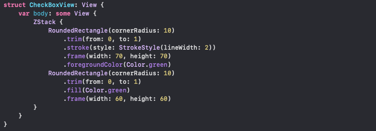
For the first checkbox, start by creating a new struct view and adding a RoundedRectangle to it. Use the stroke function and give it a StrokeStylewith the line width of your choice:

Embed the RoundedRectangle inside a ZStack and add another RoundedRectangle filled with your choice of color. Make sure that the second RoundedRectangle is smaller than the first one:
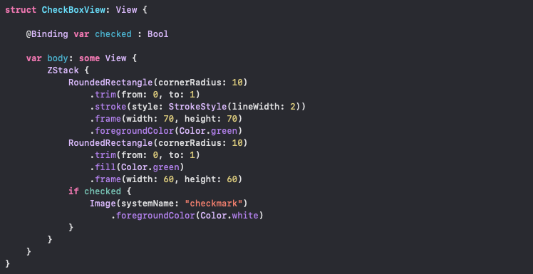
Declare a binding boolean variable called checked at the top of your struct view. Add a checkmark image underneath your second RoundedRectangleinside the condition bracket, as below:
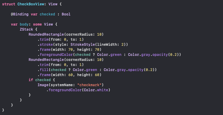
Now use the same checkedvariableto control the rectangles’ colors:
Declare another variable to control the trim function value of the first RoundedRectangle. This value will be animated. Have this value inside the animatableData variable:
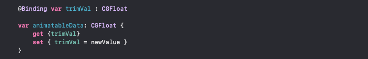
Change the to: value of the trim function to your new variable, trimVa

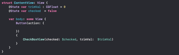
You are done with the CheckBoxView. Inside your ContentView, add your CheckBoxView as a button and pass two state variables (checked and trimVal):
You need to change checked and trimVal inside your button. Inside withAnimation, assign the trimVal to 1 and use toggle() to change the checked boolean value. You can add an else statement to reverse the animation too:

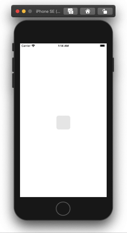
Code result: checkbox inside a button
You can use an onTapGesture instead of the button. This will eliminate the flashing that you get with a button:

#programming #swift #xcode #ios #swiftui