Introduction
In this article, I am going through the steps I followed to create an interactive dashboard, using PlotlyDash, a library for Python and R, and enhancing the layout with CSS Bootstrap.
Dash library is written on top of Flask, Plotly.js, and React.js, that allows to build data visualization apps in pure Python, rendered via the web browser.
The final result I produced can be displayed here: https://corporate-dash.herokuapp.com/
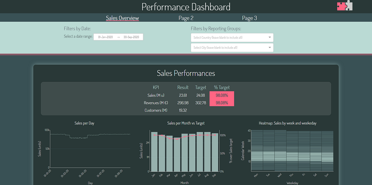
This is a multi-page dashboard, simulating a business scenario, where there normally are some layout guidelines to be respected (corporate colours scheme, a pre-defined font, a corporate website that can inspire us, …) and some sales-related KPIs to be monitored.
The first page is filled with different types of charts (scatter plots, bar charts, bubble charts, heat-maps) and a recap table, with random data; the other pages are blank, but useful to show how to build a multi-page structure.
In this article, I’ll cover:
1. Dashboard Objectives
2. Getting started with Dash
3. Configuring the folder structure for a multi-page dashboard
4. Conceptualizing the layout with the CSS Bootstrap Grid system
4.1 Building the layout framework with CSS Bootstrap
4.2 Styling Dash components accessing to their CSS classes
5. Callbacks & Components
5.1 Multi dropdown filter : how to have a “Select All” option
5.2 Unveiling seasonality patterns with Heatmaps
5.3 Providing additional information when hovering on data points
6. How to deploy and share the dashboard
#dashboard #python #dash #css