Using CollectionView Compositional Layouts in IOS13
The advancements Apple brought in the CollectionView layout this year proves the fact that, despite the storm SwiftUI created, UIkit isn’t over yet. At least not anytime soon, as SwiftUI does not even support CollectionView currently.
UICollectionFlowLayout works pretty well in simple layouts but as the designs are getting more heterogeneous, the need for building custom layouts comes in, which has its own share of problems.
Boilerplate code and challenges of self-sizing cells are just a few issues that make building advanced designs cumbersome.
Gladly, during WWDC 2019, Apple introduced compositional layouts with the goal to simplify the development process of complex layouts in our applications.
Compositional Layouts: Under the Hood
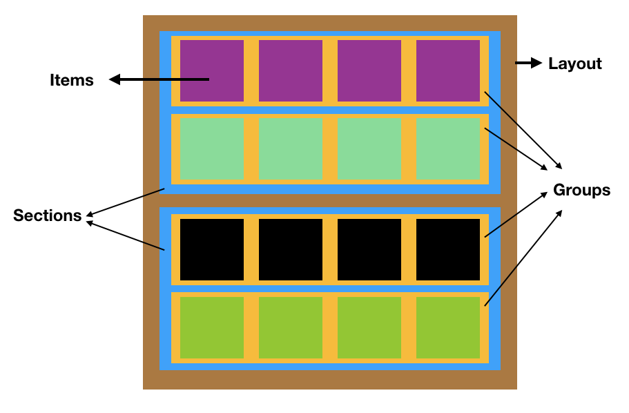
Compositional layouts are a declarative kind of API that allows us to build large layouts by stitching together smaller layout groups. Compositional layouts have a hierarchy that consists of: Item, Group, Section, and Layout.

Hierarchy of a compositional layout
Core Concepts
To build any compositional layout, the following four classes need to be implemented:
NSCollectionLayoutSize— The width and height dimensions are of the typeNSCollectionLayoutDimensionwhich can be defined by setting the fractional width/height of the layout (percentage relative to its container), or by setting the absolute or estimated sizes.NSCollectionLayoutItem— This is your layout’s cell that renders on the screen based on the size.NSCollectionLayoutGroup— It holds theNSCollectionLayoutItemin either horizontal, vertical, or custom forms.NSCollectionLayoutSection— This is used to initialize the section by passing along theNSCollectionLayoutGroup.Sections eventually compose the compositional layouts.
Implementation
Let’s have a look at code that mixes (rather, embeds) each of the above components to build a compositional layout for CollectionView.
private func createLayout() -> UICollectionViewLayout {
//1
let itemSize = NSCollectionLayoutSize(widthDimension: .fractionalWidth(1.0),heightDimension: .fractionalHeight(1.0))
let item = NSCollectionLayoutItem(layoutSize: itemSize)
//2
let groupSize = NSCollectionLayoutSize(widthDimension: .fractionalWidth(1.0),heightDimension: .absolute(44))
//3
let group = NSCollectionLayoutGroup.horizontal(layoutSize: groupSize,subitems: [item])
let section = NSCollectionLayoutSection(group: group)
let layout = UICollectionViewCompositionalLayout(section: section)
return layout
}
The above code is a pretty basic example or building a compositional layout for the CollectionView. Let’s look at what is happening at a few key points:
- By setting the
flexibleWidthandflexibleHeightto 1 for the item layout, we’re assigning the item to occupy the full width and height of the group. - Similarly, the group dimensions are set to occupy the full width of the section and an absolute height.
- The group’s layout size and sub-items are wrapped into the section component which eventually goes in the compositional layout.
To add the compositional layout to our collection view, simply add it to the initializer as shown below:
collectionView = UICollectionView(frame: view.bounds, collectionViewLayout: createLayout())
Groups Are Crucial
Even if it doesn’t look like it at first glance, groups are the components that ultimately determine the item height. Additionally, they can even override the item’s size dimensions.
In the following code snippet, we explicitly set the number of items per group which automatically determines the size of each item in the group and overrides the default item size:
let group = NSCollectionLayoutGroup.horizontal(layoutSize: groupSize,subitem: item, count: 2)
Spacing of Items
Compositional layouts provide plenty of options to add spacing. It can be done on the item or the group, as shown in the below snippets:
item.contentSize = NSDirectionalEdgeInsets(top: 5, leading: 5, trailing: 5, bottom: 5)
group.interItemSpacing = .fixed(CGFloat(10))
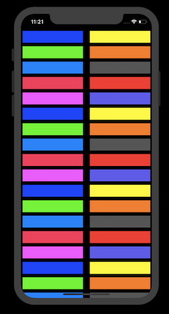
We’ve mapped our collection view cells to some random UIColors which ultimately gives us this:

With group and item spacing
With just a few lines of code, you can bring a completely new look of compositional layouts. In the next section, we’ll explore multiple sections with different layouts.
Multiple Sections, Multiple Layouts
Besides the top to bottom way of defining layouts that we saw previously, we can use closures to initialize sections and return them to the compositional layout.
The following piece of code shows that:
func createLayoutDiffSection() -> UICollectionViewLayout {
        let layout = UICollectionViewCompositionalLayout { (sectionIndex: Int,
            layoutEnvironment: NSCollectionLayoutEnvironment) -> NSCollectionLayoutSection? in

            var columns = 1
            switch sectionIndex{
            case 1:
                columns = 3
            case 2:
                columns = 5
            default:
                columns = 1

            }

            let itemSize = NSCollectionLayoutSize(widthDimension: .fractionalWidth(1.0),
                                                  heightDimension: .fractionalHeight(1.0))
            let item = NSCollectionLayoutItem(layoutSize: itemSize)
            item.contentInsets = NSDirectionalEdgeInsets(top: 2, leading: 2, bottom: 2, trailing: 2)

            let groupHeight = columns == 1 ?
                NSCollectionLayoutDimension.absolute(44) :
                NSCollectionLayoutDimension.fractionalWidth(0.2)
            let groupSize = NSCollectionLayoutSize(widthDimension: .fractionalWidth(1.0),
                                                   heightDimension: groupHeight)
            let group = NSCollectionLayoutGroup.horizontal(layoutSize: groupSize, subitem: item, count: columns)

            let section = NSCollectionLayoutSection(group: group)
            section.contentInsets = NSDirectionalEdgeInsets(top: 20, leading: 20, bottom: 20, trailing: 20)
            return section
        }
        return layout
    }
CompostionalLayout-MultiSections.swift
The above code is more or less similar to the one we saw earlier, except for the fact that we’re creating section providers closures and returning them to the layout. Based on the section number in the above snippet, we’ve set a different column count.
The layoutEnvironment contains useful properties related to the view. We can fetch the view width/height from this argument and, based on that, set the number of items per group on different screen sizes.
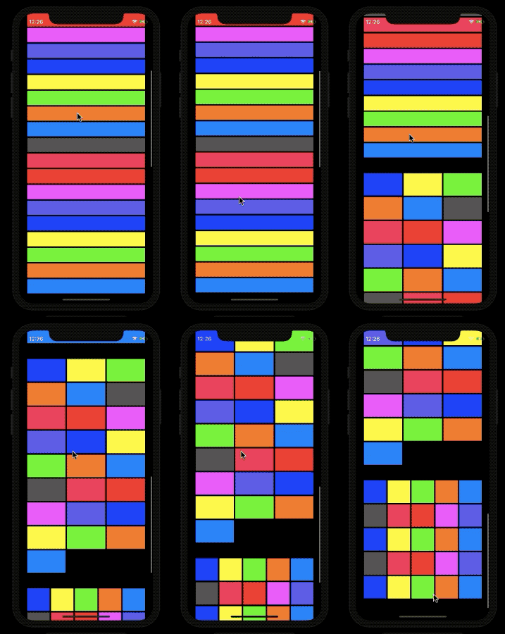
In our case, we set the number of sections to 3 in the CollectionView and got the following result:

Screengrab
So, we’ve discussed the various components that are the key to building compositional layouts. The full source code containing the above examples is available in this GitHub repository.
There’s More
We can build even more interesting layouts by using supplementary views, badges in our compositional layouts.
The diffable data source was introduced during WWDC 2019 and works well with compositional layouts as it uses type-safe identifiers to identify its sections and items. We’ll cover these in the next part.
That wraps up this piece. I hope you enjoyed reading it.
#ios #swift #IOS13
