Next.js is the most popular React framework for developing React server-side rendering apps.
This tutorial will help you to develop reusable React components that can be shared across different projects and repositories by using Bit platform.
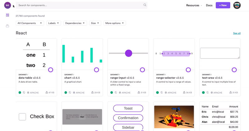
Bit is a component collaboration platform that enables you to share components between different projects and repositories. It’s a very handy tool that handles registering, tracking, updating, and installing your components.
Creating a reusable card list component
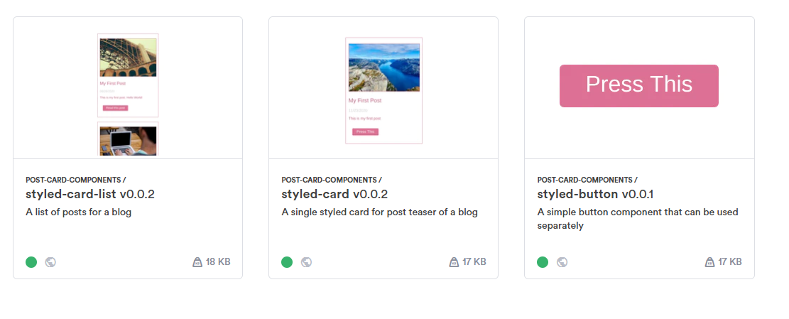
We’re going to create a simple card list component that you can use to display posts in a neat and organized layout. You can see a demo of the final result here.
These components will be styled using styled-components. We will isolate the button and the card into its own component so that it can be used separately outside of a card list:
Before getting started, please make sure that you have Node.js version 10.3 or later installed on your computer. Let’s install a fresh new Next application by using the terminal:
npx create-next-app
# or
yarn create next-app
Inside your Next directory, create a new directory named components/ that will host all of your reusable components.
It’s time to develop our components. We’re going to start with developing the StyledButton component. It’s a simple component with props for Title and onClick function:
import React from 'react';
import styled from 'styled-components';
import PropTypes from 'prop-types';

const Button = styled.button`
  cursor: pointer;
  background: #DB7093;
  color: white;
  font-size: 1em;
  margin: 1em;
  padding: 0.25em 1em;
  border: 2px solid #DB7093;
  border-radius: 3px;
&:hover{
    background: #C16482;
    border: 2px solid #C16482;
  }
`;
const StyledButton = ({
  title,
  onClick,
}) => (
  <Button onClick={onClick}>{title}</Button>
)
StyledButton.propTypes = {
  /**
   * button title
   */
  title: PropTypes.string.isRequired,
  /**
   * on click function
   */
  onClick: PropTypes.func.isRequired,
};
export default StyledButton;
Next, we need to write the StyledCard component that makes use of the StyledButton component. This component will have image, title, date, and description props that will be rendered as a card.
We will pass the StyledButton’s title and onClick props through this component using the buttonTitle and buttonClick props:
import React from 'react'
import styled from 'styled-components'
import PropTypes from 'prop-types'
import StyledButton from '../StyledButton'
const StyledContainer = styled.div`
  border: 1px solid #C16482;
  padding: 25px 12px 18px;
  margin: 25px 20px;
};
`
const StyledImg = styled.img`
  width: 100%;
  height: 100%;
  object-fit: cover;
  border: 1px solid #C16482;
`
const Title = styled.h2`
  color: #C16482;
  font-weight: 300;
  @media (max-width: 500px) {
    font-size: 1rem;
  }
`
const Date = styled.div`
  color: #ccc;
  font-weight: 300;
  margin: 6px 0;
  @media (max-width: 500px) {
    font-size: 0.8rem;
  }
`
const Description = styled.p`
  color: #C16482;
  font-weight: 300;
  @media (max-width: 500px) {
    font-size: 0.75rem;
  }
`
const StyledCard = ({
  image,
  title,
  date,
  description,
  buttonTitle,
  buttonClick
}) => (
  <StyledContainer>
    <StyledImg src={image} />
    <Title>{title}</Title>
    <Date>{date}</Date>
    <Description>{description}</Description>
    <StyledButton title={buttonTitle} onClick={buttonClick} />
  </StyledContainer>
)
StyledCard.propTypes = {
  /**
   * post image
   */
  image: PropTypes.string.isRequired,
  /**
   * post title
   */
  title: PropTypes.string.isRequired,
  /**
   * date
   */
  date: PropTypes.string.isRequired,
  /**
   * short description of the post
   */
  description: PropTypes.string.isRequired,
  /**
   * Title for the button
   */
  buttonTitle: PropTypes.string.isRequired,
  /**
   * on click function for the button
   */
  buttonClick: PropTypes.func.isRequired,
};
export default StyledCard
Finally, we’ll use the StyledCard inside the StyledCardList component. This component will take a single array prop containing the list of posts that are going to be rendered by the component:
import React from 'react';
import styled from 'styled-components'
import PropTypes from 'prop-types';
import StyledCard from '../StyledCard';
const StyledContainer = styled.div`
  max-width: 750px;
  padding: 50px 12px;
  width: 100%;
  margin: auto;
`
const StyledCardList = ({postList}) => {
  return (
    <StyledContainer>
    {postList.map(post => (
        <StyledCard
          key={post.id}
          image={post.image}
          title={post.title}
          date={post.date}
          description={post.description}
          buttonTitle={post.buttonTitle}
          buttonClick={post.buttonClick}
        />
    ))}
    </StyledContainer>
  );
};
StyledCardList.propTypes = {
  /**
   * A list of posts to render
   */
  postList: PropTypes.arrayOf(
    PropTypes.shape({
      id: PropTypes.number,
      image: PropTypes.string,
      title: PropTypes.string,
      date: PropTypes.string,
      description: PropTypes.string,
      buttonTitle: PropTypes.string,
      buttonClick: PropTypes.func,
    })
  ),
};
export default StyledCardList;
You can test the StyledCardList component by providing it with dummy data and rendering it inside pages/index.js:
const postList = [
  {
    id: 1,
    image: "https://picsum.photos/id/134/300/200",
    title : "My First Post",
    date : "06/26/2020",
    description : "This is my first post. Hello World!",
    buttonTitle : "Read this post",
    buttonClick : () => alert("This should take you to the post link")
  },
  {
    id: 2,
    image: "https://picsum.photos/id/5/300/200",
    title : "My Second Post",
    date : "06/27/2020",
    description : "This is my second post. Keep up the rythm!",
    buttonTitle : "Read this post",
    buttonClick : () => alert("This should take you to the post link")
  }
]
// render the postList into StyledCardList component
<StyledCardList postList={postList} />
Now that we have our components sorted out, we can start publishing our components to the Bit platform to allow other projects to reuse it.
#programming #javascript #front-end-development #software-development #react