CSS flex-wrap Property Explained
This tutorial will help you understanding of the CSS flex-wrap property and how it works in Flexbox layout design. We will explore the CSS flex-wrap property, its values, and how it’s important to responsive layout behavior.
Before the introduction of the Flexbox layout model, most designers and developers used different techniques to create responsive and flexible layouts. These techniques include floats, tables, and positioning. While using these techniques is still possible, most designers have switched to using the Flexbox model.
One of the most vital properties of Flexbox is flex-wrap, which allows developers to control the wrapping behavior of flex items when they exceed the size of their flex container. In this article, we will explore the flex-wrap property, its values, and how it’s important to responsive layout behavior.
Contents:
- Understanding Flexbox and Flex Container
- The
flex-wrapproperty - Flex-wrap and responsiveness in CSS
Understanding Flexbox and Flex Container
To fully understand flex-wrap, you first have to understand what Flexbox is and how it works. I’m going to briefly explain it but if you want a deeper understanding of the Flexbox model, you can read about it in this article.
Flexbox is a layout model that provides a more efficient way to organize, align, and distribute space among items in a container. The Flexbox model consists of two main components: the flex container and the flex items.
The flex container is a parent element that contains one or more flex items. It sets the context for how the flex items will be positioned within it. It is basically the container into which everything enters. The flex items, on the other hand, are the child elements that are contained within the flex container. They can be sized, ordered, and aligned within the container using Flexbox properties like flex-wrap, flex-grow, flex-basis, etc.
Now that we understand what the flex container and flex items are, let’s dive into the flex-wrap property.
The flex-wrap property
The flex-wrap property is used to control the wrapping behavior of flex items within the flex container. It defines whether the flex items you have in a flex container should wrap onto multiple lines or not.
To put it simply, imagine you have a box that can fit a certain number of toys. When you have too many toys to fit in the box, you can keep squeezing them in until they all fit in the box, or you can start a new box and put some of the toys there.
That’s exactly what flex-wrap does. When we use the flex-wrap property in CSS, it’s like telling the items to either stay in one line (like squeezing them all into the box) or to wrap onto a new line when there’s not enough space (like starting a new box with some of the toys).
The flex-wrap property can have three values:
nowrap: This is the default flex-wrap value. It indicates that the flex items should not wrap and should remain in a single line. Here’s how to apply this to a component:
    .example  {
      display: flex;
      flex-wrap: nowrap;
}wrap: This flex-wrap value allows the flex items to wrap onto multiple lines if necessary:
    .example   {
      display: flex;
      flex-wrap: wrap;
    }
wrap-reverse : This flex-wrap value allows the flex items to wrap onto multiple lines but in reverse order:
    .example  {
      display: flex;
      flex-wrap: wrap-reverse;
    }
To understand these values properly, let’s take an example using a simple box model. To create this, let’s first write down the HTML:
<html lang="en">
<head>
    <meta charset="UTF-8">
    <meta http-equiv="X-UA-Compatible" content="IE=edge">
    <meta name="viewport" content="width=device-width, initial-scale=1.0">
    <title>Document</title>
</head>
<body>
    <ul class="container nowrap">
        <li class="flex-item"></li>
        <li class="flex-item"></li>
        <li class="flex-item"></li>
        <li class="flex-item"></li>
        <li class="flex-item"></li>
        <li class="flex-item"></li>
        <li class="flex-item"></li>
        <li class="flex-item"></li>
      </ul>


      <ul class="container wrap">
        <li class="flex-item"></li>
        <li class="flex-item"></li>
        <li class="flex-item"></li>
        <li class="flex-item"></li>
        <li class="flex-item"></li>
        <li class="flex-item"></li>
        <li class="flex-item"></li>
        <li class="flex-item"></li>
      </ul>


      <ul class="container wrap-reverse">
        <li class="flex-item"></li>
        <li class="flex-item"></li>
        <li class="flex-item"></li>
        <li class="flex-item"></li>
        <li class="flex-item"></li>
        <li class="flex-item"></li>
        <li class="flex-item"></li>
        <li class="flex-item"></li>
      </ul>
</body>
</html>
Next, let’s style the <ul> and <li> tags, and give the three sections different flex-wrap values:
.container {
  padding: 0;
  margin: 0;
  list-style: none;
  border: 1px solid silver;
  display: flex;
  justify-content: center;
  background: green;


}

.nowrap  {
  display: flex;
  flex-wrap: nowrap;
}

.nowrap li {
  background: black;
}

.wrap    {
  flex-wrap: wrap;
}
.wrap li {
  background: purple;
}

.wrap-reverse {
  flex-wrap: wrap-reverse;
}
.wrap-reverse li {
  background: pink;
}

.flex-item {


  padding: 5px;
  width: 100px;
  height: 100px;
  margin: 10px;


  line-height: 100px;
  color: white;
  font-weight: bold;
  font-size: 2em;
  text-align: center;
}
Now that we’ve given the three sections different flex-wrap values, here’s what they look like:
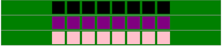
That doesn’t look particularly extraordinary right now, but the magic of flex-wrap only truly shines when the box is squeezed, or in this case, when the screen sizes are compressed, like this:
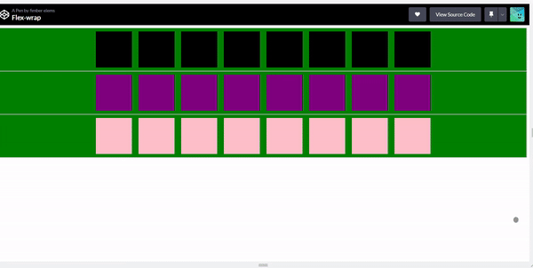
As you can see, the first row that has flex-wrap set to nowrap doesn’t move into a new line when the screen size decreases. It instead squeezes itself into whatever space is available, no matter how small the screen size becomes.
The other two rows have flex-wrap set to wrap and wrap-reverse respectively, so as the screen size reduces, the boxes in these rows react to the reduction and move into a new line, with the second row creating a new line directly underneath itself, while the last row does the exact opposite and creates a new line above itself.
Flex-wrap and responsiveness in CSS
Flex-wrap plays a crucial role in creating responsive layouts in CSS, as it enables the flexible and creative wrapping of components within a flex container. By controlling how flex items wrap, developers can create layouts that adapt to different screen sizes and device types, making them more responsive.
Here are a few ways in which flex-wrap aids responsiveness in CSS:
Multiline layouts
flex-wrap enables flex items to wrap onto multiple lines, allowing you to easily create layouts that adjust to different screen sizes. On smaller screens, flex items can wrap onto multiple lines, creating a stacked layout. This makes it easier to display contents on smaller screens without sacrificing user experience.
Equal distribution of space
flex-wrap allows you to properly distribute space in a container, making it easier to create responsive layouts. For example, on larger screens, flex items can be arranged side by side, with equal spacing between them. When the screen size decreases, the flex items can wrap onto multiple lines, and the remaining space is distributed equally among them.
Improved readability
With the flex-wrap property, you can greatly improve the readability of contents on smaller screens by wrapping components onto multiple lines. You can prevent contents from becoming too cramped; this is especially important for websites that have a lot of text content, such as blogs and news sites.
Simplified layout design
The flex-wrap property also simplifies the process of creating responsive layouts. By using a single property, you can control how components wrap, making it easier to create flexible and responsive layouts that adapt to different screen sizes and device types.
Conclusion
The flex-wrap property is a valuable tool in flexbox layout design, and overall web development. It enables you to control the wrapping behavior of flex items within a flex container, and create flexible and responsive designs that adapt to different screen sizes and device types.
The flex-wrap property can be combined with other flexbox properties to achieve more advanced layout designs. Some of these properties include flex-direction, justify-content, and align-items.
I hope this article has provided you with a better understanding of the flex-wrap property and how it works in Flexbox layout design.
Source: https://blog.logrocket.com
#css