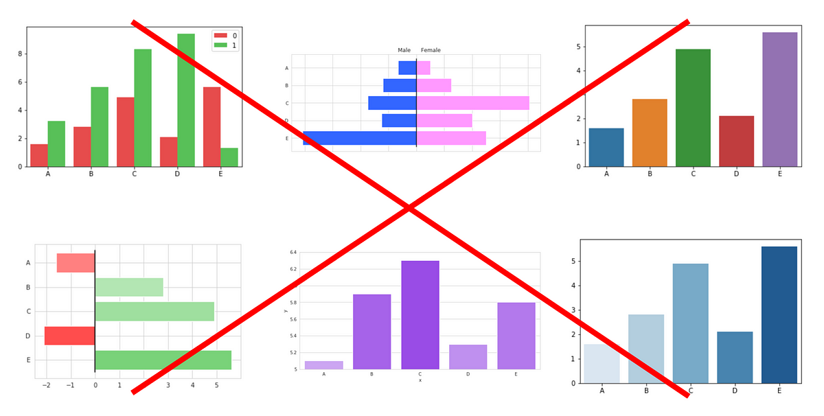
Bar charts were probably the first type of chart you were ever introduced to in first grade. Their simplicity makes them a standard in visualizing data, but it is its accessibility that leads visualizers to often be careless with bar charts.
Bar charts are one of the most basic forms of data representation — a continuous variable against a discrete variable — but they are so often presented in ways that could be significantly improved.
In this article, I’ll present five tips you can use to make your bar plot deliver the message it intends to more effectively.
#visual-design #data-science #ui #data-analysis #data-visualization

1.40 GEEK