Maps in Dash
Dash is a Python framework built on top of Flask and Plotly, designed to make data-driven web applications. Thanks to Plotly it provides some basic charts such as histograms and pie charts, and it also comes with a multitude of highly customizable controls such as dropdowns, checkbox, date sliders, and many more.
To build an app you can combine all of these controls and charts in one or more tabs. But when it comes to map drawing, it gets touchy. Plotly has some basic built-in maps plots: enough to show data, but not as nice as 2020 web maps should be. To tackle that weakness, Plotly made a partnership with Mapbox. Together they provide a great service.
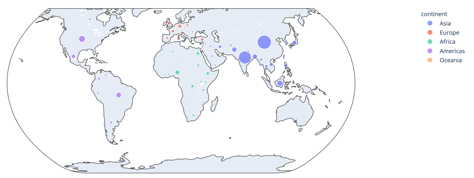
Example of Scatter map with default plotly maps (quite ugly)
Today we’ll see how to use Mapbox with Plotly within a dash application, and how to create animated scatter maps.
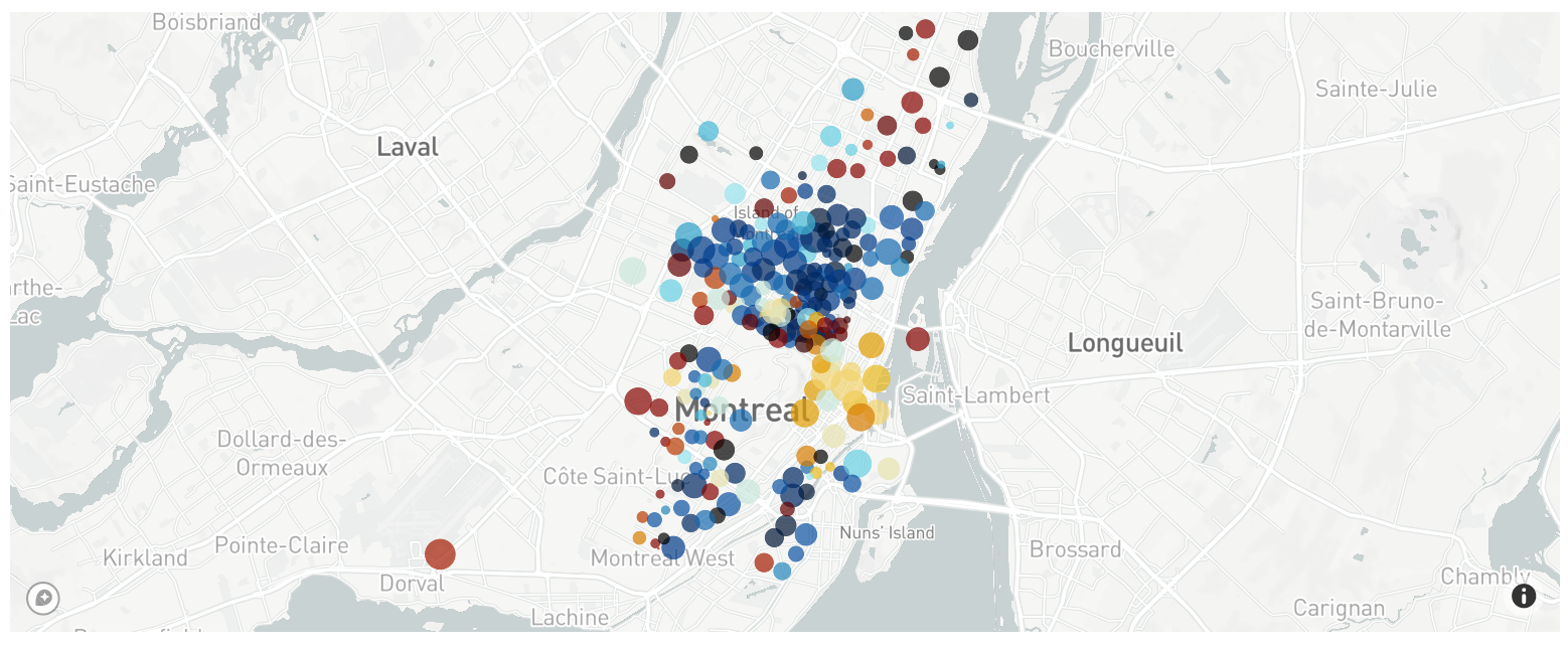
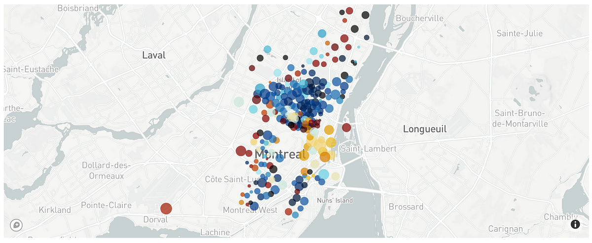
Example of scatter map with Mapbox maps (very nice)
As this post is written in April 2020 during the coronavirus pandemic, I suggest working with Covid-19 Open Data to discover scatter maps.
Register to Mapbox
Some Mapbox representations require a token, and Scatter Maps is part of these. Don’t worry, this easy and free.
Go to www.mapbox.com and create an account. For this step, you only need an email for account verification. When it’s done you get your token on the “Tokens” page and clicking on the “Create a token” button.
With this token, you can draw 50000 maps/month for free. By the end of the article, we’ll see how to store maps and minimize the number of requests needed.


Screenshot from Mapbox’s website
It is common to store this information in a separate file from scripts. A usual way to do is using a *.ini file for storing, and then the python built-in configparser module for accessing it.
config.ini
[mapbox]
secret_token=your-token
any_file_needing_token.py
import configparser
config = configparser.read('config.ini')
mapbox_token = config['mapbox']['secret_token']
Create the Scatter Map
Loading data
As mentioned before, we’ll work with Covid pandemic data. We’ll use the dataset from Hopkins University which is updated on a daily basis during the crisis. It is available on opendatasoft.
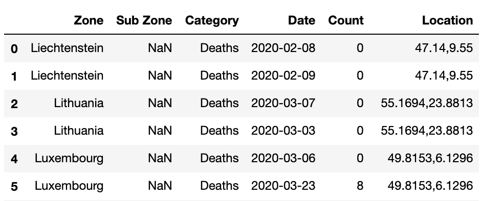
Head of the original dataset
Data are quite easy to understand: it contains daily information about covid in many countries, about either Death, Confirmed, or _Recovered _persons, with GPS information.
Processing data
This dataset has to be transformed to fit the Mapbox inputs. Let’s be clear about the input needed.
#data-visualisation #animation #data-science #data analysis