Common Date Picker & Calendar in React Native
An awesome and cross-platform React Native date picker and calendar component for iOS and Android.
Install & Import:
# Yarn
$ yarn add react-native-common-date-picker

# NPM
$ npm i react-native-common-date-picker --save// date picker
import {DatePicker} from "react-native-common-date-picker";

// calendar
import {CalendarList} from "react-native-common-date-picker";
Basic Usage:
// date picker
<DatePicker
  confirm={date => {
    console.warn(date)
  }}
/>

// calendar
<Modal animationType={'slide'} visible={this.state.visible}>
   <CalendarList
      containerStyle={{flex: 1}}
      cancel={() => this.setState({visible: false})}
      confirm={data => {
        this.setState({
           selectedDate1: data[0],
           selectedDate2: data[1],
           visible: false,
        });
      }}
   />
</Modal>
Default props for the date picker:
/**
* Container background color. Default is 'white'.
*/
backgroundColor: PropTypes.string,

/**
* Date type in order. Default is 'YYYY-MM-DD'. WOW! All kinds of date type order are supported. Awesome!
* NOTE: for 'MM-DD'、'DD-MM'、'MM', the same year for minDate and maxDate is required. E.g: minDate={'2020-03-10'}, maxDate={'2020-06-25'}.
* For 'DD', the year and the month for minDate and maxDate must be the same. E.g: minDate={'2020-03-06'}, maxDate={'2020-03-25'}.
*/
type: PropTypes.oneOf([
  'YYYY-MM-DD',
  'MM-DD-YYYY',
  'DD-MM-YYYY',
  'YYYY-MM',
  'MM-YYYY',
  'MM-DD',
  'DD-MM',
  'YYYY',
  'MM',
  'DD',
]),

/**
* The min date. Default is '2000-1-1'. Other supported formats: '2000-01-01'、'2000-1-01'、'2000-01-1'、
* '2000/01/01'、'2000/1/1'. A string type or Date type are supported.
*/
minDate: PropTypes.oneOfType([PropTypes.string, PropTypes.instanceOf(Date)]),

/**
* The min date. Default is today. Other supported formats are the same as minDate. A string type or Date type are
* also supported. E.g: new Date().
*/
maxDate: PropTypes.oneOfType([PropTypes.string, PropTypes.instanceOf(Date)]),

/**
* The default date. Default is equal to maxDate. Other supported formats are the same as minDate and maxDate.
* A string type or Date type are also supported. E.g: new Date().
*/
defaultDate: PropTypes.oneOfType([PropTypes.string, PropTypes.instanceOf(Date)]),

/**
* Whether to show tool bar, default is true. If false, hide tool bar on top.
*/
showToolBar: PropTypes.bool,

/**
* The position of tool bar, default is 'top' that is at the top of screen. So far, just both 'top' and 'bottom'
* are supported.
*/
toolBarPosition: PropTypes.oneOf(['top', 'bottom']),

/**
* Tool bar view styles, passed like {backgroundColor: 'red'} as you like.
*/
toolBarStyle: PropTypes.object,

/**
* Tool bar cancel button text styles, passed like {color: 'red', fontSize: 15} as you like.
* Note that you can control the active opacity of the button through {activeOpacity: 1}.
*/
toolBarCancelStyle: PropTypes.object,

/**
* Tool bar confirm button text styles, passed like {color: 'red', fontSize: 15} as you like.
* Note that you can control the active opacity of the button through {activeOpacity: 1}.
*/
toolBarConfirmStyle: PropTypes.object,

/**
* Tool bar title text style.
*/
titleStyle: PropTypes.object,

/**
* Tool bar title text, default is "".
*/
titleText: PropTypes.string,

/**
* Tool bar cancel button text, default is "Cancel".
*/
cancelText: PropTypes.string,

/**
* Tool bar confirm button text, default is "Confirm".
*/
confirmText: PropTypes.string,

/**
* Tool bar cancel button callback.
*/
cancel: PropTypes.func,

/**
* Tool bar confirm button callback with a date string like "2020-06-10".
*/
confirm: PropTypes.func,

/**
* Whether to disable the cancel button. Default is false.
*/
cancelDisabled: PropTypes.bool,

/**
* Whether to disable the confirm button. Default is false.
*/
confirmDisabled: PropTypes.bool,

/**
* Width for date picker. Default is screen width. Note that the height for date picker relied on the rowHeight and the rows below.
*/
width: PropTypes.oneOfType([PropTypes.string, PropTypes.number]),

/**
* Row number for date picker. Default is 5. Note that Only one of [5, 7] is supported up to now. E.g: rows={5} or rows={7}.
*/
rows: PropTypes.oneOf([5, 7]),

/**
* Height for each row. Default is 35.
*/
rowHeight: PropTypes.oneOfType([PropTypes.string, PropTypes.number]),

/**
* Background color for the selected row. Default is 'white'.
*/
selectedRowBackgroundColor: PropTypes.string,

/**
* Background color for the unselected row. Default is 'white'.
*/
unselectedRowBackgroundColor: PropTypes.string,

/**
* Border line color for the selected row. Default is '#d3d3d3'.
*/
selectedBorderLineColor: PropTypes.string,

/**
* Border line width for the selected row. Default is 0.5. string and number type are supported. E.g: selectedBorderLineWidth={20} or selectedBorderLineWidth={'20'}.
*/
selectedBorderLineWidth: PropTypes.oneOfType([PropTypes.string, PropTypes.number]),

/**
* Border line margin horizontal. Default is 0.
*/
selectedBorderLineMarginHorizontal: PropTypes.oneOfType([PropTypes.string, PropTypes.number]),

/**
* Font size for the selected row text. Default is 22. string and number type are supported. E.g: selectedTextFontSize={20} or selectedTextFontSize={'20'}.
*/
selectedTextFontSize: PropTypes.oneOfType([PropTypes.string, PropTypes.number]),

/**
* Text color for the selected row text. Default is 'black'.
*/
selectedTextColor: PropTypes.string,

/**
* Text color for the unselected row text. Default is '#9d9d9d'.
*/
unselectedTextColor: PropTypes.string,

/**
* Text margin horizontal distance to left and right. Default is 0.
*/
textMarginHorizontal: PropTypes.oneOfType([PropTypes.string, PropTypes.number]),

/**
* The display of the month. Default is 'digit', namely "1, 2, 3, ..., 12". If monthDisplayMode={'en-short'}, "Jan, Feb, ...,
* Nov, Dec" will be displayed. If monthDisplayMode={'en-long'}, similarly, "January, February, ..., November, December" will be displayed.
*/
monthDisplayMode: PropTypes.oneOf([
  'digit',
  'en-short',
  'en-long',
]),

/**
* Year suffix string to display for each row. E.g: if yearSuffix={'年'}, the year column will follow a '年' suffix like 2020年.
*/
yearSuffix: PropTypes.string,

/**
* Month suffix string to display for each row. E.g: if monthSuffix={'月'}, the month column will follow a '月' suffix like 6月.
*/
monthSuffix: PropTypes.string,

/**
* Day suffix string to display for each row. E.g: if daySuffix={'日'}, the year column will follow a '日' suffix like 10日.
*/
daySuffix: PropTypes.string,
Default props for the calendar:
/**
* Seen as FlatList component.
*/
horizontal: PropTypes.bool,
/**
* Seen as FlatList component.
*/
showsHorizontalScrollIndicator: PropTypes.bool,
/**
* Seen as FlatList component.
*/
showsVerticalScrollIndicator: PropTypes.bool,
/**
* Seen as FlatList component. Default is true.
*/
scrollEnabled: PropTypes.bool,
/**
* Seen as FlatList component. Default is false.
*/
pagingEnabled: PropTypes.bool,
/**
* Styles for container, you can set it as any view prop styles such as {backgroundColor: 'red'}
*/
containerStyle: PropTypes.object,
/**
* Styles for scroll list - FlatList, you can set it as any view prop styles such as {backgroundColor: 'red'}
*/
scrollContentStyle: PropTypes.object,
/**
* Whether to show tool bar, default is true. If false, hide tool bar on top.
*/
showToolBar: PropTypes.bool,
/**
* The position of tool bar, default is 'top' that is at the top of screen. So far, just both 'top' and 'bottom'
* are supported.
*/
toolBarPosition: PropTypes.string,
/**
* tool bar view styles, passed like {backgroundColor: 'red'} as you like.
*/
toolBarStyle: PropTypes.object,
/**
* tool bar cancel button text styles, passed like {color: 'red', fontSize: 15} as you like.
* Note that you can control the active opacity of the button through {activeOpacity: 1}.
*/
toolBarCancelStyle: PropTypes.object,
/**
* tool bar confirm button text styles, passed like {color: 'red', fontSize: 15} as you like.
* Note that you can control the active opacity of the button through {activeOpacity: 1}.
*/
toolBarConfirmStyle: PropTypes.object,
/**
* tool bar title text style.
*/
titleStyle: PropTypes.object,
/**
* tool bar title text, default is "".
*/
titleText: PropTypes.string,
/**
* tool bar cancel button text, default is "Cancel".
*/
cancelText: PropTypes.string,
/**
* tool bar confirm button text, default is "Confirm".
*/
confirmText: PropTypes.string,
/**
* tool bar cancel button callback.
*/
cancel: PropTypes.func,
/**
* tool bar confirm button callback with a date array like ["2016-01-09", "2019-09-18"]. "2016-01-09" is the
* start date(min date) you selected. "2019-09-18" is the end date(max date) you selected. If nothing is selected,
* the array's elements will be empty string like ["", ""].
*/
confirm: PropTypes.func,
/**
* Whether to disable the cancel button. Default is false.
*/
cancelDisabled: PropTypes.bool,
/**
* Whether to disable the confirm button. Default is false.
*/
confirmDisabled: PropTypes.bool,
/**
* A callback with a date parameter(like "2019-08-09") and row index when the user presses some date item.
*/
onPressDate: PropTypes.func,
/**
* Min date to limit, default is "2000-01-01". Other supported formats: "2000-1-1", "2000/01/01", "2000/1/1".
* Note: Date type is also supported.
*/
minDate: PropTypes.oneOfType([
PropTypes.string,
PropTypes.instanceOf(Date),
]),
/**
* Max date to limit, default is today calculated by new Date(). Other supported formats: "2015-1-1", "2015/01/01", "2015/1/1".
* Note: Date type is also supported.
*/
maxDate: PropTypes.oneOfType([
PropTypes.string,
PropTypes.instanceOf(Date),
]),
/**
* Whether to show weeks, default is true.
*/
showWeeks: PropTypes.bool,
/**
* Week days to show, default is from Sunday to Saturday, namely ['Su','Mo','Tu','We','Th','Fr','Sa'].
* Note that if you want to custom "weeks", then you have to accomplish "firstDayOnWeeks" at the same time.
* For example, you passed "['Mon', 'Tue', 'Wed', 'Thu', 'Fri', 'Sat', 'Sun']" to "weeks", you must pass 1 to
* "firstDayOnWeeks" equal to "firstDayOnWeeks={1}". What's more, 1 means Monday, 2 means Tuesday, ..., 0 Means Sunday.
*/
weeks: PropTypes.array,
/**
* Weeks type. Default is false, namely ['Su','Mo','Tu','We','Th','Fr','Sa']. If you want to use chinese, such as
* ['日','一','二','三','四','五','六'], just setting "weeksChineseType={true}" is okay. But the precondition is that
* "weeks" above uses the default value. Or it will be invalid.
*/
weeksChineseType: PropTypes.bool,
/**
* The first day for weeks. Default is 0 equal to Sunday. If you'd like to start with Saturday, "firstDayOnWeeks={6}"
* will work. The value ranges from 0 to 6.
*/
firstDayOnWeeks: PropTypes.number,
/**
* For week days, set the container styles like {backgroundColor: 'red'}.
*/
weeksStyle: PropTypes.object,
/**
* For week days, set the week day text styles like {color: 'blue', fontSize: 14}.
*/
weeksTextStyle: PropTypes.object,
/**
* Display form of the header title. Default is 0. Take "2020-04" date as an example:
* 0: "2020-04"
* 1: "2020年4月"
* 2: "Apr 2020"
* 3: "April 2020"
* 4: "2020/04"
* 5: "04/2020"
*/
headerTitleType: PropTypes.number,
/**
* Content styles containing header title and days content. This is a nesting object style. So if you want to set
* some specific style such as "headerTitle", you can set it to {headerTitle: {fontSize: 18, color: 'red'}}. Details
* are as follows:
{
container: {
flex: 1,
},
headerTitleContainer: {
height: 50,
},
headerTitle: {
fontSize: 17,
},
dayContent: {
backgroundColor: 'red',
},
day: {
color: '#3e3e3e',
},
};
*/
listItemStyle: PropTypes.object,
/**
* Selected date mark type. Default is 'ellipse', other choices: 'semiellipse'、'rectangle'、'circle'、 'square'、'dot'.
*/
selectedDateMarkType: PropTypes.string,
/**
* Selected date mark background color for start date and end date. Default is 'magenta'.
*/
selectedDateMarkColor: PropTypes.string,
/**
* Selected date mark background color between start date and end date. Default is 'skyblue'.
*/
selectedDateMarkRangeColor: PropTypes.string,
/**
* When the date is out of minDate or maxDate, whether to disable the button. Default is true.
*/
beyondDatesDisabled: PropTypes.bool,
/**
* When the date is out of minDate or maxDate, the button text color. Default is '#b9b9b9'.
*/
beyondDatesDisabledTextColor: PropTypes.string,
/**
* Left arrow click callback with current date index parameter. Only when "horizontal={true}".
*/
leftArrowClick: PropTypes.func,
/**
* Right arrow click callback with current date index parameter. Only when "horizontal={true}".
*/
rightArrowClick: PropTypes.func,
/**
* Whether to hide arrow. Default is false. Only when "horizontal={true}".
*/
hideArrow: PropTypes.bool,
/**
* Arrow color. Default is 'gray'. Only when "horizontal={true}".
*/
arrowColor: PropTypes.string,
/**
* Arrow size. Default is 8. Only when "horizontal={true}".
*/
arrowSize: PropTypes.number,
/**
* Arrow align. Default is 'left'. One of ['left', 'center', 'right']. Only when "horizontal={true}".
*/
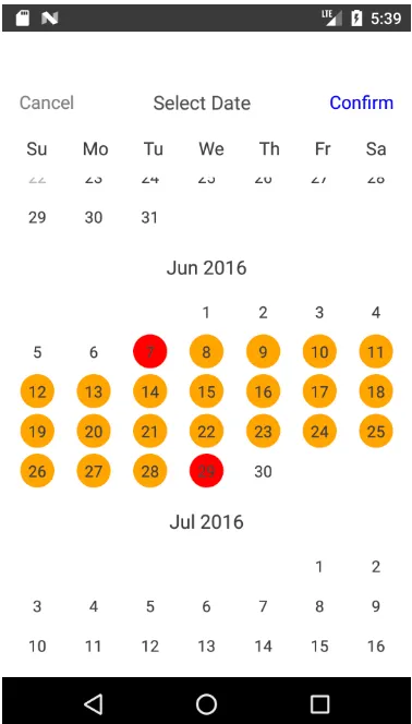
arrowAlign: PropTypes.string,Preview:
Download Details:
Author: lchenfox
Live Demo: View The Demo
Download Link: Download The Source Code
Official Website: https://github.com/lchenfox/react-native-common-date-picker
License:

1.05 GEEK