Basics to create useful visuals in python using ‘matplotlib’ and ‘seaborn’
Data Visualization in Python (Source: Simplified Python)
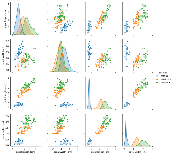
Visualizing data is the key to exploratory analysis. It is not just for aesthetic purposes, but is essential to uncover insights on data distributions and feature interactions.
In this article, you will be introduced to the basics of creating some useful and common data visualizations using the ‘matplotlib’ and ‘seaborn’ modules in python. The built-in dataset ‘iris’ from _sklearn _module is used for the demonstration. Only the main arguments of each plot are showcased here that will let you create simple plots without much pomp and glamour, yet serves the purpose.
Basic Chart Elements
The basic chart elements such as chart title, axes labels, figure size and axes limits are common to all plots. Let’s first see how to set these and use that as the template for any plot you wish to create using ‘matplotlib’ and ‘seaborn’.
figure, figsize_ : Initiate the plot area and figure size_
title_ : Set the plot title_
xlabel, ylabel_ : Set the x and y axes labels_
xlim, ylim_ : Set the x and y axes limits (optional). These limits will be automatically set based on the data_
#exploratory-data-analysis #matplotlib #python #visualization #seaborn