To create an animated color palette generator we’re going to use the Animated library supplied by React Native. Some external libraries for generating consistent colors. Also we will use useLayoutEffect, useEffect, and useState hooks to automatically respond to changes in state to cause our animations to trigger.
An inspiration from UIDesignDaily but with some added polish. Including animated from the previous color to the next color, and animating the toast message when a color is selected.
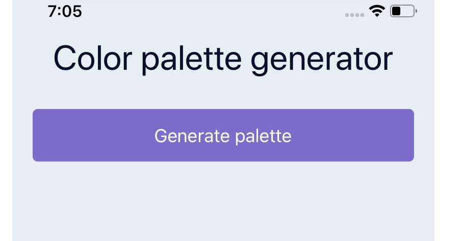
Setup a Title and Button
We’ll need a few libraries to help us out in accomplishing our desired interactions. We’ll use randomcolor to generate a random hex color, the hex-to-hsl helps us convert HSL so the animations are smoother from color to color. And our the react-use-previous will help us track what the previous colors were.
We’ll touch more on these later
npm install hex-to-hsl react-use-previous randomcolor
// or
yarn add hex-to-hsl react-use-previous randomcolor
This will be our base component for now. We will first add a button that’s a TouchableOpacity, as well as a title inside of our container.
import React from "react";
import { StyleSheet, Text, View, TouchableOpacity } from "react-native";
import usePrevious from "react-use-previous";
import hexToHsl from "hex-to-hsl";
import randomColor from "randomcolor";

export default function App() {
  return (
    <View style={styles.container}>
      <Text style={styles.title}>Color palette generator</Text>
      <View>
        <TouchableOpacity style={styles.generateButton}>
          <Text style={{ color: "#FFF", fontSize: 18 }}>Generate palette</Text>
        </TouchableOpacity>
      </View>
    </View>
  );
}
We create some styles, the first is our container to tell it to take up our entire screen with a background color. Then we supply our title style, and our generate button style.
const styles = StyleSheet.create({
  container: {
    flex: 1,
    paddingVertical: 50,
    paddingHorizontal: 20,
    backgroundColor: "#E8ECF3",
  },
  title: {
    fontSize: 34,
    color: "#0A102C",
    textAlign: "center",
    marginBottom: 30,
  },
  generateButton: {
    backgroundColor: "#7E6CCA",
    shadowOffset: { width: 0, height: 0 },
    shadowRadius: 6,
    shadowColor: "#7E6CCA",
    borderRadius: 5,
    paddingVertical: 15,
    alignItems: "center",
    justifyContent: "center",
  },
});
Create a Color Card Component
Next we need to create our ColorCard. This will be a component that we use for rendering all of our colors. So it needs to take 2 props. The first is the color prop and the second is the onPress so we can trigger the toast animation later when a user presses on the color card.
Because we need to handle a press we wrap in a TouchableOpacity. The outer wrap is set to 50% so that we can display 2 cards side by side. Then we take our color that we passed in and set it on an Animated.View so we can animate this color later.
const ColorCard = ({ color, onPress }) => {

  return (
    <TouchableOpacity
      style={{
        width: "50%",
        height: 180,
        padding: 5,
      }}
      onPress={onPress}
    >
      <View
        style={{
          padding: 5,
          backgroundColor: "#FFF",
          borderRadius: 15,
          height: "100%",
        }}
      >
        <Animated.View
          style={{
            backgroundColor: color
            padding: 10,
            borderRadius: 10,
            flex: 1,
          }}
        />
        <View
          style={{
            paddingVertical: 5,
            alignItems: "center",
            justifyContent: "center",
          }}
        >
          <Text
            style={{
              fontSize: 16,
            }}
          >
            {color}
          </Text>
        </View>
      </View>
    </TouchableOpacity>
  );
};
Generate Random Colors
Now that we have a card to render we need to create some colors to actually render.
First we setup a function to get a random color. This is just a helper function that will return a call to the randomcolor library. This can be adjusted based upon the styles of colors you want to generate.
Also depending on how many you want to generate you can control by setting a differing amount on state. Here I made a function called get5New that we can call at any time to get a new set of 5 colors.
#react