So firstly let’s understand the visualization first .
Human mostly understand things by seeing instead of reading. “A Picture depicts thousand of words. A Large amount of Data which cannot be depict through large set of texts and tabular data can easily be understand through visual.Data visualization derives insights from the data.”
1. Introduction to the Pyplot interface:
There are many ways to use to Matplotlib. In this article I used the Pyplot interface.
#Import the matplotlib.pyplot submodule and name it plt
import matplotlib.pyplot as plt

#Create a Figure and an Axes with plt.subplots
fig, ax = plt.subplots()
# Call the show function
plt.show()
The plt.subplots() function when invoked without the inputs , it create two different objects:
- fig -> fig object is just like container that holds things you see on the page.
- ax -> axes object holds the data . To understand better , its just a canvas on which we can draw with our data to visualize it.
When you hit this code you can see the figure with the empty axis as shown in fig (1).

Fig (1)
Let’s see it with the data . So we can use any basic datasets to know about the plots, I used my own so its your choice to take any data for the practice purpose.
So here I have datasets of the weather , in which its shows the precipitation according to the months from JAN to DEC.
#Create a Figure and an Axes with plt.subplots
fig, ax = plt.subplots()

# Plot PRECIPITATION_NML from north_weather against the MONTH
ax.plot(north_weather[“MONTH”], north_weather[‘PRECIPITATION_NML’])
# Plot PRECIPITATION_NML from south_weather against MONTH
ax.plot(south_weather[“MONTH”], south_weather[‘PRECIPITATION_NML’])
#Call the show function
plt.show()
So here I used two different plot in same figure and output would be two line plot in single graph. We also use the single plot axis, I used two axis here. Its your choice, how you want to visualize data. Let hit the show() function and output will be like as shown in fig(2).
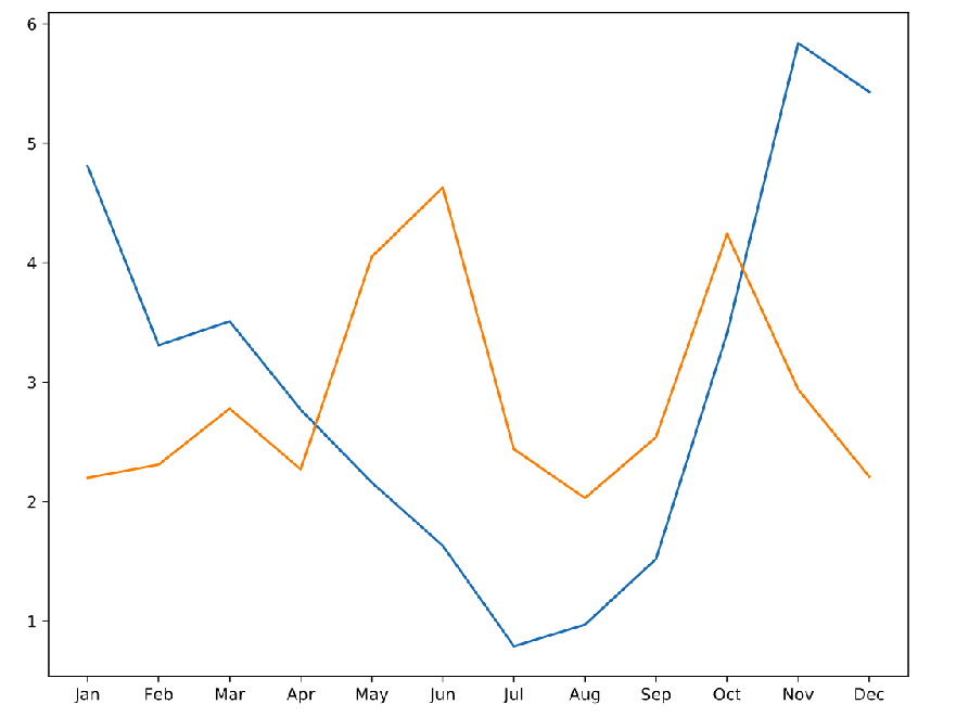
fig (2)
2. Customizing the Plots:
Let’s we customize plot according to our needs. We can do many customization in plots like change the color, lines etc.
2.1 Coloring and Markers :
# Plot North data
ax.plot(north_weather[“MONTH”], north_weather[“PRECIPITATION_NML”], color = ‘b’,marker = ‘o’)

# Plot South data
ax.plot(south_weather[“MONTH”], south_weather[“PRECIPITATION_NML”],color = ‘r’,marker = ‘v’ )
# Call show to display the resulting plot
plt.show()
In this code snippet we changed the color with color argument and marker . We can see the output in the fig(3).
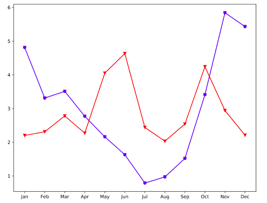
fig (3)
2.2 Labeling :
To make our plot more easily understandable we will use the the set__xlabel_() and set_ylabel() function and will also give the title to our plot with help of _set_title() _function. Let us have a look on code snippet. The fig(4) shows the output of the following snippet.
#data-analysis #data-visualization #pyplot #data-science #matplotlib #data analysis