Cohort Analysis with Python
Sample retention matrix —follow along and learn how to create your own matrix
A question that I often face is, “What do our cohorts look like?” Investors use the answer to this question to better understand their customers’ lifetime value. Management uses it to identify well-performing cohorts and their common traits so they can focus on those customers. Finance can also use it, to a certain extent, for forecasting.
What you will learn in this article:
- What are cohorts?
- What do cohorts look like?
- How do you generate dummy data?
- How do you build the function that will generate the cohorts?
- Some noteworthy Python techniques
Prerequisites:
This article is intended as a code-along article so you should have:
- Basic Python understanding
- Development environment (I recommend Jupyter Notebook/Lab)
What Are Cohorts?
Before talking about how they look, we should spend some time understanding what cohorts are.
In the context of business, a cohort is generally the group of customers who had their first purchase in a given time interval (typically months, but this depends on your business model).
Cohorts help understand how a particular group of customers develops over its lifecycle. Questions cohorts may answer are:
- Is there a high churn? (This will be indicated by a low number of follow-up bookings/purchases.)
- Do customers become more engaged over time? (This may be demonstrated by customers booking/purchasing more frequently the longer they stay with you.)
What Do Cohorts Look Like?
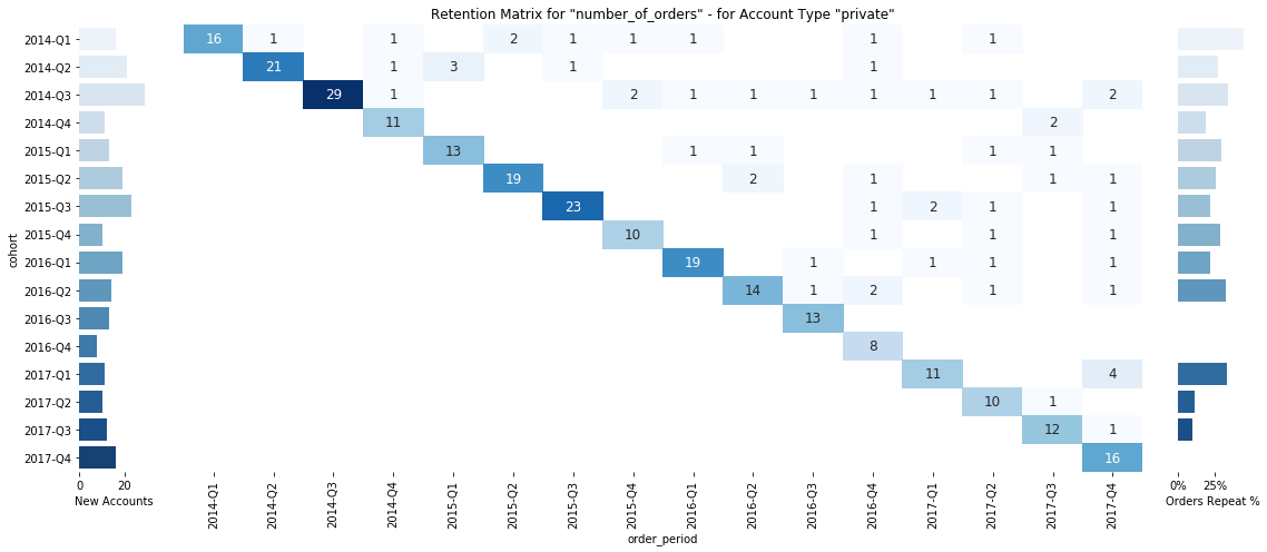
I like to use a retention matrix to represent the development of the cohorts. The left side shows the number of new accounts in that cohort, the right side shows the percent of repeat orders of this cohort, and, in the middle, we find a matrix of what the retention for a chosen metric looks like. Please note that there are multiple ways of visualizing cohort development, but this one works well for me.
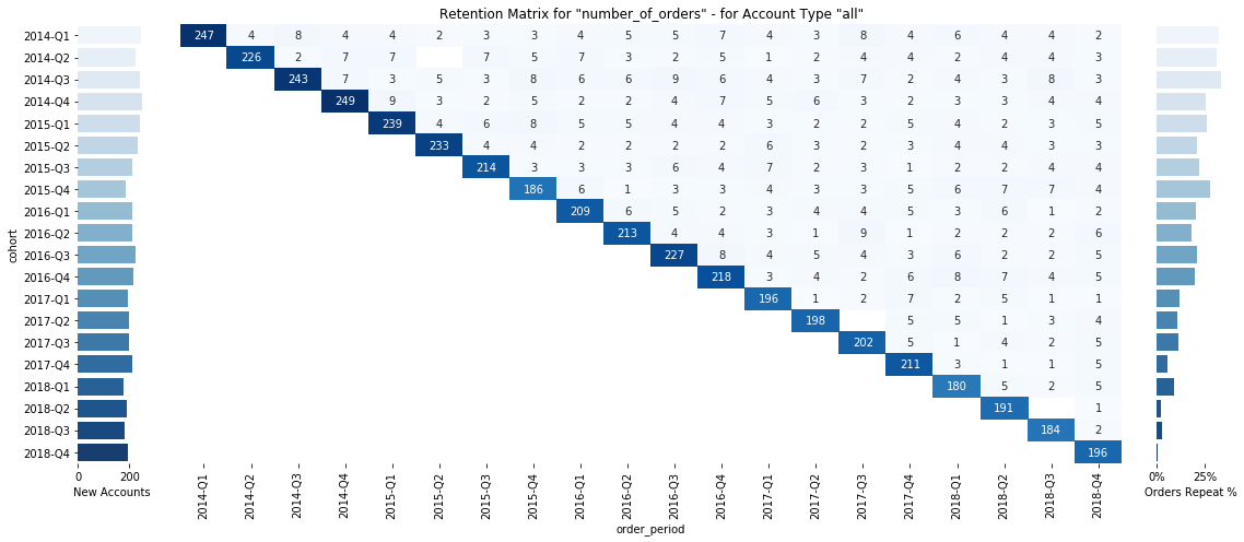
Sample retention matrix (generated with a python function, sample data)
How Do You Generate Dummy Data?
- Let’s start with the Python imports. These are the packages we will be using later on.
import pandas as pd
import numpy as np
import datetime
import string
import names
import matplotlib.pyplot as plt
import seaborn as sns
cohorts_imports.py
You will most likely have to install names and seaborn by running them (in your notebook).
!pip install seaborn
!pip install names
- Set up some seed data.
ADJECTIVES = [
    'cool','smart','beautiful','funky','dorky', 'babyish', 'back', 'bad', 'baggy', 'bare', 'barren', 'dorky', 'bad',
    'calculating', 'calm', 'candid', 'canine', 'capital', 'carefree', 'hairy', 'half', 'handmade', 'handsome', 'handy',
    'crazy', 'deliberate'
]

PEOPLE = list(set([names.get_first_name().lower() for i in range(10000)]))

PRODUCTS = [
    'airplane','banana','train','bow','map','skull'
]
seed_data.py
ADJECTIVES, PEOPLE, and PRODUCTS are all capitalized. In Python, this notation is typically used for variables that are static and/or for settings of a module.
Note how for PEOPLE we used a so-called list comprehension, a very powerful concept in Python. In our case, we call the function names.get_first_name() 10,000 times and put the unique results into the PEOPLE list.
- Build some helper functions.
def generate_dummy_names(adj,sub,number_names=10):
    """
    function generates random name combinations of the provided adjectives and subjects
    >>> name_generator(adj=['cool','strong'],sub=['harry','kate'],number_names=3)
    ['cool_harry', 'strong_kate', 'strong_harry', 'cool_kate']
    """
    if number_names > len(adj)*len(sub):
        raise ValueError(f"""
            Can at most genereate {len(adj)*len(sub) -1} names, increase adj or sub to allow for more names
            """)
    res = set()
    while len(res) < number_names:
        new_name = f'{np.random.choice(adj)}_{np.random.choice(sub)}'
        res = res | set([new_name])
    return list(res)

def generate_dummy_order_id(size=16, chars=list(string.ascii_uppercase + string.digits)):
    """
    function generates random order ids
    >>> generate_order_id()
    '0BHSIX003CJKMH2A'
    """
    return ''.join(np.random.choice(chars) for _ in range(size))

def fortmat_quarter(x):
    """
    function turns a datetime into a string representation of the corresponding quarter:
    >>> fortmat_quarter(datetime.datetime(2018,1,3))
    '2018-Q1'
    >>> fortmat_quarter(datetime.datetime(2019,5,3))
    '2019-Q2'
    """
    quarter = (x.month-1)//3 + 1
    return str(x.year)+'-Q'+str(quarter)
helper_functions.py
- Build the dummy data function.
customers = generate_dummy_names(ADJECTIVES, PEOPLE, 15000)
# we create 15000 fake customer names: ['smart_randy', 'canine_carol', 'carefree_cheryl',  ...]

products = generate_dummy_names(ADJECTIVES, PRODUCTS, 10)
# we create 10 fake products: ['carefree_skull', 'bare_map', 'calculating_banana', 'funky_train', 'cool_train', ...]
dummy_data.py
5. Generate the dummy DataFrame.
def generate_dummy_dataframe(
    dummy_products,
    dummy_customers,
    dummy_customer_types = ['company','private','government'],
    first_date=datetime.datetime(2014,1,1),
    last_date=datetime.datetime(2018,12,31),
    data_points=1000):

    customer_type = {customer:np.random.choice(['company','private','government']) for customer in dummy_customers}
    product_prices = {product:np.random.randint(100,10000) for product in dummy_products}

    df = pd.DataFrame({
        'order_id' : [generate_dummy_order_id() for i in range(data_points)],
        'order_date' : [np.random.choice(pd.date_range(first_date,last_date)) for i in range(data_points)],
        'customer' : [np.random.choice(dummy_customers) for i in range(data_points)],
        'product' : [np.random.choice(dummy_products) for i in range(data_points)],
        'order_size': [np.random.randint(1,5) for i in range(data_points)]
    })
    df['customer_type'] = df['customer'].map(customer_type)
    df['product_price'] = df['product'].map(product_prices)
    df['basket_size'] = df['order_size']*df['product_price']

    return df
generate_dummy_data.py
This function generates a sample pandas DataFrame based on dummy_products and dummy_customers. There are additional parameters that you can set, but you don’t have to (like data_points, for example, which specifies the number of rows in the resulting DataFrame). Again, we make use of list comprehensions.
Let’s create our dummy DataFrame:
df = generate_dummy_data(dummy_products, dummy_customers)
execute_create_dummy_data.py
Our dummy data has the following form:

Screenshot of the first rows of the DF generated by “generate_dummy_data”
- Enrich the dummy data with order types and times of first orders
customer_data = pd.DataFrame(df.groupby('customer')['order_date'].min())
customer_data.columns = ['customer_first_order']
customer_data.head(2)

# combine first booking with our dummy data
df = pd.merge(df,customer_data.reset_index(),on='customer')
df.head(2)

#determine if a order is a repeat order or first order
df['type_of_order'] = np.where(df['order_date'] != df['customer_first_order'], 'repeat', 'first')
cohorts_enrichment.py
We are now done with generating the sample data. Feel free to play around with the functions by changing parameters and running the data again.
How to Build the Function That Will Generate the Cohorts
We do need some helper functions for the cohort analysis; the following two functions are prefixed with an underscore. In Python, this means that the function is intended for internal use. In our case, theses functions are being called by our actual function generate_cohort_analysis to make said function a little bit more readable.
For now, copy-paste the following code block into your Jupyter Notebook and run the cell. The functions become available, but ignore them for the time being.
def _generate_cohorts(dataset, metric):
    cohorts = dataset.groupby(['cohort','order_period']).agg({
        'order_id':pd.Series.nunique,
        'order_size':sum,
        'basket_size':sum
    })
    cohorts.columns = ['number_of_orders','number_of_items_bought','total_order_value']

    cohorts = cohorts[metric].unstack(0)

    return cohorts

def _generate_repeat_percentages(dataset,metric):
    repeat_perc = dataset.groupby(['cohort', 'type_of_order']).agg({
        'order_id':pd.Series.nunique,
        'order_size':sum,
        'basket_size':sum
    }).unstack()

    repeat_perc = repeat_perc.stack().T.stack(level=0).fillna(0)
    repeat_perc['percentage repeat'] = repeat_perc['repeat']/repeat_perc.sum(axis=1)
    repeat_perc = repeat_perc.unstack(level=0).iloc[:,-3:]

    repeat_perc.columns = ['Orders Repeat %', 'Items Bought Repeat %', 'Order Value Repeat %']

    if metric == 'number_of_orders':
        selection = 'Orders Repeat %'
    if metric == 'number_of_items_bought':
        selection = 'Items Bought Repeat %'
    if metric == 'total_order_value':
        selection = 'Order Value Repeat %'
    if not selection:
        raise NotImplementedError('No repeat figures for specified metric')

    repeat_perc = repeat_perc[selection].reset_index()

    return repeat_perc, selection
cohort_analysis_helper.py
The following function generates the cohort visualizations:
def generate_cohort_analysis(df, metric, record_type='all', period_agg='quarterly', fig=True, size=10, save_fig=True):
    """
    For metric use 'number_of_orders', 'number_of_items_bought'  or 'total_order_value'
    For record_type use 'all' or specific customer_type ['private','company','government']
    no_fig controlls the output of a figure, by default True (i.e. no figure)
    """

    dataset = df.copy()
    if record_type != 'all':
        dataset = df[df.customer_type == record_type].copy()

    # format dates (i.e. map customers into their cohort and orders into the respective order period)
    if period_agg=='quarterly':
        dataset['cohort'] = dataset['customer_first_order'].apply(lambda x: fortmat_quarter(x))
        dataset['order_period'] = dataset['order_date'].apply(lambda x: fortmat_quarter(x))
    elif period_agg=='monthly':
        dataset['cohort'] = dataset['customer_first_order'].apply(lambda x: x.strftime('%Y-%m'))
        dataset['order_period'] = dataset['order_date'].apply(lambda x: x.strftime('%Y-%m'))
    else:
        raise NotImplementedError(f'period_agg: {period_agg} is not implemented')

    # generate cohorts
    cohorts = _generate_cohorts(dataset,metric)

    # generate new accounts data
    cohort_group_size = dataset.groupby('cohort').agg({'customer': pd.Series.nunique})
    new_accs = cohort_group_size.reset_index()
    new_accs.columns = ['cohort', 'New Accounts']

    # generate repeat data
    repeat_perc, selection = _generate_repeat_percentages(dataset,metric)

    # returns the data and does not plot anything
    if not fig:
        return (cohorts.T.join(new_accs.set_index('cohort')).fillna(0))

    #### Plot the Data ####
    # create the figures grid
    fig, (ax1, ax2, ax3) = plt.subplots(1, 3, figsize=(16, 7), gridspec_kw={'width_ratios': (1, 14, 1)})
    sns.despine(left=True, bottom=True, right=True)
    # plot new accounts
    Accounts = sns.barplot(x="New Accounts", y='cohort', data=new_accs, palette="Blues", ax=ax1)

    # plot retention matrix
    Heatmap = sns.heatmap(cohorts.T,
                          cmap="Blues",
                          annot=True,
                          fmt=".0f",
                          annot_kws={"size": size},
                          cbar=False,
                          yticklabels=False,
                          ax=ax2)

    title = 'Retention Matrix for "{}" - for Account Type "{}"'.format(metric, record_type)
    Heatmap.set_title(title)
    Heatmap.yaxis.get_label().set_visible(False)
    Heatmap.set_xlabel('order_period')

    # plot repeat table
    Repeats = sns.barplot(x=selection, y='cohort', data=repeat_perc, palette="Blues", ax=ax3)
    # removes y-axis label
    Repeats.yaxis.get_label().set_visible(False)
    # removes y-axis tickl labels
    Repeats.set(yticklabels=[])
    # removes y-axis ticks themselves
    Repeats.set(yticks=[])
    vals = Repeats.get_xticks()
    Repeats.set_xticklabels(['{:,.0f}%'.format(x * 100) for x in vals])


    # final layout touches

    plt.tight_layout()

    # saves the figure
    if save_fig:
        fig = Heatmap.get_figure()
        fig.savefig(metric+'RetentionMatrix'+record_type+'.png', bbox_inches='tight', dpi=600)
generate_cohorts.py
You can just run it (see the examples below) with different parameters. I’ll explain the parameters after the examples. To create a cohort analysis you would just run:
generate_cohort_analysis(df=df, metric='number_of_orders')
generate_cohort_analysis(df=df, metric='number_of_orders', period_agg='monthly')
generate_cohort_analysis(df=df, metric='number_of_items_bought')
generate_cohort_analysis(df=df, metric='number_of_items_bought', record_type='private')
...
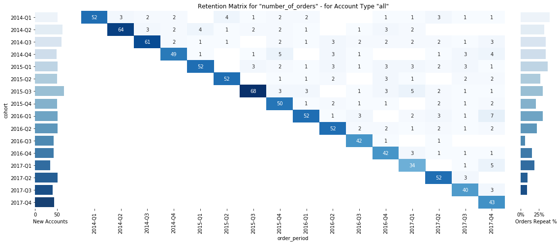
generate_cohort_analysis(df=df, metric=’number_of_orders’)
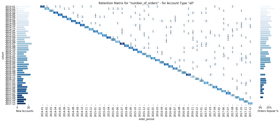
generate_cohort_analysis(df=df, metric=’number_of_orders’, period_agg=’monthly’)
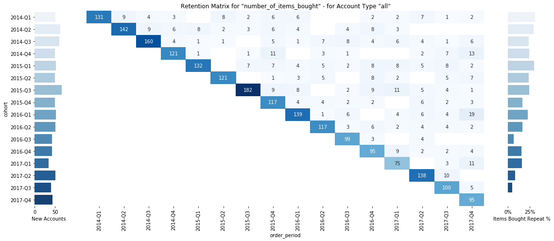
generate_cohort_analysis(df=df, metric=’number_of_items_bought’)
generate_cohort_analysis(df=df, metric=’number_of_items_bought’,
record_type=’private’)
To understand the details, let us break this one down a little bit.
How does generate_cohort_anlysis work?
It uses:
- a
**df**parameter(which is just the dummy data we created earlier), - a
**metric**parameter(which indicates the metric you are curious about, in our example:number_of_orders,number_of_items_bought, ortotal_order_value) - an (optional)
record_typeparameter, default=all(which lets you subsegment our sample data and only look at a specific group, in our example:all,private,company, orgovernment) - an (optional)
period_agg parameter, default=quarterly(which lets you choose eithermonthlyorquarterlyfor your cohorts) - an (optional)
figparameter, default=True(which defines whether a figure or the actual data should be produced) - an (optional)
save_figparameter, default=True(which defines whether the resulting figure should be saved on disk) - an (optional)
sizeparameter, default=10(which defines the size of the annotations)
You can run the function with your enriched sample data and choose one of the available metrics, and you’ll be presented with a visualization of the new accounts, the retention matrix for that metric, and the return rate of each cohort.
If you want to test the code in an interactive notebook, head here.
#python #programming
