Angular module that uses SVG to create a circular progressbar
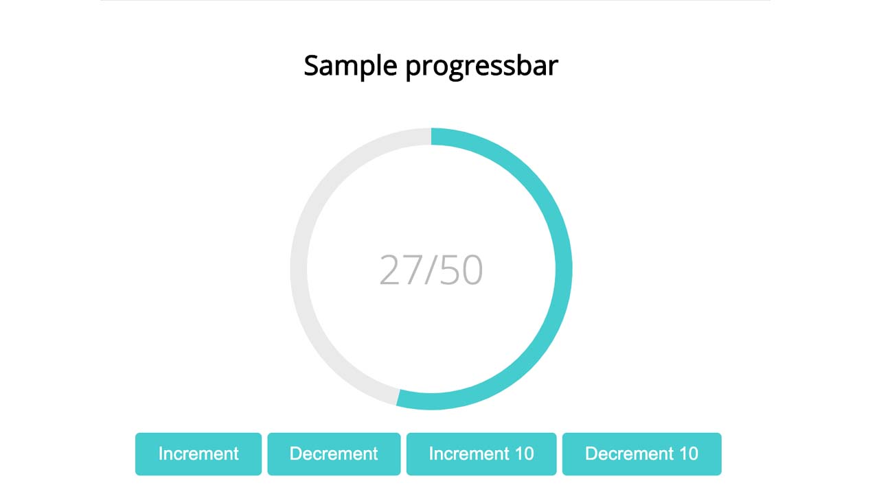
Angular SVG round progressbar
Angular module that uses SVG to create a circular progressbar
Demo
Click here for the Angular 1.x version
Install
First you have to install the module through npm:
npm install angular-svg-round-progressbar --save
Afterwards you need to import the RoundProgressModule in your module:
import {NgModule} from '@angular/core';
import {RoundProgressModule} from 'angular-svg-round-progressbar';

@NgModule({
  imports: [RoundProgressModule]
})
export class YourModule {};
If you’re using SystemJS as your module loader, there is also a UMD bundle at ./node_modules/angular-svg-round-progressbar/dist/round-progress.umd.js.
Options
| Name | Description | Required | Default value | Possible values |
|---|---|---|---|---|
current |
The current progress. Limited by the max option. |
Yes | undefined |
number |
max |
The progress’ maximum value. | Yes | undefined |
number |
radius |
Radius of the circle. | No | 125 |
number |
color |
The color of the current value on the circle. |
No | #45ccce |
string |
background |
Color of the circle’s background. | No | #eaeaea |
string |
stroke |
Specifies the circle’s thickness. | No | 15 |
number |
semicircle |
Whether the progressbar should be a full circle or a semicircle. | No | false |
boolean |
clockwise |
Whether the progressbar should rotate clockwise or counter-clockwise. | No | true |
boolean |
responsive |
Whether the progressbar should fit inside its parent container. Note Turning this option on will override the specified radius in order to make the circle fit in its parent. The radius to stroke ratio won’t change. | No | false |
boolean |
rounded |
Whether the current progress ending should be rounded or straight. | No | false |
boolean |
duration |
The duration of the animation. Pass 0 for no animation. | No | 800 |
number |
animationDelay |
Milliseconds to wait before starting an animation. | No | 0 |
number |
onRender |
Callback function that gets executed every time the circle is animated. The function gets called with the current progress as it is being animated. | No | undefined |
Function |
animation |
The easing function that will be used when animating. | No | easeOutCubic | linearEase |
| easeInQuad | ||||
| easeOutQuad | ||||
| easeInOutQuad | ||||
| easeInCubic | ||||
| easeOutCubic | ||||
| easeInOutCubic | ||||
| easeInQuart | ||||
| easeOutQuart | ||||
| easeInOutQuart | ||||
| easeInQuint | ||||
| easeOutQuint | ||||
| easeInOutQuint | ||||
| easeInSine | ||||
| easeOutSine | ||||
| easeInOutSine | ||||
| easeInExpo | ||||
| easeOutExpo | ||||
| easeInOutExpo | ||||
| easeInCirc | ||||
| easeOutCirc | ||||
| easeInOutCirc | ||||
| easeInElastic | ||||
| easeOutElastic | ||||
| easeInOutElastic | ||||
| easeInBack | ||||
| easeOutBack | ||||
| easeInOutBack | ||||
| easeInBounce | ||||
| easeOutBounce | ||||
| easeInOutBounce | ||||
Minimal example:
<round-progress [current]="current" [max]="max"></round-progress>
Full example:
<round-progress
    [current]="current"
    [max]="max"
    [color]="'#45ccce'"
    [background]="'#eaeaea'"
    [radius]="125"
    [stroke]="20"
    [semicircle]="true"
    [rounded]="true"
    [clockwise]="false"
    [responsive]="false"
    [duration]="800"
    [animation]="'easeInOutQuart'"
    [animationDelay]="0"
    (onRender)="doSomethingWithCurrentValue($event)"></round-progress>
Configuring the default values
The module comes with some pre-configured options for things like colors, size, stroke etc. If these don’t match your app’s design, you can change the global defaults by providing a new value for the ROUND_PROGRESS_DEFAULTS injection token. Whenever an option isn’t defined on a round-progress element, it’s value will be taken from the defaults.
import {NgModule} from '@angular/core';
import {
  RoundProgressModule,
  RoundProgressConfig,
  ROUND_PROGRESS_DEFAULTS
  } from 'angular-svg-round-progressbar';

@NgModule({
  imports: [RoundProgressModule],
  providers: [{
    provide: ROUND_PROGRESS_DEFAULTS,
    useValue: {
      color: '#f00',
      background: '#0f0'
    }
  }]
})
export class YourModule {};
Browser support
- Internet Explorer 9+
- Firefox 28.0+
- Chrome 31+
- Safari 5.1+
- and pretty much any browser that supports SVG
Note: Some older browsers may require (a polyfill for requestAnimationFrame). Read more about the requestAnimationFrame browser support.
Development
npm installto install development dependenciesgulpto run a development server. Not mandatory(you can run the build/index.html directly), but more convenient.gulp module:buildto build minified demo in build/gulp deployto do a build and push the demo to thegh-pagesbranch
Download Details:
Author: crisbeto
Live Demo: http://crisbeto.github.io/angular-svg-round-progressbar/
GitHub: https://github.com/crisbeto/angular-svg-round-progressbar
#angular #javascript #angularjs