This is Minard’s analysis of the fall of Napoleon’s Grand Army at the French invasion of Russia in 1812, considered a masterpiece of analytic design:
(source)
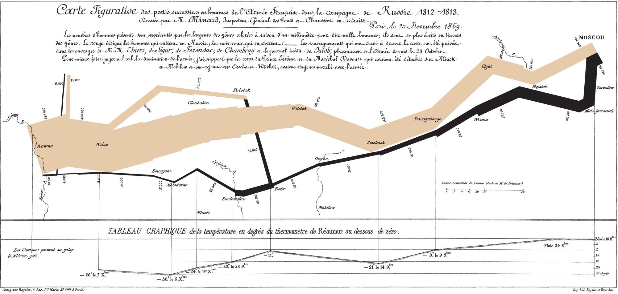
It features in my favourite book by Edward Tufte, “Beautiful Evidence”, as the focal piece for explaining the principles of data presentation. It is a landmark in the history of the ‘infographic’, renowned for its cleverness (in stark contrast to the military disaster it describes).
With not much more than a glance, we can learn a great deal. We immediately see the French Army was decimated - that the approach cost many lives, that the attack on Moscow was ruinous. We see that the timing for the return to France could not have been worse, the sinking mercury being the death of many. We note that river crossings were particularly dangerous, each costing a great many thousand lives.
But something is missing.
We are missing why? Why was Napoleon attacking Russia? Why was he doing this just before the onset of Winter? And why did all these people agree to such a poorly thought-out plan?
From Minard’s analysis we know “what” happened, but we do not understand the “why” behind any of it.
In software, we spend a lot of time working in the analytic “thinking space”, a place where we are taking things apart and trying to figure out how they work. It’s a safe space, because if you do it well, you will probably be able to figure out most of what is happening. But does this help you understand why it is happening? Does this help you tell the story of your software?
#devops #management #engineering #devops-top-story #analytic-thinking #synthetic-management #hackernoon-top-story #software-development