A React-native Component to Use Uicontextmenu on IOS 13+
react-native-ios-context-menu
A react native component to use UIMenu on iOS 13 and later.
- Support for creating menu actions and submenu’s (nested menu’s)
- Support for the iOS 14 functionality (like the
UIButtonmenu, and updating the menu while its visible). - Support for setting (almost) all of the native 
UIMenu and UIAction properties, ActionSheetIOSmenu fallback for unsupported iOS versions.- Support for custom context menu previews.
Show/Hide Gifs
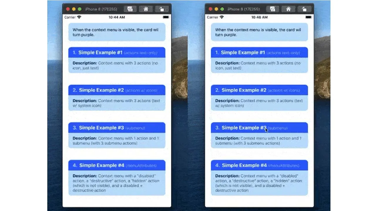
ContextMenuView Left: Example 1, Example 2, and Right: Example 3, Example 4 
ContextMenuView Left: Example 5, Example 6, and Right: Example 7, Example 8 
ContextMenuView Left: Example 9, and Right: Example 10 
ContextMenuView Left: Test 1, and Right: Test 2 
ContextMenuView Left: Test 3, and Right: Test 4 
ContextMenuView Left: Test 5, and Right: Test 6 
ContextMenuView ActionSheetIOS fallback for simple example 1 to 9 
ContextMenuView ActionSheetIOS fallback for context menu view test 1 to 6 
ContextMenuButton Left: Example 1, and Right: Example 2 
🚧 ⚠️ Documentation WIP 🚧 ⚠️
(iOS 14 specific features also in WIP — Check TODO for progress)
1. Installation
# install via NPM
npm install react-native-ios-context-menu

# or install via yarn
yarn add react-native-ios-context-menu

# then run pod install (uses autolinking)
cd ios && pod install
1.1 Installation Notes
This library is written in Swift. If you are having trouble building your app after installing this library, try adding an empty swift file:
- Open up your
ios/project.xcworkspaceproject - On the project navigator panel (located on the right side of Xcode), right click on your project group (or another folder/group i.e the blue or yellow icons) and select the “New File…” option
- In the popup sheet, select “Swift” as the template and then click the “Next” button
- A “Save As” popup sheet should appear and then click “Create” (you can rename the file first if you want to)
- If Xcode asks you to create a “Objective-C Bridging Header” choose “Create Objective-C Bridging Header”
2. Usage
2.1 ContextMenuView Usage
Please check out the examples section or the examples directory for more on how to use it.
- See Example 1 section for the basic
menuConfigconfiguration, and Example 9 for basic menu-related events usage. - See Example 11, and Example 12 for details on how to show a custom context menu preview.
import { ContextMenuView } from "react-native-ios-context-menu";

<ContextMenuView
  onPressMenuItem={({nativeEvent}) => {
    alert(`${nativeEvent.actionKey} was pressed`);
  }}
  menuConfig={{
    menuTitle: 'Context Menu Example',
    menuItems: [{
      actionKey  : 'action-key',
      actionTitle: 'Action #1' ,
    }]
  }}
>
  <Text> Hello World </Text>
</ContextMenuView>
Note: This component is only available on iOS 13+. Use the Platform module to handle logic if ContextMenuView is not available i.e. by adding your own onLongPress handler.
- By default, on iOS 12 and below, a long press on a
ContextMenuViewwill show aActionSheetIOSmenu based on themenuConfigprop. If you want to disable this behavior, setuseActionSheetFallbackprop to false. - This component is just a regular view on Android, so a long press will do nothing on Android.
2.2 ContextMenuButton Usage
Please check out the examples section or the examples directory for more on how to use it. See Example 1 section for the basic menuConfig configuration.
- The
ContextMenuButtoncomponent is almost the same as theContextMenuViewcomponent (It supports the same kind of props and events). - The only difference between them is that the
ContextMenuButtoncomponent does not have a preview, and it can be immediately shown when its tapped instead of having to do a long press. See Simple Example 2 for more details. - Note that
ContextMenuButtonis only available on iOS 14 and above. On iOS 13, it will use aContextMenuButton, and on iOS 12 and below, it will use theActionSheetFallbackmodule to present aActionSheetIOSmenu.
import { ContextMenuButton } from "react-native-ios-context-menu";

<ContextMenuButton
  onPressMenuItem={({nativeEvent}) => {
    alert(`${nativeEvent.actionKey} was pressed`);
  }}
  menuConfig={{
    menuTitle: 'Context Menu Example',
    menuItems: [{
      actionKey  : 'action-key',
      actionTitle: 'Action #1' ,
    }]
  }}
>
  <Text> Hello World </Text>
</ContextMenuView>
3. Documentation
3.1 Modules/Components
3.1.1 ContextMenuView Component Props
| Prop | Type | Description |
|---|---|---|
menuConfig |
Required: MenuConfig Object |
An object that represents the menu to display. You can use state if you want to dynamically change the menu configuration: See ContextMenuView Test 3, Test 4 and Test 6 for examples. Check the MenuConfig section for the object’s structure/properties. On iOS 14+ the menu config can be updated while it’s visible. |
useActionSheetFallback |
Optional: Bool |
If set to true, a long press will show a ActionSheetIOS menu based on the menuConfig prop. Default value is false on iOS 13+ and true on android, and on iOS 12 and below. |
previewType |
Optional: String i.e. a PreviewType enum value |
Default: DEFAULT — Configures what to use for the context menu preview. |
previewSize |
Optional: {width: Number, height: Number} Object |
Default: null — The size of the context meu preview. By default, it wil try to fill the entire screen. |
lazyPreview |
Optional: Bool |
Default: true — By default, the context mrenu preview is only mounted/rendered when the context menu is visible. Set this to false if you want the preview to be always mounted. |
renderPreview |
Optional: Function |
Accepts a function that returns a react component. The returned component will displayed in the context menu preview. See section Example #11 and Example #12 for more details. |
onMenuWillShow |
Event: Function | Event that gets called before the context menu is shown, i.e. this event is immediently invoked when the menu is about to become visible. |
onMenuDidShow |
Event: Function | Event that gets called after the context menu is completely shown, i.e. this event is invoked after the menu entrance animation is finished. |
onMenuWillHide |
Event: Function | Event that gets called before the context menu is hidden, i.e. this event is immediently invoked when the menu is about to become hidden. |
onMenuDidHide |
Event: Function | Event that gets called after the context menu is completely hidden, i.e. this event is invoked after the menu exit animation is finished. |
onMenuWillCancel |
Event: Function | Event that gets called when the menu is cancelled and before the context menu is hidden, i.e. this event is immediently invoked when the menu is cancelled and about to become hidden. |
onMenuDidCancel |
Event: Function | Event that gets called when the menu is cancelled and after the context menu is completely hidden, i.e. this event is invoked when the menu is cancelled and the menu exit animation is finished. |
onPressMenuItem |
Event: Function: onPressMenuItem({nativeEvent}) |
Event that gets called when a menu action is pressed. You can identify which action was pressed via nativeEvent.actionKey . Check out the onPressMenuItem Object section for more details or Simple Example #9 section. |
onPressMenuPreview |
Event: Function | Event that gets called when the menu’s preview is pressed. |
3.1.2 ContextMenuButton Component Props
| Prop | Type | Description |
|---|---|---|
menuConfig |
Required: MenuConfig Object |
Same as ContextMenuView |
enableContextMenu |
Optional: Bool |
Default: true — Whether or not the context menu is enabled. |
isMenuPrimaryAction |
Optional: Bool |
Default: false — When set to true, the context menu will be shown when its tapped instead of a long press. |
wrapNativeComponent |
Optional: Bool |
Default: true — When true, the ContextMenuButton component is wrapped inside a TouchableOpacity component and it handles all of the onPress and onLongPress events. If you want to use a different “button” component, set this prop to false first and wrap the ContextMenuButton in your own custom button component. |
useActionSheetFallback |
Optional: Bool |
Same as ContextMenuView |
onMenuWillShow |
Event: Function | Same as ContextMenuView |
onMenuDidShow |
Event: Function | Same as ContextMenuView |
onMenuWillHide |
Event: Function | Same as ContextMenuView |
onMenuDidHide |
Event: Function | Same as ContextMenuView |
onMenuWillCancel |
Event: Function | Same as ContextMenuView |
onMenuDidCancel |
Event: Function | Same as ContextMenuView |
onPressMenuItem |
Event: Function onPressMenuItem({nativeEvent}) |
Same as ContextMenuView |
3.1.2 ActionSheetFallback Module
A module to show a ActionSheetIOS menu based on a MenuConfig object. This module attempts to approximate UIMenu behavior using ActionSheetIOS, so it’s very limited (i.e. it does not support menu/action icons, etc.) but it does support things like submenu’s, destructive actions/menu’s, inline submenu’s, and hidden actions.
- Import the module like this:
import { ActionSheetFallback } from "react-native-ios-context-menu"; - To present a 
ActionSheetIOSmenu, callconst selectedAction = await ActionSheetFallback.show(menuConfig)
| Function | Returns | Description |
|---|---|---|
async show(menuConfig: MenuConfig Object) |
MenuAction Object or null |
This function accepts a MenuConfig object and returns the selected MenuAction object or null if cancelled. |
3.2 Enum Values
3.2.1 ImageTypes Enum
Enum values of strings you can use for MenuConfig.imageType or MenuAction.imageType.
- Import the enum like this:
import { ImageTypes } from "react-native-ios-context-menu"; - And use it like this:
imageType: ImageTypes.SYSTEM - Or you can directly pass a string like this:
imageType: 'SYSTEM' - Check out the 
ContextMenuView Simple Example #2 section for example usage.
| Value | Description |
|---|---|
| NONE | The default value for the imageType property. Specifies to not use an icon. Since this is the default value, you don’t have to explicitly specify: imageType: 'NONE' in the MenuConfig or MenuAction object if you don’t want to use an icon. |
| SYSTEM | Specifies that we want to a system image (i.e. like a SF Symbols icon). Internally, it passes the imageValue string from the MenuConfig or MenuAction object like this: UIImage(systemName: imageValue) |
3.2.2 MenuOptions Enum
Enum values of strings you can use in a MenuConfig object (i.e. in the MenuConfig.menuOptions property). These string values corresponds to the swift/objc-c UIMenu.Options struct, please check the Apple Docs for more info.
- Import the enum like this:
import { MenuOptions } from "react-native-ios-context-menu"; - And use it like this:
menuOptions: [MenuOptions.destructive] - Or you can directly pass a string like this:
menuOptions: ['destructive'] - Check out
ContextMenuViewSimple Example #5 and Simple Example #6 section for example usage.
| Value | Description |
|---|---|
destructive |
An option indicating the menu’s appearance represents a destructive action. This will tint the submenu title and it’s icon to red (the submenu’s elements will be unaffected). |
displayInline |
An option indicating the menu displays inline with its parent menu instead of displaying as a submenu. If you set a submenu to menuOptions: 'displayInline', it will create a “section” in the parent menu. |
3.2.3 MenuElementAtrributes Enum
Enum values of strings you can use in a MenuAction object (i.e. in the MenuAction.menuAttributes property). These string values corresponds to the swift/obj-c UIMenuElement.Attributes struct, please check the Apple Docs for more info.
- Import the enum like this:
import { MenuElementAtrributes } from "react-native-ios-context-menu"; - And use it like this:
menuAttributes: [MenuElementAtrributes.destructive] - Or you can directly pass a string like this:
menuAttributes: ['destructive'] - Check out Simple Example #4 section for example usage.
| Value | Description |
|---|---|
hidden |
An attribute indicating the hidden style. This will hide the menu action i.e the menu action will no longer be visible in the menu. You can use this to temporarily hide a menu action (via state). |
disabled |
An attribute indicating the disabled style. This will tint the menu action’s title and icon to grey, and will also prevent the user from selecting/pressing the menu action. |
destructive |
An attribute indicating the destructive style. This will tint the menu action’s title and icon to red. |
3.2.4 UIMenuElementState Enum
Enum values of strings you can use in a MenuAction object (i.e. in the MenuAction.menuState property). These string values corresponds to the swift/obj-c UIMenuElementState struct, please check the Apple Docs for more info.
- Import the enum like this:
import { UIMenuElementState } from "react-native-ios-context-menu"; - And use it like this:
menuState: UIMenuElementState.on - Or you can directly pass a string like this:
menuState: 'on' - Check out 
ContextMenuView Simple Example #8 section for example usage.
| Value | Description |
|---|---|
on |
Indicates that the menu element is in the “on” state. Visually, on iOS 13 it will replace the menu action’s icon with a checkmark, meanwhile on iOS 14 it will show a checkmark on the left of the menu label. |
off |
Indicates that the menu element is in the “off” state. |
mixed |
Indicates that the menu element is in the “mixed” state. Visually, (at least on iOS 13) it will replace the menu action’s icon with a checkmark (same as the on state). |
3.2.4 PreviewType Enum
Enum values of strings you can use in the ContextMenuView PreviewType prop.
- Import the enum like this:
import { PreviewType } from "react-native-ios-context-menu"; - And use it like this:
previewSize={PreviewType.CUSTOM} - Or you can directly pass a string like this:
previewSize={'CUSTOM'}
| Value | Description |
|---|---|
DEFAULT |
The default value for the previewSize prop. Indicates that we don’t want to use a custom context menu preview. |
CUSTOM |
Indicates that we want to use a custom context menu preview. |
3.3 Object Types
3.3.1 MenuAction Object
An object that is used to display/create a context menu action or a submenu action. This object represents a UIAction instance. This object is used inside a MenuConfig object’s menuItems property.
| Key/Property | Type | Description |
|---|---|---|
actionKey |
Required: String |
A string that is used to identify a menu action. You will receive this value in the onPressMenuItem({nativeEvent}) event. |
actionTitle |
Required: String |
The text to display in the menu action. |
imageType |
Optional: String (ImageTypes value) |
Configures the menu action’s icon. Check out the ImageTypes section. |
imageValue |
Optional: String |
String value used to for the menu actions’s icon. |
menuState |
Optional: String (UIMenuElementState value) |
Check the UIMenuElementState section for the list of values to use. |
menuAttributes |
Optional: [String] (Array of MenuElementAtrributes values) |
Options to change the look/behaviour of the menu action. Check out the MenuOptions section for the list of values to use. |
3.3.2 MenuConfig Object
An object that is used to display/create a context menu or a submenu. This object represents a UIMenu instance.
| Key/Property | Type | Description |
|---|---|---|
menuTitle |
Required: String |
The title of the menu. |
menuOptions |
Optional: [String] (Array of MenuOptions values) |
Options to change the look/behaviour of the menu. Check out the MenuOptions section for the list of values to use. |
imageType |
Optional: String (ImageTypes value) |
Configures the menu action’s icon. Check out the ImageTypes section. |
imageValue |
Optional: String |
String value used to for the menu’s icon. |
menuItems |
Optional: [Object] (An array of either MenuAction object or MenuConfig) |
The items to display in a menu. if you pass a MenuAction it will create a menu action element, and if you pass a MenuConfig object, it will create a submenu. |
3.3.3 onPressMenuItem nativeEvent Object
The nativeEvent object that you receive inside the onPressMenuItem event basically just contain the MenuAction object that was selected in the context menu. Use the actionKey property to identify which action was selected.
{
  "actionKey": "key-01",
  "imageType": 'SYSTEM',
  "actionTitle": "Action #1",
  "imageValue": "folder",
  "menuAttributes": [],
  "target": 1175
}
4 Examples
Check out the examples directory. The example app contains a bunch of demos that showcases the different ContextMenuView configurations, props and events you can use.
- Clone the repository:
git clone https://github.com/dominicstop/react-native-ios-context-menu.git cd react-native-ios-context-menu && yarn bootstrap- Go to the
react-native-ios-context-menu/exampledirectory and runyarn iosto build/launch the example app in the iOS simulator.
4.1 ContextMenuView Examples
4.1.1 ContextMenuView Simple Example #1
A plain context menu configured with 3 actions (no icons, just text).
<ContextMenuView
  // `menuConfig` prop accepts a `MenuConfig` object
  menuConfig={{
    menuTitle: 'ContextMenuViewSimpleExample01', // title of our menu
    // a `MenuConfig` object has `menuItems` property
    // which is an array of `MenuConfig` or `MenuAction` object
    // these are the items we want to show in our menu
    menuItems: [{
	   // a menu action config item  - `MenuAction` object
      // represents an menu item that we want to show in our menu
      actionKey  : 'key-01'   , // an id for your action
      actionTitle: 'Action #1', // text to display in your menu action
    }, {
      // another `MenuAction` object item
      actionKey  : 'key-02'   ,
      actionTitle: 'Action #2',
    }, {
      // and another `MenuAction` object item
      actionKey  : 'key-03'   ,
      actionTitle: 'Action #3',
    }],
  }}
/>

4.1.2 ContextMenuView Simple Example #2
A menu configured with 3 actions with “system” SF Symbols icons.
<ContextMenuView
  menuConfig={{
    menuTitle: 'ContextMenuViewSimpleExample02',
    menuItems: [{
      // a menu action config item (i.e. a `MenuAction` object)
      actionKey  : 'key-01'   ,
      actionTitle: 'Action #1',
      imageType  : 'SYSTEM'   , // indicates that we want to use SF Symbols
      imageValue : 'folder'   , // the icon string of SF Symbols icon
    }, {
      // another `MenuAction` object item
      actionKey  : 'key-02'   ,
      actionTitle: 'Action #2',
      imageType  : 'SYSTEM'   , // don't forget to add this property/key
      imageValue : 'dial.fill', // a SF symbol has other variants for an icon
    }, {
      // and another `MenuAction` object item
      actionKey  : 'key-03'   ,
      actionTitle: 'Action #3',
      imageType  : 'SYSTEM'   , // <- set `imageType` to "SYSTEM"
      imageValue : 'archivebox.fill', // <- provide a SF Symbols icon string
    }],
  }}
/>

4.1.3 ContextMenuView Simple Example #3
A context menu configured with 1 action, and a submenu (with 3 submenu actions)
- A
MenuConfigobject has a property calledmenuItemswhich accepts an array of objects. Those objects can either be aMenuActionitem or anotherMenuConfigitem. - If you pass a
MenuConfigobject tomenuItems, it will make a submenu.
<ContextMenuView
  // `menuConfig` prop accepts a `MenuConfig` object
  menuConfig={{
    menuTitle: 'ContextMenuViewSimpleExample03', // title of our menu
    // a `MenuConfig` object has `menuItems` property
    // which is an array of `MenuConfig` or `MenuAction` object
    // these are the items we want to show in our menu
    menuItems: [{
      // a menu action config item - `MenuAction` object
      actionKey  : 'key-01',
      actionTitle: 'Action #1',
      imageType  : 'SYSTEM',
      imageValue : 'folder',
    }, {
      // a menu config item, i.e. a submenu - `MenuConfig` object
      // the `menuItems` property can accept an array of both a `MenuAction`
      // object and a `MenuConfig` object. If we pass a `MenuConfig` object
      // this means that we want to show another menu i.e. a submenu
      menuTitle: 'Submenu...', // the title of submenu

      // Since this is a `MenuConfig` object, we have a `menuItems` property.
      // This represents the items that we want to show in our submenu.
      // An array of `MenuAction` or `MenuConfig` object. If you want another
      // submenu in your submenu, pass a `MenuConfig` object.
      menuItems: [{
        // a menu action config item - `MenuAction` object
        actionKey  : 'key-01-01',
        actionTitle: 'Submenu Action #1',
        imageType  : 'SYSTEM',
        imageValue : 'star',
      }, {
        // another `MenuAction` object item
        actionKey  : 'key-01-02',
        actionTitle: 'Submenu Action #2',
        imageType  : 'SYSTEM',
        imageValue : 'star.lefthalf.fill',
      }, {
        // and another `MenuAction` object item
        actionKey  : 'key-01-03',
        actionTitle: 'Submenu Action #3',
        imageType  : 'SYSTEM',
        imageValue : 'star.fill',
      }]
    }],
  }}
/>

4.1.4 ContextMenuView Simple Example #4
A example context menu with a “disabled” action, a “destructive” action, a “hidden” action (which is not visible in the context menu), and a “disabled + destructive” action.
- A
MenuActionobject can have an optionalmenuAttributesproperty. ThemenuAttributesproperty accepts an array of strings (i.e aMenuElementAtrributesitem).
<ContextMenuView
  menuConfig={{
    menuTitle: 'ContextMenuViewSimpleExample04',
    menuItems: [{
      // a menu action config item (i.e. a `MenuAction` object)
      // but we set an optional property called `menuAttributes`
      // we set the `menuAttributes` to `disabled` which will prevent
      // this menu action item to selected/pressed
      actionKey     : 'key-01',
      actionTitle   : 'Disabled Action',
      imageType     : 'SYSTEM',
      imageValue    : 'folder',
      menuAttributes: ['disabled'] // disable this menu action
    }, {
      // another `MenuAction` object item
      // but this time we make the action "destructive"
      // will tint the menu action item's text/icon bright red
      actionKey     : 'key-02'   ,
      actionTitle   : 'Destructive Action',
      imageType     : 'SYSTEM',
      imageValue    : 'trash',
      menuAttributes: ['destructive'] // make menu action "destructive"
    }, {
      // and another `MenuAction` object item
      // but this time we make the action "hidden"
      // will make the menu action item not appear in the menu
      actionKey     : 'key-03',
      actionTitle   : 'Hidden Action',
      imageType     : 'SYSTEM',
      imageValue    : 'trash',
      menuAttributes: ['hidden'] // make menu action "hidden"
    }, {
      // and yet another `MenuAction` object item
      // but this time we make the action both "hidden" and "disabled"
      // looks the same as `menuAttributes: ['disabled']`
      actionKey     : 'key-04',
      actionTitle   : 'Disabled/Destructive',
      imageType     : 'SYSTEM',
      imageValue    : 'trash.fill',
      menuAttributes: ['disabled', 'destructive'] // <- set `menuAttributes`
    }],
  }}
/>

4.1.5 ContextMenuView Simple Example #5
A context menu that has a “displayInline” submenu. This is the same as Simple Example #3 but we set the MenuConfig’s optional menuOptions property to ["displayInline"]. Visually, this creates a “section” in the parent menu (i.e it add top and bottom separators).
<ContextMenuView
  // `menuConfig` prop accepts a `MenuConfig` object
  menuConfig={{
    menuTitle: 'ContextMenuViewSimpleExample05',
    menuItems: [{
      // a menu action config item (i.e. a `MenuAction` object)
      actionKey  : 'key-01',
      actionTitle: 'Action #1',
      imageType  : 'SYSTEM',
      imageValue : 'folder',
    }, {
      // a menu config item, i.e. a submenu - `MenuConfig` object
      // but this time we make it an inline submenu.
      // A `MenuConfig` object has an optional `menuOptions` property.
      menuTitle: 'Submenu...',
      menuOptions: ['displayInline'], // <- set the `menuOptions` property
      menuItems: [{
        // a `MenuAction` object
        actionKey  : 'key-01-01',
        actionTitle: 'Submenu Action #1',
        imageType  : 'SYSTEM',
        imageValue : 'star',
      }, {
        // another `MenuAction` object
        actionKey  : 'key-01-02',
        actionTitle: 'Submenu Action #2',
        imageType  : 'SYSTEM',
        imageValue : 'star.lefthalf.fill',
      }, {
        // yet another `MenuAction` object
        actionKey  : 'key-01-03',
        actionTitle: 'Submenu Action #3',
        imageType  : 'SYSTEM',
        imageValue : 'star.fill',
      }]
    }]
  }}
/>

4.1.6 ContextMenuView Simple Example #6
A context menu that has a “destructive” submenu. This is the same as Simple Example #3 but we set the MenuConfig’s optional menuOptions property to ['destructive']
<ContextMenuView
  menuConfig={{
    menuTitle: 'ContextMenuViewSimpleExample06',
    menuItems: [{
      // a `MenuAction` object
      actionKey  : 'key-01',
      actionTitle: 'Action #1',
      imageType  : 'SYSTEM',
      imageValue : 'folder',
    }, {
      // a `MenuConfig` object i.e a submenu
      menuTitle: 'Submenu...',
      menuOptions: ['destructive'], // <- set the `menuOptions` property
      menuItems: [{
        // a submenu action i.e `MenuAction` object
        actionKey  : 'key-01-01',
        actionTitle: 'Submenu Action #1',
        imageType  : 'SYSTEM',
        imageValue : 'star',
      }, {
        // another submenu `MenuAction` object
        actionKey  : 'key-01-02',
        actionTitle: 'Submenu Action #2',
        imageType  : 'SYSTEM',
        imageValue : 'star.lefthalf.fill',
      }, {
        // and another submenu `MenuAction` object
        actionKey  : 'key-01-03',
        actionTitle: 'Submenu Action #3',
        imageType  : 'SYSTEM',
        imageValue : 'star.fill',
      }]
    }],
  }}
/>

4.1.7 ContextMenuView Simple Example #7
A context menu that has a “displayInline” and “destructive” submenu. This is the same as Simple Example #3 but we set the MenuConfig’s optional menuOptions property to ['displayInline', 'destructive']
- Note: Visually, this looks the same as an “displayInline” submenu (i.e. Example #5)
<ContextMenuView
  menuConfig={{
    menuTitle: 'ContextMenuViewSimpleExample07',
    menuItems: [{
      actionKey  : 'key-01',
      actionTitle: 'Action #1',
      imageType  : 'SYSTEM',
      imageValue : 'folder',
    }, {
      menuTitle: 'Submenu...',
	   // set the optional `menuOptions` property
      menuOptions: ['displayInline', 'destructive'],
      menuItems: [{
        actionKey  : 'key-01-01',
        actionTitle: 'Submenu Action #1',
        imageType  : 'SYSTEM',
        imageValue : 'star',
      }, {
        actionKey  : 'key-01-02',
        actionTitle: 'Submenu Action #2',
        imageType  : 'SYSTEM',
        imageValue : 'star.lefthalf.fill',
      }, {
        actionKey  : 'key-01-03',
        actionTitle: 'Submenu Action #3',
        imageType  : 'SYSTEM',
        imageValue : 'star.fill',
      }]
    }],
  }}
/>

4.1.8 ContextMenuView Simple Example #8
A context menu with 3 actions that has “on”, “off”, and “mixed” menuState
- A
MenuActionobject can have an optional property calledmenuState. menuStateaccepts a string which is aMenuElementStateitem, namely: “on”, “off” and “mixed”
<ContextMenuView
  menuConfig={{
    menuTitle: 'ContextMenuViewSimpleExample08',
    menuItems: [{
      // a menu action config item - `MenuAction` object
      // we set the optional `menuState` property to: "on"
      actionKey  : 'key-01',
      actionTitle: 'menuState: on',
      imageType  : 'SYSTEM',
      imageValue : 'folder',
      menuState  : 'on', // <- set the `menuState` property
    }, {
      // another `MenuAction` object
      // but this time we set the optional `menuState` property to: "off"
      actionKey  : 'key-02',
      actionTitle: 'menuState: off',
      imageType  : 'SYSTEM',
      imageValue : 'dial',
      menuState  : 'off', // <- set `menuState` property
    }, {
      // and another `MenuAction` object
      // but this time we set the optional `menuState` property to: "mixed"
      // note: visually, appears the same as `menuState: "on"`
      actionKey  : 'key-03',
      actionTitle: 'menuState: mixed',
      imageType  : 'SYSTEM',
      imageValue : 'archivebox',
      menuState  : 'mixed', // <- set `menuState` property
    }],
  }}
/>
Left Image: iOS 13, and Right Image: iOS 14 
4.1.9 ContextMenuView Simple Example #9
A example context menu that uses the ContextMenuView’s onPressMenuItem and onPressMenuPreview event props.
<ContextMenuView
  onPressMenuItem={({nativeEvent}) => {
    switch (nativeEvent.actionKey) {
      case 'save':
        alert('saving...');
        break;

      case 'like':
        alert('liking...');
        break;

      case 'play':
        alert('playing...');
        break;
    };
  }}
  onPressMenuPreview={() => alert('onPressMenuPreview')}
  menuConfig={{
    menuTitle: 'ContextMenuViewSimpleExample09',
    menuItems: [{
      actionKey  : 'save',
      actionTitle: 'Save',
      imageType  : 'SYSTEM',
      imageValue : 'square.and.arrow.down',
    }, {
      actionKey  : 'like'         ,
      actionTitle: 'Like'         ,
      imageType  : 'SYSTEM'       ,
      imageValue : 'hand.thumbsup',
    }, {
      actionKey  : 'play'  ,
      actionTitle: 'Play'  ,
      imageType  : 'SYSTEM',
      imageValue : 'play'  ,
    }],
  }}
/>

4.1.10 ContextMenuView Simple Example #10
On iOS 14 and above, you can update the menu while it’s visible. You can update the menu while its open by updating the menuConfig prop via state. This is a simple demo with a counter state incrementing every second when the menu is open.
function ContextMenuViewSimpleExample10(props) {
  const [timer, setTimer] = useState(0);
  const increment = useRef(null);

  const handleStart = () => {
    increment.current = setInterval(() => {
      setTimer((timer) => timer + 1);
    }, 1000);
  };

  const handleReset = () => {
    clearInterval(increment.current);
    setTimer(0);
  };

  return(
    <ContextMenuView
      onMenuDidShow={handleStart}
      onMenuDidHide={handleReset}
      menuConfig={{
        menuTitle: 'ContextMenuViewSimpleExample10',
        menuItems: [{
          actionKey  : 'key-00',
          actionTitle: `Static Action`,
          imageType  : 'SYSTEM',
          imageValue : 'square.and.arrow.down',
        }, {
          actionKey  : 'key-01',
          actionTitle: `timer: ${timer}`, // <- the action title should update
          imageType  : 'SYSTEM',
          imageValue : ((timer % 2 == 0) // <- will show/hide
            ? 'heart'
            : 'heart.fill'
          ),
        }, (timer % 3 == 0) && {
          actionKey  : 'key-02',
          actionTitle: `Dynamic Action`,
          imageType  : 'SYSTEM',
          imageValue : 'scissors.badge.ellipsis',
        }],
      }}
    />
  );
};

4.1.11 ContextMenuView Simple Example #11
A context menu configured to have a custom preview.
- To show a custom preview, first set the
previewTypeprop toCUSTOM. Then pass a “render” function in therenderPreviewprop. TherenderPreviewprop must return a react component. - The
previewSizeprop is an optional property that sets the preview size. If you don’t set thepreviewSizeprop, the preview will stretch to fill the screen. - The
previewSizeprop accepts an object:{ width: Number, height: Number }. If thewidthproperty is omitted or null, then it it’s default value will be the screen width. Conversely, If theheightproperty is omitted or null, then it it’s default value will be the screen height. - Note,
UIContextMenuwill automatically resize/scale the preview to fit the screen, but it will try to match the values you pass topreviewSize.
<ContextMenuView
  previewType={'CUSTOM'}
  previewSize={{ height: 200 }}
  renderPreview={() => (
    <View style={{ flex: 1, alignItems: 'center', justifyContent: 'center' }}>
      <Text style={{fontSize: 32}}>
        Hello World
      </Text>
      <Text style={{fontSize: 32}}>
        Hello World
      </Text>
      <Text style={{fontSize: 32}}>
        Hello World
      </Text>
    </View>
  )}
  menuConfig={{
    menuTitle: 'ContextMenuViewSimpleExample11',
  }}
/>

4.1.12 ContextMenuView Simple Example #12
Another context menu with custom preview example. This example shows a counter in the context menu preview that increments every half a second. The context menu is also configured with a menu action to add 100 to the counter, and an action to reset the counter.
function ContextMenuViewSimpleExample12(props) {
  const [timer, setTimer] = useState(0);
  const increment = useRef(null);

  const handleStart = () => {
    increment.current = setInterval(() => {
      setTimer((timer) => timer + 1);
    }, 500);
  };

  const handleStop = () => {
    clearInterval(increment.current);
  };

  const handleReset = () => {
    clearInterval(increment.current);
    setTimer(0);
  };

  return(
    <ContextMenuView
      previewType={'CUSTOM'}
      previewSize={{ height: 200 }}
      renderPreview={() => (
        <View style={{ flex: 1, alignItems: 'center', justifyContent: 'center' }}>
          <Text style={{fontSize: 32}}>
            {`Counter: ${timer}`}
          </Text>
        </View>
      )}
      onMenuDidShow={() => handleStart()}
      onMenuDidHide={() => handleStop()}
      onPressMenuItem={({nativeEvent}) => {
        switch (nativeEvent.actionKey) {
          case 'add':
            setTimer((timer) => timer + 100);
            break;

          case 'reset':
            handleReset();
            break;
        };
      }}
      menuConfig={{
        menuTitle: 'ContextMenuViewSimpleExample12',
        menuItems: [{
          actionKey     : 'add',
          actionTitle   : `Add 100`,
          imageType     : 'SYSTEM',
          imageValue    : 'plus',
        }, (timer > 0) && {
          actionKey     : 'reset',
          actionTitle   : `Reset Counter`,
          imageType     : 'SYSTEM',
          imageValue    : 'trash',
          menuAttributes: ['destructive']
        }],
      }}
    />
  );
};

4.2 ContextMenuButton Examples
Most of the examples in the ContextMenuView section also applies here. The props in ContextMenuView (like the menuConfig and useActionSheetFallback props) as well as most of the events behave the same. So the examples in this section are only for ContextMenuButton.
4.2.1 ContextMenuButton Simple Example #1
A plain context menu button configured with 3 actions (no icons, just text). A long press on the ContextMenuButton component will show the context menu.
<ContextMenuButton
  onPress={() => alert('TouchableOpacity - OnPress')}
  onPressMenuItem={({nativeEvent}) => {
    alert(`onPressMenuItem nativeEvent: ${JSON.stringify(nativeEvent)}`)
  }}
  menuConfig={{
    menuTitle: 'ContextMenuButtonSimpleExample01',
    menuItems: [{
      actionKey  : 'key-01',
      actionTitle: 'Action #1',
    }, {
      actionKey  : 'key-02'   ,
      actionTitle: 'Action #2',
    }, {
      actionKey  : 'key-03'   ,
      actionTitle: 'Action #3',
    }],
  }}
/>

4.2.2 ContextMenuButton Simple Example #2
A context menu button but we set the isMenuPrimaryAction prop to true. Instead of a long press, tapping on the ContextMenuButton component will now immediately show the context menu.
<ContextMenuButton
  onPressMenuItem={({nativeEvent}) => {
    alert(`onPressMenuItem nativeEvent: ${JSON.stringify(nativeEvent)}`);
  }}
  isMenuPrimaryAction={true} // <- set the prop to true
  menuConfig={{
    menuTitle: 'ContextMenuButtonSimpleExample02',
    menuItems: [{
      actionKey  : 'key-01',
      actionTitle: 'Action #1',
      imageType  : 'SYSTEM',
      imageValue : 'folder',
    }, {
      actionKey  : 'key-02'   ,
      actionTitle: 'Action #2',
      imageType  : 'SYSTEM',
      imageValue : 'dial.fill',
    }, {
      actionKey  : 'key-03'   ,
      actionTitle: 'Action #3',
      imageType  : 'SYSTEM'   ,
      imageValue : 'archivebox.fill',
    }],
  }}
/>

License
MIT
Links
- I’m @DominicGo on twitter if you have any questions ✨
- Other libraries: react-native-ios-modal
- This library was generated/made using @react-native-community/bob
Download Details:
Author: dominicstop
Source Code: https://github.com/dominicstop/react-native-ios-context-menu
#react-native #react #mobile-apps