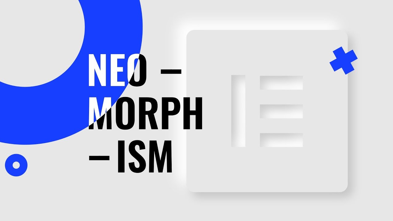
Neomorphism effect is one of the most talked-about web design and UI trends in 2020.
Is it possible to recreate in Elementor? Absolutely! Elementor Pro allows you to add custom CSS code to your elements, and this is the feature that is going to help us construct this trendy neomorphic look. Tune in!
⏰ Timestamps:
1:15 - What is Neomorphism?
1:44 - The components of neomorphism
2:42 - When to avoid neomorphism
4:10 - How to create the 1st effect
8:33 - How to create the 2nd effect
Soon after its appearance on Dribbble, Neumorphism has become one of the most talked-about web design trends 2020. Did you know that it is possible to recreate neumorphism in Elementor? Absolutely! By the way, this is pretty easy and convenient. Watch our Neumorphism Elementor tutorial to get know #how to create a neumorphism effect.
Neumorphism looks cool and innovative.
➤ Is it really a new trend?
Actually, it originates from two UI design trends:
-
Skeuomorphism - when designers aimed at making the virtual world more realistic. Nowadays, it may seem to be the past tense. Does anybody miss the realistic leather cover of Apple’s Notes?
-
UI Flat design replaced Skeuomorphism. Users loved it for its simplicity and laconism. But we need to admit that we’ve had it up, and Flat design seems quite boring now.
Neumorphism UI design combines realistic elements of Skeuomorphism and minimalism of the Flat design.
➤ Neumorphism UI design looks unique and fresh
✅Neumorphism design components are fulfilled in a single color and have a dark frame shadow. Using darkness transitions, the effect of pushing the elements of UI is created.
✅The user presses the virtual button and seems like he presses the real one. Your button looks cool and even seems to be real. You receive a fancy visual illusion, in an elegant performance.
✅Esthetically attractive soft UI design with the effect of pleasant texture. A user experiences “fresh impressions”. Thus, the site looks airy and isn’t overloaded with extra details. That’s amazing!
➤ When to avoid Neumorphism
📌 #Neumorphism UI may be inefficient. Neumorphic buttons might be a problem for a friendly UI. The borders of the button are hardly visible and they are blurred with the background. That may cause particular difficulties for older users, but not only for them. Thus, it is better to make the major buttons in contrast colors with precise boundaries.
📌Keep in mind that the neuromorphic charming effect strongly depends on the quality of its performance. You can notice that while looking through the Neumorphism web designs. With poor design quality, the visual effect gets lost and the aesthetics of the interface suffers. 👇
We tried to take into account all possible difficulties you may face, recreating impressive neuromorphic visual effects.
❗️ All you need is just to copy and paste the ready-made #Neumorphism CSS into the Custom CSS field of Elementor and follow a couple of simple steps from our #Neumorphism Elementor tutorial.
The background and object color in this video: #f5f5f5;
HERE GOES THE CODE:
1st effect 👇👇👇👇
.your-class {
    -webkit-box-shadow:
 5px 5px 10px rgba(0,0,0,0.1),
-5px -5px 10px #fff ;

    -moz-box-shadow:
 5px 5px 10px rgba(0,0,0,0.1),
-5px -5px 10px #fff ;


    box-shadow:
 5px 5px 10px rgba(0,0,0,0.1),
-5px -5px 10px #fff ;

}

.your-class:hover {
-webkit-box-shadow:
  15px 15px 20px rgba(0,0,0,0.1),
 -15px -15px 20px #fff;

 -moz-box-shadow:
  15px 15px 20px rgba(0,0,0,0.1),
 -15px -15px 20px #fff;

    box-shadow:
  15px 15px 20px rgba(0,0,0,0.1),
 -15px -15px 20px #fff;

}
2nd effect 👇👇👇👇
.your-class {
-webkit-box-shadow:
5px 5px 10px rgba(0,0,0,0.1),
-5px -5px 10px #fff ;

-moz-box-shadow:
5px 5px 10px rgba(0,0,0,0.1),
-5px -5px 10px #fff ;

    box-shadow:
5px 5px 10px rgba(0,0,0,0.1),
-5px -5px 10px #fff ;

}

.your-class:hover  {
 -webkit-box-shadow:
     inset  10px 10px 20px rgba(0,0,0,0.05),
      inset -15px -15px 20px #fff;

   -moz-box-shadow:
     inset  10px 10px 20px rgba(0,0,0,0.05),
      inset -15px -15px 20px #fff;

    box-shadow:
     inset  10px 10px 20px rgba(0,0,0,0.05),
      inset -15px -15px 20px #fff;

}
#css #webdev