CSS Grid has taken over the world of web design. It’s cool and awesome. There are plenty of tutorials, blogs and articles on the internet, which are great sources of knowledge.
But the majority of them teach you the basics with very few real examples. So in this guide we’ll look at examples as we learn.
What is Grid?
CSS Grid allows us to write better layouts using the in-browser capability of grids. Prior to CSS Grid, we either had to use our own custom grid system or something like Bootstrap.
These other options work fine, but CSS grid takes the pain out of most of the things we faced in those solutions.
CSS Grid makes it a piece of cake to develop simple and complex layouts. In this blog we will learn some basic terminologies and then go ahead with a simple layout example.
Basic Terminologies
The basic terms associated with CSS Grid are as follows:
- Columns
- Rows
- Cells
- Grid Lines
- Gutter
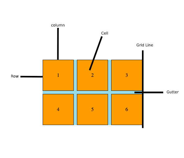
All the terms are explained in the diagram above. This example is a 3x2 column grid, which means 3 columns and 2 rows.
Example Layout
Now that the basic concepts are out of the way, we are going to use these concepts to make an example layout like the below:
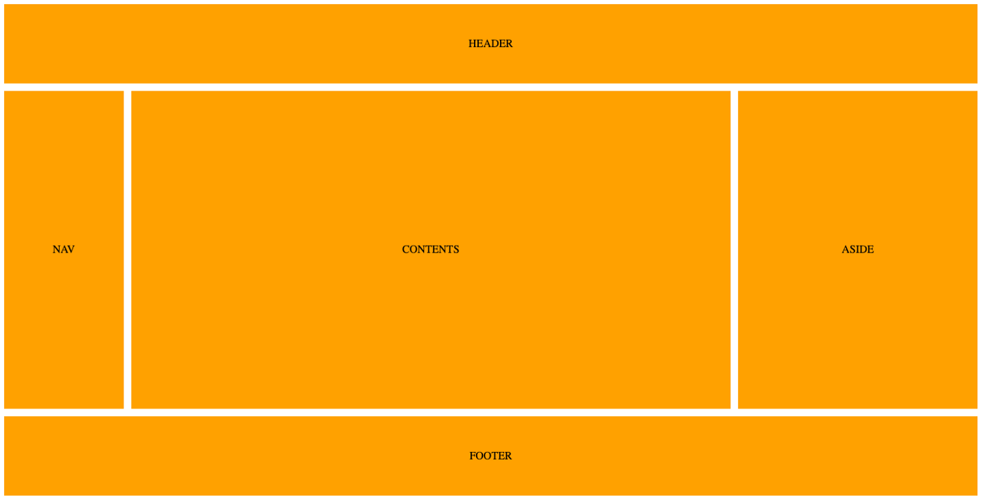
As you can see, there is a header and a footer. Then the center row has 3 columns with nav in the first column sidebar on the right, and the main content area in the center (which occupies most of the row).
Below is the sample HTML for this example.
<div class="wrapper">
  <header class="items">HEADER</header>
  <nav class="items">NAV</nav>
  <div class="items contents">CONTENTS</div>
  <aside class="items">ASIDE</aside>
  <footer class="items">FOOTER</footer>
</div>
Now that the HTML is out of our way, let’s dig into the CSS. First and foremost, let’s give it some styling so that our HTML looks like the above. These CSS rules are not part of CSS grid, so you can omit them if you want.
.wrapper * {
  background: orange;
  display: flex;
  justify-content: center;
  align-items: center;
  margin-bottom: 1px;
  margin-right: 1px;
}
As you can see I am styling all the items inside a wrapper container. I am setting its background color to orange and giving bottom and right margins. I’m setting display flex just to align items dead center by setting justify-content and align-items to center.
Next, let’s get into the CSS grid part of it.
.wrapper {
  display: grid;
  grid-template-columns: 1fr 5fr 2fr;
  grid-template-rows: 5fr 20fr 5fr;
  grid-gap: 10px;
  height: 720px;
}
#css #web-development #developer