Material Login & Signup Form with CSS, HTML and JavaScript
Basically, Material Design is a type of design and it is developed by Google. Material Design uses more grid-based layouts, responsive animations and transitions, padding, and depth effects such as lighting and shadows. Languages like angular, react has an inbuilt material design for elements but we can create that kind of design using CSS.
Today you will learn to create Material Design Form using HTML and CSS. Basically, there is a login form and a button on the right-top of the form, when you will click on that then the signup or registration form will appear. And all the input fields and the layout designed as material design, and transitions are also like that.
So, Today I am sharing CSS Material Login & Signup Form With jQuery. There I have used pure HTML and CSS but jQuery is only for the toggle feature. And there material design effect is a combination of shadow, size, animation, etc. Believe me, this is a very good designed login/registration form you can use it on your website after backed integration.
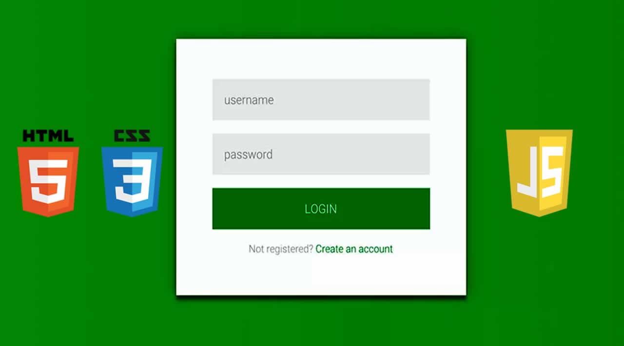
If you are thinking now how this material design form actually is, then see the preview given below.
CSS Material Login & Signup Form With jQuery Source Code
Before sharing source code, let’s talk about it. First I have created two different sections one for login and one for the registration form. Inside a single card, I have placed a button, input, and label to creating the complete form. And also in the HTML file, I have linked external files like jQuery, font-awesome, and other files.
Now using CSS I have placed all the elements in the right place, as you can see in the preview. There I have created two cards and a toggle button which is for the register section. There is a class name .active which is handling the whole function. I have put the condition when it’s active then do these things to element. For signup form expand feature I have used CSS transform: scale (); command (info).
jQuery just handling the toggle feature by adding and removing the active class. All the design and animation are based on pure CSS, and the register icon is powered by font-awesome library. And this form is responsive means it will fit on every screen size, I have used CSS @media query for creating this. There I have created many things using CSS, I can’t explain all you will understand after getting the codes.
For Creating this program, you have to create 3 files. First for HTML, second for CSS, and the third for JavaScript. Follow the steps to creating this without any error.
index.html
Create an HTML file named ‘index.html‘ and put these codes given below.
<html lang="en" >
<head>
  <meta charset="UTF-8">
  <title>Material Login Form | Webdevtrick.com</title>
  <link rel="stylesheet" href="https://cdnjs.cloudflare.com/ajax/libs/meyer-reset/2.0/reset.min.css">
<link rel='stylesheet' href='https://fonts.googleapis.com/css?family=Roboto:400,100,300,500,700,900|RobotoDraft:400,100,300,500,700,900'>
<link rel='stylesheet' href='https://maxcdn.bootstrapcdn.com/font-awesome/4.3.0/css/font-awesome.min.css'>
<link rel="stylesheet" href="style.css">

</head>
<body>

<div class="container">
  <div class="card">
    <h1 class="title">Login</h1>
    <form>
      <div class="input-container">
        <input type="text" id="usern" required="required"/>
        <label for="usern">Username</label>
        <div class="bar"></div>
      </div>
      <div class="input-container">
        <input type="text" id="passw" required="required"/>
        <label for="passw">Password</label>
        <div class="bar"></div>
      </div>
      <div class="button-container">
        <button><span>Go</span></button>
      </div>
      <div class="footer"><a href="#">Forgot your password?</a></div>
    </form>
  </div>
  <div class="card alt">
    <div class="toggle"></div>
    <h1 class="title">Register
      <div class="close"></div>
    </h1>
    <form>
      <div class="input-container">
        <input type="text" id="usernR" required="required"/>
        <label for="usernR">Username</label>
        <div class="bar"></div>
      </div>
      <div class="input-container">
        <input type="text" id="passwR" required="required"/>
        <label for="passwR">Password</label>
        <div class="bar"></div>
      </div>
      <div class="input-container">
        <input type="text" id="repeatpass" required="required"/>
        <label for="repeatpass">Repeat Password</label>
        <div class="bar"></div>
      </div>
      <div class="button-container">
        <button><span>Next</span></button>
      </div>
    </form>
  </div>
</div>

  <script src='https://cdnjs.cloudflare.com/ajax/libs/jquery/2.1.3/jquery.min.js'></script>
  <script  src="function.js"></script>

</body>
</html>
style.css
Now create a CSS file named ‘style.css‘ and put these codes given here.
body {
  background: #e9e9e9;
  color: #666666;
  font-family: 'RobotoDraft', 'Roboto', sans-serif;
  font-size: 14px;
  -webkit-font-smoothing: antialiased;
  -moz-osx-font-smoothing: grayscale;
  overflow-x: hidden;
}
.container {
  position: relative;
  max-width: 460px;
  width: 100%;
  margin: 0 auto 100px;
  margin-top: 10%;

}
.container.active .card:first-child {
  background: #f2f2f2;
  margin: 0 15px;
}
.container.active .card.alt {
  top: 20px;
  right: 0;
  width: 100%;
  min-width: 100%;
  height: auto;
  border-radius: 5px;
  padding: 60px 0 40px;
  overflow: hidden;
}
.container.active .card.alt .toggle {
  position: absolute;
  top: 40px;
  right: -70px;
  box-shadow: none;
  -webkit-transform: scale(10);
  transform: scale(10);
  transition: -webkit-transform .3s ease;
  transition: transform .3s ease;
  transition: transform .3s ease, -webkit-transform .3s ease;
}
.container.active .card.alt .toggle:before {
  content: '';
}
.container.active .card.alt .title,
.container.active .card.alt .input-container,
.container.active .card.alt .button-container {
  left: 0;
  opacity: 1;
  visibility: visible;
  transition: .3s ease;
}
.container.active .card.alt .title {
  transition-delay: .3s;
}
.container.active .card.alt .input-container {
  transition-delay: .4s;
}
.container.active .card.alt .input-container:nth-child(2) {
  transition-delay: .5s;
}
.container.active .card.alt .input-container:nth-child(3) {
  transition-delay: .6s;
}
.container.active .card.alt .button-container {
  transition-delay: .7s;
}

.card {
  position: relative;
  background: #ffffff;
  border-radius: 5px;
  padding: 60px 0 40px 0;
  box-sizing: border-box;
  box-shadow: 0 1px 3px rgba(0, 0, 0, 0.12), 0 1px 2px rgba(0, 0, 0, 0.24);
  transition: .3s ease;
}

.card .title {
  position: relative;
  z-index: 1;
  border-left: 5px solid #ff4444;
  margin: 0 0 35px;
  padding: 10px 0 10px 50px;
  color: #ff4444;
  font-size: 32px;
  font-weight: 600;
  text-transform: uppercase;
}
.card .input-container {
  position: relative;
  margin: 0 60px 50px;
}
.card .input-container input {
  outline: none;
  z-index: 1;
  position: relative;
  background: none;
  width: 100%;
  height: 60px;
  border: 0;
  color: #212121;
  font-size: 24px;
  font-weight: 400;
}
.card .input-container input:focus ~ label {
  color: #9d9d9d;
  -webkit-transform: translate(-12%, -50%) scale(0.75);
          transform: translate(-12%, -50%) scale(0.75);
}
.card .input-container input:focus ~ .bar:before, .card .input-container input:focus ~ .bar:after {
  width: 50%;
}
.card .input-container input:valid ~ label {
  color: #9d9d9d;
  -webkit-transform: translate(-12%, -50%) scale(0.75);
          transform: translate(-12%, -50%) scale(0.75);
}
.card .input-container label {
  position: absolute;
  top: 0;
  left: 0;
  color: #757575;
  font-size: 24px;
  font-weight: 300;
  line-height: 60px;
  transition: 0.2s ease;
}
.card .input-container .bar {
  position: absolute;
  left: 0;
  bottom: 0;
  background: #757575;
  width: 100%;
  height: 1px;
}
.card .input-container .bar:before, .card .input-container .bar:after {
  content: '';
  position: absolute;
  background: #ff4444;
  width: 0;
  height: 2px;
  transition: .2s ease;
}
.card .input-container .bar:before {
  left: 50%;
}
.card .input-container .bar:after {
  right: 50%;
}
.card .button-container {
  margin: 0 60px;
  text-align: center;
}
.card .button-container button {
  outline: 0;
  cursor: pointer;
  position: relative;
  display: inline-block;
  background: 0;
  width: 240px;
  border: 2px solid #e3e3e3;
  padding: 20px 0;
  font-size: 24px;
  font-weight: 600;
  line-height: 1;
  text-transform: uppercase;
  overflow: hidden;
  transition: .3s ease;
}
.card .button-container button span {
  position: relative;
  z-index: 1;
  color: #ddd;
  transition: .3s ease;
}
.card .button-container button:before {
  content: '';
  position: absolute;
  top: 50%;
  left: 50%;
  display: block;
  background: #ff4444;
  width: 30px;
  height: 30px;
  border-radius: 100%;
  margin: -15px 0 0 -15px;
  opacity: 0;
  transition: .3s ease;
}
.card .button-container button:hover, .card .button-container button:active, .card .button-container button:focus {
  border-color: #ff4444;
}
.card .button-container button:hover span, .card .button-container button:active span, .card .button-container button:focus span {
  color: #ff4444;
}
.card .button-container button:active span, .card .button-container button:focus span {
  color: #ffffff;
}
.card .button-container button:active:before, .card .button-container button:focus:before {
  opacity: 1;
  -webkit-transform: scale(10);
  transform: scale(10);
}
.card .footer {
  margin: 40px 0 0;
  color: #d3d3d3;
  font-size: 24px;
  font-weight: 300;
  text-align: center;
}
.card .footer a {
  color: inherit;
  text-decoration: none;
  transition: .3s ease;
}
.card .footer a:hover {
  color: #bababa;
}
.card.alt {
  position: absolute;
  top: 40px;
  right: -70px;
  z-index: 10;
  width: 140px;
  height: 140px;
  background: none;
  border-radius: 100%;
  box-shadow: none;
  padding: 0;
  transition: .3s ease;
}
.card.alt .toggle {
  position: relative;
  background: #ff4444;
  width: 140px;
  height: 140px;
  border-radius: 100%;
  box-shadow: 0 1px 3px rgba(0, 0, 0, 0.12), 0 1px 2px rgba(0, 0, 0, 0.24);
  color: #ffffff;
  font-size: 58px;
  line-height: 140px;
  text-align: center;
  cursor: pointer;
}
.card.alt .toggle:before {
  content: '\f040';
  display: inline-block;
  font: normal normal normal 14px/1 FontAwesome;
  font-size: inherit;
  text-rendering: auto;
  -webkit-font-smoothing: antialiased;
  -moz-osx-font-smoothing: grayscale;
  -webkit-transform: translate(0, 0);
          transform: translate(0, 0);
}
.card.alt .title,
.card.alt .input-container,
.card.alt .button-container {
  left: 100px;
  opacity: 0;
  visibility: hidden;
}
.card.alt .title {
  position: relative;
  border-color: #ffffff;
  color: #ffffff;
}
.card.alt .title .close {
  cursor: pointer;
  position: absolute;
  top: 0;
  right: 60px;
  display: inline;
  color: #ffffff;
  font-size: 58px;
  font-weight: 400;
}
.card.alt .title .close:before {
  content: '\00d7';
}
.card.alt .input-container input {
  color: #ffffff;
}
.card.alt .input-container input:focus ~ label {
  color: #ffffff;
}
.card.alt .input-container input:focus ~ .bar:before, .card.alt .input-container input:focus ~ .bar:after {
  background: #ffffff;
}
.card.alt .input-container input:valid ~ label {
  color: #ffffff;
}
.card.alt .input-container label {
  color: rgba(255, 255, 255, 0.8);
}
.card.alt .input-container .bar {
  background: rgba(255, 255, 255, 0.8);
}
.card.alt .button-container button {
  width: 100%;
  background: #ffffff;
  border-color: #ffffff;
}
.card.alt .button-container button span {
  color: #ff4444;
}
.card.alt .button-container button:hover {
  background: rgba(255, 255, 255, 0.9);
}
.card.alt .button-container button:active:before, .card.alt .button-container button:focus:before {
  display: none;
}
@media (max-width: 750px) {
  .card.alt .toggle {
    width: 50px;
    height: 50px;
    line-height: 50px;
    font-size: 25px;
  }
  .container.active .card.alt .toggle {
   transform: scale(27);
  }
  .container.active .card.alt{
   left: 0;
  }
}
function.js
The last step, create a JavaScript file named ‘function.js‘ and put the codes.
$('.toggle').on('click', function() {
  $('.container').stop().addClass('active');
});

$('.close').on('click', function() {
  $('.container').stop().removeClass('active');
});
That’s It. Now you have successfully created CSS Material Login & Signup Form With jQuery, Material Design Form. If you have any doubt or question comment down below.
Thanks for reading !
#css #html #javascript #jQuery #WebDesign