Yeah, neither can I!
But, there is a huuuuuge difference between those two reports! What if I tell you that the report on the right is 5x faster than the one on the left? Would you believe me? No? Then keep reading and I will show you how’s that possible…
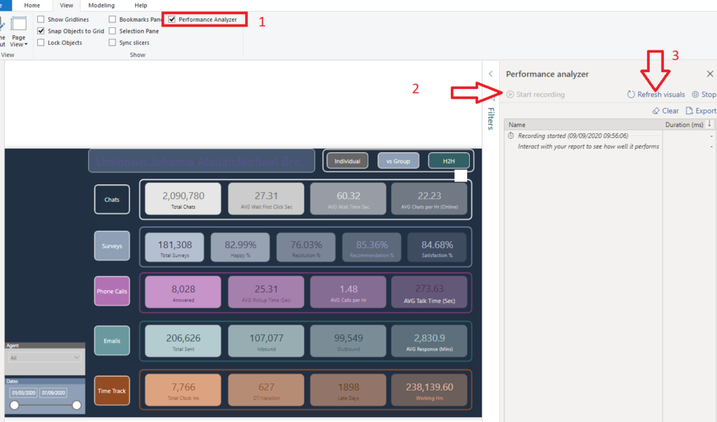
How it all started…
I was reading a great blog post by Chris Hamill, where he explained how to substitute some visuals in the report while keeping the same visual look. So, I was immediately tempted to try to apply a similar technique to one of the reports I previously created.
The report page which you see on the left side in the illustration above displays some figures related to the performance of the customer support center. There are a whole bunch of metrics related to chats, surveys, phone calls, emails, etc.
However, this report page needs a hell of a lot of time to render and load. The main culprit is the big number of card visuals (21 in total). Since Formula Engine behind the Power BI works single-threaded, as explained in detail in this article, for every single Card visual, a new query is being generated and can’t be executed until the previous one is completed!
#data-visualization #towards-data-science #data-science #power-bi #data