In this article, you will be exposed to ApexCharts and to the different types and variants of charts it provides. Along the way, we’ll build several types of charts and learn how we can customize the appearance of our charts. By the end of the article, you will be able to integrate different types and variants of chats in your applications with ApexCharts.
ApexCharts is a modern charting library that helps developers to create beautiful and interactive visualizations for web pages with a simple API, while React-ApexCharts is ApexChart’s React integration that allows us to use ApexCharts in our applications. This article will be beneficial to those who need to show complex graphical data to their customers.
Getting Started
First, install the React-ApexCharts component in your React application and import react-apexcharts.
npm i react-apexcharts apexcharts

import ReactApexCharts from 'react-apexcharts'
The core components of an ApexChart is its configuration object. In the configuration object, we define the series and options properties for a chart. series is the data we want to visualize on the chart. In the series, we define the data and name of the data. The values in the data array will be plotted on the y-axis of the chart. The name of the data will appear when you hover over the chart. You can have a single or multiple data series. In options, we define how we want a chart to look, the features and tools we want to add to a chart and the labels of the x and y axes of a chart. The data we define in the configuration object’s series and options properties is what we then pass to the ReactApexChart component’s series and options props respectively.
Here is a sample of how the components of an ApexChart work together. (We will take a closer look at them later in the article.)
const config = {
  series: [1, 2, 3, 4, 5],
  options: {
    chart: {
      toolbar: {
      show: true
      },
    }
  }
}

return (
  <ReactApexChart options={config.options} series={config.series} type="polarArea" />
)
When going through the docs, you will notice that the width, height, and type of chart are defined in the options object, like in the code snippet below.
const config = {
  series: [44, 55, 13, 43, 22],
  chart: {
    width: 380,
    type: 'pie'
  }
},
This is because the docs were written with vanilla JavaScript application in mind. We are working with React, so we define the width, height, and type by passing them in as props to the ReactApexCharts component. We will see how this works in the next section.
Line Charts
This is a type of chart used to show information that changes over time. We plot a line using several points connected by straight lines. We use Line charts to visualize how a piece of data changes over time. For example, in a financial application, you could use it to show a user how their purchases have increased over some time.
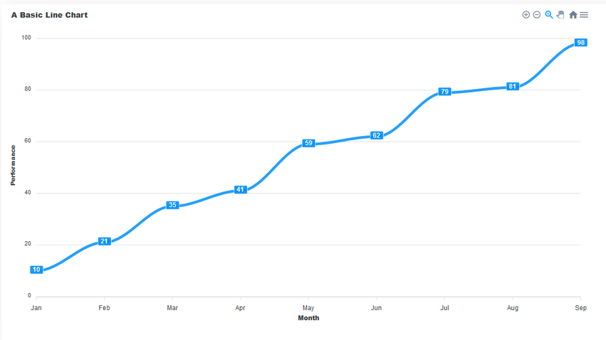
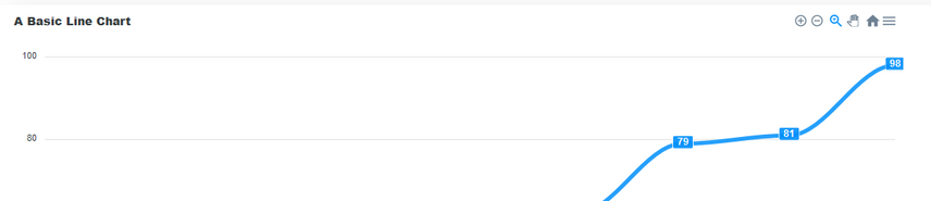
An example of a Line chart built with ApexCharts. (Large preview)
This chart consists of the following components:
- Title
- This sits on top of the chart and informs the user about what data the chart represents.
- Toolbar
- The toolbar is at the right-hand corner in the image above. It controls the level of zoom of the chart. You can also export the char through the toolbar.
- Axis labels
- On the left and right axes, we have the labels for each axis.
- Data labels
- The data labels are visible at each plot point on the line. They make it easier to view the data on the chart.
We have seen how a line chart looks and its different components. Now let us go through the steps of building one.
We start with series. Here we define the data of the series and its name. Then, we pass the options and series to the ReactApexChart component’s props. We also define the type of chart in the type prop and set it to line.
const config = {
  series: [{
    name: "Performance",
    data: [10, 21, 35, 41, 59, 62, 79, 81, 98]
  }],
 options: {}
}
return (
  <ReactApexChart options={config.options} series={config.series} type="line" />
)
The critical part of an ApexChart is its series data. The configurations defined in the options property are optional. Without setting any definitions in options, the data will still be displayed. However, it may not be the most readable chart. If you decide not to set any custom definitions in options, it must still be present as an empty object.
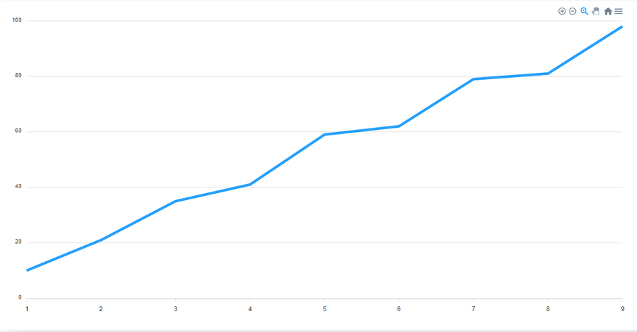
The default view of a line chart. (Large preview)
Let’s configure the options of the chart by adding some values to the options object we have in the config object.
In the chart property of the options object, we define the configurations of the chart. Here, we add the toolbar from the chart by setting its show property to true. The toolbar provides us with tools to control the zoom level of the chart and to export the chart in different file formats. The toolbar is visible by default.
options: {
  chart: {
    toolbar: {
      show: true
    },
  },
}
We can make our chart easier to read by enabling data labels for the chart. To do that, we add the dataLabels property to the options object and set it’s enabled property to true. This makes it easier to interpret the data in the chart.
dataLabels: {
  enabled: true
},
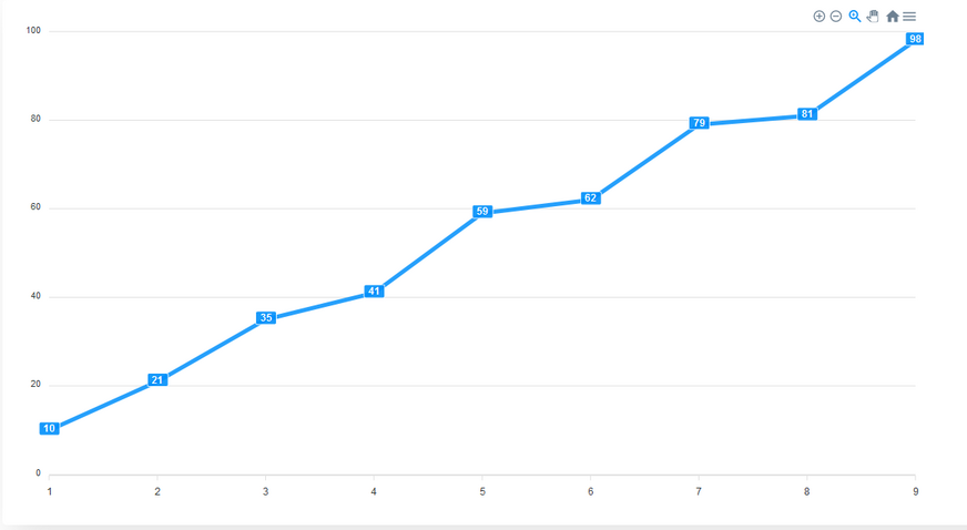
A line chart with data labels added. (Large preview)
By default, the stroke of a line chart is straight. However, we can make it curved. We add the stroke property to options and set to it’s curve to smooth.
stroke: {
  curve: "smooth"
}
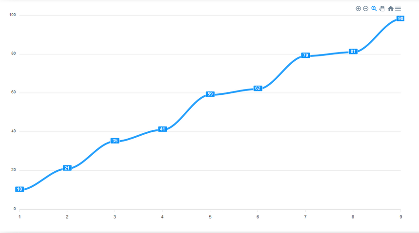
A curved line chart. (Large preview)
An important part of any chart is its title. We add a title property to options to give the chart a title.
title: {
  text: 'A Line Chart',
  align: 'left'
},
A line chart with a title on the top left corner. (Large preview)
We can add labels to the x and y axes of the chart. To do this we add xaxis and yaxis properties to options and there, we define the title for each axis.
xaxis: {
  categories: ['Jan', 'Feb', 'Mar', 'Apr', 'May', 'Jun', 'Jul', 'Aug', 'Sep'],
  title: {
    text: 'Month'
  }
},
yaxis: {
  title: {
    text: 'Performance'
  }
}
A Line chart with axes labels added. (Large preview)
In the end, your code should look like this. With these steps, we’ve not only built a line chart but seen a breakdown of how the options we define can enhance a chart.
import ReactApexCharts from 'react-ApexCharts'

const config = {
  series: [{
    name: "Performance",
    data: [10, 21, 35, 41, 59, 62, 79, 81, 98]
  }],
  options: {
    chart: {
      toolbar: {
        show: true
      },
    },

    dataLabels: {
      enabled: true
    },

    stroke: {
      curve: "smooth"
    }

    title: {
      text: 'A Line Chart',
      align: 'left'
    },

    xaxis: {
      categories: ['Jan', 'Feb', 'Mar', 'Apr', 'May', 'Jun', 'Jul', 'Aug', 'Sep'],
      title: {
        text: 'Month'
      }
    },

    yaxis: {
      title: {
        text: 'Performance'
      }
    }
  }
}
return (
  <ReactApexChart options={config.options} series={config.series} type="line" />
)
#developer #programming #web-development
