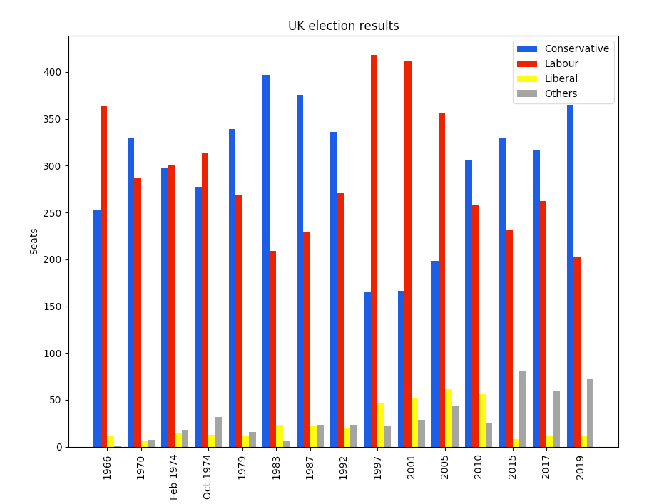
Python offers a rich set of options for visualizing data. I’ll show you the basics of plotting in Matplotlib by creating a bar chart with grouped bars. It shows election results for the UK between 1966 and 2020:
For a full comparison of Python plotting libraries, see The 7 most popular ways to plot data in Python.
Precise and powerful
Matplotlib is the alligator of the plotting zoo. It’s been around for a while, but it’s still got plenty of bite. Matplotlib gives you precise control over your plots—but, like anything precise and powerful, this sometimes forces you to think harder than you might want to.
To see what I mean, let’s start creating the multi-bar plot. Before we go further, note that you may need to tune your Python environment to get this code to run, including the following.
- Running a recent version of Python (instructions for Linux, Mac, and Windows)
- Verify you’re running a version of Python that works with these libraries
The data is available online and can be imported using pandas:
import pandas as pd
df = pd.read_csv('https://anvil.works/blog/img/plotting-in-python/uk-election-results.csv')
Now we’re ready to go. Start by importing Matplotlib and Numpy:
import matplotlib.pyplot as plt
import numpy as np
It’s in wide form, meaning there’s a column for each political party:
    year conservative labour liberal others
0   1966     253  364   12   1
1   1970     330  287    6   7
2 Feb 1974     297  301   14   18
..   ...     ...  ...   ...  ...
12   2015     330  232    8   80
13   2017     317  262   12   59
14   2019     365  202   11   72
Next, tell Matplotlib that you’re creating a figure with a single axis in it. It gives you a Figure and Axis object. If you have several subplots, you have one Figure and several Axes.
# Create a Figure with one Axis on it
fig, ax = plt.subplots()
Making the bar plots
Now add the bar charts themselves. The multi-bar chart is made by drawing four separate bar charts on the same axes—offset each bar chart by a certain amount, so they appear side-by-side. This means you have to work out how to calculate the offset for each bar chart, and if you wanted to add another political party, you’d have to rethink your calculation.
# The x-values of the bars.
years = df['year']
x = np.arange(len(years))

# The width of the bars (1 = the whole width of the 'year group')
width = 0.15

# Create the bar charts!
ax.bar(x - 3*width/2, df['conservative'], width, label='Conservative', color='#0343df')
ax.bar(x - width/2, df['labour'], width, label='Labour', color='#e50000')
ax.bar(x + width/2, df['liberal'], width, label='Liberal', color='#ffff14')
ax.bar(x + 3*width/2, df['others'], width, label='Others', color='#929591')
#matplotlib #python #data plotting