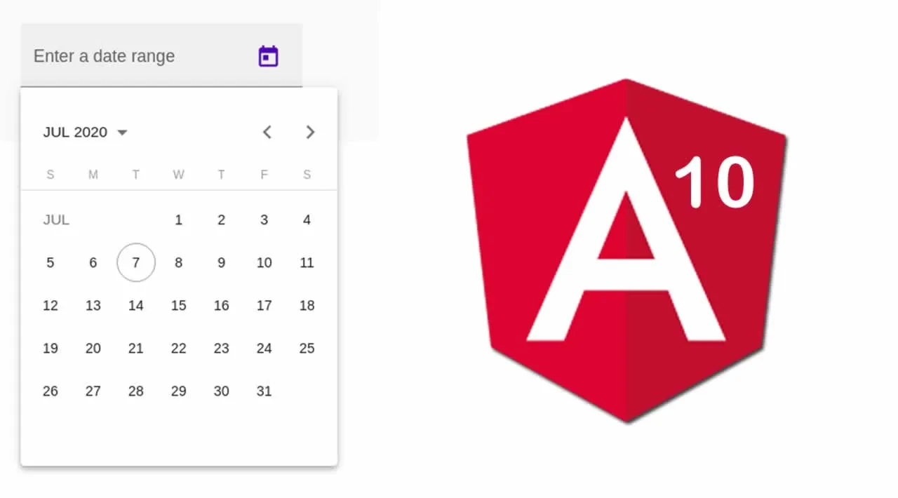
Angular 10 has been recently released and introduced some new features as usual with any new major release. Among the new features is adding the date range feature to the date picker component of Angular Material.
Throughout this tutorial, we’ll learn how to create a basic material date picker using mat-datepicker directive and then how to create one with a date range using the new mat-date-range-picker directive available in Angular 10 Material.
We also learn how to use the matDatepickerFilter property of the input field to disable specific dates using a filter function
and the disabled property which is available on the <input>, <mat-datepicker-toggle> and <mat-datepicker> elements to make the element disabled.
We’ll learn about Material date picker events that can be triggered from the input field - the dateInput and dateChange events then how to use the min and max properties of the input field to set the range of dates that can be selected by the users of your Angular 10 app.
Finally, we will learn how to change the calendar start view using the startView property of <mat-datepicker> directive which can be used to show a month, year, or multi-year for user selection and how to use the startAt property to set start date on <mat-datepicker>.
#angular-10 #angular