How to Create a Responsive Image Grid with HTML and CSS
Learn how to create a Responsive Image Grid with HTML and CSS. Unlock the secrets of crafting an engaging website with a Responsive Image Grid using HTML and CSS. Elevate your design game effortlessly!
Responsive Image Grid
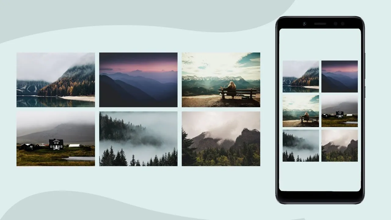
Learn how to create an image gallery that varies between four, two or full-width images, depending on screen size:
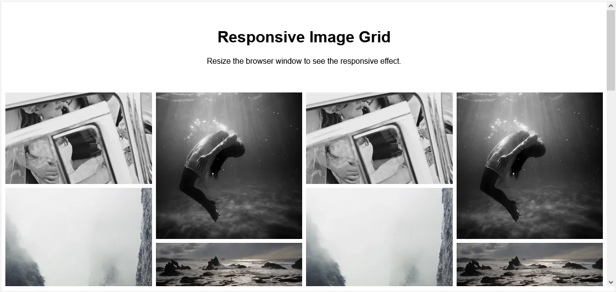
Creating an Image Grid
Step 1) Add HTML:
Example
<div class="row">
  <div class="column">
    <img src="wedding.jpg">
    <img src="rocks.jpg">
    <img src="falls2.jpg">
    <img src="paris.jpg">
    <img src="nature.jpg">
    <img src="mist.jpg">
    <img src="paris.jpg">
  </div>
  <div class="column">
    <img src="underwater.jpg">
    <img src="ocean.jpg">
    <img src="wedding.jpg">
    <img src="mountainskies.jpg">
    <img src="rocks.jpg">
    <img src="underwater.jpg">
  </div>
  <div class="column">
    <img src="wedding.jpg">
    <img src="rocks.jpg">
    <img src="falls2.jpg">
    <img src="paris.jpg">
    <img src="nature.jpg">
    <img src="mist.jpg">
    <img src="paris.jpg">
  </div>
  <div class="column">
    <img src="underwater.jpg">
    <img src="ocean.jpg">
    <img src="wedding.jpg">
    <img src="mountainskies.jpg">
    <img src="rocks.jpg">
    <img src="underwater.jpg">
  </div>
</div>
Step 2) Add CSS:
Use CSS Flexbox to create a responsive layout:
Example
.row {
  display: flex;
  flex-wrap: wrap;
  padding: 0 4px;
}

/* Create four equal columns that sits next to each other */
.column {
  flex: 25%;
  max-width: 25%;
  padding: 0 4px;
}

.column img {
  margin-top: 8px;
  vertical-align: middle;
  width: 100%;
}

/* Responsive layout - makes a two column-layout instead of four columns */
@media screen and (max-width: 800px) {
  .column {
    flex: 50%;
    max-width: 50%;
  }
}

/* Responsive layout - makes the two columns stack on top of each other instead of next to each other */
@media screen and (max-width: 600px) {
  .column {
    flex: 100%;
    max-width: 100%;
  }
}
#html #css
4.10 GEEK