Build Custom Date Range Picker For Angular 8
Material Design features pretty cool widgets for date range selection, but if you are just like me, a curious learner, you could implement a widget like that with some CSS/HTML and TypeScript.
Step 1. Design the Experience
Let’s constrain ourselves with a use case that I found and helped to resolve at Stack Overflow which had the following criteria:
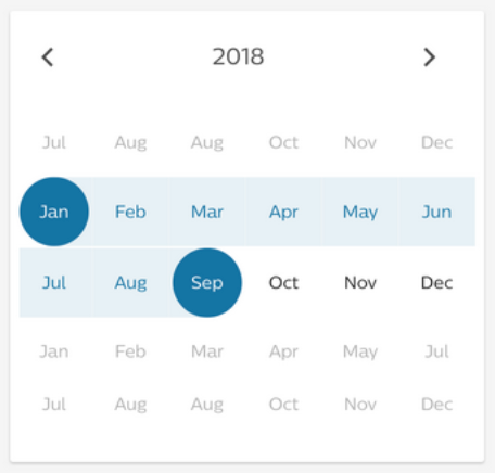
- User can switch between different years.
- User can see the current year’s 12 months (in black) and six months of the past year, as well as six months of the next year (in gray).
- Hovering over each month highlights it with a blue-colored circle.
- User can select a range between any month, in any order.
- The first click highlights the start of the range, the second click draws the range, with a milder blue color highlight in between selected months.
At a high level, there seem to be a few components here:
- Outer card with a shadow.
- Top panel with two buttons to switch between the years.
- Content panel with 24 (6+12+6) months inside the view.
- Each individual month has a round highlight and a dimmed highlight.
Step 2. Implement All Components
Implement all components mentioned above with the first iteration to roughly position everything.
<div class="outerCard">
  <div class="topPanel">
    <button class="prevYearButton">
      <i class="arrow left"></i>
    </button>
    <span class="yearLabel">CURRENT YEAR</span>
    <button class="nextYearButton">
      <i class="arrow right"></i>
    </button>
  </div>
  <div class="contentPanel">
    <div class="monthItem">
      <div class="monthItemHighlight">
        MON
      </div>
    </div>
  </div>
</div>
As seen above, we created basic elements and added classes according to the components we mentioned. Now, let’s add some CSS to make it all look close to what we need:
.outerCard {
  touch-action: none;
  overflow: hidden;
  width: 400px;
  height: 400px;
  box-shadow: 0 4px 8px 0 rgba(0,0,0,0.2);
}
.topPanel {
  width: 400px;
  height: 50px;
  text-align: center;
  line-height: 50px;
}
.prevYearButton {
  float: left;
}
.nextYearButton {
  float: right;
}
button {
  width: 50px;
  height: 50px;
  background:none;
  border:none;
  margin:0;
  padding:0;
  cursor: pointer;
}
button:focus {outline:0;}
i {
  border: solid black;
  border-width: 0 3px 3px 0;
  display: inline-block;
  padding: 6px;
}
.right {
  transform: rotate(-45deg);
  -webkit-transform: rotate(-45deg);
}
.left {
  transform: rotate(135deg);
  -webkit-transform: rotate(135deg);
}
.topPanel.yearLabel {
  display: inline-block;
  margin: 0 auto;
}
.contentPanel {
  padding: 24px 8px;
}
.monthItem {
  display: inline-block;
  height: 64px;
  width: 64px;
  cursor: pointer;
  text-align: center;
  line-height: 64px;
  margin-top: 1px;
  margin-bottom: 1px;
}
Some highlights of the above:
- We use
touch-action: noneto prevent default actions such as text select. Since we will add listeners ourselves, this makes interaction with the component cleaner. - We use
text-align,line-height, andmargin: 0 automagic to position text elements horizontally and vertically centered. - We are creating a simple list here using
inline-block— this helps to render all 24 months line-by-line, forming a table-like view (without actually creating a table), this way our months are just an ordered list and we do not have to worry about actual rows and columns. - We left top and bottom margins at 1px since there should be some gap between month rows.
- Finally, for the left and right arrow, we are using a simple 45-degree transform rotation trick.
Let’s add some TypeScript and let’s also use *ngFor in our template to replicate all 24 months and see what things look like:
.import { Component } from '@angular/core';
@Component({
  selector: 'month-picker',
  templateUrl: 'month-picker.component.html',
  styleUrls: ['month-picker.component.scss']
})
export class MonthPickerComponent  {
  years: Array<number>;
  months: Array<string>;
ngOnInit() {
    this.years = [ 2018, 2019, 2020, 2021, 2022, 2023, 2024 ];
    this.months = ['Jan', 'Feb', 'Mar', 'Apr', 'May', 'Jun', 'Jul', 'Aug', 'Sep', 'Oct', 'Nov', 'Dec'];
  }

}
We declare properties with their type and we initialize the values inside the ngOnInit Hook. Let’s not worry about these being “hardcoded” for now. It is indeed a tech debt and we will deal with it later in the article.
<div class="outerCard">
  <div class="topPanel">
    <button class="prevYearButton">
      <i class="arrow left"></i>
    </button>
    <span class="yearLabel">{{ years[0] }}</span>
    <button class="nextYearButton">
      <i class="arrow right"></i>
    </button>
  </div>
  <div class="contentPanel">
    <div class="monthItem" *ngFor="let month of months">
      <div class="monthItemHighlight">
        {{ month }}
      </div>
    </div>
  </div>
</div>
Our template is now a thing, but we need to start working on the next set of challenges here:
- Create a data model that can help us track each month’s state. (Is it in range? Is it at the start of the range? Is it at the range’s end? Which year does this month belong to? What is its
label?) - Implement the state of our range. (Is the first edge selected? Is the second edge selected and do we have a range? Has it reset again?)
- Figure out how we want to show only a part of the entire list of all the months for all the years. (Since, remember, I wanted to implement the month’s data layer as a flat array.)
Step 3. Implement Required Data Structures
First, let’s create monthsData property that will store the list of all the months with their current state:
monthsData: Array<{
    monthName: string,
    monthYear: number,
    isInRange: boolean,
    isLowerEdge: boolean,
    isUpperEdge: boolean
}>
It is an array of objects (Month) that can help us track important states. Next, we will create the list of all the months for all the years we have so far (2018–2024):
initMonthsData() {
    this.monthsData = new Array();
    this.years.forEach( year => {
      this.months.forEach( month => {
        this.monthsData.push({
          monthName: month,
          monthYear: year,
          isInRange: false,
          isLowerEdge: false,
          isUpperEdge: false
        })
      })
    })
  }
ngOnInit() {
    this.years = [ 2018, 2019, 2020, 2021, 2022, 2023, 2024 ];
    this.months = ['Jan', 'Feb', 'Mar', 'Apr', 'May', 'Jun', 'Jul', 'Aug', 'Sep', 'Oct', 'Nov', 'Dec'];
    this.initMonthsData();
}
In the snippet above, we are iterating over our initial months and years properties to create our monthsData array in its initial state. Since we might need to use such a data “reset” in our component, we wrapped this operation inside the initMonthsData method.
Next, we can update our view (HTML) to read from this entire (huge) list:
<div class="contentPanel">
    <div class="monthItem" *ngFor="let month of monthsData">
      <div class="monthItemHighlight">
        {{ month.monthName }}
      </div>
    </div>
</div>
OK, good stuff. Next, we need a simple way to track the state of our range, for this I chose (you will see later on why) to use a simple array with two values representing the indexes of a chosen “range start” month and “range end” month:
rangeIndexes: Array<number>;
initRangeIndexes() {
    this.rangeIndexes = [ null, null ];
};
The null value is intentional and will help us track the range’s state. As with our monthsData — we are adding this method into our ngOnInit Hook.
Step 4. Let’s Make It All Interactive
Alright, now we need to add a method that we will call each time a user clicks on a month:
onClick(indexClicked) {
    if (this.rangeIndexes[0] === null) {
      this.rangeIndexes[0] = indexClicked;
    } else
    if (this.rangeIndexes[1] === null) {
      this.rangeIndexes[1] = indexClicked;
      this.rangeIndexes.sort((a,b) => a-b);
      this.monthsData.forEach((month, index) => {
        if ((this.rangeIndexes[0] <= index) && (index <= this.rangeIndexes[1])) {
          month.isInRange = true;
        };
        if (this.rangeIndexes[0] === index) {
          month.isLowerEdge = true;
        };
        if (this.rangeIndexes[1] === index) {
          month.isUpperEdge = true;
        };
      })
    } else {
      this.initRangeIndexes();
      this.initMonthsData();
      this.onClick(indexClicked);
    };
  }
The logic here should be straightforward:
- We check if the first index of our range is null, this means our months are in their initial state and we then add the selected month index to the
rangeIndexes. - If the first index exists (not a null) now, we have reason to believe there is already a month selected and we can now: a) capture the second selected month’s index, b) sort the array (since the user could have gone back to a month in the past, this is why array is useful here), or c) knowing the range indexes, we can now browse through the entire list and update months accordingly (in range, is lower edge, is upper edge).
- Lastly, if there was a range already -> we reset and start a new one.
Alright, the above gives us data model changes but our widget does not yet handle any changes based on model changes. We will leverage ngClass to bind data states to the CSS classes that will help alter the view:
<div class="outerCard">
  <div class="topPanel">
    <button class="prevYearButton">
      <i class="arrow left"></i>
    </button>
    <span class="yearLabel">{{ years[0] }}</span>
    <button class="nextYearButton">
      <i class="arrow right"></i>
    </button>
  </div>
  <div class="contentPanel">
    <div (click)="onClick(i)" class="monthItem" *ngFor="let month of monthsData; let i = index" [ngClass]="{ isEdge: rangeIndexes[0]===i || rangeIndexes[1]===i }">
      <div class="monthItemHighlight" [ngClass]="{ inRange: month.isInRange, isLowerEdge: month.isLowerEdge, isUpperEdge: month.isUpperEdge }">
        {{ month.monthName }}
      </div>
    </div>
  </div>
</div>
The isEdge class will now be auto-added to our month at .monthItem level if it equals the index of our range edges.
Month highlight is a bit trickier: here we need to know which month represents the lower edge vs. the upper edge as the class we are adding is specific — we are using the “gradient” CSS trick to only color one half of the highlight div.
See the full CSS classes here:
.monthItem:hover {
  border-radius: 100%;
  background-color: #1474a4;
  color: white;
}
.isEdge {
  border-radius: 100%;
  background-color: #1474a4;
  color: white;
}
.inRange {
  background-color: #1474a4;
  opacity: 0.5;
  color: white;
}
.isLowerEdge {
  background-color: none;
  background: linear-gradient(to right, transparent 50%, #1474a4 50%);
}
.isUpperEdge {
  background-color: none;
  background: linear-gradient(to right,  #1474a4 50%, transparent 50%);
}
Cool, now our range is sort of operational, we can actually select a range of months. Still, three problems remain for us to solve:
- We need to somehow restrict rendering of the list to 24 months max, with 12 months of the current year to be colored black and the adjacent six months (previous and next year) to be colored gray.
- We need to implement the logic for switching between the years.
- And we need some basic logic to emit selections to other components.
Let’s push for the last few steps, we are almost there!
Step 5. Restricting the View to a ‘Slice’ of the Total List
Since we need to display 6+12+6 = 24 months for each year, I decided to leverage the Array.slice method and periodically slice our source of truth (monthsData) and display it to our user, which will require new functionality and some refactoring for what we already created:
- It’s time to get rid of the hardcoded value and refactor the way we obtain months and years labels.
- We also need a programmatic way to obtain the current year.
- Then, we need a method to initialize/configure those view slices (
initViewSlices). - And, really important, a method of actually slicing our
monthsDataarray as well as new methods for our arrow buttons to increment/decrement the current year in the view. - Finally, we need to add a new CSS class to support “not in current year” months to be colored in gray and add
[ngClass]changes to our template.
It seems like a lot. Let’s start:
- Getting rid of hardcoded arrays and allowing them to be generated off the actual current date of our user:
initYearLabels() {
    const currentYear = (new Date()).getFullYear();
    const range = (start, stop, step) => Array.from({ length: (stop - start) / step + 1}, (_, i) => start + (i * step));
    this.years = range(currentYear-1, currentYear + 5, 1)
  };
initMonthLabels() {
    this.months = new Array(12).fill(0).map((_, i) => {
      return new Date(`${i + 1}/1`).toLocaleDateString(undefined, {month: 'short'})
    });
  };
2. Obtaining the current year’s index:
this.currentYearIndex = this.years.findIndex(year => year === (new Date()).getFullYear());
3. The InitViewSlices method will create a simple array that will contain offset for each year (0, 6, 18, 30, 42, 54, 66). The offset basically tells us where to start slicing our global data model (monthsData) and we know where to finish it already (it is always going to be == 24, which is the number of month delegates in our view):
initViewSlices() {
    this.monthViewSlicesIndexes = [];
    this.years.forEach((year,index) => {
      if (index===0) { this.monthViewSlicesIndexes.push(0) } else
      if (index===1) { this.monthViewSlicesIndexes.push(6) } else
     this.monthViewSlicesIndexes.push(this.monthViewSlicesIndexes[index-1]+12);
    })
  };
4. Slicing data into the view and implementing increment/decrement per year:
sliceDataIntoView() {
    this.globalIndexOffset = this.monthViewSlicesIndexes[this.currentYearIndex];
    this.monthDataSlice = this.monthsData.slice(this.globalIndexOffset,this.globalIndexOffset+24);
  };
incrementYear() {
    if (this.currentYearIndex !== this.years.length-1) {
      this.currentYearIndex++
      this.sliceDataIntoView()
    };
  };
decrementYear() {
    if (this.currentYearIndex !==0) {
      this.currentYearIndex--;
      this.sliceDataIntoView()
    };
  };
5. Added the missing notCurrentYear class (.notCurrentYear { color: #c4cbd6;}) and added all the changes to our template which is now final:
<div class="outerCard">
  <div class="topPanel">
    <button class="prevYearButton" (click)="decrementYear()">
      <i class="arrow left"></i>
    </button>
    <span class="yearLabel">{{ years[currentYearIndex] }}</span>
    <button class="nextYearButton" (click)="incrementYear()">
      <i class="arrow right"></i>
    </button>
  </div>
  <div class="contentPanel">
    <div (click)="onClick(i)" class="monthItem" *ngFor="let month of monthDataSlice; let i = index" [ngClass]="{ isEdge: rangeIndexes[0]===globalIndexOffset+i || rangeIndexes[1]===globalIndexOffset+i, notCurrentYear: currentYearIndex===0? i > 11:(i < 6 || i > 17)}">
      <div class="monthItemHighlight" [ngClass]="{ inRange: month.isInRange, isLowerEdge: month.isLowerEdge, isUpperEdge: month.isUpperEdge }">
        {{ month.monthName }}
      </div>
    </div>
  </div>
</div>
Step 6. Last Step
The last step is actually refactoring everything (just a bit) to support the logic of sliced views. Specifically, we needed changes with the onClick method, which now looks like this:
onClick(indexClicked) {
    if (this.rangeIndexes[0] === null) {
      this.rangeIndexes[0] = this.globalIndexOffset+indexClicked;
    } else
    if (this.rangeIndexes[1] === null) {
      this.rangeIndexes[1] = this.globalIndexOffset+indexClicked;
      this.rangeIndexes.sort((a,b) => a-b);
      this.monthsData.forEach((month, index) => {
        if ((this.rangeIndexes[0] <= index) && (index <= this.rangeIndexes[1])) {
          month.isInRange = true;
        };
        if (this.rangeIndexes[0] === index) {
          month.isLowerEdge = true;
        };
        if (this.rangeIndexes[1] === index) {
          month.isUpperEdge = true;
        };
      })
      let fromMonthYear = this.monthsData[this.rangeIndexes[0]];
      let toMonthYear = this.monthsData[this.rangeIndexes[1]];
      this.emitData(`Range is: ${fromMonthYear.monthName} ${fromMonthYear.monthYear} to ${toMonthYear.monthName} ${toMonthYear.monthYear}`)
    } else {
      this.initRangeIndexes();
      this.initMonthsData();
      this.onClick(indexClicked);
      this.sliceDataIntoView();
    };
  };
As seen above, now we are supporting a global index offset and we reset the view before each new range.
For convenience, I added a simple event emitter as well…
Thakn you for reading !
#Angular #Angular8 #JavaScript #Front End Development #Web Development