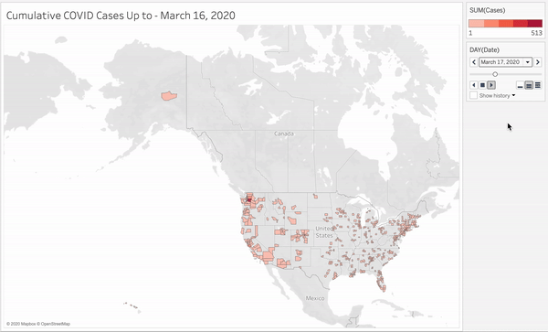
This project arose out of an interest to visualize how COVID-19 hotspots have shifted over the course of the unfolding pandemic. Ever since watching this video, I’ve been interested in time-based animations like the “racing bar chart” shown in the video, as well as animated maps.Since COVID outbreaks are highly linked to geography, I’m going to create some animated maps and racing bar charts to see what we can learn. Along the way, you’ll learn how to blend datasets with Python and create time-based animations with Tableau Public. If you just want to skip to the completed project, check it out here.**🚨OBLIGATORY PUBLIC HEALTH ADVISORY 🚨 **Stay away from crowded beaches, and go make a friend with a backyard pool instead 😉 (as long as they’ve tested negative of course…and they don’t invite other friends…you know what, just take a relaxing bath instead)
I will be using two datasets here:
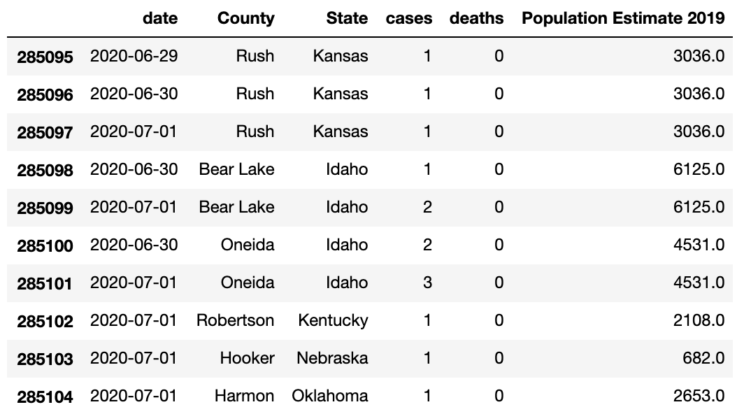
- Data from the New York Times showing COVID-19 cases by U.S. county. It updates daily, but I downloaded data only leading up to July 1, 2020. _NOTE: __COVID cases are listed here as cumulative totals up to a given date, including asymptomatic cases, symptomatic cases, and those who have already recovered. In other words, the number of cases may be an overestimate of how many people ACTUALLY had COVID at that given point in time, so just keep that in the back of your mind._A table of population data for each U.S. county from the Census Bureau.
Data Cleaning and Blending (AKA Every Data Scientist’s Favorite Part ❤️)
I’d like to visualize not only what counties have the most cases, but also which counties have the highest infection rates by percentage. Although places like Florida, California, and New York have high numbers of cases (sheerly due to having higher populations), do they necessarily have the highest infection rates by percentage?The NYT dataset doesn’t include information about county population, so I’m going to merge the two datasets into one using Python and pd.merge(). If you’re not into Python, you could also accomplish this by using a SQL JOIN or a VLOOKUP in Excel. Before we do that, we first need to clean the data to get it in the most desirable format for merging.I won’t bore you with all the details of cleaning the data - if you want to see the entirety of my data cleaning, check the Github repo here. However, I did encounter a few unexpected roadbumps.Louisiana has parishes instead of counties, and Alaska has no consistency whatsoever with county names like “Skagway Municipality,” “Nome Census Area,” and “Denali Borough”. This made isolating the names of these areas so Tableau could correctly identify them to build the map a **~fun~**_ (read: two painful hours) task._
import numpy as np
import pandas as pd

covid = pd.read_csv('covid-us-counties.csv')
cpop = pd.read_excel('co-est2019-annres.xlsx',skiprows=2)
df = pd.merge(covid,cpop,left_on=['county','state'],right_on=['County','State'],how='inner')
dfm = df[['date','County','State','cases','deaths','Population Estimate 2019']]
dfm.to_excel('covid-us-county-population.xlsx')
Note that I’ve performed an inner merge, meaning that the two datasets will only be joined on rows where the values for county and state match, and all the unmatched rows will be thrown out. Now our data looks something like this, with only the rows we need:
#data-science #maps #covid19 #data-analysis #data analysis