In this article I will analyze the cryptocurrencies (Litecoin, Ether, & Bitcoin) using the Python programming language. These three currencies are some of the most popular cryptocurrencies in circulation today.
The first thing that I like to do before writing a single line of code is to put in a description in comments of what the code does. This way I can look back on my code and know exactly what it does.
#Description: This is a python program for cryptocurrency analysis
Import the libraries.
#Import the libraries
import numpy as np
import pandas as pd
Load the data. Since I am using Google Colab , I need to use Googles library to upload the data.
# Load the data
from google.colab
import filesuploaded = files.upload()
Store the data into dataframes. This data contains a years worth of data from (3/22/2019) to (3/21/2019) for Bitcoin, Ether, and Litecoin.
df_btc = pd.read_csv('BTC_USD_2019-03-22_2020-03-21-CoinDesk.csv')
df_eth = pd.read_csv('ETH_USD_2019-03-22_2020-03-21-CoinDesk.csv')
df_ltc = pd.read_csv('LTC_USD_2019-03-22_2020-03-21-CoinDesk.csv')
Print the first 5 rows for all three dataframes.
# Print the data for BTC
df_btc.head()

# Print the data for ETH
df_eth.head()

# Print the data for LTC
df_ltc.head()

Create a new datframe that holds the closing price of all 3 cryptocurrencies.
df = pd.DataFrame({'BTC': df_btc['Closing Price (USD)'],
'ETH': df_eth['Closing Price (USD)'],
'LTC': df_ltc['Closing Price (USD)']
})
Show the new dataframe.
df
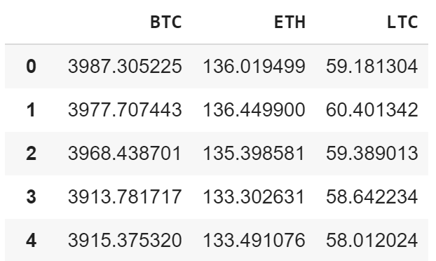
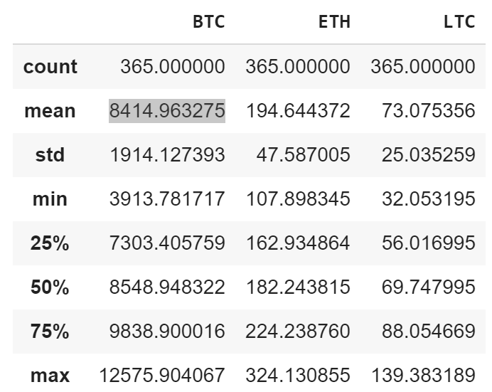
Get some statistics on the data.
df.describe()
Visualize and graph the cryptocurrencies closing price.
import matplotlib.pyplot as plt
plt.style.use('fivethirtyeight')
my_crypto = df
plt.figure(figsize = (12.2, 4.5))
for c in my_crypto.columns.values:
   plt.plot(my_crypto[c], label = c)
plt.title('Cryptocurrency Graph')plt.xlabel('Days')
plt.ylabel(' Crypto Price ($)')
plt.legend(my_crypto.columns.values, loc= 'upper left')
plt.show()
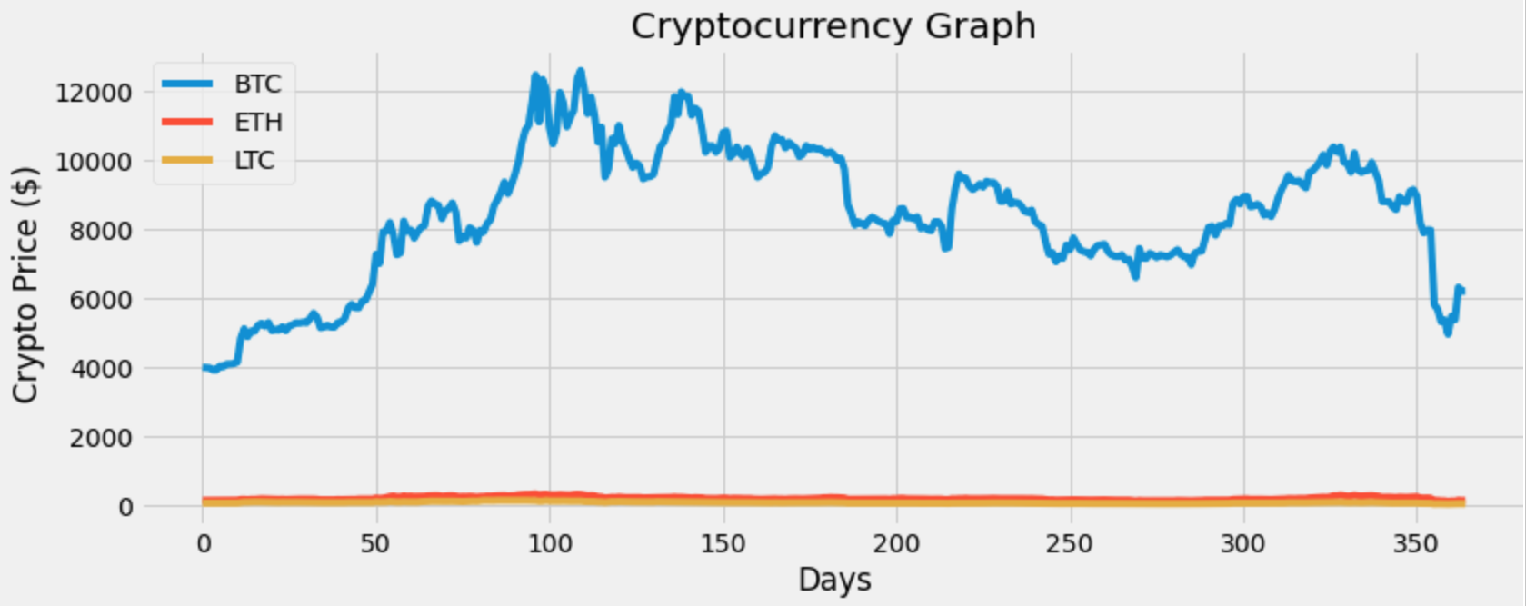
The graph above doesn’t truly give us any information on the other two cryptocurrencies (LTC & ETH). So let’s put the data on the same scale and then graph the data.
#Scale the data
#the min-max scaler method scales the dataset so that all the input features lie between 0 and 100 inclusive
from sklearn import preprocessing
min_max_scaler = preprocessing.MinMaxScaler(feature_range=(0, 100))
scaled = min_max_scaler.fit_transform(df)
scaled

Convert the scaled data to a dataframe.
df_scale = pd.DataFrame(scaled, columns = df.columns)
Visualize and graph the scaled data.
#Visualize the scaled data
my_crypto = df_scale
plt.figure(figsize=(12.4, 4.5))
for c in my_crypto.columns.values:
   plt.plot(my_crypto[c], label=c)
plt.title('Cryptocurrency Scaled Graph')
plt.xlabel('Days')
plt.ylabel('Crypto Scaled Price ($)')
plt.legend(my_crypto.columns.values, loc = 'upper left')
plt.show()
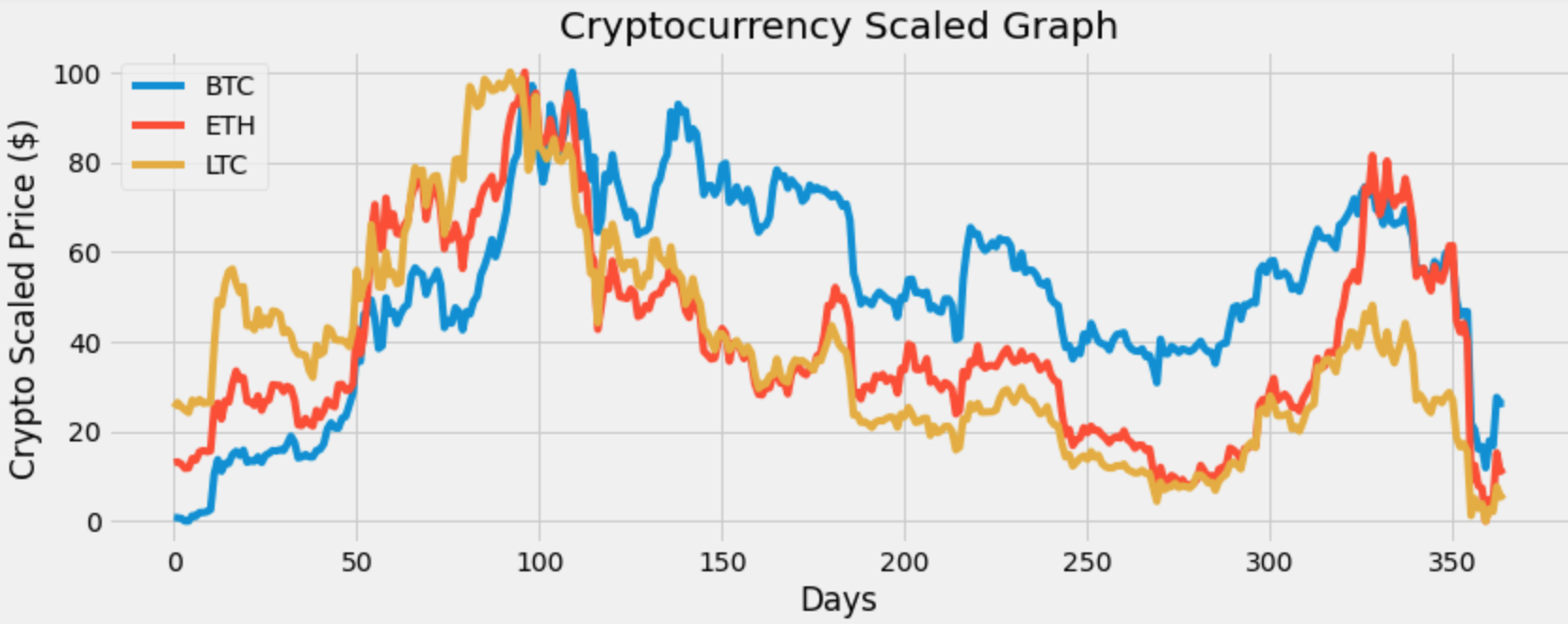
That graph looks better. Now I can see that these currencies seem to have a correlation meaning when one asset drops the others drop and when one asset rises the other assets rise. We will check that later.
For now let’s get and show the daily simple return.
DSR = df.pct_change(1)
DSR
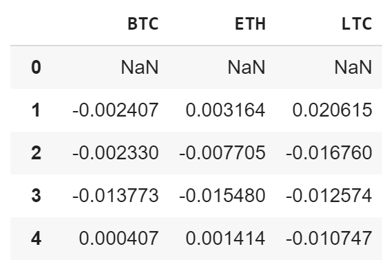
Visualize and graph the daily simple returns.
plt.figure(figsize=(12, 4.5))
for c in DSR.columns.values:
   plt.plot(DSR.index, DSR[c], label = c, lw = 2, alpha = .7)
plt.title('Daily Simple Returns')
plt.ylabel('Percentage (in decimal form')
plt.xlabel('Days')
plt.legend(DSR.columns.values, loc= 'upper right')
plt.show()

Litecoin has some extreme dips in the graph. Let’s take a look at the assets / cryptocurrencies volatility.
print('The cryptocurrency volatility:')
DSR.std()

The most volatile cryptocurrency is LTC and the least volatile or risky cryptocurrency out of the three is BTC. Show the mean or average daily simple return.
DSR.mean()
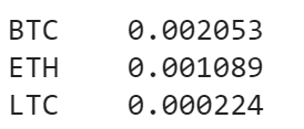
So on average I can expect about .2053% return on BTC. Also I noticed that BTC has the highest return and LTC has the lowest return. I did not expect this seeing as how LTC has a higher risk / volatility.
Let’s get the correlation matrix to determine if a change in one variable can result in a change in another.
DSR.corr()
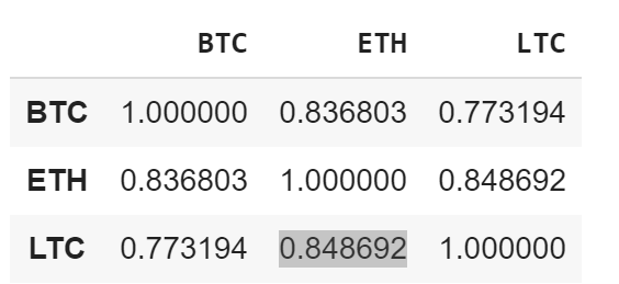
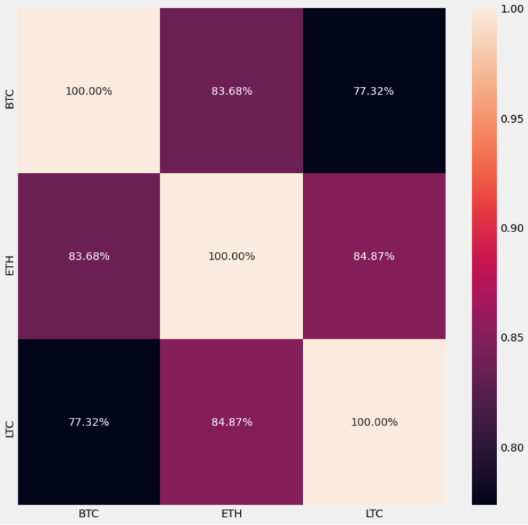
Immediately I see that their is a high positive correlation between all three cryptocurrencies. The highest correlation seems to be between ETH and LTC. The currency with the highest correlation to BTC is ETH.
I want to graph this to make it more appealing to the eyes, so I will create a heat map for the correlation matrix.
import seaborn as sns
plt.subplots(figsize= (11,11))
sns.heatmap(DSR.corr(), annot= True, fmt= '.2%')
Time to get and show the daily cumulative simple returns.
DCSR = (DSR+1).cumprod()
DCSR
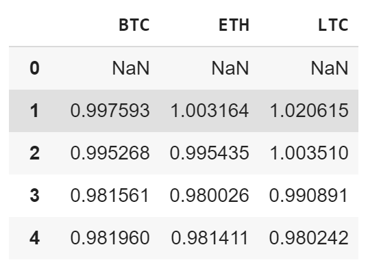
Hmm…. Let’s visualize this and see the growth of a $1 investment in these currencies.
plt.figure(figsize=(12.2, 4.5))
for c in DCSR.columns.values:
  plt.plot(DCSR.index, DCSR[c], lw=2, label= c)
plt.title('Daily Cumulative Simple Return')
plt.xlabel('Days')
plt.ylabel('Growth of $1 investment')
plt.legend(DCSR.columns.values, loc = 'upper left', fontsize = 10)
plt.show()
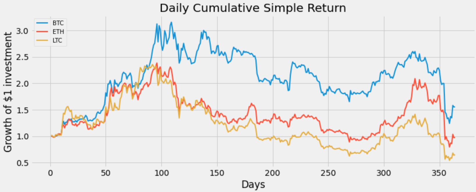
Okay looks like if I had invested a dollar in all three assets and sold on day 100, my investment would have grown to about $2 for LTC, about $2.20 for ETH, and over $3.50 for BTC.
Also if I had invested a dollar in all three assets and sold on the last day (day 365), then it looks like I would have lost money in LTC and ETH, however I still would be up in my investment for BTC.
That’s it, we are done creating this program !
Originally published by randerson112358 at medium.com
#Python #Cryptocurrency
