The combined power of Matplotlib, Seaborn and Pandas provide data scientists and engineers with a deep well of resources for data visualization and presentation of results. However, it is not always easy for beginners to manipulate the tools available into the beautiful graphics they envision. I have found in my own work (PhD in brain-computer interfaces) that the data I acquire is not always structured in a way that is directly applicable to using certain functions and that customization can be difficult and time-consuming. Additionally, landing on the best type of graph to display your results can requires significant thought and often some trial and error.
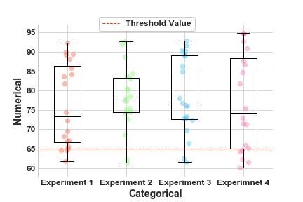
Scattered boxplots can be a very effective way of communicating results in a way that is both attractive to the eye and informative to the audience. Boxplots vizualize the distribution of results, indicating the median value, interquartile range and other factors relating to skewness and symmetry of the data. You can find a useful tutorial on understanding boxplots here: https://towardsdatascience.com/understanding-boxplots-5e2df7bcbd51.
#data-science #python #data-visualization