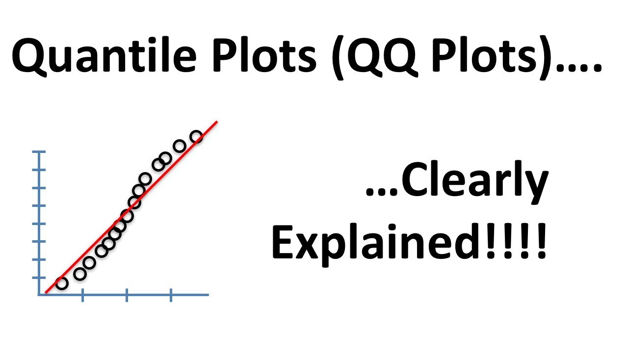
Quantile-Quantile (QQ) plots are used to determine if data can be approximated by a statistical distribution. For example, you might collect some data and wonder if it is normally distributed. A QQ plot will help you answer that question. You can also use QQ plots to compare to different datasets that you collected to determine if their distributions are comparable. This video shows you how to do both things.
NOTE: The data in this video are measures of gene expression. If “gene expression” doesn’t mean anything to you, just imagine that the data represents how tall a bunch of people are, or how much they weigh. Then consider the y-axis to be the height or weight of the people, and the x-axis just represents all of the data you collected on a single day. In this case, all of the data were collected on the same day, so they form a single column.
Subscribe: https://www.youtube.com/c/joshstarmer/featured
#quantile