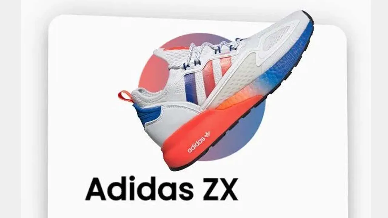
3D Product Card With Interactive Movement Animation
A stylish 3D product card that comes with a 3D interactive parallax animation on mouse movement as you’ve seen on Apple TV.
How to use it:
- Build the HTML for the product card.
<div class="card">
  <div class="sneaker">
    <div class="circle"></div>
    <img src="./adidas.png" alt="adidas">
  </div>
  <div class="info">
    <h1 class="title">Adidas ZX</h1>
    <h3>FUTURE-READY TRAINERS WITH WRAPPED BOOST FOR EXCEPTION COMFORT.</h3>
    <div class="sizes">
      <button>39</button>
      <button>40</button>
      <button class="active">42</button>
      <button>44</button>
    </div>
    <div class="purchase">
      <button>Purchase</button>
    </div>
  </div>
</div>
2. The required CSS & CSS3 styles.
.card {
  transform-style: preserve-3d;
  min-height: 80vh;
  width: 35rem;
  border-radius: 30px;
  padding: 0rem 5rem;
  box-shadow: 0 20px 20px rgba(0, 0, 0, 0.2), 0px 0px 50px rgba(0, 0, 0, 0.2);
}

.sneaker {
  min-height: 35vh;
  display: flex;
  align-items: center;
  justify-content: center;
}

.sneaker img {
  width: 20rem;
  z-index: 2;
  transition: all 0.75s ease-out;
}

.circle {
  width: 15rem;
  height: 15rem;
  background: linear-gradient(
    to right,
    rgba(245, 70, 66, 0.75),
    rgba(8, 83, 156, 0.75)
  );
  position: absolute;
  border-radius: 50%;
  z-index: 1;
}

.info h1 {
  font-size: 3rem;
  transition: all 0.75s ease-out;
}

.info h3 {
  font-size: 1.3rem;
  padding: 2rem 0rem;
  color: #585858;
  font-weight: lighter;
  transition: all 0.75s ease-out;
}

.sizes {
  display: flex;
  justify-content: space-between;
  transition: all 0.75s ease-out;
}

.sizes button {
  padding: 0.5rem 2rem;
  background: none;
  border: none;
  box-shadow: 0px 5px 10px rgba(0, 0, 0, 0.2);
  border-radius: 30px;
  cursor: pointer;
  font-weight: bold;
  color: #585858;
}

button.active {
  background: #585858;
  color: white;
}

.purchase {
  margin-top: 5rem;
  transition: all 0.75s ease-out;
}

.purchase button {
  width: 100%;
  padding: 1rem 0rem;
  background: #f54642;
  border: none;
  color: white;
  cursor: pointer;
  border-radius: 30px;
  font-weight: bolder;
}
3. The core JavaScript to enable the 3D hover-triggered parallax animation.
//Movement Animation to happen
const card = document.querySelector(".card");
const container = document.querySelector(".container");
//Items
const title = document.querySelector(".title");
const sneaker = document.querySelector(".sneaker img");
const purchase = document.querySelector(".purchase");
const description = document.querySelector(".info h3");
const sizes = document.querySelector(".sizes");
//Moving Animation Event
container.addEventListener("mousemove", (e) => {
  let xAxis = (window.innerWidth / 2 - e.pageX) / 25;
  let yAxis = (window.innerHeight / 2 - e.pageY) / 25;
  card.style.transform = `rotateY(${xAxis}deg) rotateX(${yAxis}deg)`;
});
//Animate In
container.addEventListener("mouseenter", (e) => {
  card.style.transition = "none";
  //Popout
  title.style.transform = "translateZ(150px)";
  sneaker.style.transform = "translateZ(200px) rotateZ(-45deg)";
  description.style.transform = "translateZ(125px)";
  sizes.style.transform = "translateZ(100px)";
  purchase.style.transform = "translateZ(75px)";
});
//Animate Out
container.addEventListener("mouseleave", (e) => {
  card.style.transition = "all 0.5s ease";
  card.style.transform = `rotateY(0deg) rotateX(0deg)`;
  //Popback
  title.style.transform = "translateZ(0px)";
  sneaker.style.transform = "translateZ(0px) rotateZ(0deg)";
  description.style.transform = "translateZ(0px)";
  sizes.style.transform = "translateZ(0px)";
  purchase.style.transform = "translateZ(0px)";
});
Download Details:
Author: developedbyed
Source Code: https://github.com/developedbyed/3d-card-effect
#javascript #css
5.05 GEEK