12 Essential Data Visualization Books for Beginners and Experts
Learn how to communicate your data effectively with the 12 essential data visualization books for beginners and experts, covering topics such as design principles, chart types, storytelling, and tools. Whether you're just starting out with data visualization or looking to master its advanced techniques, these books will provide you with the knowledge and skills you need to communicate your data effectively.
12 Must-Read Data Visualization Books
Here are our top 12 picks that would give you the best idea about data visualization:
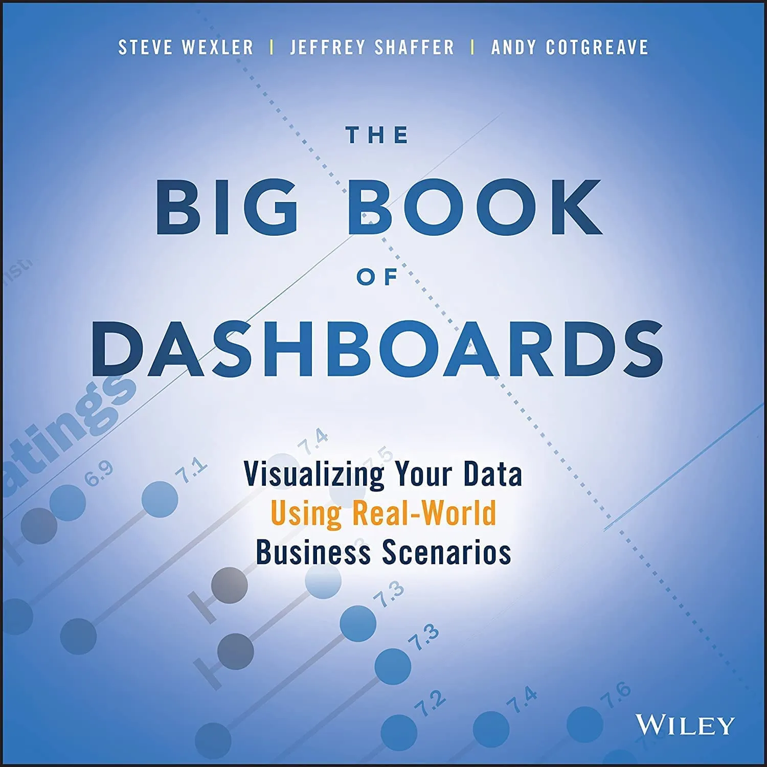
- “The Big Book of Dashboards” by Steve Wexler, Jeffrey Shaffer, and Andy Cotgreave
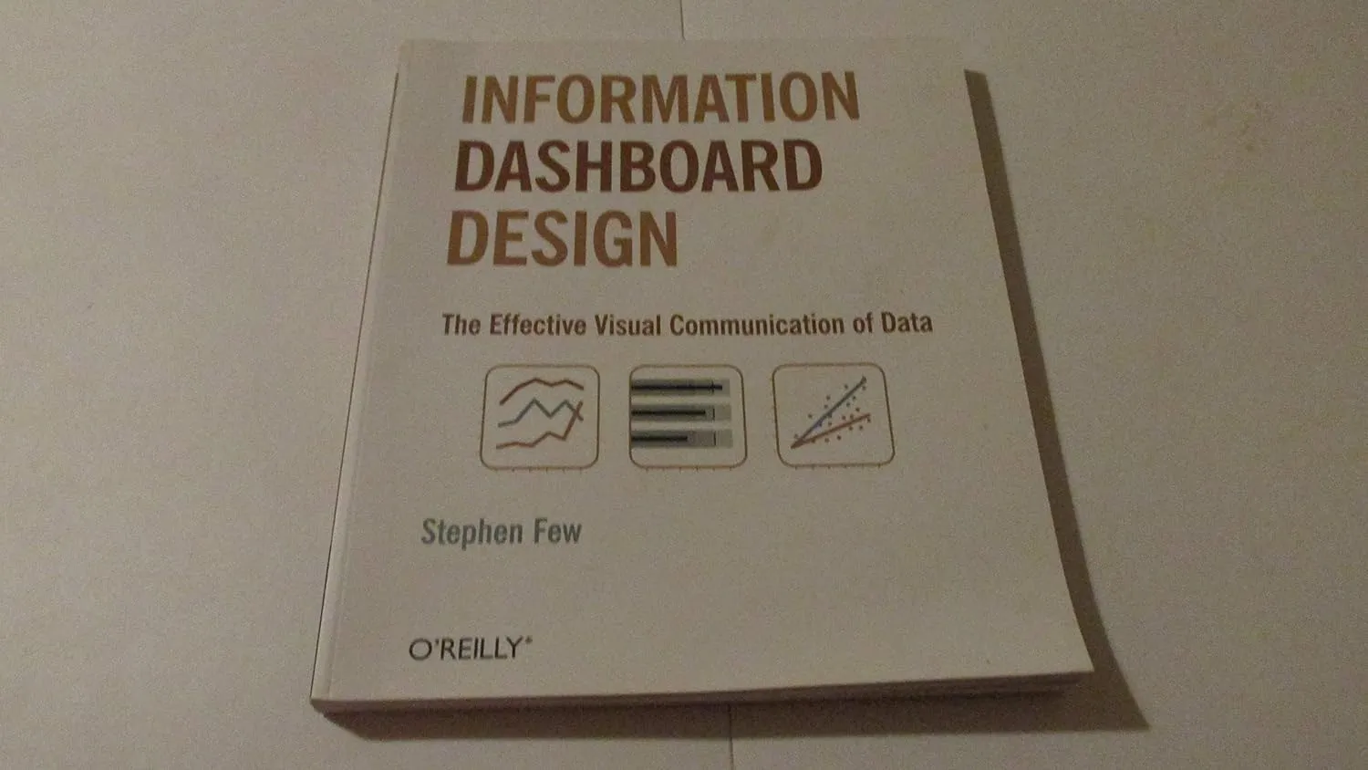
- “Information Dashboard Design” by Stephen Few
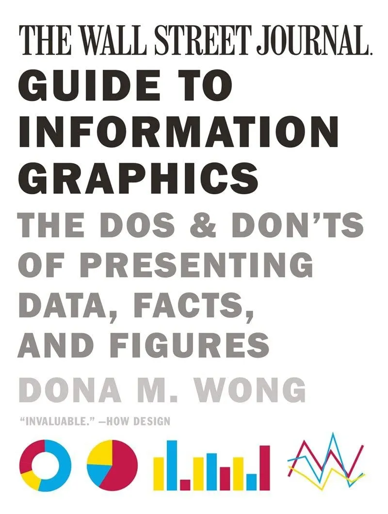
- “The Wall Street Journal Guide to Information Graphics” by Dona M. Wong
- “Storytelling with Data: A Data Visualization Guide for Business Professionals” by Cole Nussbaumer Knaflic
- “Information Visualization: Perception for Design” by Colin Ware
- “Data Visualization: A Practical Introduction” by Kieran Healy
- “Information Graphics: A Comprehensive Illustrated Reference” by Robert L. Harris
- “The Truthful Art: Data, Charts, and Maps for Communication” by Alberto Cairo
- “Visual Explanations: Images and Quantities, Evidence and Narrative” by Edward R. Tufte
- “Interactive Data Visualization for the Web” by Scott Murray
- “Beautiful Visualization, Looking at Data Through the Eyes of Experts” by Julie Steele, Noah Iliinsky
- “Knowledge is Beautiful” by David McCandless
Book 1: “The Big Book of Dashboards” by Steve Wexler, Jeffrey Shaffer, and Andy Cotgreave
Book Summary
“The Big Book of Dashboards” is a comprehensive manual for designing effective dashboards. It offers information on the finest procedures, methods, and tactics for creating data-communicating dashboards. This book provides professionals looking to improve their dashboard design skills with inspiration and helpful guidance using more than 28 dashboard examples.
Source: Amazon
Key Takeaways
- Learn the principles of effective dashboard design and layout.
- Understand how to choose the right charts and visual elements for specific data.
- Discover techniques for integrating interactivity and storytelling into dashboards.
Exploration of Data Visualization Techniques and Examples
One of the examples in the big book of dashboards showcases a sales dashboard that effectively presents vital sales metrics such as revenue, units sold, and customer demographics. The authors explain how interactive elements, color coding, and well-designed visual components can enhance the user experience and facilitate quick insights into sales performance.
Get the book here.
Book 2: “Information Dashboard Design” by Stephen Few
Book Summary
The book “Information Dashboard Design” by Stephen Few thoroughly examines efficient data visualization methods for developing educative and aesthetically appealing dashboards. According to the Information Dashboard Design book, the presentation of data-driven insights must be simple, straightforward, and purposeful. It highlights the fundamental concepts and industry-specific best practices of information dashboard design by offering multiple examples of well-designed dashboards from diverse sectors.
Key Takeaways:
- Develop a thorough understanding of the guiding concepts and recommended procedures for creating valuable dashboards.
- Acquire the ability to select the best visual representations for various data kinds.
- Learn how to build dashboards that aid in timely and accurate decision-making.
Exploration of Data Visualization Techniques and Examples
A financial dashboard that displays critical financial data for a business, such as revenue, expenses, and profit margins, is the subject of one of the Information Dashboard Design examples. The author emphasizes the significance of employing the right chart kinds, labeling, and color schemes to explain financial performance and aid decision-making.
Get the book here.
Book 3: “The Wall Street Journal Guide to Information Graphics” by Dona M. Wong
Book Summary
The use of information graphics in efficient data exchange is thoroughly examined in “The Wall Street Journal Guide to Information Graphics.” Dona M. Wong, a former graphics director at The Wall Street Journal, provides an insightful look into the design process. She also offers helpful advice and methods for producing engaging and clear visualizations. This book is an invaluable resource for anyone in the workforce looking to hone their data storytelling abilities.
Source: Amazon
Key Takeaways:
- Recognize the steps involved in producing successful information graphics.
- Acquire the skills necessary to transform complex data sets into appealing visualizations.
- Develop an understanding of the value of context, accuracy, and clarity in information graphics.
Exploration of Data Visualization Techniques and Examples
One of the examples in the book focuses on a data visualization that represents global population trends over time using an interactive map. The authors explain how thoughtful color choices, interactive features, and clear labeling can transform a complex dataset into a visually appealing and informative representation of population patterns.
Get the book here.
Book 4: “Storytelling with Data: A Data Visualization Guide for Business Professionals” by Cole Nussbaumer Knaflic
Book Summary
A helpful book called “Storytelling with Data” emphasizes the significance of storytelling in data visualization. On how to effectively communicate data insights and captivate people through intriguing storytelling, Cole Nussbaumer Knaflic gives insightful suggestions. This book gives readers the know-how to create compelling data tales that appeal to their target market.
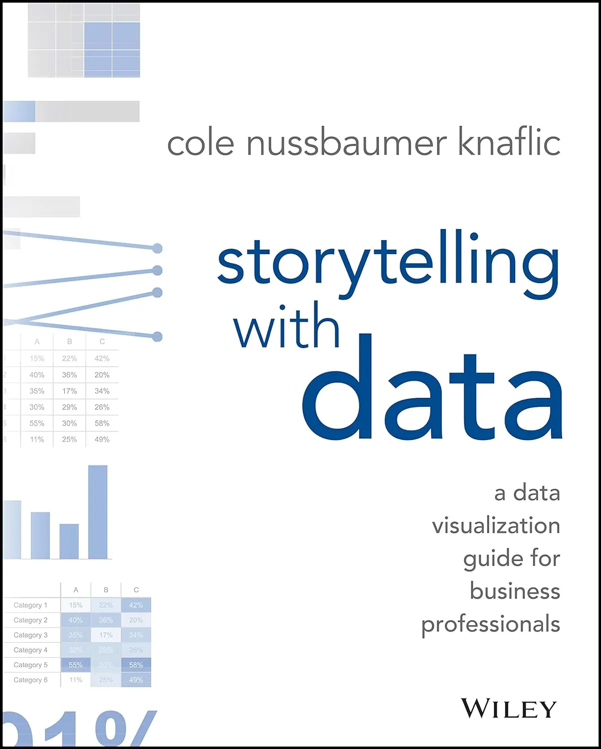
Source: Amazon
Key Takeaways:
- Learn the art of storytelling and its application in data visualization.
- Understand how to structure a data story to engage and persuade your audience.
- Gain insights into visual storytelling techniques for creating memorable and impactful presentations.
Exploration of Data Visualization Techniques and Examples
One of the examples in the book focuses on data visualization that tells a compelling story about the impact of a marketing campaign on sales. The author illustrates how using before-and-after visuals, annotations, and contextual information can transform raw data into a persuasive narrative that convinces stakeholders of the campaign’s success.
Get the book here.
Book 5: “Information Visualization: Perception for Design” by Colin Ware
Book Summary
Colin Ware’s “Information Visualization: Perception for Design” explores the cognitive aspects of data visualization and the principles that guide effective design choices. This book bridges the gap between theory and practice, offering a scientific foundation for understanding how visualizations are perceived and processed by the human brain. It provides a comprehensive framework for designing visualizations that optimize perception and cognition.
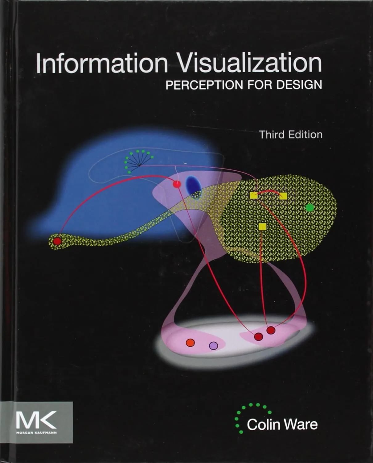
Source: Amazon
Key Takeaways:
- Exploring the cognitive and perceptual processes involved in data visualization.
- Determine how to use visual elements to improve communication and comprehension.
- Acquire skills in visualization design that take cognition and perception into account.
Exploration of Data Visualization Techniques and Examples
One of the book’s examples focuses on a network visualization that shows the connections among people in a social network. The author examines efficient ways to communicate network structure information using visual signals, including node size, color, and spatial arrangement.
Get the book here.
Book 6: “Data Visualization: A Practical Introduction” by Kieran Healy
Book Summary
The book “Data Visualization: A Practical Introduction” by Kieran Healy provides a clear and thorough overview. The core ideas, methods, and resources needed to produce excellent visualizations are covered in this book. Through real-world examples and hands-on exercises, readers can learn the skills essential to translate data into compelling visual tales.
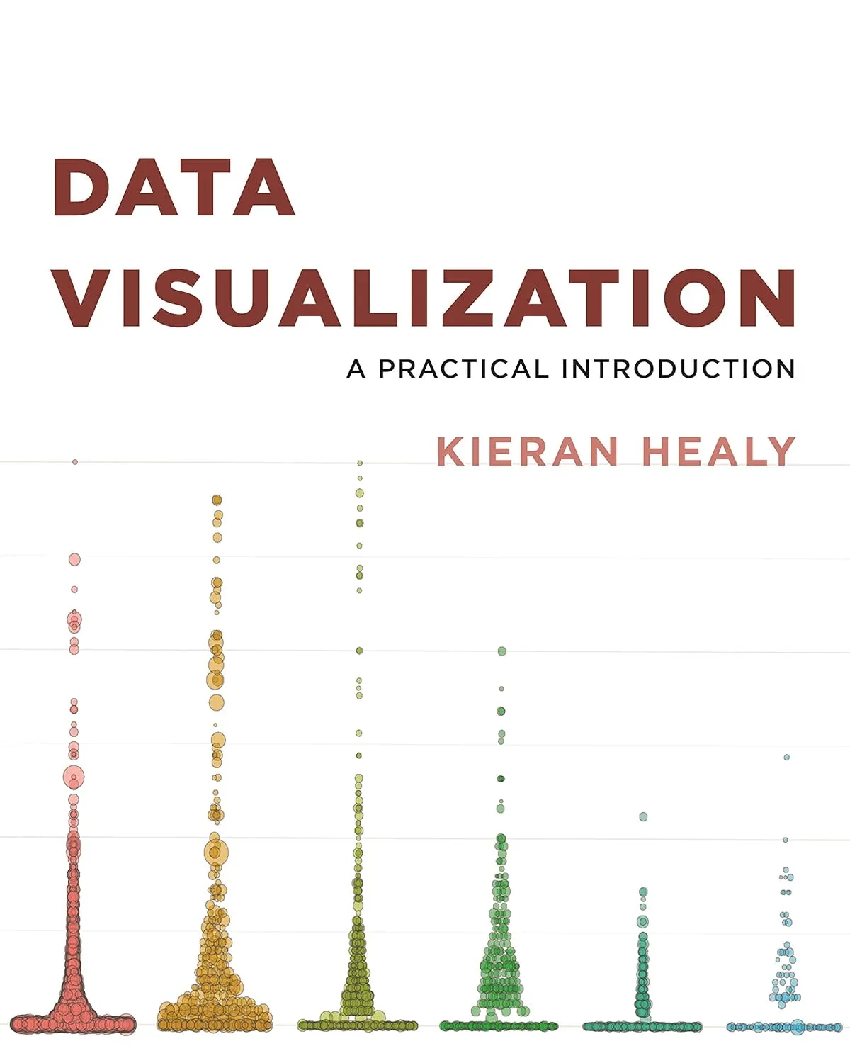
Source: Amazon
Key Takeaways:
- Build a strong foundation in the concepts and methods of data visualization.
- Recognize how crucial context, target audience, and purpose are when building visualizations.
- Develop your ability to use several programming languages and visualization tools to produce powerful visualizations.
Exploration of Data Visualization Techniques and Examples
One of the examples in the book focuses on a scatter plot that visualizes the relationship between two variables. The author explains how different markers, color schemes, and axes labeling can effectively highlight patterns and correlations in the data.
Get the book here.
Book 7: “Information Graphics: A Comprehensive Illustrated Reference” by Robert L. Harris
Book Summary
Robert L. Harris’s “Information Graphics” is an invaluable reference for anyone interested in the art and science of information graphics. This comprehensive book covers various topics, including the history of information graphics, visualization techniques, and design principles. With over 400 illustrations and examples, this book offers inspiration and guidance for creating visually compelling graphics.
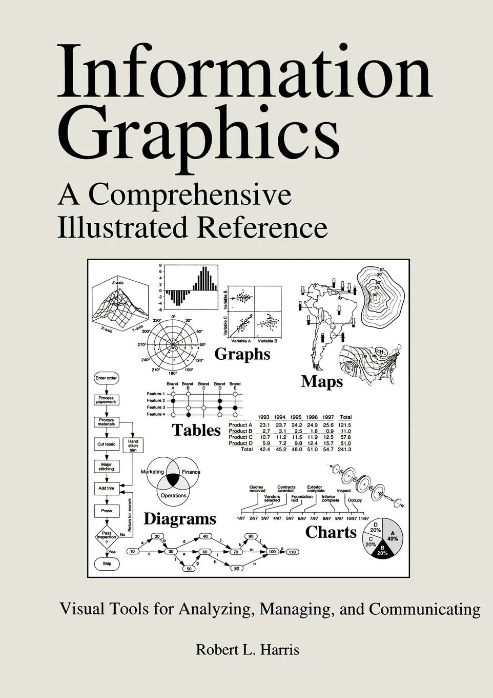
Source: Amazon
Key Takeaways:
- Explore the evolution of information graphics and its various forms.
- Learn about different visualization techniques and their applications.
- Discover how to communicate complex information through clear and engaging visuals effectively.
Exploration of Data Visualization Techniques and Examples
One of the examples in the book showcases an infographic that visually represents the steps involved in a scientific research process. The author discusses using icons, color coding, and sequential layout to guide the reader through the complex process, making it more accessible and engaging.
Get the book here.
Book 8: “The Truthful Art: Data, Charts, and Maps for Communication” by Alberto Cairo
Book Summary
“The Truthful Art” by Alberto Cairo explores the intersection of data visualization, design, and journalism. Cairo emphasizes the importance of truth and accuracy in data representation, providing insights into ethical considerations and the role of visualization in storytelling. This book equips readers with the skills to analyze and create impactful visualizations that inform and engage critically.
Source: Amazon
Key Takeaways:
- Acknowledge your ethical obligations and duties while using data visualization.
- Gain skills in finding and conveying the truth in data tales.
- Develop an understanding of how it is used in journalism and narrative.
Exploration of Data Visualization Techniques and Examples
In this data visualization book’s examples, a line chart shows the increase and fall of global temperatures during the previous century. The author provides examples of how careful design decisions, accurate labeling, and contextual information can aid readers in comprehending the complexity of climate change and its effects.
Get the book here.
Book 9: “Visual Explanations: Images and Quantities, Evidence and Narrative” by Edward R. Tufte
Book Summary
The book “Visual Explanations” by Edward R. Tufte explores the fundamentals of good data visualization, concentrating on the visual presentation of arguments and stories. Tufte looks at various instances to show how visualizations may improve comprehension and develop insight, from scientific diagrams to historical charts. This book questions traditional data visualization methods and encourages readers to think outside the box regarding how they convey information.
Source: Amazon
Key Takeaways:
- Examine novel and unorthodox data visualization techniques.
- Realize the value of evidence-based narratives and storytelling in visual communication.
- Develop your ability to produce engaging and informative visual explanations for your audience.
Exploration of Data Visualization Techniques and Examples
One of the examples in this data visualization book showcases a series of diagrams that visually explain the workings of a complex machinery system. The author discusses using clear labels, simplified illustrations, and step-by-step sequencing to facilitate understanding and provide a comprehensive visual explanation of the machinery’s operation.
Get the book here.
Book 10: “Interactive Data Visualization for the Web” by Scott Murray
Book Summary
Scott Murray’s book “Interactive Data Visualization for the Web” focuses on how to make interactive visualizations for the Web. The fundamental technologies and frameworks for web-based data visualization, such as HTML, CSS, SVG, and JavaScript, are covered in this book. Readers may master the techniques necessary to produce interactive and captivating visualizations for web platforms with the help of step-by-step lessons and code samples.
Source: Amazon
Key Takeaways:
- Acquire a basic understanding of web-based data visualization techniques.
- Use JavaScript, HTML, CSS, SVG, and other technologies to create interactive and beautiful data visualization.
- Get practical experience using well-known visualization libraries like D3.js.
Exploration of Data Visualization Techniques and Examples
In one of the book’s examples, the author shows how to create an interactive bar chart that enables readers to explore and contrast data values by sorting and filtering. The author describes how to change and update the visualization in response to user inputs, producing a dynamic and exciting experience. D3.js and JavaScript are used.
Get the book here.
Books 11: “Beautiful Visualization, Looking at Data Through the Eyes of Experts” by Julie Steele, Noah Iliinsky
Book Summary
“Beautiful Visualization: Looking at Data Through the Eyes of Experts” by Julie Steele and Noah Iliinsky is a deep dive into the world of data visualization. This book explores the strategies and insights of 24 experts in the field, each from different domains, as they share their approaches to designing impactful data visualizations. It emphasizes the art of storytelling with data, the use of visual indicators for effective communication, and research methods to fuse data and design. Through an examination of real-world data visualization projects, readers gain practical knowledge and inspiration for their own work.
Source: Amazon
Key Takeaways:
- The book highlights diverse approaches from 24 experts, showcasing the multidisciplinary nature of data visualization.
- Data visualization is a potent storytelling tool, using visual cues like color and layout for engaging presentations.
- Real-world case studies offer practical lessons for enhancing data visualization skills.
- Acknowledgement of data collection and cleaning as a universal challenge in data visualization projects.
Exploration of Data Visualization Techniques and Examples
- The book offers detailed case studies of well-known data visualizations, dissecting their design choices and storytelling elements.
- t delves into the strategies and methods used by experts to convey complex information visually, offering readers a deeper understanding of effective visualization techniques.
- Throughout the book, readers will find practical advice and tips for improving their own data visualization projects, drawing from the experiences of seasoned professionals.
- By exploring the challenges faced by experts, particularly in data collection and cleaning, readers gain insights into how to overcome common obstacles in the field of data visualization.
Get the book here.
Book 12: “Knowledge is Beautiful” by David McCandless
Book Summary

Source: Amazon
“Knowledge is Beautiful” by David McCandless is a captivating exploration of the power of data visualization to transform complex information into beautiful, understandable visual narratives. McCandless takes readers on a visual journey through a wide range of topics, using data-driven graphics and infographics to uncover hidden insights and patterns in data.
Key Takeaways:
- The book showcases how data visualization can provide profound insights by presenting information in visually compelling ways.
- McCandless covers a diverse range of subjects, from science and technology to culture and human behavior, demonstrating the versatility of data visualization in making complex topics accessible.
- “Knowledge is Beautiful” highlights the aesthetic aspects of data visualization, showing how data can be transformed into artful and engaging visuals.
- Readers can enjoy both the educational and entertainment value of the book, as it presents data-driven stories that are both informative and visually stunning.
- The book promotes data literacy by encouraging readers to think critically about the data presented and by demonstrating the importance of clear communication through visuals.
Get the book here.
#datavisualization