What is the purpose of life? Is that to be happy? Why people go through all the pain and hardship? Is it to achieve happiness in some way?
I’m not the only person who believed the purpose of life is happiness. If you look around you, most people are pursuing happiness in their lives.
On March 20th, the world celebrates the International Day of Happiness. The 2020 report ranked 156 countries by how happy their citizens perceive themselves based on their evaluations of their own lives. The rankings of national happiness are based on a Cantril ladder survey. Nationally representative samples of respondents are asked to think of a ladder, the best possible life for them being a 10, and the worst possible experience is a 0. They are then asked to rate their own current lives on that 0 to 10 scale. The report correlates the results with various life factors. In the reports, experts in economics, psychology, survey analysis, and national statistics describe how well-being measurements can be used effectively to assess nations’ progress and other topics.
So, how happy are people today? Were people more comfortable in the past? How satisfied with their lives are people in different societies? How do our living conditions affect all of this?
Features Analyzed
- GDP: GDP per capita is a measure of a country’s economic output that accounts for its number of people.
- Support: Social support means having friends and other people, including family, turning to in times of need or crisis to give you a broader focus and positive self-image. Social support enhances the quality of life and provides a buffer against adverse life events.
- Health: Healthy Life Expectancy is the average number of years that a newborn can expect to live in “full health” — in other words, not hampered by disabling illnesses or injuries.
- **Freedom: **Freedom of choice describes an individual’s opportunity and autonomy to perform an action selected from at least two available options, unconstrained by external parties.
- Generosity: is defined as the residual of regressing the national average of responses to the question, “Have you donated money to a charity in past months?” on GDP capita.
- Corruption: The Corruption Perceptions Index (CPI) is an index published annually by Transparency International since 1995, which ranks countries “by their perceived levels of public sector corruption, as determined by expert assessments and opinion surveys.”
Outline:
- Import Modules, Read the Dataset and Define an Evaluation Table
- Define a Function to Calculate the Adjusted R²
- How is the Happiness Score is distributed?
- The relationship between different features with Happiness Score.
- Visualize and Examine Data
- Multiple Linear Regression
- Conclusion
Grab yourself a coffee, and join me on this journey towards predicting happiness!
1. Import Modules, Read the Dataset and Define an Evaluation Table
To do some analysis, we need to set our environment up. First, we introduce some modules and read the data. The below output is the head of the data, but if you want to see more details, you might remove ## signs in front of thedf_15.describe()and df_15.info()
## FOR NUMERICAL ANALYTICS
import numpy as np

## TO STORE AND PROCESS DATA IN DATAFRAME
import pandas as pd
import os
## BASIC VISUALIZATION PACKAGE
import matplotlib.pyplot as plt
## ADVANCED PLOTING
import seaborn as seabornInstance
## TRAIN TEST SPLIT
from sklearn.model_selection import train_test_split
## INTERACTIVE VISUALIZATION
import chart_studio.plotly as py
import plotly.graph_objs as go
import plotly.express as px
from plotly.offline import download_plotlyjs, init_notebook_mode, plot, iplot
init_notebook_mode(connected=True)
import statsmodels.formula.api as stats
from statsmodels.formula.api import ols
from sklearn import datasets
from sklearn.linear_model import LinearRegression
from sklearn.metrics import mean_squared_error
from discover_feature_relationships import discover
#2015 data
df_15 = pd.read_csv('2015.csv')
#df_15.describe()
#df_15.info()
usecols = ['Rank','Country','Score','GDP','Support',
                'Health','Freedom','Generosity','Corruption']
df_15.drop(['Region','Standard Error', 'Dystopia Residual'],axis=1,inplace=True)
df_15.columns = ['Country','Rank','Score','Support',
                'GDP','Health',
                'Freedom','Generosity','Corruption']
df_15['Year'] = 2015 #add year column
df_15.head()
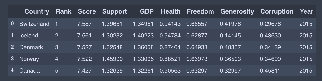
output
I only present the 2015 data code as an example; you could do similar for other years.
Parts starting with Happiness, Whisker, and Dystopia. Residual are different targets. Dystopia Residual compares each countries scores to the theoretical unhappiest country in the world. Since the data from the years have a bit of a different naming convention, we will abstract them to a common name.
#data-science #data-virtualization #happiness #python #machine-learning #data analysis