I read Bari Weiss’ resignation letter from the New York Times with some perplexity. In particular, I found her claim that she “was hired with the goal of bringing in voices that would not otherwise appear in your pages” a bit strange: Weiss is, after all, a wealthy graduate of Columbia who’s lived in the Northeast her entire life.
I’ve been playing around with New York Times archive data for some time and wanted to test Weiss’ claim. Has there been a (quantitative) change in the news the New York Times produces, especially since November 2016?
In this post, I’m going to take a look at what we can learn about “all the news that’s fit to print” from the metadata available in the archive — things like word counts, bylines, and news divisions. I’m looking for ways to approximate the “diversity” of the Times’ coverage since 2015. Essentially, we’re looking for real evidence of all those reporters sent to diners in Trump country in 2016 and after.
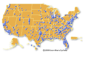
(For reference, here’s a map of all the IHOPs in the country. IHOP seemed like a good proxy for diners generally, and Waffle House is too concentrated in the south to be meaningful nationwide — it’s actually not that far off from what we have.)
The New York Times, as the largest and most successful American newspaper (and as far as I can tell, the biggest one with a publicly available API) offers an interesting case for analysis: the Times went to a paywall in 2011, and its emphasis on producing content to fuel subscriptions has accelerated since then; simultaneously, engagement with the Times since Trump’s election has increased steadily. Bari Weiss aside, how has the Times navigated its way through competing currents in media?
#new-york-times #news #python #analytics #data analytic
