What can we learn about Observable Plot (and parking lots)?
Let’s explore 2 things:
- Observable’s new Plot library for quick data visualizations and exploratory data analysis.
- The minor plague that is parking sprawl.
A few reasons why Observable Plot is great:
- It’s super quick and relatively mindless to crank out “good enough” charts and graphs. If you need something fancy, d3 is still a reasonable bet, but for basic bar graphs, line charts, distributions, etc., it’s does the trick with minimal fuss.
- The API is intuitive, minimal and uses the conventions that most d3 data visualization developers have come to rely on for custom dataviz.
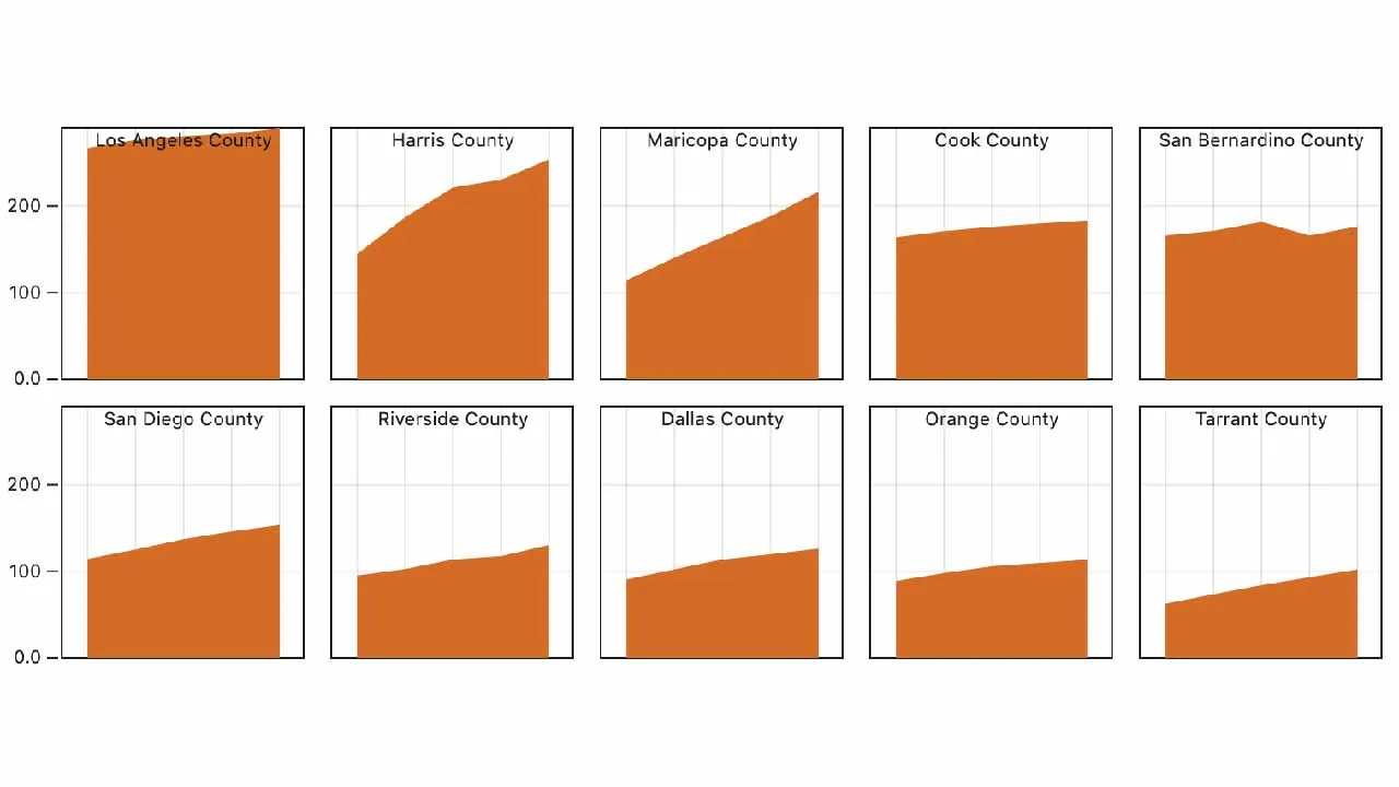
- The faceting concept, which we’ll explore here, makes it easy to visualize many different dimensions of the same dataset in parallel, as small multiple charts.
A few reasons why parking lots are the worst:
- Car accidents. 20% of car accidents happen in parking lots (leading to 60k injuries each year, src).
- Housing prices. More parking → less housing. In NYC, a 10% increase in minimum parking requirements leads to a 6% reduction in housing density ( src).
- Pollution. More parking → more auto emissions ( src).
- They’re so, so ugly.
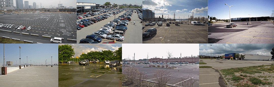
Collage of ugly parking lots (credit: various)
Land Use for Parking Dataset
Let’s start with a dataset. Note that Plot is built with “Tidy Data” in mind, which is another way of saying it’s clean and tabular. Observable’s definition:
- Each variable must have its own column.
- Each observation must have its own row.
- Each value must have its own cell.
#data-science #urban-planning #javascript
1.70 GEEK