How to Create Responsive Side Navigation menu with CSS
Learn how to create a responsive side navigation menu with CSS. Build a responsive side navigation menu with CSS for your website. Elevate user experience with an adaptable and stylish navigation solution.
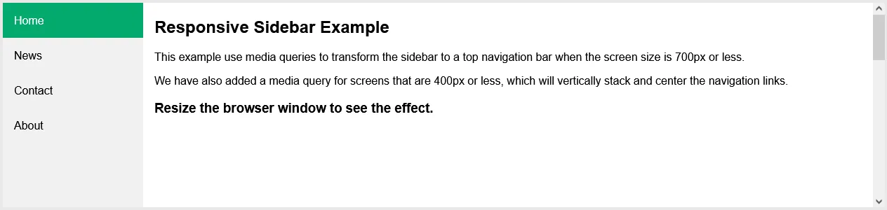
Create a Responsive Sidebar
Step 1) Add HTML:
Example
<!-- The sidebar -->
<div class="sidebar">
  <a class="active" href="#home">Home</a>
  <a href="#news">News</a>
  <a href="#contact">Contact</a>
  <a href="#about">About</a>
</div>

<!-- Page content -->
<div class="content">
  ..
</div>
Step 2) Add CSS:
Example
/* The side navigation menu */
.sidebar {
  margin: 0;
  padding: 0;
  width: 200px;
  background-color: #f1f1f1;
  position: fixed;
  height: 100%;
  overflow: auto;
}

/* Sidebar links */
.sidebar a {
  display: block;
  color: black;
  padding: 16px;
  text-decoration: none;
}

/* Active/current link */
.sidebar a.active {
  background-color: #04AA6D;
  color: white;
}

/* Links on mouse-over */
.sidebar a:hover:not(.active) {
  background-color: #555;
  color: white;
}

/* Page content. The value of the margin-left property should match the value of the sidebar's width property */
div.content {
  margin-left: 200px;
  padding: 1px 16px;
  height: 1000px;
}

/* On screens that are less than 700px wide, make the sidebar into a topbar */
@media screen and (max-width: 700px) {
  .sidebar {
    width: 100%;
    height: auto;
    position: relative;
  }
  .sidebar a {float: left;}
  div.content {margin-left: 0;}
}

/* On screens that are less than 400px, display the bar vertically, instead of horizontally */
@media screen and (max-width: 400px) {
  .sidebar a {
    text-align: center;
    float: none;
  }
}
#css
3.05 GEEK