Create Beautiful Floating Action Buttons with React
Last week I had a nightmare that involved a UI designer and the Product manager chasing me around the office with a Figma logo-shaped broomstick because the border radius of a button was supposed to be 10px and not 8px. That is how much I am afraid of front-end tasks and try to avoid them at all costs.
But upon waking up, this crippling self-doubt took over and I asked myself, do I even deserve to call myself a “Full Stack Developer”? I am probably a Fully Stacked Moron. And since then, I have been on a mission of redemption trying to learn everything scary about CSS.
Enough with my sad and inspiring backstory, let us take a look at what piece of art we will be designing today.

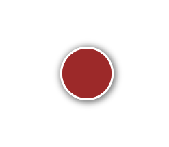
Cute right? This is one of my greatest achievements.Step 1 : Understanding the anatomy of the design.
Let’s break down the design so that it becomes easier to understand. This is a prerequisite that will help you avoid therapy for all the trauma your UI designers will put you through.
- We have a Circle (C1) which acts as the button.
- The second circle (C2) appears when C1 is clicked
- C2 houses 4 buttons that will be performing different actions.
Looking at the above we can form a simple element hierarchy. Place C1 in the center of C2 and place the action buttons at the top, bottom left, and right of C2. C2 is hidden behind C1 which means we will be assigning C1 a higher z-index so that it always stays on top.
Now let us observe the animation. C1 grows smaller after the click while C2 fills the entire container at the same time. There is a slight delay before the action buttons appear.
The growth aspect can be animated by the height and width CSS property while the action buttons fading in and out can be controlled using the opacity property.
Overwhelmed? Do not worry! I promise things are only going to get tougher from here as we attempt to achieve this animation with pure CSS.
̶S̶t̶e̶p̶ ̶2̶ ̶:̶-̶ ̶T̶e̶l̶l̶ ̶y̶o̶u̶r̶ ̶p̶r̶o̶d̶u̶c̶t̶ ̶t̶e̶a̶m̶ ̶t̶h̶i̶s̶ ̶i̶s̶ ̶n̶o̶t̶ ̶t̶e̶c̶h̶n̶i̶c̶a̶l̶l̶y̶ ̶f̶e̶a̶s̶i̶b̶l̶e̶ ̶a̶n̶d̶ ̶t̶r̶y̶ ̶t̶o̶ ̶m̶o̶v̶e̶ ̶o̶n̶.̶
Step 2: — Design the Initial State
Create a button component that has an outer container, an outer circle, and the inner circle.
const Button = ({}) => {

  return (
    <div className="button_container">
      <div className="button_outer">
        <div className="button_inner">
        </div>
      </div>
    </div>
  );
};
We created the hierarchy as described above. Let’s style it …
.button_container {
  height: 8em;
  width: 8em;
  display: flex;
  justify-content: center;
  align-items: center;

}
We set the container to a fixed size and use the flex display properties to make sure that the button always stays in the middle of the container.
.button_outer {
  display: flex;
  justify-content: center;
  align-items: center;
  height: 3em;
  width: 3em;
  border-radius: 50%;
  background-color: rgba(165, 42, 42, 0.704);
  border-radius: 50%;
  box-shadow: 1px 1px 6px 2px grey;
  border: 2px solid white;
  transition: all 0.5s ease-in-out;
}

.button_inner {
  display: flex;
  justify-content: center;
  align-items: center;
  height: 3em;
  width: 3em;
  border-radius: 50%;
  background-color: brown;
  transition: all 0.5s ease-in-out;
  z-index: 999;
}
Here we set both the outer and the inner circles to the same size of 3em (the initial state) and apply some basic styling to make it look a little better. Box shadows are one of my favorite properties that help the element to “pop out” and give a beautiful 3D effect.
Take note of the transition property. This is where all the magic happens. We are asking CSS to transition “all” properties such that it animates them from the initial state to the final state in 0.5 seconds. We can be more specific and write
transition: height 0.5s ease-in-out, width 0.5s ease-in-out;
in case we want to avoid using transitions on other properties that we might want to change between the initial and the final state.
A simple buttonStep 3 — Adding the Click Function
What do we want when we click the button? Our entire website crashes and makes all of the user’s data made public? Hmmmm. Maybe, but that’s a tutorial for another day.
We should be able to transition the “button_outer” class to grow while the “button_inner” class shrinks. A really easy way to achieve this via CSS is by using a custom property. Let’s see how.
const Button = ({}) => {
  const [active,setActive] = useState(false)

  return (
    <div className="button_container" active={`${active}`>
      <div className="button_outer" active={`${active}`>
        <div className="button_inner" onClick={() => {setActive(!active)}}>
        </div>
      </div>
    </div>
  );
};
We added a state that will be able to control the toggle of the button using the useState hook and we added the on click function which will simply toggle the active variable. Now you must be wondering what is the use of active={`${active}`}? Well, it sets a custom property to the DIVs which can be accessed via CSS. To select any element with a custom property all we need to do is use the CSS selector [custom_property=”something”] or just [custom_property]. Why do we use `${active}`? Because custom properties can only have String values and we are converting our boolean variable to String to assign it to the active property
.button_outer[active="true"] {
  height: 8em;
  width: 8em;
  border: 2px solid transparent;
}

.button_inner[active="true"] {
  height: 2em;
  width: 2em;
  box-shadow: inset 0px 0px 6px 2px white;
}
By combining the class name followed by the active selector, we are asking CSS to apply certain styles to any element that matches the above condition. So now, whenever active is set to true, button_outer grows to the defined height and width while the button_inner shrinks down. MAGIC.
Step 4— Adding the Actions
I love Material Icons, so that is what I would be using to create the actions.
Installation guide — https://mui.com/material-ui/getting-started/installation/
The action buttons are positioned at fixed places and the easiest way to achieve this is by using position = absolute. Absolute elements are positioned using top, bottom, left and right coordinates. These coordinates are relative to its closest parent that has the property position = relative. If none of its parents have the property, the element is positioned relative to the root.
Since we want the buttons inside the outer circle, we will add position = relative to the outer circle. Let’s start coding.
import React, { useState } from "react";
import HomeIcon from "@mui/icons-material/Home";
import SettingsIcon from "@mui/icons-material/Settings";
import LockIcon from "@mui/icons-material/Lock";
import FaceIcon from "@mui/icons-material/Face";
import AddIcon from "@mui/icons-material/Add";
import "./button.css";

const Button = () => {
  const [active, setActive] = useState(false);

  return (
    <div className="button_container">
      <div className="button_outer" active={`${active}`}>
        <div className="action_1" active={`${active}`}>
          <HomeIcon style={{ color: "white" }} />
        </div>
        <div className="action_2" active={`${active}`}>
          <SettingsIcon style={{ color: "white" }} />
        </div>
        <div className="action_3" active={`${active}`}>
          <LockIcon style={{ color: "white" }} />
        </div>
        <div className="action_4" active={`${active}`}>
          <FaceIcon style={{ color: "white" }} />
        </div>
        <div
          className="button_inner"
          active={`${active}`}
          onClick={() => {
            setActive(!active);
          }}
        >
          <AddIcon className="mid_icon" active={`${active}`} />
        </div>
      </div>
    </div>
  );
};

export default Button;
After adding the actions ….
That's it, we added the actions inside “button_outer”. Time to style them.
.button_outer {
  ...
  position: relative;
}


.action_1,
.action_2,
.action_3,
.action_4 {
  position: absolute;
  box-shadow: 1px 1px 3px 2px white;
  display: flex;
  justify-content: center;
  align-items: center;
  border-radius: 50%;
  background-color: rgba(255, 255, 255, 0.404);
  padding: 10px;
  opacity: 0;
  transition: all 0.2s ease-in;
  transition-delay: 0s;
}

.action_1 {
  top: 0.7em;
}

.action_2 {
  bottom: 0.7em;
}

.action_3 {
  right: 0.7em;
}

.action_4 {
  left: 0.7em;
}

.action_1[active="true"],
.action_2[active="true"],
.action_3[active="true"],
.action_4[active="true"] {
  opacity: 1;
  transition-delay: 0.5s;
}
.mid_icon {
  transition: all 0.5s ease-in-out;
  font-size: 2em;
  color: white;
}

.mid_icon[active="true"] {
  transform: rotate(45deg);
  font-size: 1em;
  color: white;
}
We position and add the transitions to the action buttons. Initially, the buttons are set to an opacity of 0, once the active property is set to true, the opacity changes to 1. Note the “transition-delay” property. This allows us to control when the transition will start. We add a delay of 0.5s because the button_outer completes its transition by then and we want the action buttons to appear only AFTER the first transition completes.
The mid icon which is a + sign is rotated 45 degrees to form the X sign. Nothing quite fancy there.
We can adjust the padding and positions of the action buttons to control how much each will overlap with another, we can also set z-indexes to each to determine which one stays on top.
It’s time for me to go back to browsing Dribble and fight my fear of creative designs. :)
- This blog post was originally published at: https://blog.devgenius.io/