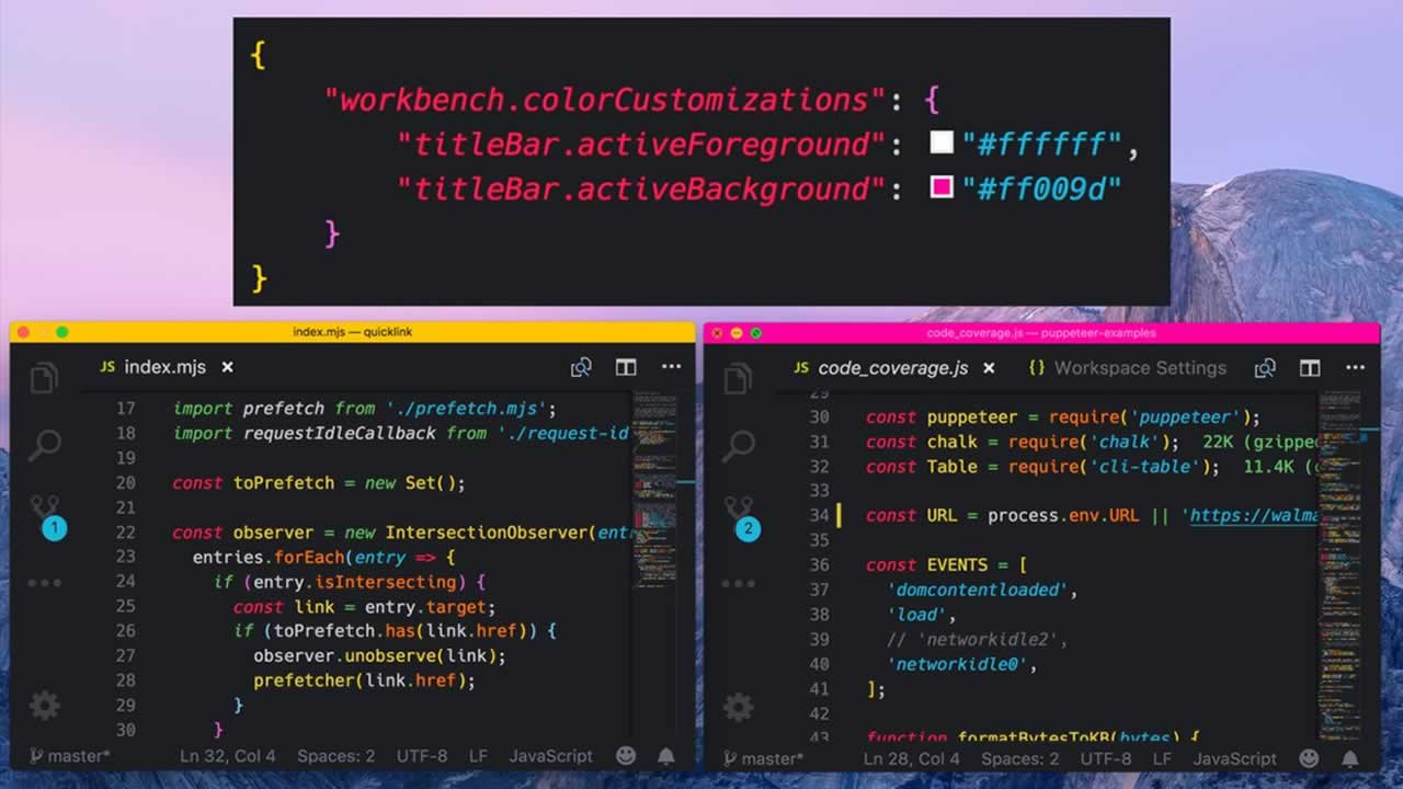
VS code theme colors can be overridden per workspace. Great for differentiating between projects
You can customize your active Visual Studio Code color theme with the workbench.colorCustomizations user setting.
{
	"workbench.colorCustomizations": {
		"activityBar.background": "#00AA00"
	}
}
Note: If you want to use an existing color theme, see Color Themes where you’ll learn how to set the active color theme through the Preferences: Color Theme dropdown (⌘K ⌘T (Windows, Linux Ctrl+K Ctrl+T)).
Color formats
Color values can be defined in the RGB color model with an alpha channel for transparency. As format, the following hexadecimal notations are supported: #RGB, #RGBA, #RRGGBB and #RRGGBBAA. R (red), G (green), B (blue), and A (alpha) are hexadecimal characters (0-9, a-f or A-F). The three-digit notation (#RGB) is a shorter version of the six-digit form (#RRGGBB) and the four-digit RGB notation (#RGBA) is a shorter version of the eight-digit form (#RRGGBBAA). For example #e35f is the same color as #ee3355ff.
If no alpha value is defined, it defaults to ff (opaque, no transparency). If alpha is set to 00, the color is fully transparent.
Some colors should not be opaque in order to not cover other annotations. Check the color descriptions to see to which colors this applies.
Contrast colors
The contrast colors are typically only set for high contrast themes. If set, they add an additional border around items across the UI to increase the contrast.
- contrastActiveBorder: An extra border around active elements to separate them from others for greater contrast.
- contrastBorder: An extra border around elements to separate them from others for greater contrast.
Base colors
- contrastActiveBorder: An extra border around active elements to separate them from others for greater contrast.
- contrastBorder: An extra border around elements to separate them from others for greater contrast.
Text colors
Colors inside a text document, such as the welcome page.
- contrastActiveBorder: An extra border around active elements to separate them from others for greater contrast.
- contrastBorder: An extra border around elements to separate them from others for greater contrast.
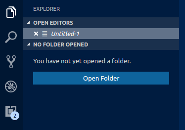
Button control
A set of colors for button widgets such as Open Folder button in the Explorer of a new window.
- contrastActiveBorder: An extra border around active elements to separate them from others for greater contrast.
- contrastBorder: An extra border around elements to separate them from others for greater contrast.
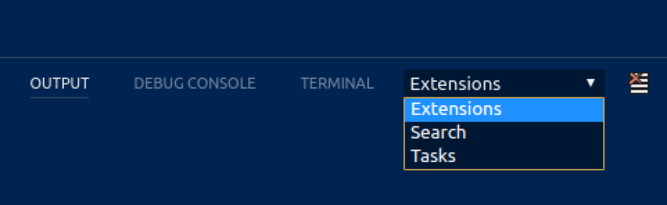
Dropdown control
A set of colors for all Dropdown widgets such as in the Integrated Terminal or the Output panel. Note that the Dropdown control is not used on macOS currently.
- contrastActiveBorder: An extra border around active elements to separate them from others for greater contrast.
- contrastBorder: An extra border around elements to separate them from others for greater contrast.
Input control
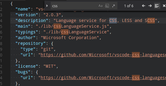
Colors for input controls such as in the Search view or the Find/Replace dialog.

- contrastActiveBorder: An extra border around active elements to separate them from others for greater contrast.
- contrastBorder: An extra border around elements to separate them from others for greater contrast.
Scrollbar control
- contrastActiveBorder: An extra border around active elements to separate them from others for greater contrast.
- contrastBorder: An extra border around elements to separate them from others for greater contrast.
Badge
Badges are small information labels, for example, search results count.
- contrastActiveBorder: An extra border around active elements to separate them from others for greater contrast.
- contrastBorder: An extra border around elements to separate them from others for greater contrast.
Progress bar
- contrastActiveBorder: An extra border around active elements to separate them from others for greater contrast.
- contrastBorder: An extra border around elements to separate them from others for greater contrast.
Lists and trees
Colors for list and trees like the File Explorer. An active list/tree has keyboard focus, an inactive does not.
- contrastActiveBorder: An extra border around active elements to separate them from others for greater contrast.
- contrastBorder: An extra border around elements to separate them from others for greater contrast.
Activity Bar
The Activity Bar is displayed either on the far left or right of the workbench and allows fast switching between views of the Side Bar.
- contrastActiveBorder: An extra border around active elements to separate them from others for greater contrast.
- contrastBorder: An extra border around elements to separate them from others for greater contrast.
Side Bar
The Side Bar contains views like the Explorer and Search.
- contrastActiveBorder: An extra border around active elements to separate them from others for greater contrast.
- contrastBorder: An extra border around elements to separate them from others for greater contrast.
Editor Groups & Tabs
Editor Groups are the containers of editors. There can be many editor groups. A Tab is the container of an editor. Multiple Tabs can be opened in one editor group.
- contrastActiveBorder: An extra border around active elements to separate them from others for greater contrast.
- contrastBorder: An extra border around elements to separate them from others for greater contrast.
Editor colors
The most prominent editor colors are the token colors used for syntax highlighting and are based on the language grammar installed. These colors are defined by the Color Theme but can also be customized with the editor.tokenColorCustomizations setting. See Customizing a Color Theme for details on updating a Color Theme and the available token types.
All other editor colors are listed here:
- contrastActiveBorder: An extra border around active elements to separate them from others for greater contrast.
- contrastBorder: An extra border around elements to separate them from others for greater contrast.
Selection colors are visible when selecting one or more characters. In addition to the selection also all regions with the same content are highlighted.

- contrastActiveBorder: An extra border around active elements to separate them from others for greater contrast.
- contrastBorder: An extra border around elements to separate them from others for greater contrast.
Word highlight colors are visible when the cursor is inside a symbol or a word. Depending on the language support available for the file type, all matching references and declarations are highlighted and read and write accesses get different colors. If document symbol language support is not available, this falls back to word highlighting.

- contrastActiveBorder: An extra border around active elements to separate them from others for greater contrast.
- contrastBorder: An extra border around elements to separate them from others for greater contrast.
Find colors depend on the current find string in the Find/Replace dialog.
- contrastActiveBorder: An extra border around active elements to separate them from others for greater contrast.
- contrastBorder: An extra border around elements to separate them from others for greater contrast.
The hover highlight is shown behind the symbol for which a hover is shown.

- contrastActiveBorder: An extra border around active elements to separate them from others for greater contrast.
- contrastBorder: An extra border around elements to separate them from others for greater contrast.
The current line is typically shown as either background highlight or a border (not both).

- contrastActiveBorder: An extra border around active elements to separate them from others for greater contrast.
- contrastBorder: An extra border around elements to separate them from others for greater contrast.
The link color is visible when clicking on a link.

- contrastActiveBorder: An extra border around active elements to separate them from others for greater contrast.
- contrastBorder: An extra border around elements to separate them from others for greater contrast.
The range highlight is visible when selecting a search result.

- contrastActiveBorder: An extra border around active elements to separate them from others for greater contrast.
- contrastBorder: An extra border around elements to separate them from others for greater contrast.
To see the editor white spaces, enable Toggle Render Whitespace.
- contrastActiveBorder: An extra border around active elements to separate them from others for greater contrast.
- contrastBorder: An extra border around elements to separate them from others for greater contrast.
To see the editor indent guides, set “editor.renderIndentGuides”: true.
- contrastActiveBorder: An extra border around active elements to separate them from others for greater contrast.
- contrastBorder: An extra border around elements to separate them from others for greater contrast.
To see editor rulers, define their location with “editor.rulers”
- contrastActiveBorder: An extra border around active elements to separate them from others for greater contrast.
- contrastBorder: An extra border around elements to separate them from others for greater contrast.
CodeLens:

- contrastActiveBorder: An extra border around active elements to separate them from others for greater contrast.
- contrastBorder: An extra border around elements to separate them from others for greater contrast.
Bracket matches:

- contrastActiveBorder: An extra border around active elements to separate them from others for greater contrast.
- contrastBorder: An extra border around elements to separate them from others for greater contrast.
Overview ruler:
This ruler is located beneath the scroll bar on the right edge of the editor and gives an overview of the decorations in the editor.
- contrastActiveBorder: An extra border around active elements to separate them from others for greater contrast.
- contrastBorder: An extra border around elements to separate them from others for greater contrast.
Errors and warnings:
- contrastActiveBorder: An extra border around active elements to separate them from others for greater contrast.
- contrastBorder: An extra border around elements to separate them from others for greater contrast.
Unused source code:
- contrastActiveBorder: An extra border around active elements to separate them from others for greater contrast.
- contrastBorder: An extra border around elements to separate them from others for greater contrast.
The gutter contains the glyph margins and the line numbers:
- contrastActiveBorder: An extra border around active elements to separate them from others for greater contrast.
- contrastBorder: An extra border around elements to separate them from others for greater contrast.
Diff editor colors
For coloring inserted and removed text, use either a background or a border color but not both.
- contrastActiveBorder: An extra border around active elements to separate them from others for greater contrast.
- contrastBorder: An extra border around elements to separate them from others for greater contrast.
Editor widget colors
The Editor widget is shown in front of the editor content. Examples are the Find/Replace dialog, the suggestion widget, and the editor hover.
- contrastActiveBorder: An extra border around active elements to separate them from others for greater contrast.
- contrastBorder: An extra border around elements to separate them from others for greater contrast.
The Debug Exception widget is a peek view that shows in the editor when debug stops at an exception.
- contrastActiveBorder: An extra border around active elements to separate them from others for greater contrast.
- contrastBorder: An extra border around elements to separate them from others for greater contrast.
The editor marker view shows when navigating to errors and warnings in the editor (Go to Next Error or Warning command).
- contrastActiveBorder: An extra border around active elements to separate them from others for greater contrast.
- contrastBorder: An extra border around elements to separate them from others for greater contrast.
Peek view colors
Peek views are used to show references and declarations as a view inside the editor.

- contrastActiveBorder: An extra border around active elements to separate them from others for greater contrast.
- contrastBorder: An extra border around elements to separate them from others for greater contrast.
Merge conflicts
Merge conflict decorations are shown when the editor contains special diff ranges.

- contrastActiveBorder: An extra border around active elements to separate them from others for greater contrast.
- contrastBorder: An extra border around elements to separate them from others for greater contrast.
Panel colors
Panels are shown below the editor area and contain views like Output and Integrated Terminal.
- contrastActiveBorder: An extra border around active elements to separate them from others for greater contrast.
- contrastBorder: An extra border around elements to separate them from others for greater contrast.
Status Bar colors
The Status Bar is shown in the bottom of the workbench.
- contrastActiveBorder: An extra border around active elements to separate them from others for greater contrast.
- contrastBorder: An extra border around elements to separate them from others for greater contrast.
Title Bar colors
- contrastActiveBorder: An extra border around active elements to separate them from others for greater contrast.
- contrastBorder: An extra border around elements to separate them from others for greater contrast.
Menu Bar colors
- contrastActiveBorder: An extra border around active elements to separate them from others for greater contrast.
- contrastBorder: An extra border around elements to separate them from others for greater contrast.
Notification colors
Note: The colors below only apply for VS Code versions 1.21 and higher.
Notification toasts slide up from the bottom-right of the workbench.

Once opened in the Notification Center, they are displayed in a list with a header:

- contrastActiveBorder: An extra border around active elements to separate them from others for greater contrast.
- contrastBorder: An extra border around elements to separate them from others for greater contrast.
If you target VS Code versions before the 1.21 (February 2018) release, these are the old (no longer supported) colors:
- contrastActiveBorder: An extra border around active elements to separate them from others for greater contrast.
- contrastBorder: An extra border around elements to separate them from others for greater contrast.
Extensions
- contrastActiveBorder: An extra border around active elements to separate them from others for greater contrast.
- contrastBorder: An extra border around elements to separate them from others for greater contrast.
Quick picker
- contrastActiveBorder: An extra border around active elements to separate them from others for greater contrast.
- contrastBorder: An extra border around elements to separate them from others for greater contrast.
Integrated Terminal colors
- contrastActiveBorder: An extra border around active elements to separate them from others for greater contrast.
- contrastBorder: An extra border around elements to separate them from others for greater contrast.
Debug
- contrastActiveBorder: An extra border around active elements to separate them from others for greater contrast.
- contrastBorder: An extra border around elements to separate them from others for greater contrast.
Welcome page
- contrastActiveBorder: An extra border around active elements to separate them from others for greater contrast.
- contrastBorder: An extra border around elements to separate them from others for greater contrast.
Git colors
- contrastActiveBorder: An extra border around active elements to separate them from others for greater contrast.
- contrastBorder: An extra border around elements to separate them from others for greater contrast.
Settings Editor colors
Note: These colors are for the GUI settings editor which can be opened with the Preferences: Open Settings (UI) command.
- contrastActiveBorder: An extra border around active elements to separate them from others for greater contrast.
- contrastBorder: An extra border around elements to separate them from others for greater contrast.
Breadcrumbs
The theme colors for breadcrumbs navigation:
- contrastActiveBorder: An extra border around active elements to separate them from others for greater contrast.
- contrastBorder: An extra border around elements to separate them from others for greater contrast.
Snippets
The theme colors for snippets:
- contrastActiveBorder: An extra border around active elements to separate them from others for greater contrast.
- contrastBorder: An extra border around elements to separate them from others for greater contrast.
Color ids can also be contributed by extensions through the color contribution point. These colors also appear when using code complete in the workbench.colorCustomizations settings and the color theme definition file. Users can see what colors an extension defines in the extension contributions tab.
Extension colors
Color ids can also be contributed by extensions through the color contribution point. These colors also appear when using code complete in the workbench.colorCustomizations settings and the color theme definition file. Users can see what colors an extension defines in the extension contributions tab.
Learn More
☞ Complete Python Bootcamp: Go from zero to hero in Python 3
☞ Angular 7 (formerly Angular 2) - The Complete Guide
☞ [The Complete JavaScript Course 2018: Build Real Projects!](http:// deal.codetrick.net/p/rJWeUz65Z “The Complete JavaScript Course 2018: Build Real Projects!”)
☞ Become a JavaScript developer - Learn (React, Node,Angular)
☞ The Complete Node.js Developer Course (2nd Edition)
☞ The Complete React Web Developer Course (2nd Edition)
☞ Vue JS 2 - The Complete Guide (incl. Vue Router & Vuex)
☞ Build Responsive Real World Websites with HTML5 and CSS3
☞ PHP for Beginners - Become a PHP Master - CMS Project
#visual-studio