
Photo by Adrianna Van Groningen on Unsplash
The human race has never been better. No, I’m not being sarcastic, nor was I being paid to say it by <insert big company name here>. For the everyday person across the globe, products are becoming cheaper and more accessible. Women have more education and contraception than in our entire shared history. Putting aside a few bumps in the road, the world is just getting better.
Don’t believe me? Most people don’t. The news is determined to make you think the world is ending because immediate doom-and-gloom sells. While the news _is _right on some accounts, such as climate change (that is one of the areas truly getting worse), there is also a million ways in which the news gives disproportionate weight to the terrible things and ignores the gradual, positive trends in the world today.
When I was a student writing on the topic of economic development in my thesis, I would use keywords like “the global south”, or “developing countries” to solemnly describe this gap between us vs. them. Then I read Hans Rosling’s Factfulness and realized my entire premise was severely outdated. Even worse, my thesis advisor’s had nodded solemnly in agreement, and yet none of us knew that our predispositions about “the developing world” hadn’t been true for over 50 years!
So thank you Hans Rosling. Thank you for enlightening me to the way the world actually worked. And we’re going use Tableau to see how child mortality, life expectancy, and income has changed in recent years.
This is what we are going to be making today:
1) Data Gathering 🧺 🦆
Download the date files from my Github repo. All data is from Gapminder (you can download straight from this website too, but I took the liberty to rename some of the column names already).
Downloading the .zip file will give you 4 CSVs (plus the readme; you can delete that):
income: Income per capita, adjusted for inflation (2011 dollars)child_mortality: Child mortality rate (number out of 1000 who die before their 5th birthday)countries: Countries (provide regional identifiers for color coding later)population: Population (provides the size of the bubbles)
2) Installing Tableau 📉
If you don’t have Tableau, download the free, public version here (this is what I’m currently using). This may take a few minutes to install; in the process, you may want to create a Tableau Public account, too.
By creating a Tableau account, you will be able to start exporting your visualizations and building a pretty portfolios (like this).
3) Prepare the Data for Analysis 📝
Now we’re going to upload each file, convert them from long to wide format, and make sure they have been added correctly:
3.1) For child_mortality.csv, income.csv, and population.csv:
- Open a new “text file” and upload one of these three. You’ll be repeating this step two more times, so it doesn’t matter which one you start with.
- Check “use data interpreter” under Files to recognize the first row as column names.
- Highlight the entire table except for the first column (example below). Right click on the highlighted boxes and press “pivot” and rename the column headers.
You’ve successfully pivoted, woohoo!
- Once you finish with the first CSV, head on back to the main screen by clicking the Tableau header in the top-left corner, repeating the same steps for the other two CSVs.
3.2) For countries.csv:
- You don’t need to do anything besides import the file → as you can see, it’s already in wide format!
- If you’ve instinctively navigated out to the main page via the logo, just click the logo again and it will take you back to the data.
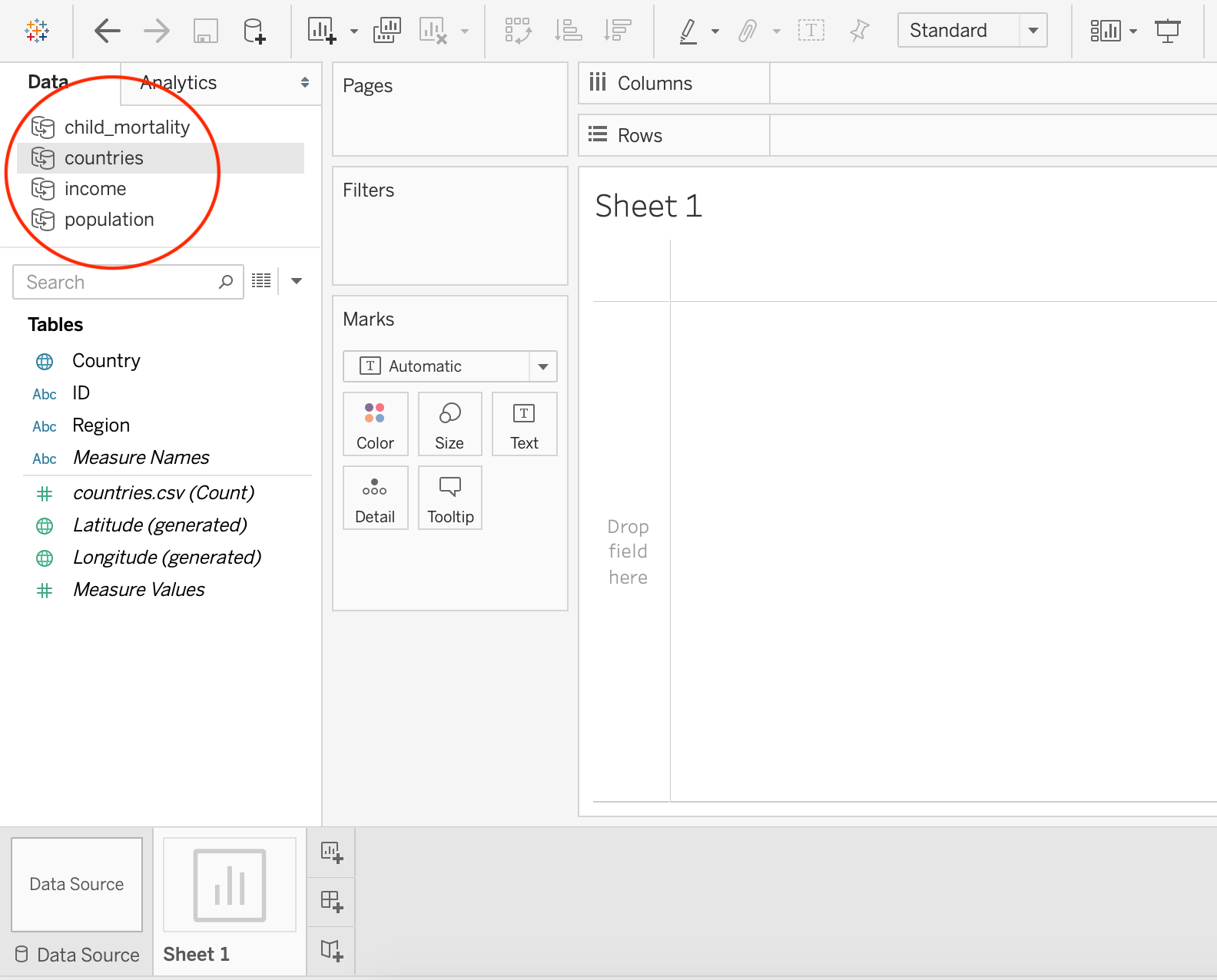
3.3) Open “Sheet 1” to check:
- Once you’ve imported/reworked all 4 CSVs, we can go to our first worksheet. Go to “Sheet 1” and confirm that you have access to all 4 datasets in the top left corner:
4) Create Scatter Plot 📈
You’ve set everything up, now let’s get graphing:
- Drag
income→Income Per Capita(or whatever you named it in step 1; under “Tables”) to the “column” shelf. This will be the x-axis value. - Drag
child_mortality→Child Mortalityto the “row” shelf. This will be the y-axis value.
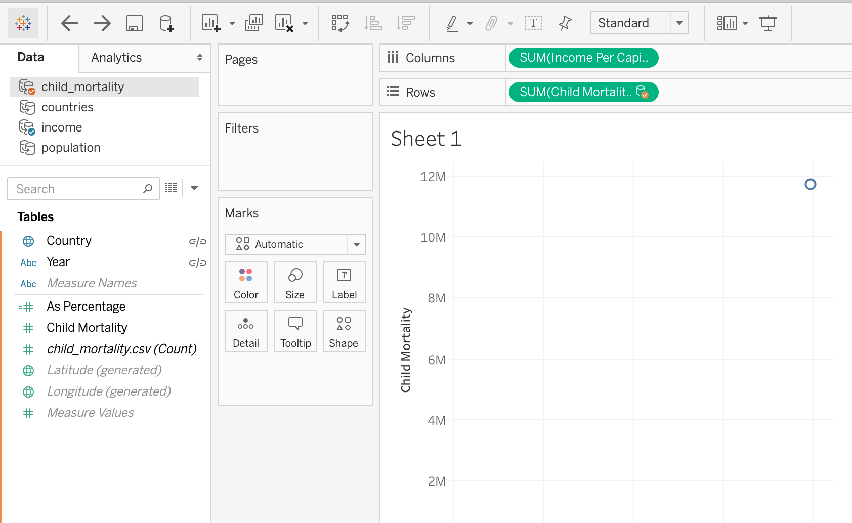
- Since the data sources are different, you may need to manually define the relationship for Tableau. If an error window pops up, go to Data → Edit Relationships to confirm the relationships between the datasets.
"countries" only has the Country variable in common; the rest share Country and Year
- Put the
Countryvariable fromincomeinto the “details” box (it must be from income, because primary data source matters). - Put the
Populationvariable frompopulationinto the “size” box. - Put the
Regionvariable fromcountriesinto the “color” box.
This is how the graph should look at this point:
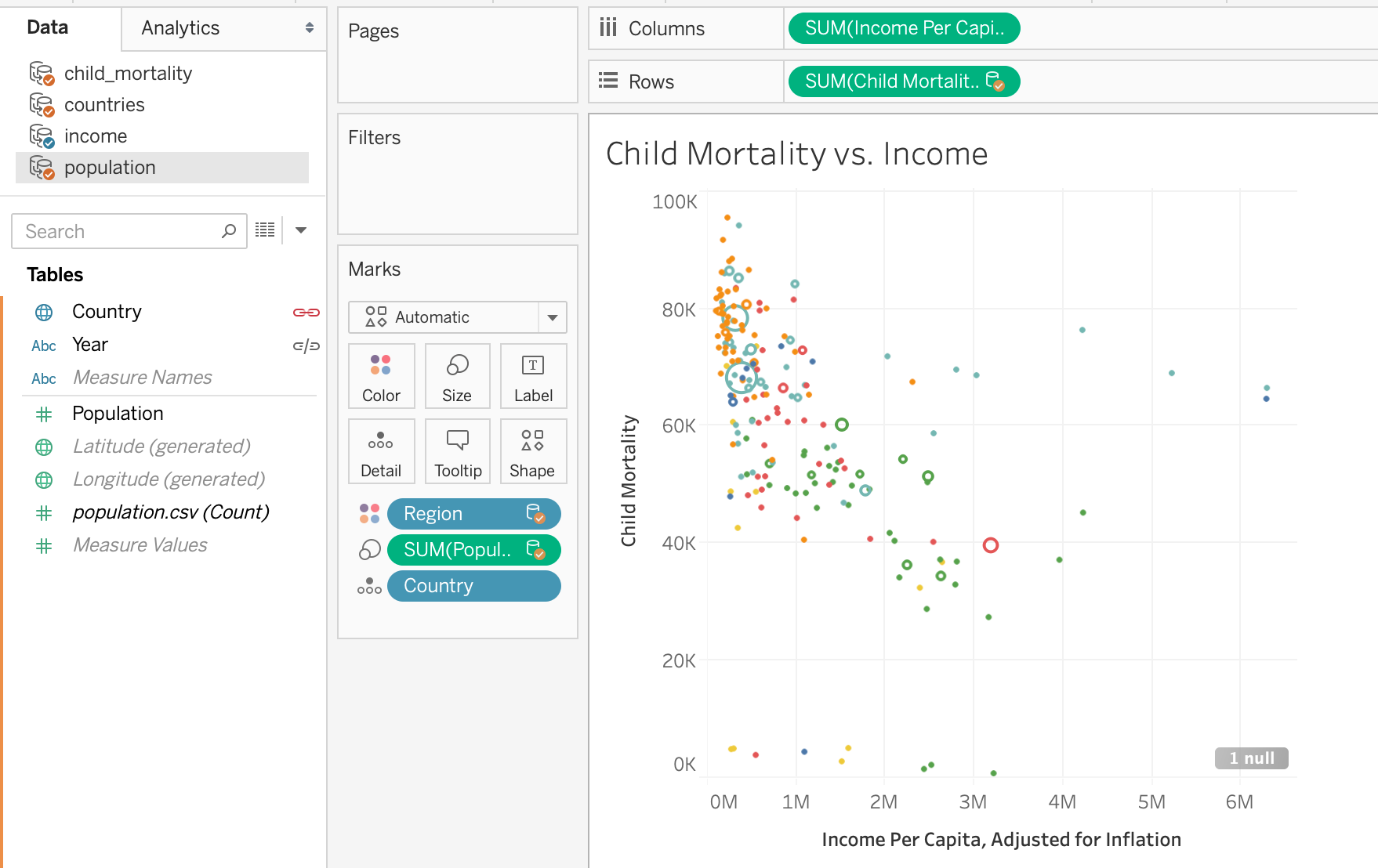
Congratulations, you made a scatter plot in Tableau!
#factfulness #tableau #data-science #visualization #programming #visual studio code