In this article, I will explain what to do when you need to change completely the visuals for a Slider in Flutter and it is not enough with the options provided for customization by the theme.
One of the things I like the most about Flutter is the number of predefined widgets available to build really amazing UI and how easily you can customize them to your needs. But even when this customization is not enough, you can still dive a bit deeper and make it happen without things getting too messy.
I need a slider in my life
Easy one. Every single UI **component library **has a prebuilt component to draw a slider (aka range). Flutter, of course, also has its own version.
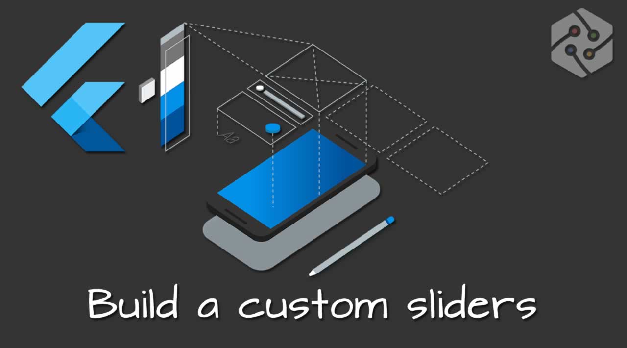
Behold… the slider
It looks quite basic, but it’s very easy to customize by wrapping it with a SliderTheme. Leaving aside the logic behind, there are three main elements in the widget:
- the track: the lane that the slider thumb slides along.
- the thumb: the shape that slides horizontally when the user drags it.
- the overlay: which appears around the thumb when this is dragged.
Pimp my slider!
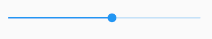
By changing some values in SliderThemeDatawe can change it quite a lot. Let’s try something simple, just changing the colors:
SliderTheme(
  data: SliderTheme.of(context).copyWith(
    activeTrackColor: Colors.red,
    inactiveTrackColor: Colors.black,
    trackHeight: 3.0,
    thumbColor: Colors.yellow,
    thumbShape: RoundSliderThumbShape(enabledThumbRadius: 8.0),
    overlayColor: Colors.purple.withAlpha(32),
    overlayShape: RoundSliderOverlayShape(overlayRadius: 14.0),
  ),
  child: Slider(
      value: _value,
      onChanged: (value) {
        setState(() {
          _value = value;
        });
      }),
),
Best Design Award for category: “Sliders”
Usually, by changing sizes and colors we can get really cool results, but sometimes this is not enough.
Back to the seventies
Recently at work, I had to implement a very special UI component in Flutter.
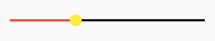
The Affective Slider
Checking the documentation for SliderThemeData it seems changing the shape for both the track and the thumb is not straightforward. We could always implement the component from scratch, as I explained in a previous post for a circular slider, but we would be missing much of the work already done here that glues the thumb and the track (and the overlay) together. Luckily, there is a better approach.
It’s all shapes
You probably spotted in the previous example that in order to change the size of the thumb I used thumbShape: RoundSliderThumbShape(enabledThumbRadius: 8.0). This class is the one in charge of building the thumb element. We just need to implement our own version to have full control of this feature, and we can do the same for the track and the overlay.
If we check the source code for RoundSliderThumbShape we can see that it actually uses the canvas to draw it, which means that we can do whatever we want basically. Let’s see the code I need for my Affective Slider.
Requirements
Our design is actually quite simple and in reality, simplifies the original implementations of the shape classes. Let’s see what we need:
- no overlay
- no colors: both the track and the thumb have to be white, but we need a black border for each of them, but with different widths
- the track has rounded borders
- the thumb has rounded borders and it’s not a circle anymore, but a rectangle
- no need to care for the status disabled
The thumb
Our class needs to implement (extend) RetroSliderThumbShape and override two methods: getPreferredSize() and paint().
import 'package:flutter/material.dart';

class RetroSliderThumbShape extends SliderComponentShape {
  final double thumbRadius;

  const RetroSliderThumbShape({
    this.thumbRadius = 6.0,
  });

  @override
  Size getPreferredSize(bool isEnabled, bool isDiscrete) {
    return Size.fromRadius(thumbRadius);
  }

  @override
  void paint(
    PaintingContext context,
    Offset center, {
    Animation<double> activationAnimation,
    Animation<double> enableAnimation,
    bool isDiscrete,
    TextPainter labelPainter,
    RenderBox parentBox,
    SliderThemeData sliderTheme,
    TextDirection textDirection,
    double value,
  }) {
    final Canvas canvas = context.canvas;

    final rect = Rect.fromCircle(center: center, radius: thumbRadius);

    final rrect = RRect.fromRectAndRadius(
      Rect.fromPoints(
        Offset(rect.left - 1, rect.top),
        Offset(rect.right + 1, rect.bottom),
      ),
      Radius.circular(thumbRadius - 2),
    );

    final fillPaint = Paint()
      ..color = sliderTheme.activeTrackColor
      ..style = PaintingStyle.fill;

    final borderPaint = Paint()
      ..color = Colors.black
      ..strokeWidth = 2.8
      ..style = PaintingStyle.stroke;

    canvas.drawRRect(rrect, fillPaint);
    canvas.drawRRect(rrect, borderPaint);
  }
}
We are in canvas territory now, so we need to draw. As we need a border, we need to draw two different rectangles: the inner (in white) and the outer (the border, in black). That’s what we are doing in the last two lines.
We usePaint class to choose the color and the width of the stroke, but the segment to draw is basically the same in both cases, a rounded rectangle that I build with a rectangle based on the radius provided.
The track
This would be even easier than the previous one, if not for the rounded borders.
import 'dart:math';

import 'package:flutter/material.dart';

class RetroSliderTrackShape extends SliderTrackShape {
  @override
  Rect getPreferredRect({
    RenderBox parentBox,
    Offset offset = Offset.zero,
    SliderThemeData sliderTheme,
    bool isEnabled,
    bool isDiscrete,
  }) {
    final double thumbWidth =
        sliderTheme.thumbShape.getPreferredSize(true, isDiscrete).width;
    final double trackHeight = sliderTheme.trackHeight;
    assert(thumbWidth >= 0);
    assert(trackHeight >= 0);
    assert(parentBox.size.width >= thumbWidth);
    assert(parentBox.size.height >= trackHeight);

    final double trackLeft = offset.dx + thumbWidth / 2;
    final double trackTop =
        offset.dy + (parentBox.size.height - trackHeight) / 2;
    final double trackWidth = parentBox.size.width - thumbWidth;
    return Rect.fromLTWH(trackLeft, trackTop, trackWidth, trackHeight);
  }

  @override
  void paint(
    PaintingContext context,
    Offset offset, {
    RenderBox parentBox,
    SliderThemeData sliderTheme,
    Animation<double> enableAnimation,
    TextDirection textDirection,
    Offset thumbCenter,
    bool isDiscrete,
    bool isEnabled,
  }) {
    if (sliderTheme.trackHeight == 0) {
      return;
    }

    final Rect trackRect = getPreferredRect(
      parentBox: parentBox,
      offset: offset,
      sliderTheme: sliderTheme,
      isEnabled: isEnabled,
      isDiscrete: isDiscrete,
    );

    final Paint fillPaint = Paint()
      ..color = sliderTheme.activeTrackColor
      ..style = PaintingStyle.fill;

    final Paint borderPaint = Paint()
      ..color = Colors.black
      ..strokeWidth = 1.0
      ..style = PaintingStyle.stroke;

    final pathSegment = Path()
      ..moveTo(trackRect.left, trackRect.top)
      ..lineTo(trackRect.right, trackRect.top)
      ..arcTo(
          Rect.fromPoints(
            Offset(trackRect.right + 7, trackRect.top),
            Offset(trackRect.right - 7, trackRect.bottom),
          ),
          -pi / 2,
          pi,
          false)
      ..lineTo(trackRect.left, trackRect.bottom)
      ..arcTo(
          Rect.fromPoints(
            Offset(trackRect.left + 7, trackRect.top),
            Offset(trackRect.left - 7, trackRect.bottom),
          ),
          -pi * 3 / 2,
          pi,
          false);

    context.canvas.drawPath(pathSegment, fillPaint);
    context.canvas.drawPath(pathSegment, borderPaint);
  }
}
The same strategy, we need to build both the filling and the border. In this case, I need to use drawPath() because of the rounded edges of the rectangle. What we do is start from the top left corner position and draw lines and arcs until we have completed the drawing.
The overlay
This is an easy one. I don’t need an overlay, so I can use the default RetroSliderThumbShape with thumbRadius as 0.0.
The Affective Slider
We just need to use our new implementations in the slider.
SliderTheme(
  data: SliderTheme.of(context).copyWith(
    trackHeight: trackHeight,
    activeTrackColor: Colors.white,
    trackShape: RetroSliderTrackShape(),
    thumbColor: Colors.white,
    thumbShape:
        RetroSliderThumbShape(thumbRadius: thumbRadius),
    overlayShape: RoundSliderOverlayShape(overlayRadius: 0.0),
  ),
  child: Slider(
      value: _value,
      onChanged: (value) {
        setState(() {
          _value = value;
        });
      }),
);
To replicate exactly the design for the original picture we just need to compose our new slider with a few png files and layout widgets.
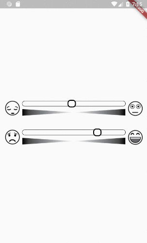
And sliiiiiide
Summary
Flutter provides an out of the box solution for sliders which works perfectly fine and allows for color and size customization.
If we need more fine grain control we need to use the canvas, but we can still focus on the graphic elements and let the logic behind for Flutter, by using some specific options in SliderTheme.
That’s all. Feel free to comment if you have any question.
#flutter