In this video, you will learn everything you need to know about media queries in CSS. Media queries allow you to create responsive layouts that will look great on all devices, from smartphones to tablets to desktops. I will walk you through the entire process, from understanding the basics of media queries to creating your own responsive layouts. By the end of this video, you will be a media query master!
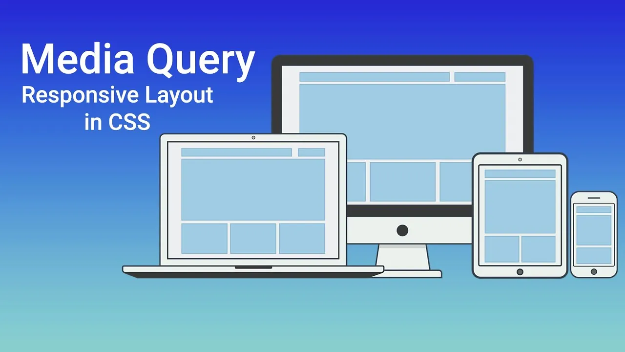
Media Query in CSS Full Tutorial | Responsive Layout HTML CSS
in this video tutorial you will learn Media Query in CSS step by step with practically and also you will learn Responsive Layout in HTML and CSS3.
media query is very important and helpful to manage the site layout on different devices, when you will increase and decrease the browser site, then your site don't display perfectly on the web.
So, when you will manage the site with different layout, you need to use media query to manage the screen size layout and display the site on different devices perfectly.
Furthermore, during this time have bunch of new features in CSS3 such as units em, rem, vh and also vw units. You must be know all about it. inside the tutorial you will also learn usage of Units step by step.
I've made complete tutorial for everyone they are interested in HTML and CSS3. Inside the tutorial have a complete usage of media query and also have units usage.
Once you learn How to use media query and also units, then you will learn How to use media Query in CSS3 to make a responsive website.
So, hope this tutorial are helpful and beneficial for you.