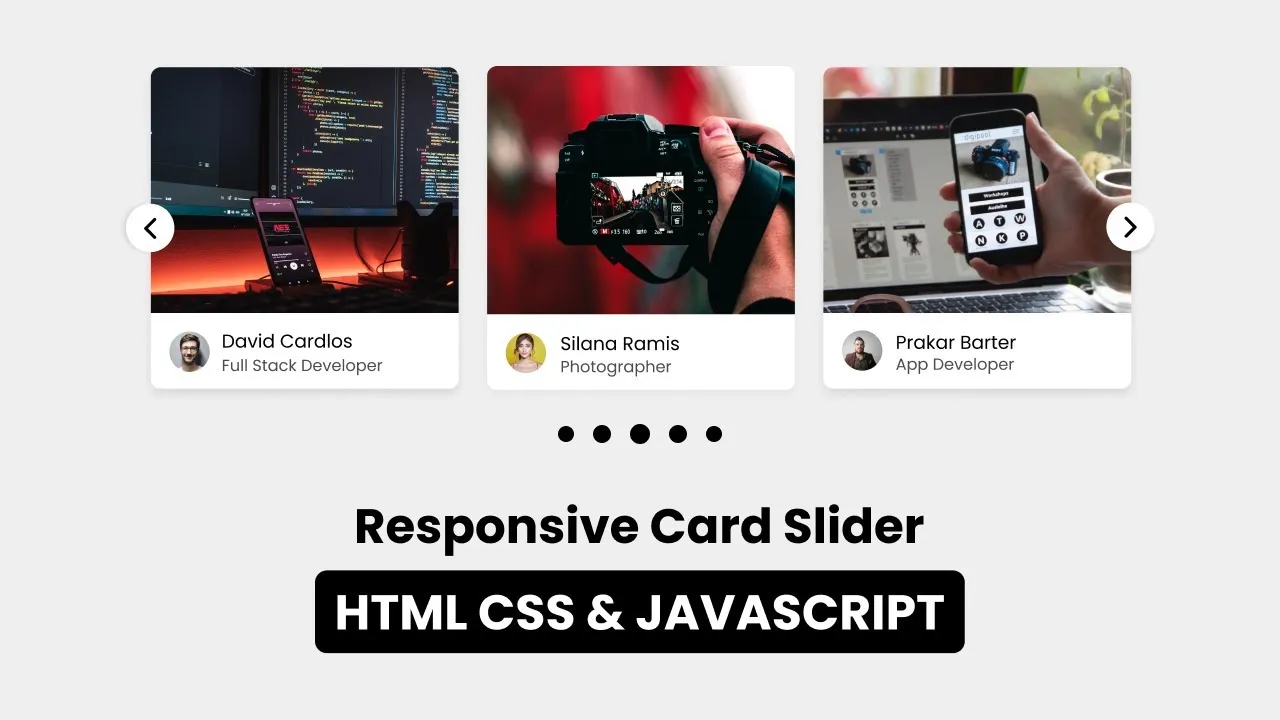
This video tutorial will teach you to create a Responsive Card Slider in HTML CSS JavaScript and Swiperjs. You can slide the card in this card slider by clicking the arrow button or grabbing it. I have also added pagination on this card slider. For the source code, you can visit the given link.
⌚ Timestamps:
00:00 Card Slider Demo
01:03 File Structure
01:22 Importing google fonts
02:27 Working on HTML
03:22 Working on CSS
08:18 Implementing Swiperjs
15:34 Making card responsive
16:36 Final result of card slider
📁 File for starting - https://drive.google.com/file/d/1rE7l6RLisUdjwbVk__IcoMnaMv19StKl/view?usp=sharing
Source Code:
HTML File
<!DOCTYPE html>
<html lang="en">
  <head>
    <meta charset="UTF-8" />
    <meta http-equiv="X-UA-Compatible" content="IE=edge" />
    <meta name="viewport" content="width=device-width, initial-scale=1.0" />
   <title>Responsive Card Slider in HTML CSS & JavaScript with Swiperjs</title>

    <!-- Swiper CSS -->
    <link rel="stylesheet" href="css/swiper-bundle.min.css" />

    <!-- CSS -->
    <link rel="stylesheet" href="css/style.css" />
  </head>
  <body>
    <div class="container swiper">
      <div class="slide-container">
        <div class="card-wrapper swiper-wrapper">
          <div class="card swiper-slide">
            <div class="image-box">
              <!--<img src="images/showImg/fullDev.jpg" alt="" />-->
            </div>
            <div class="profile-details">
              <!--<img src="images/profile/profile1.jpg" alt="" />-->
              <div class="name-job">
                <h3 class="name">David Cardlos</h3>
                <h4 class="job">Full Stack Developer</h4>
              </div>
            </div>
          </div>
          <div class="card swiper-slide">
            <div class="image-box">
              <!--<img src="images/showImg/photographer.jpg" alt="" />-->
            </div>
            <div class="profile-details">
              <!--<img src="images/profile/profile2.jpg" alt="" />-->
              <div class="name-job">
                <h3 class="name">Siliana Ramis</h3>
                <h4 class="job">Photographer</h4>
              </div>
            </div>
          </div>
          <div class="card swiper-slide">
            <div class="image-box">
              <!--<img src="images/showImg/dataAna.jpg" alt="" />-->
            </div>
            <div class="profile-details">
              <!--<img src="images/profile/profile3.jpg" alt="" />-->
              <div class="name-job">
                <h3 class="name">Richard Bond</h3>
                <h4 class="job">Data Analyst</h4>
              </div>
            </div>
          </div>
          <div class="card swiper-slide">
            <div class="image-box">
              <!--<img src="images/showImg/appDev.jpg" alt="" />-->
            </div>
            <div class="profile-details">
              <!--<img src="images/profile/profile4.jpg" alt="" />-->
              <div class="name-job">
                <h3 class="name">Priase</h3>
                <h4 class="job">App Developer</h4>
              </div>
            </div>
          </div>
          <div class="card swiper-slide">
            <div class="image-box">
              <!--<img src="images/showImg/blogger.jpg" alt="" />-->
            </div>
            <div class="profile-details">
              <!--<img src="images/profile/profile5.jpg" alt="" />-->
              <div class="name-job">
                <h3 class="name">James Laze</h3>
                <h4 class="job">Blogger</h4>
              </div>
            </div>
          </div>
        </div>
      </div>
      <div class="swiper-button-next swiper-navBtn"></div>
      <div class="swiper-button-prev swiper-navBtn"></div>
      <div class="swiper-pagination"></div>
    </div>

    <script src="js/swiper-bundle.min.js"></script>
    <script src="js/script.js"></script>
  </body>
</html>
CSS File:
/* Google Fonts - Poppins */
@import url("https://fonts.googleapis.com/css2?family=Poppins:wght@300;400;500;600&display=swap");

* {
  margin: 0;
  padding: 0;
  box-sizing: border-box;
  font-family: "Poppins", sans-serif;
}
body {
  min-height: 100vh;
  display: flex;
  align-items: center;
  justify-content: center;
  background: #efefef;
}
.container {
  max-width: 1120px;
  width: 100%;
  padding: 40px 0;
}
.slide-container {
  margin: 0 30px;
  overflow: hidden;
}
.card {
  background: #fff;
  border-radius: 8px;
}
.card .image-box {
  height: 200px;
}
.card .image-box img {
  width: 100%;
  height: 100%;
  border-radius: 8px 8px 0 0;
}
.card .profile-details {
  display: flex;
  align-items: center;
  column-gap: 12px;
  padding: 15px;
}
.card .profile-details img {
  height: 40px;
  width: 40px;
  border-radius: 50%;
}
.profile-details .name {
  font-size: 15px;
  font-weight: 500;
}
.profile-details .job {
  font-size: 12px;
  font-weight: 500;
  color: #4d4d4d;
}

.swiper-navBtn {
  color: #000;
  height: 40px;
  width: 40px;
  background: #fff;
  border-radius: 50%;
}
.swiper-navBtn::before,
.swiper-navBtn::after {
  font-size: 18px;
}

.swiper-pagination-bullet {
  background-color: #000;
}

@media screen and (max-width: 768px) {
  .swiper-navBtn {
    display: none;
  }
}
JavaScript File
var swiper = new Swiper(".slide-container", {
  slidesPerView: 4,
  spaceBetween: 20,
  sliderPerGroup: 4,
  loop: true,
  centerSlide: "true",
  fade: "true",
  grabCursor: "true",
  pagination: {
    el: ".swiper-pagination",
    clickable: true,
    dynamicBullets: true,
  },
  navigation: {
    nextEl: ".swiper-button-next",
    prevEl: ".swiper-button-prev",
  },

  breakpoints: {
    0: {
      slidesPerView: 1,
    },
    520: {
      slidesPerView: 2,
    },
    768: {
      slidesPerView: 3,
    },
    1000: {
      slidesPerView: 4,
    },
  },
});
11.50 GEEK