toggle Switch - A Simple Toggle Switch Widget For Flutter
Toggle Switch
A simple toggle switch widget. It can be fully customized with desired icons, width, colors, text, corner radius, animation etc. It also maintains selection state.
Getting Started
In the pubspec.yaml of your flutter project, add the following dependency:
dependencies:
  ...
  toggle_switch: ^2.1.0
Import it:
import 'package:toggle_switch/toggle_switch.dart';
Usage Examples
Basic toggle switch
// Here, default theme colors are used for activeBgColor, activeFgColor, inactiveBgColor and inactiveFgColor
ToggleSwitch(
  initialLabelIndex: 0,
  totalSwitches: 3,
  labels: ['America', 'Canada', 'Mexico'],
  onToggle: (index) {
    print('switched to: $index');
  },
),

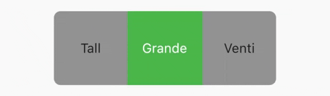
Basic toggle switch with custom height and font size
ToggleSwitch(
  minWidth: 90.0,
  minHeight: 90.0,
  fontSize: 16.0,
  initialLabelIndex: 1,
  activeBgColor: [Colors.green],
  activeFgColor: Colors.white,
  inactiveBgColor: Colors.grey,
  inactiveFgColor: Colors.grey[900],
  totalSwitches: 3,
  labels: ['Tall', 'Grande', 'Venti'],
  onToggle: (index) {
    print('switched to: $index');
  },
),
With text or icon and custom widths
ToggleSwitch(
  customWidths: [90.0, 50.0],
  cornerRadius: 20.0,
  activeBgColors: [[Colors.cyan], [Colors.redAccent]],
  activeFgColor: Colors.white,
  inactiveBgColor: Colors.grey,
  inactiveFgColor: Colors.white,
  totalSwitches: 2,
  labels: ['YES', ''],
  icons: [null, FontAwesomeIcons.times],
  onToggle: (index) {
    print('switched to: $index');
  },
),

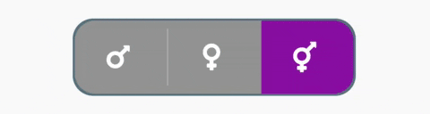
With icons, text and different active background colors
ToggleSwitch(
  minWidth: 90.0,
  initialLabelIndex: 1,
  cornerRadius: 20.0,
  activeFgColor: Colors.white,
  inactiveBgColor: Colors.grey,
  inactiveFgColor: Colors.white,
  totalSwitches: 2,
  labels: ['Male', 'Female'],
  icons: [FontAwesomeIcons.mars, FontAwesomeIcons.venus],
  activeBgColors: [[Colors.blue],[Colors.pink]],
  onToggle: (index) {
    print('switched to: $index');
  },
),

With border color, border width, icons, custom height and different active background colors
ToggleSwitch(
  minWidth: 90.0,
  minHeight: 70.0,
  initialLabelIndex: 2,
  cornerRadius: 20.0,
  activeFgColor: Colors.white,
  inactiveBgColor: Colors.grey,
  inactiveFgColor: Colors.white,
  totalSwitches: 3,
  icons: [
    FontAwesomeIcons.mars,
    FontAwesomeIcons.venus,
    FontAwesomeIcons.transgender
  ],
  iconSize: 30.0,
  borderWidth: 2.0,
  borderColor: [Colors.blueGrey],
  activeBgColors: [[Colors.blue], [Colors.pink], [Colors.purple]],
  onToggle: (index) {
    print('switched to: $index');
  },
),
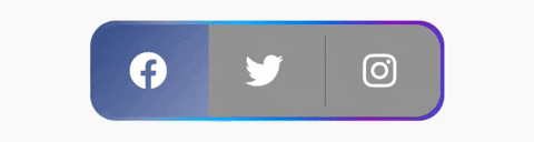
With gradient border color, divider color and gradient active background colors
ToggleSwitch(
  minWidth: 90.0,
  minHeight: 70.0,
  initialLabelIndex: 0,
  cornerRadius: 20.0,
  activeFgColor: Colors.white,
  inactiveBgColor: Colors.grey,
  inactiveFgColor: Colors.white,
  totalSwitches: 3,
  icons: [
    FontAwesomeIcons.facebook,
    FontAwesomeIcons.twitter,
    FontAwesomeIcons.instagram
  ],
  iconSize: 30.0,
  borderColor: [Color(0xff3b5998), Color(0xff8b9dc3), Color(0xff00aeff), Color(0xff0077f2), Color(0xff962fbf), Color(0xff4f5bd5)],
  dividerColor: Colors.blueGrey,
  activeBgColors: [[Color(0xff3b5998), Color(0xff8b9dc3)], [Color(0xff00aeff), Color(0xff0077f2)], [Color(0xfffeda75), Color(0xfffa7e1e), Color(0xffd62976), Color(0xff962fbf), Color(0xff4f5bd5)]],
  onToggle: (index) {
    print('switched to: $index');
  },
),
With bounceInOut animation
ToggleSwitch(
  minWidth: 90.0,
  minHeight: 70.0,
  initialLabelIndex: 0,
  cornerRadius: 20.0,
  activeFgColor: Colors.white,
  inactiveBgColor: Colors.grey,
  inactiveFgColor: Colors.white,
  totalSwitches: 2,
  icons: [
    FontAwesomeIcons.lightbulb,
    FontAwesomeIcons.solidLightbulb,
  ],
  iconSize: 30.0,
  activeBgColors: [[Colors.black45, Colors.black26], [Colors.yellow, Colors.orange]],
  animate: true, // with just animate set to true, default curve = Curves.easeIn
  curve: Curves.bounceInOut, // animate must be set to true when using custom curve
  onToggle: (index) {
    print('switched to: $index');
  },
),

With radius style
ToggleSwitch(
  minWidth: 90.0,
  cornerRadius: 20.0,
  activeBgColors: [[Colors.green[800]!], [Colors.red[800]!]],
  activeFgColor: Colors.white,
  inactiveBgColor: Colors.grey,
  inactiveFgColor: Colors.white,
  initialLabelIndex: 1,
  totalSwitches: 2,
  labels: ['True', 'False'],
  radiusStyle: true,
  onToggle: (index) {
    print('switched to: $index');
  },
),

With custom text styles, null initial label, double tap to de-activate
ToggleSwitch(
  minWidth: 90.0,
  cornerRadius: 20.0,
  inactiveFgColor: Colors.white,
  initialLabelIndex: null,
  doubleTapDisable: true, // re-tap active widget to de-activate
  totalSwitches: 3,
  labels: ['Normal', 'Bold', 'Italic'],
  customTextStyles: [
    null,
    TextStyle(
        color: Colors.brown,
        fontSize: 18.0,
        fontWeight: FontWeight.w900),
    TextStyle(
        color: Colors.black,
        fontSize: 16.0,
        fontStyle: FontStyle.italic)
  ],
  onToggle: (index) {
    print('switched to: $index');
  },
),

With custom icons
ToggleSwitch(
  minWidth: 90.0,
  minHeight: 90.0,
  cornerRadius: 20.0,
  activeBgColors: [
    [Color(0xfffdbb0a)],
    [Colors.black54],
    [Colors.white54]
  ],
  inactiveFgColor: Colors.white,
  initialLabelIndex: 2,
  totalSwitches: 3,
  customIcons: [
    Icon(
      FontAwesomeIcons.ccVisa,
      color: Color(0xff1a1f71),
      size: 55.0,
    ),
    Icon(
      FontAwesomeIcons.ccMastercard,
      color: Color(0xffF79E1B),
      size: 55.0,
    ),
    Icon(
      FontAwesomeIcons.ccAmex,
      color: Color(0xff27AEE3),
      size: 55.0,
    )
  ],
  onToggle: (index) {
    print('switched to: $index');
  },
),

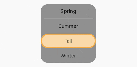
Vertical toggle switch with active border
ToggleSwitch(
  activeBorders: [
    Border.all(
      color: Colors.purple,
      width: 3.0,
    ),
    Border.all(
      color: Colors.yellow.shade700,
      width: 3.0,
    ),
    Border.all(
      color: Colors.deepOrangeAccent,
      width: 3.0,
    ),
    Border.all(
      color: Colors.blue.shade500,
      width: 3.0,
    ),
  ],
  activeFgColor: Colors.black54,
  isVertical: true,
  minWidth: 150.0,
  radiusStyle: true,
  cornerRadius: 20.0,
  initialLabelIndex: 2,
  activeBgColors: [
    [Colors.purpleAccent],
    [Colors.yellow],
    [Colors.orange],
    [Colors.lightBlueAccent]
  ],
  labels: ['Spring', 'Summer', 'Fall', 'Winter'],
  onToggle: (index) {
    print('switched to: $index');
  },
),
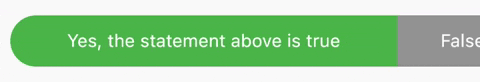
Custom widths greater than device width
SingleChildScrollView(
  scrollDirection: Axis.horizontal,
  child: Scrollbar(
    child: Padding(
      padding: const EdgeInsets.symmetric(horizontal: 10.0),
      child: ToggleSwitch(
        customWidths: [300.0, 100.0, 100.0],
        cornerRadius: 20.0,
        activeBgColors: [
          [Colors.green],
          [Colors.redAccent],
          [Colors.blue]
        ],
        activeFgColor: Colors.white,
        inactiveBgColor: Colors.grey,
        inactiveFgColor: Colors.white,
        labels: ['Yes, the statement above is true', 'False', 'Other'],
        onToggle: (index) {
          print('switched to: $index');
        },
      ),
    ),
  ),
),
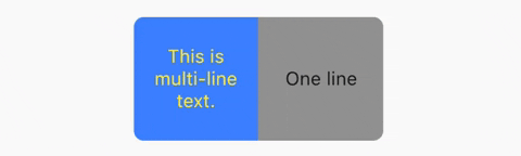
Multi-line text with custom text style inheriting activeFgColor and inactiveFgColor
ToggleSwitch(
  initialLabelIndex: 0,
  minHeight: 100.0,
  minWidth: 100.0,
  activeBgColor: [Colors.blueAccent.shade200],
  activeFgColor: Colors.yellow,
  customTextStyles: [
    TextStyle(
      fontSize: 15.0
    )
  ],
  multiLineText: true,
  centerText: true,
  totalSwitches: 2,
  labels: ['This is multi-line text.', 'One line'],
  onToggle: (index) {
    print('switched to: $index');
  },
),
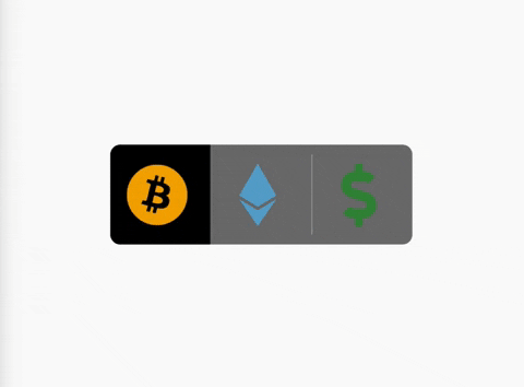
Cancel toggle
ToggleSwitch(
  initialLabelIndex: 0,
  inactiveBgColor: Colors.black54,
  activeBgColor: [Colors.black],
  totalSwitches: 3,
  minHeight: 80.0,
  minWidth: 80.0,
  customIcons: [
    Icon(
      FontAwesomeIcons.bitcoin,
      color: Color(0xFFF2A900),
      size: 50.0,
    ),
    Icon(
      FontAwesomeIcons.ethereum,
      color: Color(0xFF5ca6ce),
      size: 50.0,
    ),
    Icon(
      FontAwesomeIcons.dollarSign,
      color: Colors.green.shade700,
      size: 50.0,
    )
  ],
  onToggle: (index) {
    print('switched to: $index');
  },
  cancelToggle: (index) async {
    String selection = index == 0
        ? 'Bitcoin'
        : index == 1
            ? 'Ethereum'
            : 'Fiat';
    return await showDialog(
      context: context,
      builder: (dialogContext) => AlertDialog(
        content: Text("Select $selection?"),
        actions: [
          TextButton(
              child: Text("No",
                  style: TextStyle(color: Colors.red)),
              onPressed: () {
                Navigator.pop(dialogContext, true);
              }),
          TextButton(
              child: Text("Yes",
                  style: TextStyle(color: Colors.black)),
              onPressed: () {
                Navigator.pop(dialogContext, false);
              })
        ],
      ),
    );
  },
),
TextDirection.rtl and corner radius
// When ToggleSwitch is used with Directionality widget and textDirection is set to TextDirection.rtl (right-to-left),
// switches are displayed right to left along with their respective index values. In this case, corner radius of switches aren't set correctly.
// To fix this, please use textDirectionRTL parameter and set it to true as shown in the example below.
Directionality(
  textDirection: TextDirection.rtl,
  child: ToggleSwitch(
    initialLabelIndex: 0,
    cornerRadius: 12.0,
    textDirectionRTL: true,
    activeFgColor: Colors.white,
    totalSwitches: 2,
    labels: ['left', 'right'],
    onToggle: (index) {
      print('switched to: $index');
    },
  ),
),
setState() inside onToggle
Use this package as a library
Depend on it
Run this command:
With Flutter:
$ flutter pub add toggle_switchThis will add a line like this to your package's pubspec.yaml (and run an implicit flutter pub get):
dependencies:
  toggle_switch: ^2.1.0
Alternatively, your editor might support flutter pub get. Check the docs for your editor to learn more.
Import it
Now in your Dart code, you can use:
import 'package:toggle_switch/toggle_switch.dart';import 'package:flutter/material.dart';
import 'package:toggle_switch/toggle_switch.dart';
import 'package:font_awesome_flutter/font_awesome_flutter.dart';
void main() => runApp(
MaterialApp(
home: MyApp(),
),
);
class MyApp extends StatelessWidget {
@override
Widget build(BuildContext context) {
return Scaffold(
body: SafeArea(
child: Padding(
padding: const EdgeInsets.only(top: 20.0, bottom: 20.0),
child: Center(
child: SingleChildScrollView(
child: Column(
mainAxisAlignment: MainAxisAlignment.center,
children: [
Padding(
padding: const EdgeInsets.all(20.0),
child: Text(
'Basic toggle switch:',
style: TextStyle(fontWeight: FontWeight.bold),
),
),
ToggleSwitch(
initialLabelIndex: 0,
totalSwitches: 3,
labels: ['America', 'Canada', 'Mexico'],
onToggle: (index) {
print('switched to: $index');
},
),
Padding(
padding: const EdgeInsets.all(20.0),
child: Text(
'Basic toggle switch with custom height and font size:',
textAlign: TextAlign.center,
style: TextStyle(fontWeight: FontWeight.bold),
),
),
ToggleSwitch(
minWidth: 90.0,
minHeight: 90.0,
fontSize: 16.0,
initialLabelIndex: 1,
activeBgColor: [Colors.green],
activeFgColor: Colors.white,
inactiveBgColor: Colors.grey,
inactiveFgColor: Colors.grey[900],
totalSwitches: 3,
labels: ['Tall', 'Grande', 'Venti'],
onToggle: (index) {
print('switched to: $index');
},
),
Padding(
padding: const EdgeInsets.all(20.0),
child: Text(
'With text or icon and custom widths:',
style: TextStyle(fontWeight: FontWeight.bold),
),
),
ToggleSwitch(
customWidths: [90.0, 50.0],
cornerRadius: 20.0,
activeBgColors: [
[Colors.cyan],
[Colors.redAccent]
],
activeFgColor: Colors.white,
inactiveBgColor: Colors.grey,
inactiveFgColor: Colors.white,
totalSwitches: 2,
labels: ['YES', ''],
icons: [null, FontAwesomeIcons.times],
onToggle: (index) {
print('switched to: $index');
},
),
Padding(
padding: const EdgeInsets.all(20.0),
child: Text(
'With icons, text and different active background colors:',
textAlign: TextAlign.center,
style: TextStyle(fontWeight: FontWeight.bold),
),
),
ToggleSwitch(
minWidth: 90.0,
initialLabelIndex: 1,
cornerRadius: 20.0,
activeFgColor: Colors.white,
inactiveBgColor: Colors.grey,
inactiveFgColor: Colors.white,
totalSwitches: 2,
labels: ['Male', 'Female'],
icons: [FontAwesomeIcons.mars, FontAwesomeIcons.venus],
activeBgColors: [
[Colors.blue],
[Colors.pink]
],
onToggle: (index) {
print('switched to: $index');
},
),
Padding(
padding: const EdgeInsets.all(20.0),
child: Text(
'With border color, border width, icons, custom height and different active background colors:',
textAlign: TextAlign.center,
style: TextStyle(fontWeight: FontWeight.bold),
),
),
ToggleSwitch(
minWidth: 90.0,
minHeight: 70.0,
initialLabelIndex: 2,
cornerRadius: 20.0,
activeFgColor: Colors.white,
inactiveBgColor: Colors.grey,
inactiveFgColor: Colors.white,
totalSwitches: 3,
icons: [
FontAwesomeIcons.mars,
FontAwesomeIcons.venus,
FontAwesomeIcons.transgender
],
iconSize: 30.0,
borderWidth: 2.0,
borderColor: [Colors.blueGrey],
activeBgColors: [
[Colors.blue],
[Colors.pink],
[Colors.purple]
],
onToggle: (index) {
print('switched to: $index');
},
),
Padding(
padding: const EdgeInsets.all(20.0),
child: Text(
'With gradient border color, divider color and gradient active background colors:',
textAlign: TextAlign.center,
style: TextStyle(fontWeight: FontWeight.bold),
),
),
ToggleSwitch(
minWidth: 90.0,
minHeight: 70.0,
initialLabelIndex: 0,
cornerRadius: 20.0,
activeFgColor: Colors.white,
inactiveBgColor: Colors.grey,
inactiveFgColor: Colors.white,
totalSwitches: 3,
icons: [
FontAwesomeIcons.facebook,
FontAwesomeIcons.twitter,
FontAwesomeIcons.instagram
],
iconSize: 30.0,
borderColor: [
Color(0xff3b5998),
Color(0xff8b9dc3),
Color(0xff00aeff),
Color(0xff0077f2),
Color(0xff962fbf),
Color(0xff4f5bd5)
],
dividerColor: Colors.blueGrey,
activeBgColors: [
[Color(0xff3b5998), Color(0xff8b9dc3)],
[Color(0xff00aeff), Color(0xff0077f2)],
[
Color(0xfffeda75),
Color(0xfffa7e1e),
Color(0xffd62976),
Color(0xff962fbf),
Color(0xff4f5bd5)
]
],
onToggle: (index) {
print('switched to: $index');
},
),
Padding(
padding: const EdgeInsets.all(20.0),
child: Text(
'With bounceInOut animation:',
style: TextStyle(fontWeight: FontWeight.bold),
),
),
ToggleSwitch(
minWidth: 90.0,
minHeight: 70.0,
initialLabelIndex: 0,
cornerRadius: 20.0,
activeFgColor: Colors.white,
inactiveBgColor: Colors.grey,
inactiveFgColor: Colors.white,
totalSwitches: 2,
icons: [
FontAwesomeIcons.lightbulb,
FontAwesomeIcons.solidLightbulb,
],
iconSize: 30.0,
activeBgColors: [
[Colors.black45, Colors.black26],
[Colors.yellow, Colors.orange]
],
animate: true,
// with just animate set to true, default curve = Curves.easeIn
curve: Curves.bounceInOut,
// animate must be set to true when using custom curve
onToggle: (index) {
print('switched to: $index');
},
),
Padding(
padding: const EdgeInsets.all(20.0),
child: Text(
'With radius style:',
style: TextStyle(fontWeight: FontWeight.bold),
),
),
ToggleSwitch(
minWidth: 90.0,
cornerRadius: 20.0,
activeBgColors: [
[Colors.green[800]!],
[Colors.red[800]!]
],
activeFgColor: Colors.white,
inactiveBgColor: Colors.grey,
inactiveFgColor: Colors.white,
initialLabelIndex: 1,
totalSwitches: 2,
labels: ['True', 'False'],
radiusStyle: true,
onToggle: (index) {
print('switched to: $index');
},
),
Padding(
padding: const EdgeInsets.all(20.0),
child: Text(
'With custom text styles, null initial label, double tap to de-activate:',
textAlign: TextAlign.center,
style: TextStyle(fontWeight: FontWeight.bold),
),
),
ToggleSwitch(
minWidth: 90.0,
cornerRadius: 20.0,
inactiveFgColor: Colors.white,
initialLabelIndex: null,
doubleTapDisable: true, // re-tap active widget to de-activate
totalSwitches: 3,
labels: ['Normal', 'Bold', 'Italic'],
customTextStyles: [
null,
TextStyle(
color: Colors.brown,
fontSize: 18.0,
fontWeight: FontWeight.w900),
TextStyle(
color: Colors.black,
fontSize: 16.0,
fontStyle: FontStyle.italic)
],
onToggle: (index) {
print('switched to: $index');
},
),
Padding(
padding: const EdgeInsets.all(20.0),
child: Text(
'With custom icons:',
style: TextStyle(fontWeight: FontWeight.bold),
),
),
ToggleSwitch(
minWidth: 90.0,
minHeight: 90.0,
cornerRadius: 20.0,
activeBgColors: [
[Color(0xfffdbb0a)],
[Colors.black54],
[Colors.white54]
],
inactiveFgColor: Colors.white,
initialLabelIndex: 2,
totalSwitches: 3,
customIcons: [
Icon(
FontAwesomeIcons.ccVisa,
color: Color(0xff1a1f71),
size: 55.0,
),
Icon(
FontAwesomeIcons.ccMastercard,
color: Color(0xffF79E1B),
size: 55.0,
),
Icon(
FontAwesomeIcons.ccAmex,
color: Color(0xff27AEE3),
size: 55.0,
)
],
onToggle: (index) {
print('switched to: $index');
},
),
Padding(
padding: const EdgeInsets.all(20.0),
child: Text(
'Vertical toggle switch with active border:',
style: TextStyle(fontWeight: FontWeight.bold),
),
),
ToggleSwitch(
activeBorders: [
Border.all(
color: Colors.purple.shade300,
width: 3.0,
),
Border.all(
color: Colors.yellow.shade500,
width: 3.0,
),
Border.all(
color: Colors.orange.shade300,
width: 3.0,
),
Border.all(
color: Colors.blue.shade300,
width: 3.0,
),
],
activeFgColor: Colors.black54,
isVertical: true,
minWidth: 150.0,
radiusStyle: true,
cornerRadius: 20.0,
initialLabelIndex: 2,
activeBgColors: [
[Colors.purple.shade100],
[Colors.yellow.shade100],
[Colors.orange.shade100],
[Colors.blue.shade100]
],
labels: ['Spring', 'Summer', 'Fall', 'Winter'],
onToggle: (index) {
print('switched to: $index');
},
),
Padding(
padding: const EdgeInsets.all(20.0),
child: Text(
'Custom widths greater than device width:',
style: TextStyle(fontWeight: FontWeight.bold),
),
),
SingleChildScrollView(
scrollDirection: Axis.horizontal,
child: Scrollbar(
child: Padding(
padding: const EdgeInsets.symmetric(horizontal: 10.0),
child: ToggleSwitch(
customWidths: [300.0, 100.0, 100.0],
cornerRadius: 20.0,
activeBgColors: [
[Colors.green],
[Colors.redAccent],
[Colors.blue]
],
activeFgColor: Colors.white,
inactiveBgColor: Colors.grey,
inactiveFgColor: Colors.white,
labels: [
'Yes, the statement above is true',
'False',
'Other'
],
onToggle: (index) {
print('switched to: $index');
},
),
),
),
),
Padding(
padding: const EdgeInsets.all(20.0),
child: Text(
'Multi-line text with custom text style inheriting activeFgColor and inactiveFgColor:',
textAlign: TextAlign.center,
style: TextStyle(fontWeight: FontWeight.bold),
),
),
ToggleSwitch(
initialLabelIndex: 0,
minHeight: 100.0,
minWidth: 100.0,
activeBgColor: [Colors.blueAccent.shade200],
activeFgColor: Colors.yellow,
customTextStyles: [TextStyle(fontSize: 15.0)],
multiLineText: true,
centerText: true,
totalSwitches: 2,
labels: ['This is multi-line text.', 'One line'],
onToggle: (index) {
print('switched to: $index');
},
),
Padding(
padding: const EdgeInsets.all(20.0),
child: Text(
'Cancel toggle:',
style: TextStyle(fontWeight: FontWeight.bold),
),
),
ToggleSwitch(
initialLabelIndex: 0,
inactiveBgColor: Colors.black54,
activeBgColor: [Colors.black],
totalSwitches: 3,
minHeight: 80.0,
minWidth: 80.0,
customIcons: [
Icon(
FontAwesomeIcons.bitcoin,
color: Color(0xFFF2A900),
size: 50.0,
),
Icon(
FontAwesomeIcons.ethereum,
color: Color(0xFF5ca6ce),
size: 50.0,
),
Icon(
FontAwesomeIcons.dollarSign,
color: Colors.green.shade700,
size: 50.0,
)
],
onToggle: (index) {
print('switched to: $index');
},
cancelToggle: (index) async {
String selection = index == 0
? 'Bitcoin'
: index == 1
? 'Ethereum'
: 'Fiat';
return await showDialog(
context: context,
builder: (dialogContext) => AlertDialog(
content: Text("Select $selection?"),
actions: [
TextButton(
child: Text("No",
style: TextStyle(color: Colors.red)),
onPressed: () {
Navigator.pop(dialogContext, true);
}),
TextButton(
child: Text("Yes",
style: TextStyle(color: Colors.black)),
onPressed: () {
Navigator.pop(dialogContext, false);
})
],
),
);
},
),
],
),
)),
),
),
);
}
}Download details:
Author: pramod.dev
Source: https://github.com/PramodJoshi/toggle_switch
4.30 GEEK