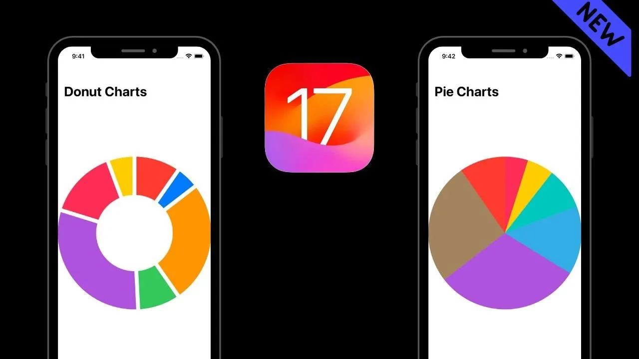
In this video, we'll take a look at the new pie charts and donut charts feature in iOS 17. These new features make it easier to create beautiful and informative data visualizations in your apps. We'll show you how to use these features, and we'll also give you some tips on how to get the most out of them.
Here are some additional details that you can include in the description:
- The new pie charts and donut charts feature in iOS 17 is based on the new SectorMark type in SwiftUI.
- This new type makes it easier to create and customize pie charts and donut charts.
- You can use these new features to create data visualizations for a variety of purposes, such as displaying sales data, tracking user behavior, or visualizing survey results.
In this tutorial, we'll dive into the exciting world of data visualization in SwiftUI using the latest iOS 17 and Xcode 15. Join us as we explore the powerful SectorMark framework and learn how to create stunning Pie Charts and Donut Charts with ease.
📺 Watch now to master SwiftUI's data visualization capabilities and take your app's UI to the next level!
🔥 What You'll Learn:
- Setting up a new SwiftUI project in Xcode 15
- Integrating the SectorMark mark in your project
- Designing beautiful and interactive Pie Charts and Donut Charts
- Customizing colors, labels, and other visual elements
- Best practices for displaying data effectively
Whether you're a beginner or an experienced iOS developer, this video is packed with step-by-step instructions and practical examples that will empower you to create visually appealing charts that make your data shine.
🚀 Get ready to level up your SwiftUI skills and create visually compelling data visualizations. Join us in this tutorial and unlock the full potential of SectorMark to captivate your users and deliver exceptional user experiences