How to Implement Parallax Scrolling with CSS
Learn how to implement parallax scrolling with CSS without compromising UX and explore the benefits of using CSS instead of JavaScript. We’ll review several CSS parallax examples, use cases, and best practices.
Parallax scrolling can improve a website’s browsing experience by making it more dynamic and immersive. In the simplest of terms, parallax scrolling is a three-dimensional effect for adding more depth to a webpage. However, there is some nuance to this that we’ll clarify later.
In this article, we’ll discuss why you should consider using parallax scrolling, demonstrate how to implement it with CSS, and explore the benefits of using CSS instead of JavaScript. We’ll review several CSS parallax examples, use cases, and best practices.
A famous and well-executed example of parallax scrolling is the Firewatch computer game website. The hero section contains a rural scene of a hiker peering across a valley to a hill station. As the user scrolls down, the parallax effect makes the scene fall away to reveal the content below:

Looks like magic, right? Let’s go backstage and see how the magic happens!
Contents:
- What is parallax scrolling?
- Why use a parallax scrolling effect?
- Improved user engagement
- Serves as a storytelling guide
- How to implement the parallax effect in CSS
- Fixing the position of the background
- Laying out the design
- Scaling the design
- Handling mobile browser compatibility issues
- Pros and cons of fixing the background position
- Using 3D translations
- Parallax scrolling demo
- Good examples of using 3D translations
- Pros and cons of using 3D translations
- Where can you use parallax scrolling?
- Best practices for parallax scrolling
- Use parallax scrolling in the right places
- Don’t impede natural scrolling
- Responsive design
- Performance
- Accessibility
- Why use CSS instead of JavaScript?
What is parallax scrolling?
Parallax scrolling is a computer graphics technique in which background images move past the camera more slowly than the foreground images, creating an illusion of depth in a 2D scene.
The example above is often referred to as 2.5D, two-and-a-half dimensional, or pseudo-3D perspective because it simulates the appearance of a three-dimensional scene.
Parallax scrolling was popularized in 2D computer graphics and was included in video games starting in the early 1980s. Many people credit the arcade game Moon Patrol as being the first use of the effect in side-scrolling games. Parallax scrolling made its way into many popular platform games throughout the 80s and 90s, like Sonic the Hedgehog.
The game The Whispered World implemented the parallax effect through the composition of layers. Below is an isometric view of the game’s layers, with each distinguished by a colored frame:
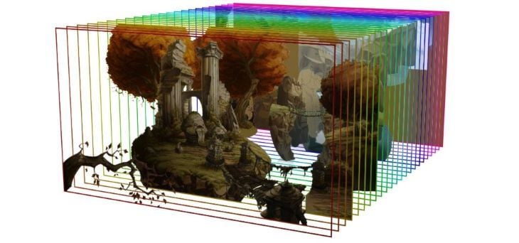
A side view of the layers used for parallax scrolling in The Whispered World. Claas Paletta, PR & New Business Manager of Daedalic Entertainment GmbH (rights owner). Free use, via Wikimedia Commons.
When viewed from the front, the layers form a complete scene:

A front view of the layers used for parallax scrolling in The Whispered World. Claas Paletta, PR & New Business Manager of Daedalic Entertainment GmbH (rights owner). Free use, via Wikimedia Commons.
This technique was incorporated into web design, but it did not become popular until the 2011 introduction of HTML5 and CSS3. As CSS has matured, it has become easier to pull off the parallax scroll effect without JavaScript and hacks.
One unfortunate outcome is that many treat the parallax effect as a blanket term; it has become synonymous with “gratuitous scrolling effects”. But, the parallax effect does not actually require any animation or scroll-triggered events; it is based purely on elements moving at different speeds to give a perception of depth.
In web design, this is achieved by grouping elements into layers and controlling how fast each layer moves. The elements are laid out vertically in a typical webpage, and the movement effect is a result of the user scrolling through the page.
Why use a parallax scrolling effect?
Before adding a parallax scroll to your website, it’s important to consider why you’d want to use one. Let’s discuss a few reasons.
Improved user engagement
Parallax graphics can hold a user’s attention and improve engagement, thereby reducing the bounce rates of users that exit after visiting just one page on your website.
Serves as a storytelling aid
Good design speaks to the user, and parallax graphics can help take users on an immersive journey. You can use parallax scrolling to produce a one-page website where visitors can read an entire story about your product or brand without navigating to multiple pages. For a great example, check out Matterday made by Netlify; this site tells a compelling story about how Netlify can save time and offers suggestions for how that extra time could be used.
How to implement the parallax effect in CSS
Broadly speaking, there are two methods for implementing a parallax effect with CSS. Let’s explore and compare both fixing the background position and using 3D translations.
Fixing the position of the background
Fixing the position of the background was the earliest method for creating a parallax effect with CSS. You can think of it as a 2.5D parallax implementation.
The secret to this method is to use a background image for a section and fix its position, typically with background-attachment:fixed. When the user scrolls through a particular section, the background does not scroll by, but the other elements do. However, once the user scrolls beyond that section, there is a different background. By having these elements move at different speeds, we can create a parallax effect.
One thing to keep in mind with this method is that mobile browser support for background-attachment:fixed still appears to be problematic at the time of writing. We’ll discuss workarounds for this later in this article.
To get a better understanding of how this method works, let’s explore a specific example.
Laying out the design
When it comes to parallax examples, many developers seem to favor those with mountain scenes. I think this is because it looks pretty cool when you see something rise above a mountain, but don’t let this idea limit your application of the technique.
Below is an overview of the webpage’s design. We create a kind of banded design in which we interweave a parallax section with a non-parallax section; I call this a “buffer” section:
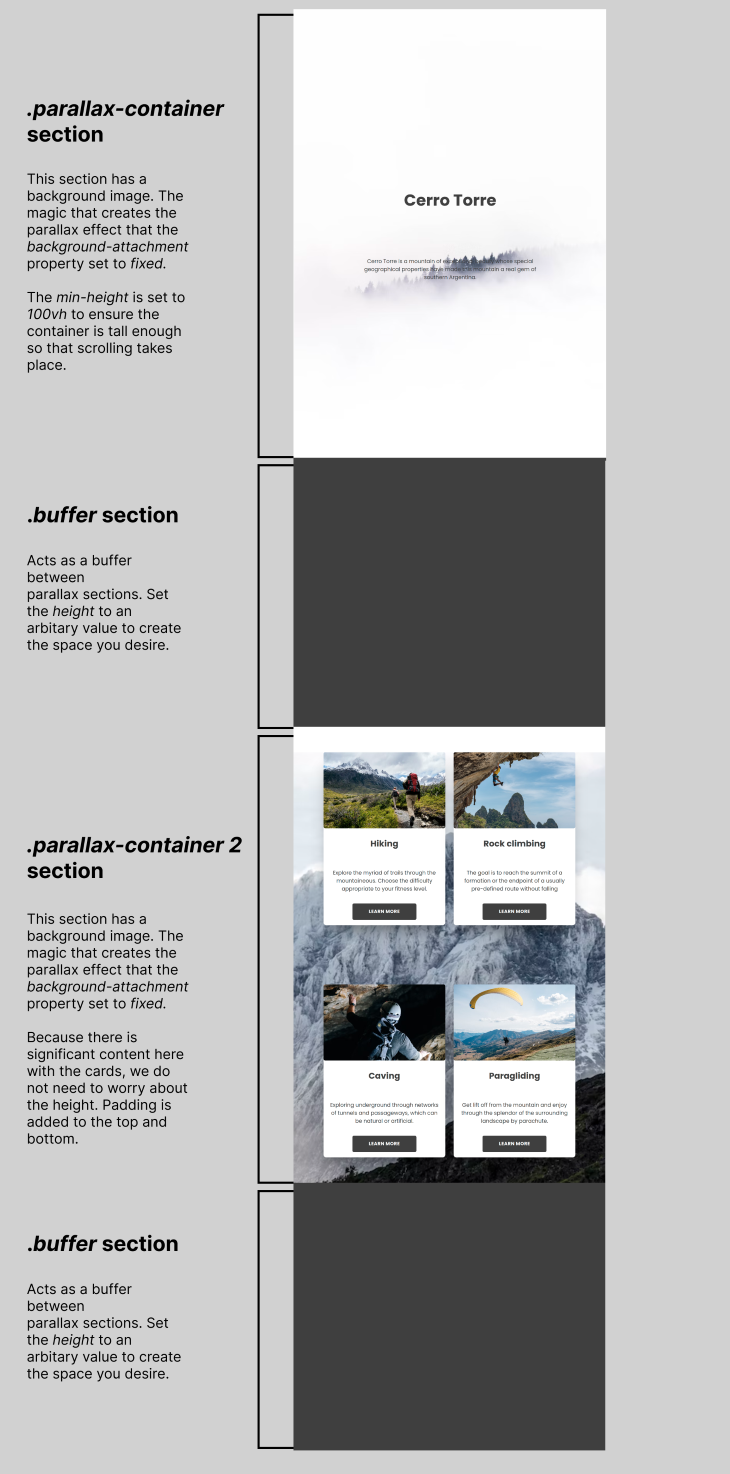
The “buffer” section is not required for the parallax effect to work, however, it can serve as a margin between parallax sections. It can also provide more control for the starting point of the background in the proceeding parallax section.
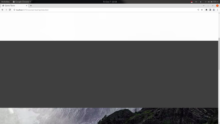
For example, on a 1920px screen, if we scroll down most of the first parallax section, we see the middle of the mountainous background in the second parallax section:
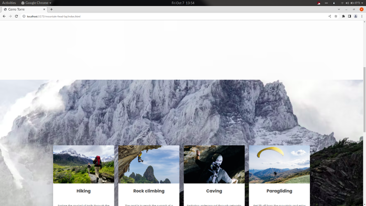
Without the first “buffer” section, we’ll see the image below at the same position on the page. You’ll notice that the initial view of the mountainous background of the second parallax section is higher:
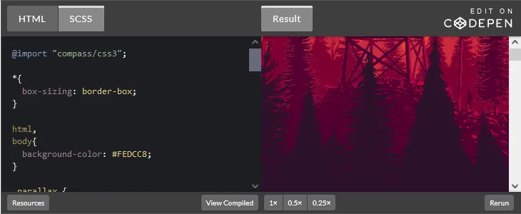
Ultimately, the “buffer” section is a design decision and not an implementation requirement. You can check out the CodePen for the above example:
The key to creating the parallax container is to set the background-image property with the image of your choosing and then set the background-attachment property to fixed. The fixed value fixes the position of the background image relative to the viewport.
Scaling the design
Using the background-size: cover; to scale the image to the smallest possible size to fill the container while preserving its aspect ratio is optional, but generally wise. In the code below, I also center the position of the background image using background-position: center:
.parallax-container {
  /*  this is where the magic happens:  */
  background-image: url("https://images.unsplash.com/photo-1519120944692-1a8d8cfc107f?ixlib=rb-1.2.1&ixid=MnwxMjA3fDB8MHxwaG90by1wYWdlfHx8fGVufDB8fHx8&auto=format&fit=crop&w=872&q=80");
  background-attachment: fixed;
  background-position: center;
  background-size: cover;

  /* dimensions are important, ensure it is tall enough to scroll */
  min-height: 100vh;

  /* you are free to lay out the container items with flexbox or whatever means you wish */
  display: flex;
  flex-direction: column;
  align-items: center;
  justify-content: center;
}
You must also be mindful of the parallax container dimensions; the container should be tall enough to require significant scrolling. A simple way to guarantee this is to set min-height: 100vh on the parallax container so that it will be at least as tall as the height of the screen, regardless of the elements it contains.
Handling mobile browser compatibility issues
At the time of writing, there are still lingering issues with background-attachment: fixed on mobile browsers. To better understand these issues, read the documentation. Fortunately, we have some options to overcome any mobile browser incompatibilities.
For example, we can take the nuclear approach and ditch parallax completely on mobile devices and smaller screens by using a media query. The CSS would look something like the following:
 /* Turn off parallax scrolling for all tablets and phones. Increase/decrease the pixels if needed */
@media only screen and (max-device-width: 1366px) {
  .parallax-container {
    background-attachment: scroll;
  }
}
Murtuzaali Surti wrote about a fixed background hack and showed how bugs manifest in mobile browsers when background-attachment: fixed is used. In a nutshell, Murtuzaali suggests creating an element with a background image using position: fixed, placing the content into a separate element, and then positioning it absolutely on top of, or stacked above, the background element.
Similarly, we could use a pseudo-element for the fixed background image, and it should work the same. However, I haven’t tried this method myself, so I can’t personally vouch for it.
Pros and cons of fixing the position of the background
Implementing parallax scrolling by fixing the background position is relatively straightforward and easy to understand. On the other hand, mobile browser support is still problematic, but workarounds are available. It’s only capable of having two layers, and we cannot control the speed of the layers.
Using 3D translations
In CSS, we can position elements in three dimensions; we can position elements along the z-axis to increase or decrease the perceivable distance between the user and the element:
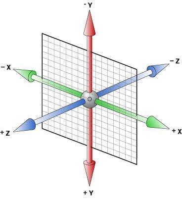
Since 3D translations mimic reality, there are similar physical effects when we move things in the digital world. For example, something that is further away (i.e., negative translation on the z-axis), will move slower. Conversely, something that is closer (i.e., positive translation on the z-axis) will move faster.
Another physical effect is scale. If we move something further away, it will appear smaller. If it is closer, it will appear bigger. If you want to counter this adjustment, you’ll need to scale it up or down yourself.
To achieve the parallax effect, we’ll use three CSS properties, position, perspective, and transform to lay out and group our elements into layers. Then, we’ll use the translateZ() and scale() transformation functions to control the scrolling speed and sizes of layers relative to the perspective set on the parent element.
Before going further, keep in mind that this is a tricky topic because it deviates from what is typical. So, let’s make a small checklist of topics you should be comfortable with to truly grasp this method:
- CSS transformations: The transform properties are core to CSS; the 3D aspect is particularly important to understand
- z-index: Stacking elements through the
positionandtransformproperties can lead to situations where layers aren’t stacked as you might expect.transformcreates a new stacking context, so you may need to intervene and manage thez-indexof the layers depending on your design - Overflow: When working in 3D with overlapping elements, you must be mindful of overflow
In 2014, Keith Clark wrote the seminal tutorial on the 3D translation method. This tutorial is a great exposition of the method, although it is a bit light on realistic examples that could make the method easier to grasp.
Rather than repeating the same information here, I’ll walk through a parallax scrolling example and share some of the finer points not covered in that article. I recommend you read Keith’s article; you can disregard any discussion about browser bugs because those are no longer an issue.
Parallax scrolling demo
Let’s create a basic parallax scrolling example with three layers that have some text as well as different background colors. Below is the HTML:
<div class="parallax">
<!--layer 1 will be the bottom layer, layer 3 will be the top layer-->
<div class="parallax-layer layer1">LAYER 1</div>
<div class="parallax-layer layer2">LAYER 2</div>
<div class="parallax-layer layer3">LAYER 3</div>
</div>
Below is the base CSS that we can reuse:
/* if you do not remove the margin, you will see a vertical scrollbar on the .parallax div */
body {
  margin: 0;
}

/* parallax "viewport" */
.parallax {
  height: 100vh;

  overflow-x: hidden;
  overflow-y: auto;

  perspective: 1px;
}

.parallax-layer {
  position: absolute;
  top: 0;
  right: 0;
  bottom: 0;
  left: 0;
}

.layer1 {
  transform: translateZ(0);
}

.layer2 {
  transform: translateZ(-1px);
}

.layer3 {
  transform: translateZ(-2px);
}
There are some things to note about this CSS code. First, the parallax class is where the magic happens. Defining an element’s height and perspective style properties creates a fixed origin 3D viewport.
The perspective property defines how far away the object is from the user. I have chosen a value of 1px for the perspective property for the parallax class, meaning we are very, very close to the div. You can increase this value if you want:
top: 10rem;
width: 100%;
height: 50rem;
background-color: green;
}
.parallax-layer.layer3 {
top: 20rem;
width: 100%;
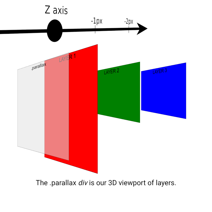
height: 50rem;pronounced parallax effect.The speed of the effect is controlled by the combination of the values provided for perspective and translateZ().
Decreasing the value for translateZ()will push the element further away, and that element will scroll slower. The further the value is from zero, the more pronounced the parallax effect. translateZ(-5px) will scroll slower than translateZ(-1px).
Beyond the base CSS, you should always consider the height of the layers. If a layer does not have much content, it may be too small to create appropriately tall scrolling context. Some people like to set a default size in .parallax-layer, but that is up to you.
We can change the position of the layers to fulfill our design using the properties top, right, left, and bottom. Alternatively, we can also use translate3d() to move an element along the x-axis and y-axis.
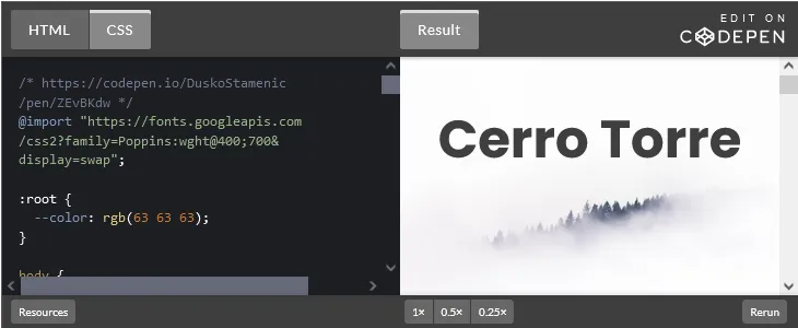
Now, let’s add size, position, and a background color to each of the layers to demonstrate how this all fits together. Below is an approximate figure of what we’re doing on the z-axis:
Next, we’ll make layer 2 and layer 3 half the height of layer 1 so we can see each layer distinctly. Then, we’ll position layer 2 lower on the y-axis with top, so it begins below layer 1. We’ll do the same with layer 3 so that it begins below layer 2:
.parallax-layer.layer1 {
  width: 100%;
  height: 100rem;

  background-color: red;
}

.parallax-layer.layer2 {
  top: 10rem;

  width: 100%;
  height: 50rem;

  background-color: green;
}
.parallax-layer.layer3 {
  top: 20rem;

  width: 100%;
  height: 50rem;

  background-color: blue;
}

div{
  font-size: 50px;
  text-align: center;
}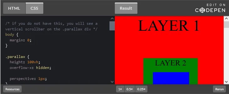
In full screen, it looks kind of like a Russian nesting doll:
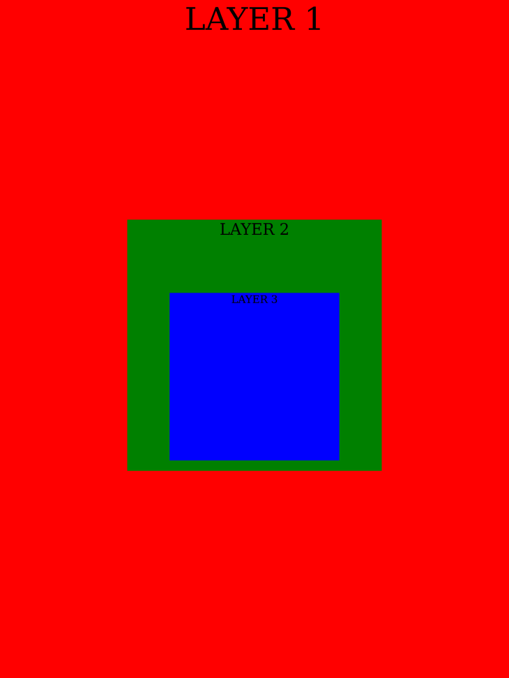
Do you notice that even though layer 2 and layer 3 have the same height, layer 3 appears to be shorter than layer 2? This is due to the 3D transformation we discussed earlier. Layer 3 is further away, so it appears smaller. You can use the scale() function if you want to make them appear equal in size.
Wondering why layer 1 is the bottom layer? In HTML, the layer 1 div comes before the layer 3 div. These divs are positioned absolutely, meaning that layer 3 should be the top layer because it comes last in the DOM. Well, a transform creates a new stacking context, which promotes each div to sit above what comes before it. So, the order of the layers is the reverse of the order in the DOM.
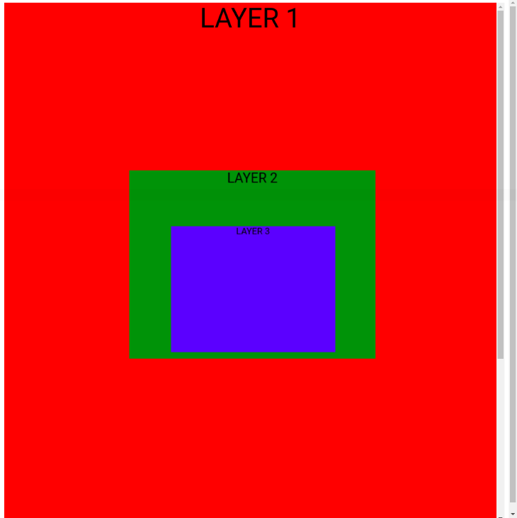
The takeaway is to remember that the first element in the “parallax” container or section will become the bottom layer. Also, it may be unexpected that our “parallax” div will have a visible scrollbar if you have a margin on the body, which is the default, as shown below. This is because the layers are taller than the container, so they overflow:
And that’s how the pieces fit together! If you want to create a design with separate parallax sections, you can consult this section of Keith’s article.
If this all feels a bit overwhelming, don’t worry! Once you explore the core mechanics as we have, you can fill in the missing pieces by exploring some good examples.
Good examples of using 3D translations
For a guided walkthrough on how to create a parallax hero section, watch this video tutorial. Here’s a CodePen for the example discussed:
To replicate the Firewatch website, here’s a CodePen with a pretty good CSS recreation; the code is written by lemmin:
To see a version that uses the original Firewatch artwork, Sam Beckham did a short blog post on this topic. Here’s a CodePen of this example:
A next-level exposition of the technique is Lynn’s Fisher work on the Matterday micro website. It’s very fun and unique.
Lynn wrote an excellent blog post on how she created this effect. I need to pick through it in more detail to unlock all of the tricks she used! The code is available on GitHub.
Pros and cons of using 3D translations
When implementing a parallax scroll using 3D translations, you can use multiple layers and control the speed of each layer. Additionally, cross-browser support is excellent. However, it’s more difficult to understand 3D translations than fixing the background position, and implementation can be tricky.
Where can you use parallax scrolling?
If you’re looking for some inspiration for where to use parallax scrolling, Adobe wrote an article called 10 Best Parallax Website Design Examples that has some excellent designs. Dribble is another good resource.
Best practices for parallax scrolling
There are many design choices that are at your discretion when applying the parallax scrolling technique, like changing the speed of layers, having a horizontal or vertical scrolling parallax section, or using text, images, or particular colors in parallax sections. However, there are a few things to keep in mind to ensure that you use parallax scrolling well.
Use parallax scrolling in the right places
Be clear on what your objectives are and consider the user at all times. Parallax scrolling can create an interesting guided experience or a novel revelation of a product, but it’s not a good fit for many use cases!
For example, if a user is seeking an answer, parallax scrolling can slow the user down if the content is presented in a staggered manner or a non-linear way. For referential content, I would generally avoid using parallax scrolling.
Consider returning users. What happens when a user sees the webpage for the second, third, or fourth time? The novelty will wear out! Is this a page users will visit often? If the parallax effect is used in a gimmicky way, users will will be put off. Don’t crowbar it into a webpage to show off.
Don’t impede natural scrolling
A user should be able scroll through a page in whatever way they want to, for example, a mouse wheel, track pad finger gesture, arrow keys on the keyboard, or scroll gestures on touch screen. If you impede a user’s scrolling, you’ll cause frustration.
It’s harder to mess this up with CSS-only implementations, but it can happen with the 3D translation technique if you don’t understand it well. You need to be mindful of containers that have overflowing content and can trap focus. If clicking in a certain area or on a certain element derails the scrolling experience for the page, you need to rethink your design.
Responsive design
With approximately 59 percent of overall web traffic coming from mobile devices, it’s vital to get the mobile user experience right. Your parallax design may not work well on mobile. It’s worth considering limiting or turning off parallax on mobile to give users the experience they deserve.
For example, if you visit the Firewatch homepage on a phone, you’ll see that they turn off parallax scrolling for smaller screens. Instead, they have a “nonparallax” section with a single background image for screens less than 600px, as shown below:

Performance
If you neglect performance, you’ll undo the benefits that the parallax effect gives a user.
According to Google, the probability of a bounce increases by 32 percent as page load time goes from one second to three seconds. Speed affects your bottom line. A study conducted by Google found that just a 100ms improvement in site speed led to retail consumers spending almost 10 percent more.
For a parallax hero section, it’s especially important to get this right. A hero section with images usually is the Largest Contentful Paint (LCP), which is one of Google’s Core Web Vitals performance metrics. LCP measures perceived load speed because it marks the point in the page load timeline when the page’s main content has likely loaded. A fast LCP helps reassure the user that the page is useful.
Firewatch loads nine images in the hero section. If you don’t optimize this, then the initial page load and the perceived loading speed will be slow to the user. For this scenario, you should consider the following:
- If you use background images, ensure that the image is preloaded via
<link rel="preload">in the HTML markup. Typically, anyimgelements are identified by the browser’s preload scanner to optimize loading - Compress the images to reduce their file size using a library like Sharp
- Use responsive image syntax in
imgorpictureto offer different resolutions of the same image so the browser can serve the smallest version that suits the screen resolution - Use next generation image formats with superior compression like WebP and AVIF. You can use the
pictureelement to offer different formats and let the browser decide which to use
You can read this detailed guide on how to optimize the LCP for your page. Site speed is also a factor for search engines ranking your website, so it will influence your site’s SEO too.
Accessibility
Motion-based animations can trigger discomfort for those with vestibular motion sensitivity or be a distraction for those with attention deficits. You can reduce the speed of the parallax scroll or turn off it for sensitive users through the @prefers-reduced-motion media query:
@media (prefers-reduced-motion) {
  /* styles to apply if the user's settings are set to reduced motion */
}
Why use CSS instead of JavaScript?
If you can pull something off in CSS rather than JavaScript, you’ll often get a more performant outcome. As an industry, at one point it seemed that some folks wanted to do everything with JavaScript, but I think there is more enlightenment around this topic now.
Sketch wrote about parallax on their design blog and spoke about how they implemented a subtle parallax scrolling effect on the homepage of their website. They used a JavaScript framework called Stimulus:
And it was simple from a development standpoint, too, as Richárd explains. “We use a super tiny JS framework called Stimulus. It lets us create small JavaScript components that are controlled by HTML data attributes,” he continues. With just a few extra HTML data parameters, the team could control horizontal and vertical velocity based on the speed of scrolling. “So larger objects and elements can move slower and the smaller ones can move faster in the virtual space,” Richárd concludes.
If this blog post was my first introduction to the parallax effect, I could be led to believe that I should implement it with a JavaScript framework too.
Development teams may opt for JavaScript because they are already using a framework and can achieve the same outcome with just a little extra JavaScript. I don’t want to admonish anyone for doing that, it may be justifiable. However, it can be easy to make a habit of shipping more and more JavaScript as you add independent features over time.
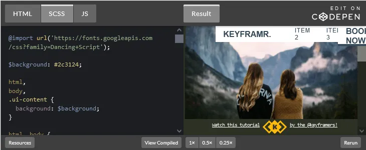
Also remember that it’s not a mutually exclusive choice. You can use mostly CSS with some JavaScript. The keyframers did an interesting example of this in a coding stream. Here’s the accompanying CodePen:
It’s important to have a balanced approach like this. You shouldn’t feel polarized and think it’s a CSS vs. JavaScript thing.
There is a time when you’ll need to reach for JavaScript. For example, an animated scroll experience calls for JavaScript. GreenSock is the best JavaScript library for web animation in my opinion.
Conclusion
A well-crafted parallax scrolling website can help you stand out from the crowd and create a lasting impression on your visitors. But, I would advise caution when using parallax scrolling. You must take care with the design and implementation to ensure that scrolling is not compromised and that the user experience is good on devices of all sizes.
I hope this article demystified the parallax scrolling technique for you and provided insights on how to implement it with CSS. Don’t forget to have fun with it. Create something awesome!
Source: https://blog.logrocket.com
#css