HTML Input Tag: How to Create and Use Input Fields in HTML
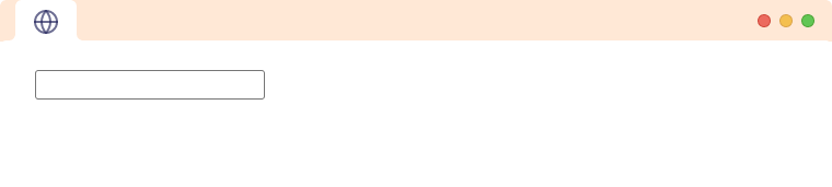
The HTML <input> tag defines the field where the user can enter data. The type attribute determines what type of user input is taken.
<input type="text" name="firstname">Browser Output
Here,
- type - determines the type of input the
<input>tag takes - name - specifies the name of the input which is what the data is named as when submitting the data to a server.
Different Input Types
The various types of input tags available in HTML5 are:
- text - creates a single-line text fields (default)
- button - creates a button with no default functionality
- checkbox - creates a checkbox
- color - creates a color picker
- date - creates a date picker
- datetime-local - creates a date and time picker
- email - creates an input field that allows the user to input a valid email address
- file - creates an input field that lets the user upload a file or multiple files
- hidden - creates an invisible input field
- image - creates a button using an image
- month - creates an input field that lets the user enter month and year
- password - creates an input field that lets the user enter information securely
- radio - creates a radio button
- range - creates a range picker from which the user can select the value
- reset - creates the button which clears all the form values to their default value
- search - allows user to enter their search queries in the text fields
- submit - allows user to submit form to the server
- tel - defines the field to enter a telephone number
- time - creates an input field that accepts time value
- url - lets the user enter and edit a URL
- week - lets the user pick a week and a year from a calendar
1. Input Type text
The input type text is used to create single-line text fields. It is the default input type.
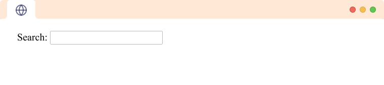
<label for="name">Search: </label>
<input type="text" id="name">
Browser Output
The input type text can also contain minlength, maxlength, and size attributes. For example,
<label for="name">Name</label>
<input type="text" id="name" minlength="4" maxlength="8">
Browser Output
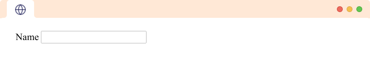
In the above example, values are only allowed between the length of 4 to 8 characters.
Note: If the type attribute is not provided, the tag becomes the type of text.
2. Input Type button
The input type button is used to create a button with no default functionality. For example,
<input type="button" value="Click Me!">Browser Output
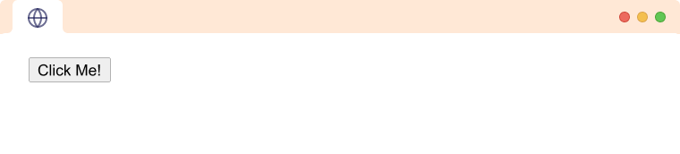
The text inside the value attribute is displayed in the button.
Note: Generally, javascript is used to add functionality to such buttons.
3. Input Type checkbox
The input type checkbox is used to create a checkbox input. For example,
<input type="checkbox" id="subscribe" value="subscribe">
<label for="subscribe">Subscribe to newsletter!</label><br>
Browser Output (checkbox unselected)
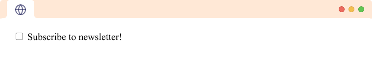
The checkbox can be toggled between selected and not selected.
Browser Output (checkbox selected)
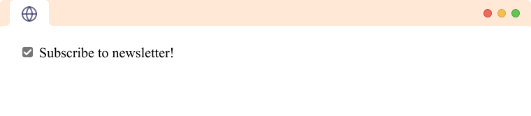
The value of the checkbox is included in the form data only if the checkbox is selected and is omitted if the checkbox is not selected.
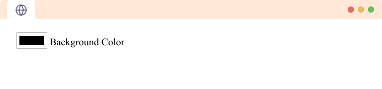
4. Input Type color
The input type color is used to create an input field that lets the user pick a color. For example,
<input type="color" id="background">
<label for="background">Background Color</label>
Browser Output (before expanding)
Browser Output (after expanding)
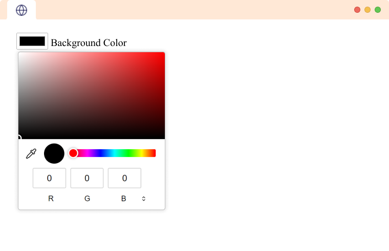
The color picker is inbuilt into the browser. Users can also manually enter the hex code of the color instead. The UI for the color picker differs from browser to browser.
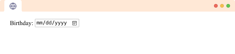
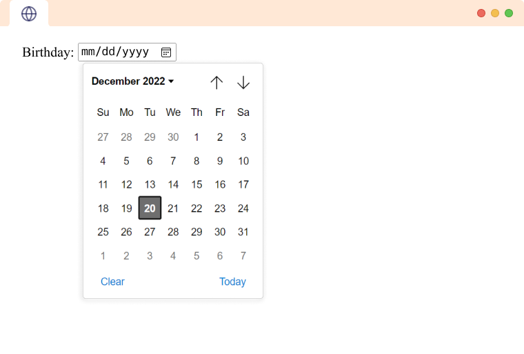
5. Input Type date
The input type date is used to create an input field that lets the user input a date using the date picker interface from the browser. For example,
<label for="birthday">Birthday:</label>
<input type="date" id="birthday">
Browser Output (before expanding)
Browser Output (after expanding)
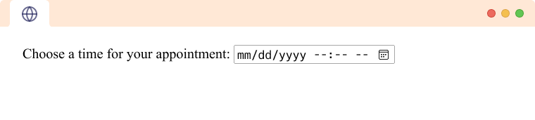
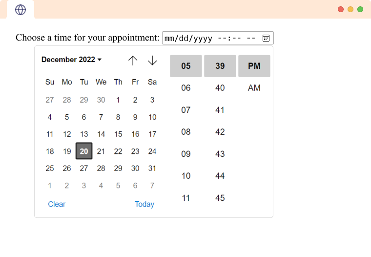
6. Input Type datetime-local
The input type datetime-local is used to create an input field that lets the user pick a date and time using a date-time-picker from the browser. The time selected from the input does not include information about the timezone. For example,
<label for="meeting-time">Choose a time for your appointment:</label>
<input type="datetime-local" id="meeting-time" >
Browser Output (before expanding)
Browser Output (after expanding)
7. Input Type email
The input type email is used to create an input field that allows the user to input a valid email address.
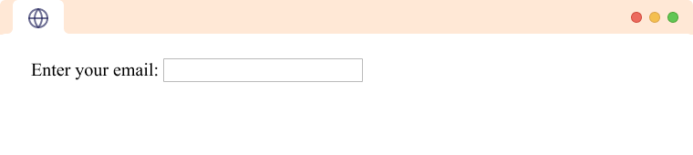
<label for="email">Enter your email:</label>
<input type="email" id="email">
Browser Output
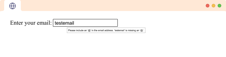
This input field throws an error if the value provided is not a valid email. For example,
Browser Output
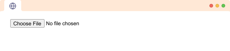
8. Input Type file
The input type file is used to create an input field that lets the user upload a file or multiple files from their device. For example,
<input type="file" name="file">Browser Output
9. Input Type hidden
The input type hidden is used to create an invisible input field. This is used to supply additional value to the server from the form that cannot be seen or modified by the user. For example,
<input type="hidden" name="id" value="123" >10. Input Type image
The input type image is used to create a button using an image.
<input type="image" src="/submit.png" alt="submit" >Browser Output

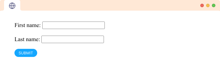
Let's see an example of how we can use it in a form.
<form>
  <label for="firstname">First name: </label>
  <input type="text" id="firstname" name="firstname"><br><br>
  <label for="lastname">Last name: </label>
  <input type="text" id="lastname" name="lastname"><br><br>
  <input type="image" src="/submit.png" alt="submit" >
</form>
Browser Output
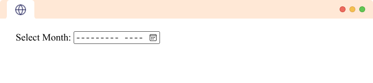
11. Input Type month
The input type month is used to create an input field that lets the user enter month and year using a visual interface from the browser. For example,
<label for="start">Select Month:</label>
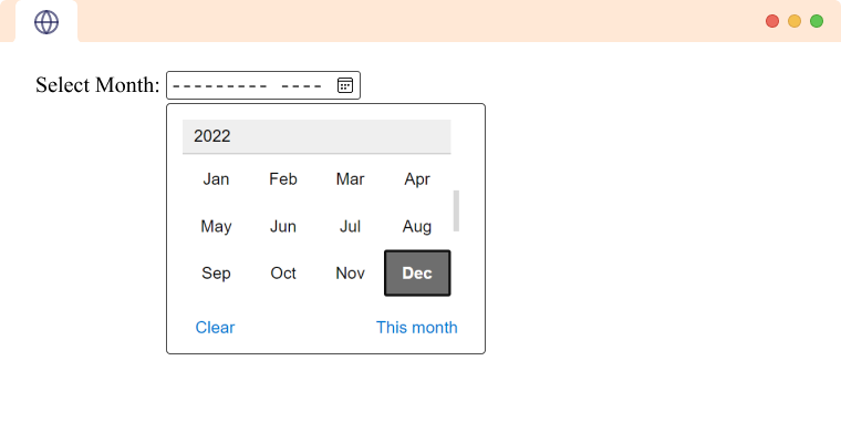
<input type="month" id="start" >Browser Output (before expanding)
Browser Output (after expanding)
12. Input Type password
The input type password is used to create an input field that lets the user enter information securely. For example,
<label for="password">Password:</label>
<input type="password" id="password">
Browser Output
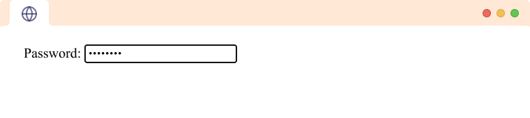
The browser displays all the characters the user types using an asterisk (*).
13. Input Type radio
The input type radio is used to define a radio button. Radio buttons are defined in a group. Radio buttons let users pick one option out of a group of options.
<form>
  <input type="radio" id="cat" name="animal" value="cat">
  <label for="cat">cat</label>
  <input type="radio" id="dog" name="animal" value="dog">
  <label for="dog">dog</label>
 </form>
Browser Output
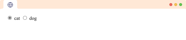
From the above example, we can see that all the radio buttons share the same name attribute. It allows the user to select exactly one option from the group of radio buttons.
When submitting the form data, the key for the input will be the name attribute, and the value will be the radio button selected.
Note: The name attribute is used as the key for the data when submitting the form.
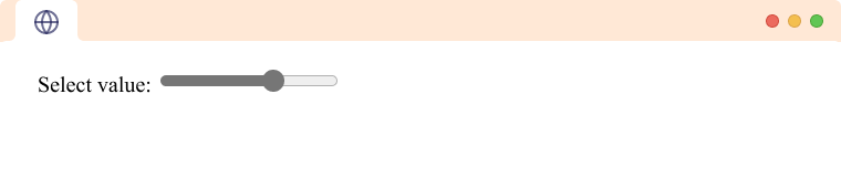
14. Input Type range
The input type range is used to create a range picker from which the user can select the value. User can select a value from the range given. It has a default range from 0 to 100. For example,
<label for="range">Select value: </label>
<input type="range" id="range" value="90">
Browser Output
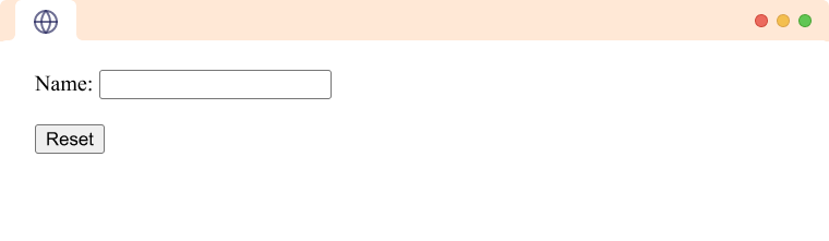
15. Input Type reset
The input type reset defines the button which clears all the form values to their default value. For example,
<form>
   <label for="name">Name:</label>
   <input id="name" type="text"  /><br />
   <input type="reset" value="Reset" />
 </form>
Browser Output
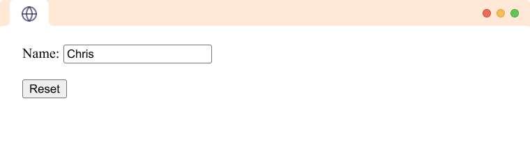
Browser Output (after reset)
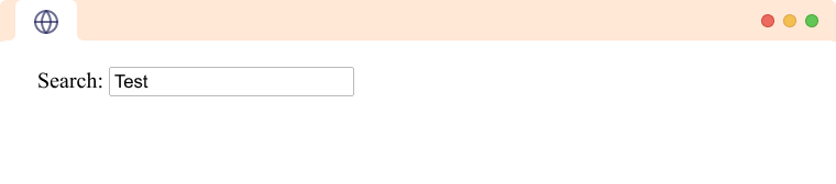
16. Input Type search
The input type search allows user to enter their search queries in the text fields. It is similar to input type text. For example,
<label for="search">Search: </label><input type="search" id="search" >Browser Output
Note: The search input does not work as a search unless we use some JavaScript to do the search calculation.
17. Input Type submit
The input type submit is used when the user submits the form to the server. It is rendered as a button. For example,
<input type="submit" value="submit">Browser Output
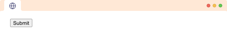
Here, The text provided in the value attribute of the input is shown in the button.
18. Input Type tel
The input type tel is used to define the field to enter a telephone number. The telephone number is not automatically validated to a particular format as telephone formats differ across the world. It has an attribute named pattern used to validate the entered value. For example,
<label for="phone">Phone Number:</label>
<input type="tel" id="phone" pattern="[0-9]{3}-[0-9]{2}-[0-9]{3}">
Browser Output
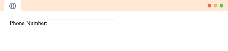
The pattern in the above example allows numbers in the format XXX-XX-XXX where X is a number between 0 and 9.
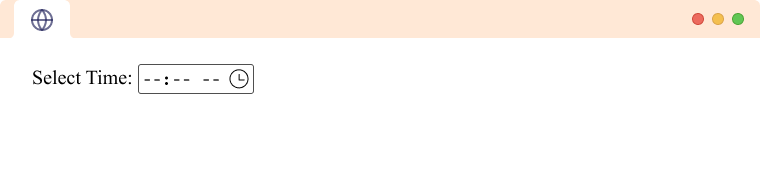
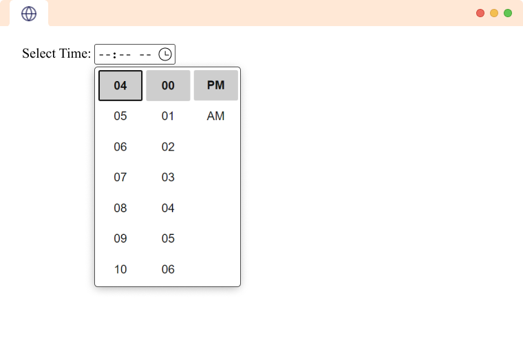
19. Input Type time
The input type time attribute creates an input field that accepts time value. It allows users to add time in hours, minutes, and seconds easily. For example,
<label for="time">Select Time:</label>
<input type="time" id="time">
Browser Output (before expanding)
Browser Output (after expanding)
20. Input Type url
The input type url is used to let the user enter and edit a URL. For example,
<label for="url">URL:</label>
<input type="url" id="url" placeholder="https://example.com" pattern="https://.*">
Browser Output
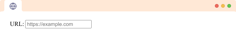
Here, placeholder is a hint that specifies the expected value of an input field, and the pattern defines what type of value is accepted. The above pattern means that only text beginning with https:// will be valid.
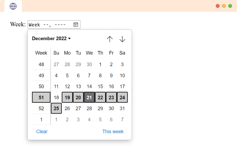
21. Input Type week
The input type week lets the user pick a week and a year from a calendar. For example,
<label for="week">Week</label>
<input type="week" id="week" >
Browser Output
- This blog post was originally published at:https://www.programiz.com/