A Beautiful Designed Toast With Animations For Flutter
Features
- Animated toasts with animated icons
- Support dark and light mode
- Built-in types (Success, Warning, Error, Info, Delete)
- Possibility to design your own toast
- Different color themes (mutliple colors support)
- Support null safety
- Heartbeat animations
- Full customized text
- Built in animations
- Customize toast layout (LTR/RTL)
- Customize toast duration
- Customize Motion toast position (Center, Bottom, Top)
- Support long text
- Background style customization
- Display simultaneous toasts
- Customizable barrier color
- Enable dismiss when toast is displayed (top, center, bottom)
- Responsive toast according to device size
- Customizable width and height
- Customizable box constraints
- Customizable toast padding
- Customizable border display
- Customizable sidebar widget display
Getting Started
In order to add motion toast to your project add this line to your pubspec.yaml file
dependencies:
	motion_toast: ^2.7.8
Or you can reference the main repository directly by adding those lines
dependencies:
	motion_toast:
		git: https://github.com/koukibadr/Motion-Toast.git
Attributes
/// the text widget used for description message
final  Widget description;

/// The title of the motion toast
/// if it's null it will not be rendered in the widget
final  Widget? title;

/// The motion toast type possible values:
/// sucess
/// error
/// warning
/// info
/// delete
/// custom
late  final  MotionToastType motionToastType;


/// The motion toast icon, for types other than custom
/// the icon will get the default type icon
/// if [motionToastType] set to [MotionToastType.custom] the icon parameter is required
late  final  IconData icon;

/// The motion toast background color
/// if `motionToastType == MOTION_TOAST_TYPE.CUSTOM` color parameter is required
/// else the color will get the default type color from [motionToastColors]
late  final  Color primaryColor;

/// Color applied on the motion toast side widget (sidebar) and the icon
/// if it's null secondary color will be the primary color
/// can be customized when using the default constructor
late  final  Color? secondaryColor;


/// the type of the background that will be applied on the motion toast content
/// available values:
/// - solid: the primary color will be applied as it is on the content background
/// - transparent: an opacity will be added to the primary color
/// - lighter: a white background added to the motion toast with little opacity added to the primary color
late  final  BackgroundType backgroundType;


/// The design type icon (Material design or Cupertino)
/// if [motionToastType] set to [MOTION_TOAST_TYPE.CUSTOM]  [iconType] will not be used
/// possible values
/// MATERIAL_DESIGN,
/// CUPERTINO
late  final  IconType? iconType;

/// The motion toast width by default it's set to 250
final  double? width;

/// define the height of the motion toast
final  double? height;

/// The constraint of the motion toast to size itself to the content
/// for responsive design
/// If it's `null`, then [width] and [height] will be used as it is.
final  BoxConstraints? constraints;

/// the motion toast icon size
/// by default it's 40
final  double iconSize;


/// disable or enable the heartbeat animation on the icon
/// by default the animation is enabled
final  bool enableAnimation;

/// The layout ToastOrientation (from right to left or from left to right)
/// {
/// LTR,
/// RTL
/// }
final  ToastOrientation layoutOrientation;


/// The type of animation, by default it's [AnimationType.fromBottom]
/// {
/// FROM_BOTTOM,
/// FROM_LEFT,
/// FROM_RIGHT
final  AnimationType animationType;


/// the Duration of the toast animation
/// by default it's 1.5 seconds
final  Duration animationDuration;

/// How long the toast will be shown
/// by default it's 3 seconds.
final  Duration toastDuration;

/// The toast animation curve
/// by default it's `Curves.ease`
final  Curve animationCurve;

/// The position where the motion toast will be displayed
/// possible values
/// CENTER,
/// TOP,
/// BOTTOM
final  MotionToastPosition position;

/// Define the border radius of the toast
/// by default it's 20
final  double borderRadius;

/// Function invoked when the toast is closed
final  Function? onClose;

/// define whether the motion toast can be dismissed or not
/// applied on bottom motion toast
final  bool dismissable;

/// The barrier color applied to the dialog display
/// by default the barrier is transparent [Colors.transparent]
final  Color barrierColor;

///padding added to the main widget motion taost
///by default the padding is set to 0
final  EdgeInsets padding;

/// define whether the borders are rendered or not
  /// by default  `= false`
  final bool displayBorder;

  /// define whether the side bar is displayed or not
  /// default `= true`
  final bool displaySideBar;
When creating you custom toast you don't have to use iconType it will not be used when rendering the toast
if secondaryColor not defined sidebar and icon will be rendered with primaryColor
if constraint and width and height are not defined the toast will be displayed with
BoxConstraints(
	maxWidth: MediaQuery.of(context).size.width * 0.75,
	minWidth: 200,
	maxHeight: 100,
)
otherwise if width and height are defined the constraints attribute will be ignored
and if you define width you need to define height also and vice versa
Implementation
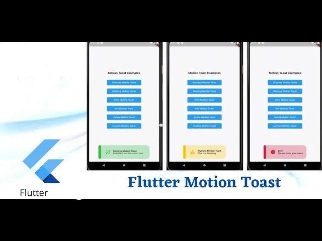
- Success Motion Toast
MotionToast.success(
	title:  Text("Success Motion Toast"),
	description:  Text("Example of success motion toast"),
).show(context);
- Warning Motion Toast
MotionToast.warning(
	title:  Text("Warning Motion Toast"),
	description:  Text("This is a Warning")
).show(context);- Error Motion Toast
MotionToast.error(
	title:  Text("Error"),
	description:  Text("Please enter your name")
).show(context);- Info Motion Toast
MotionToast.info(
	title:  Text("Info Motion Toast"),
	description:  Text("Example of Info Toast")
).show(context);- Delete Motion Toast
MotionToast.delete(
	title:  Text("Deleted"),
	description:  Text("The item is deleted")
).show(context);- Custom Motion Toast
To create your custom toast just use the default constructor,
icon description and color are required
MotionToast(
	icon:  Icons.alarm,
	primaryColor:  Colors.pink,
	title:  Text("Custom Toast"),
	description:  Text("You can customize the toast!"),
	width:  300,
	height:  100,
).show(context);- Right-Designed Motion Toast
To change the toast layout you need to use layoutOrientation,
icon description and color are required
MotionToast.success(
	title:  Text("من اليمين"),
	description:  Text("هذا مثال بالعربية"),
	layoutOrientation:  ToastOrientation.rtl,
	animationType:  AnimationType.fromRight,width:  300,
).show(context);- Top-displayed Motion Toast
To change the display position of the motion toast use position attribute
MotionToast(
	icon:  Icons.zoom_out,
	color:  Colors.deepOrange,
	title:  Text("Top Motion Toast"),
	description:  Text("Another motion toast example"),
	position: MotionToastPosition.top,
	animationType:  AnimationType.fromTop,
).show(context);- Center-displayed Motion Toast
MotionToast(
	icon:  Icons.zoom_out,
	color:  Colors.deepOrange,
	title:  Text("Center Motion Toast"),
	description:  Text("Another motion toast example"),
	position:  MotionToastPosition.center
).show(context);- Using onClose parameter (display two successive toasts)
MotionToast.success(
	title:  Text("User Data"),
	description:  Text("Your data has been deleted"),
	onClose: (){
		MotionToast.error(
			title:  Text("User Data"),
			description:  Text("Your data has been deleted"),
		).show(context);
	},
).show(context);- Two-Colors Motion Toast
MotionToast(
	icon:  Icons.zoom_out,
	primaryColor:  Colors.orange[500]!,
	secondaryColor:  Colors.grey,
	backgroundType:  BackgroundType.solid,
	title:  Text('Two Color Motion Toast'),
	description:  Text('Another motion toast example'),
	position:  MotionToastPosition.top,
	animationType:  AnimationType.fromTop,
	height:  100,
	width:  300,
).show(context);
- Transparent background motion toast
MotionToast(
	icon:  Icons.zoom_out,
	primaryColor:  Colors.grey[400]!,
	secondaryColor:  Colors.yellow,
	backgroundType:  BackgroundType.transparent,
	title:  Text('Two Color Motion Toast'),
	description:  Text('Another motion toast example'),
	position:  MotionToastPosition.center,
	height:  100,
	width:  300,
).show(context);
- Motion toast without sidebar and with border
MotionToast(
	icon:  Icons.zoom_out,
	primaryColor:  Colors.orange[500]!,
	secondaryColor:  Colors.grey,
	backgroundType:  BackgroundType.solid,
	title:  Text('Two Color Motion Toast'),
	description:  Text('Another motion toast example'),
	displayBorder: true,
	displaySideBar: false,
).show(context);- Dismiss the toast from your UI screen
MotionToast toast = MotionToast(
	icon:  Icons.zoom_out,
	primaryColor:  Colors.orange[500]!,
	secondaryColor:  Colors.grey,
	backgroundType:  BackgroundType.solid,
	title:  Text('Two Color Motion Toast'),
	description:  Text('Another motion toast example'),
	displayBorder: true,
	displaySideBar: false,
).show(context);
toast.dismiss();
Contribution
Of course the project is open source, and you can contribute to it repository link
If you found a bug, open an issue.
If you have a feature request, open an issue.
If you want to contribute, submit a pull request.
Use this package as a library
Depend on it
Run this command:
With Flutter:
$ flutter pub add motion_toastThis will add a line like this to your package's pubspec.yaml (and run an implicit flutter pub get):
dependencies:
  motion_toast: ^2.7.8
Alternatively, your editor might support flutter pub get. Check the docs for your editor to learn more.
Import it
Now in your Dart code, you can use:
import 'package:motion_toast/motion_toast.dart';import 'package:flutter/material.dart';
import 'package:motion_toast/motion_toast.dart';
import 'package:motion_toast/resources/arrays.dart';
void main() {
runApp(const MyApp());
}
class MyApp extends StatelessWidget {
const MyApp({Key? key}) : super(key: key);
// This widget is the root of your application.
@override
Widget build(BuildContext context) {
return MaterialApp(
title: 'Motion Toast Demo',
theme: ThemeData(
primarySwatch: Colors.blue,
brightness: Brightness.light,
),
darkTheme: ThemeData(
primarySwatch: Colors.blue,
brightness: Brightness.dark,
),
themeMode: ThemeMode.light,
home: const HomePage(),
);
}
}
class HomePage extends StatefulWidget {
const HomePage({
Key? key,
}) : super(key: key);
@override
State<HomePage> createState() => _HomePageState();
}
class _HomePageState extends State<HomePage> {
@override
void initState() {
super.initState();
}
@override
Widget build(BuildContext context) {
return Scaffold(
backgroundColor: Theme.of(context).brightness == Brightness.dark
? Colors.black
: Colors.white,
body: SafeArea(
child: Center(
child: SizedBox(
width: double.infinity,
child: SingleChildScrollView(
child: Column(
mainAxisAlignment: MainAxisAlignment.center,
crossAxisAlignment: CrossAxisAlignment.center,
children: [
const Text(
'Motion Toast Examples',
style: TextStyle(fontWeight: FontWeight.bold, fontSize: 18),
),
const SizedBox(
height: 15,
),
SizedBox(
width: 200,
child: ElevatedButton(
onPressed: () {
_displaySuccessMotionToast();
},
child: const Text('Success Motion Toast'),
),
),
const SizedBox(
height: 10,
),
SizedBox(
width: 200,
child: ElevatedButton(
onPressed: () {
_displayWarningMotionToast();
},
child: const Text('Warning Motion Toast'),
),
),
const SizedBox(
height: 10,
),
SizedBox(
width: 200,
child: ElevatedButton(
onPressed: () {
_displayErrorMotionToast();
},
child: const Text('Error Motion Toast'),
),
),
const SizedBox(
height: 10,
),
SizedBox(
width: 200,
child: ElevatedButton(
onPressed: () {
_displayInfoMotionToast();
},
child: const Text('Info Motion Toast'),
),
),
const SizedBox(
height: 10,
),
SizedBox(
width: 200,
child: ElevatedButton(
onPressed: () {
_displayDeleteMotionToast();
},
child: const Text('Delete Motion Toast'),
),
),
const SizedBox(
height: 10,
),
SizedBox(
width: 200,
child: ElevatedButton(
onPressed: () {
_displayResponsiveMotionToast();
},
child: const Text('Responsive Motion Toast'),
),
),
const SizedBox(
height: 10,
),
SizedBox(
width: 200,
child: ElevatedButton(
onPressed: () {
_displayCustomMotionToast();
},
child: const Text('Custom Motion Toast'),
),
),
const SizedBox(
height: 10,
),
SizedBox(
width: 200,
child: ElevatedButton(
onPressed: () {
_displayMotionToastWithoutSideBar();
},
child: const Text('Without sidebar'),
),
),
const SizedBox(
height: 10,
),
SizedBox(
width: 200,
child: ElevatedButton(
onPressed: () {
_displayMotionToastWithBorder();
},
child: const Text('With border'),
),
),
const SizedBox(
height: 10,
),
SizedBox(
width: 200,
child: ElevatedButton(
onPressed: () {
_displayTwoColorsMotionToast();
},
child: const Text('Two-color Motion Toast'),
),
),
const SizedBox(
height: 10,
),
SizedBox(
width: 200,
child: ElevatedButton(
onPressed: () {
_displayTransparentMotionToast();
},
child: const Text('Transparent Motion Toast'),
),
),
const SizedBox(
height: 10,
),
SizedBox(
width: 200,
child: ElevatedButton(
onPressed: () {
_displaySimultaneouslyToasts();
},
child: const Text('Simultaneously taosts'),
),
),
],
),
),
),
),
),
);
}
void _displaySuccessMotionToast() {
MotionToast toast = MotionToast.success(
title: const Text(
'Lorum Ipsum',
style: TextStyle(fontWeight: FontWeight.bold),
),
description: const Text(
'Lorem ipsum dolor sit amet, Lorem ipsum dolor sit amet, Lorem ipsum dolor sit amet, Lorem ipsum dolor sit amet, Lorem ipsum dolor sit amet, Lorem ipsum dolor sit amet, consectetur adipiscing elit, sed do eiusmod tempor, sed do eiusmod tempor, sed do eiusmod tempor',
style: TextStyle(fontSize: 12),
),
layoutOrientation: ToastOrientation.rtl,
animationType: AnimationType.fromRight,
dismissable: true,
);
toast.show(context);
Future.delayed(const Duration(seconds: 4)).then((value) {
toast.dismiss();
});
}
void _displayWarningMotionToast() {
MotionToast.warning(
title: const Text(
'Warning Motion Toast',
style: TextStyle(
fontWeight: FontWeight.bold,
),
),
description: const Text('This is a Warning'),
animationCurve: Curves.bounceIn,
borderRadius: 0,
animationDuration: const Duration(milliseconds: 1000),
).show(context);
}
void _displayErrorMotionToast() {
MotionToast.error(
title: const Text(
'Error',
style: TextStyle(
fontWeight: FontWeight.bold,
),
),
description: const Text('Please enter your name'),
position: MotionToastPosition.top,
barrierColor: Colors.black.withOpacity(0.3),
width: 300,
height: 80,
dismissable: false,
).show(context);
}
void _displayInfoMotionToast() {
MotionToast.info(
title: const Text(
'Info Motion Toast',
style: TextStyle(
fontWeight: FontWeight.bold,
),
),
position: MotionToastPosition.center,
description: const Text('Example of Info Toast'),
).show(context);
}
void _displayDeleteMotionToast() {
MotionToast.delete(
title: const Text(
'Deleted',
style: TextStyle(
fontWeight: FontWeight.bold,
),
),
description: const Text('The item is deleted'),
animationType: AnimationType.fromTop,
position: MotionToastPosition.top,
).show(context);
}
void _displayResponsiveMotionToast() {
MotionToast(
icon: Icons.rocket_launch,
primaryColor: Colors.purple,
title: const Text(
'Custom Toast',
style: TextStyle(
fontWeight: FontWeight.bold,
),
),
description: const Text(
'Hello my name is Flutter dev',
),
).show(context);
}
void _displayCustomMotionToast() {
MotionToast(
primaryColor: Colors.pink,
title: const Text(
'Bugatti',
style: TextStyle(
fontWeight: FontWeight.bold,
),
),
dismissable: false,
description: const Text(
'Automobiles Ettore Bugatti was a German then French manufacturer of high-performance automobiles. The company was founded in 1909 in the then-German city of Molsheim, Alsace, by the Italian-born industrial designer Ettore Bugatti. ',
),
).show(context);
}
void _displayMotionToastWithoutSideBar() {
MotionToast(
icon: Icons.zoom_out,
primaryColor: Colors.orange[500]!,
secondaryColor: Colors.grey,
backgroundType: BackgroundType.solid,
title: const Text('Two Color Motion Toast'),
description: const Text('Another motion toast example'),
displayBorder: true,
displaySideBar: false,
).show(context);
}
void _displayMotionToastWithBorder() {
MotionToast(
icon: Icons.zoom_out,
primaryColor: Colors.deepOrange,
title: const Text('Top Motion Toast'),
description: const Text('Another motion toast example'),
position: MotionToastPosition.top,
animationType: AnimationType.fromTop,
displayBorder: true,
width: 350,
height: 100,
padding: const EdgeInsets.only(
top: 30,
),
).show(context);
}
void _displayTwoColorsMotionToast() {
MotionToast(
icon: Icons.zoom_out,
primaryColor: Colors.orange[500]!,
secondaryColor: Colors.grey,
backgroundType: BackgroundType.solid,
title: const Text(
'Two Color Motion Toast',
style: TextStyle(
fontWeight: FontWeight.bold,
),
),
description: const Text('Another motion toast example'),
position: MotionToastPosition.top,
animationType: AnimationType.fromTop,
width: 350,
height: 100,
).show(context);
}
void _displayTransparentMotionToast() {
MotionToast(
icon: Icons.zoom_out,
primaryColor: Colors.grey[400]!,
secondaryColor: Colors.yellow,
backgroundType: BackgroundType.transparent,
title: const Text(
'Two Color Motion Toast',
style: TextStyle(
fontWeight: FontWeight.bold,
),
),
description: const Text('Another motion toast example'),
position: MotionToastPosition.center,
width: 350,
height: 100,
).show(context);
}
void _displaySimultaneouslyToasts() {
MotionToast.warning(
title: const Text(
'Warning Motion Toast',
style: TextStyle(
fontWeight: FontWeight.bold,
),
),
description: const Text('This is a Warning'),
animationCurve: Curves.bounceIn,
borderRadius: 0,
animationDuration: const Duration(milliseconds: 1000),
).show(context);
MotionToast.error(
title: const Text(
'Error',
style: TextStyle(
fontWeight: FontWeight.bold,
),
),
description: const Text('Please enter your name'),
animationType: AnimationType.fromLeft,
position: MotionToastPosition.top,
width: 300,
height: 80,
).show(context);
}Download details:
Author: koukibadr
Source: https://github.com/koukibadr/Motion-Toast