Top 12+ Seaborn Functions that You Should Know
Discover Seaborn's prowess! Explore essential data visualization with the top 12+ functions, enhancing your skills in advanced data analysis. Here are the 12+ most common functions of the Seaborn library in order from the most to the least common
Seaborn is a popular Python data visualization library based on matplotlib. It provides a high-level interface for creating attractive and informative statistical graphics.
- distplot( ): The distplot function is a versatile tool for visualizing univariate distributions. It plots histograms, kernel density estimates (KDE), rug plots, and can also fit parametric distributions such as normal, exponential, and others.

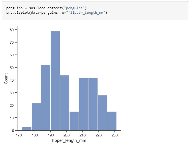
https://seaborn.pydata.org/generated/seaborn.displot.html#seaborn.displot
2. countplot( ): The countplot function creates a bar chart that displays the frequency of each category in a categorical dataset. This function is useful for understanding the distribution of categorical data.
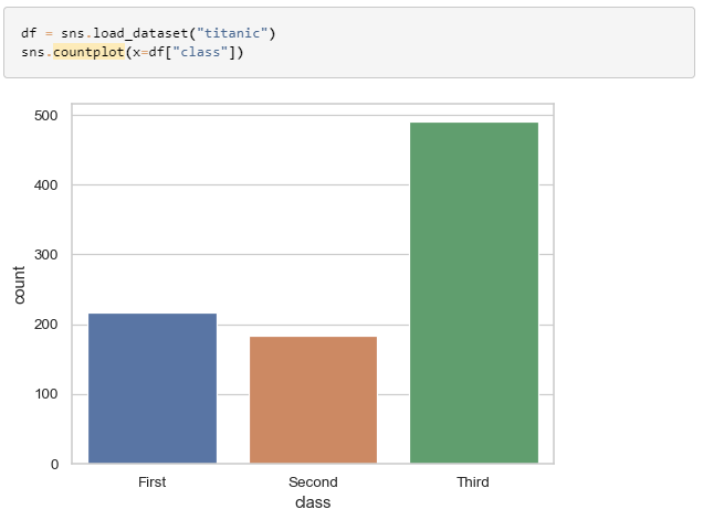
https://seaborn.pydata.org/generated/seaborn.countplot.html?highlight=countplot#seaborn.countplot
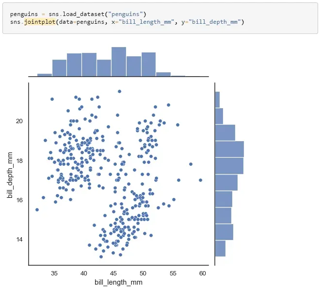
3. jointplot( ): The jointplot function creates a scatterplot of two variables with bivariate and univariate representations of the distributions of the variables. This function can also display a hexbin plot, a kde plot, and fit a regression line.
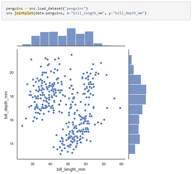
https://seaborn.pydata.org/generated/seaborn.jointplot.html?highlight=jointplot#seaborn.jointplot
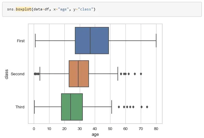
4. boxplot( ): A box plot is a standardized way of displaying the distribution of a dataset, based on five number summary (minimum, first quartile, median, third quartile, and maximum). The Seaborn boxplot function can also display violin plots and swarm plots, which give more information about the distribution of the data.

https://seaborn.pydata.org/generated/seaborn.boxplot.html?highlight=boxplot#seaborn.boxplot
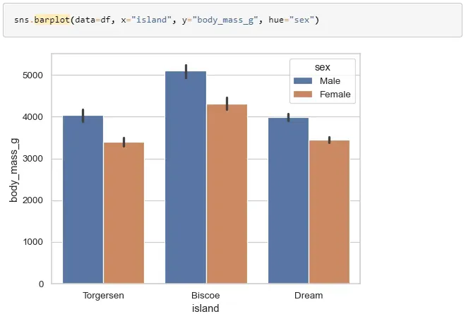
5. barplot( ): The barplot function creates a bar chart that displays the mean of a continuous variable for each category in a categorical dataset. This function is useful for comparing the means of different groups.

https://seaborn.pydata.org/generated/seaborn.barplot.html?highlight=barplot#seaborn.barplot
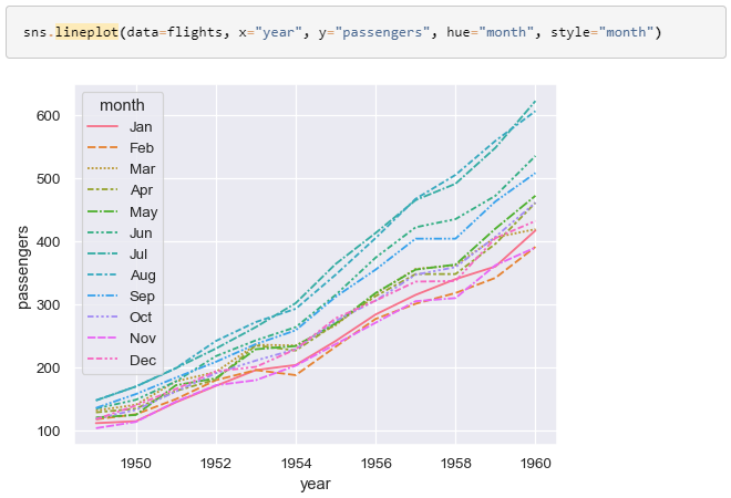
6. lineplot( ): The lineplot function creates a line chart that displays the relationship between two continuous variables. This function is useful for visualizing trends in the data.
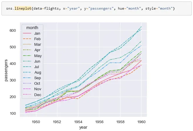
https://seaborn.pydata.org/generated/seaborn.lineplot.html?highlight=lineplot#seaborn.lineplot
7. pairplot( ): The pairplot function creates a matrix of scatterplots to visualize the relationships between multiple variables. It also creates histograms and KDE plots for each variable.

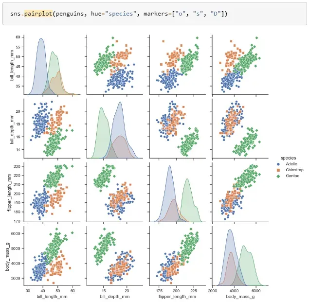
https://seaborn.pydata.org/generated/seaborn.pairplot.html?highlight=pairplot#seaborn.pairplot
8. violinplot( ): A violin plot is a combination of a box plot and a kernel density plot. It displays the distribution of the data, including the median, quartiles, and the density of the data.

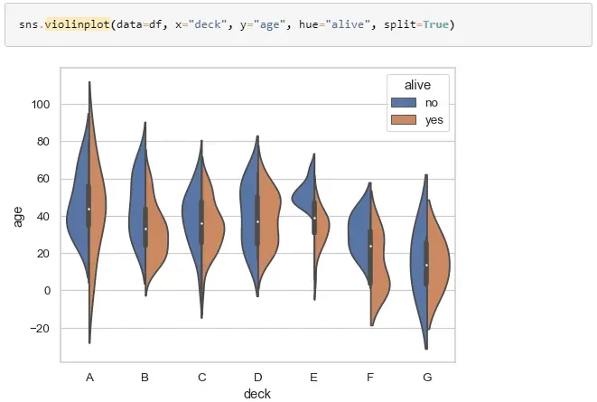
https://seaborn.pydata.org/generated/seaborn.violinplot.html?highlight=violinplot#seaborn.violinplot
9. swarmplot( ): Swarmplot is similar to a violin plot but instead of showing the density of the data, it shows every single observation. This function is useful for visualizing the distribution of the data when the number of observations is not too large.

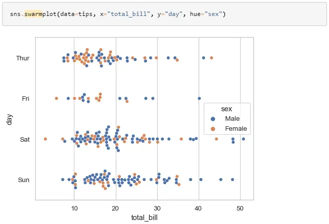
https://seaborn.pydata.org/generated/seaborn.swarmplot.html?highlight=swarm#seaborn.swarmplot
10. stripplot( ): The stripplot function creates a scatterplot where one variable is categorical. This function is useful for visualizing the relationship between a continuous variable and a categorical variable.

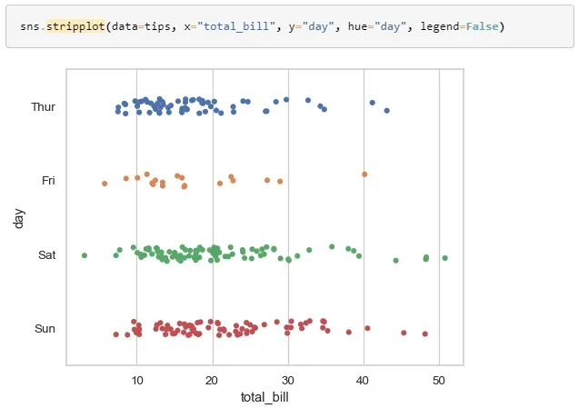
https://seaborn.pydata.org/generated/seaborn.stripplot.html?highlight=stripplot#seaborn.stripplot
11. lmplot( ): The lmplot function fits a linear regression model to a dataset and creates a scatterplot with the regression line. This function is useful for visualizing the relationship between two continuous variables and fitting a regression line to the data.
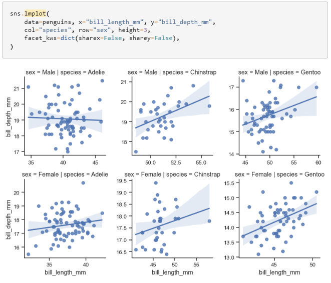
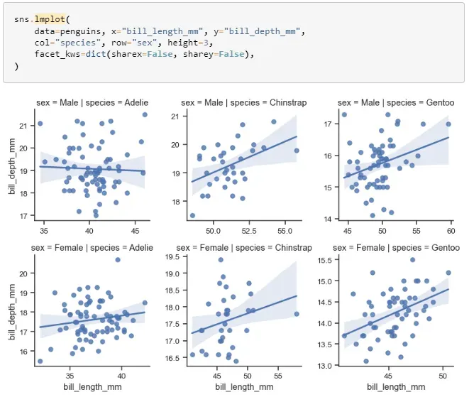
https://seaborn.pydata.org/generated/seaborn.lmplot.html?highlight=lmplot#seaborn.lmplot
12. heatmap( ): The heatmap function creates a color-encoded matrix representation of a dataset. This function is useful for visualizing the relationship between multiple variables.

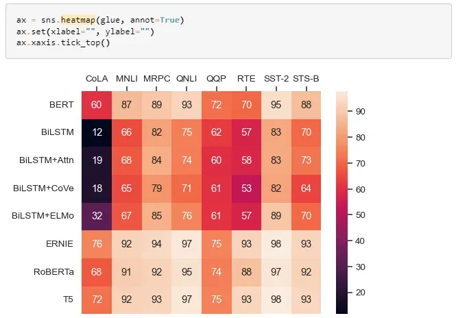
https://seaborn.pydata.org/generated/seaborn.heatmap.html?highlight=heatmap#seaborn.heatmap
13. pairgrid( ): The pairgrid function creates a matrix of subplots using pairplot. This function is useful for visualizing the relationships between multiple variables and comparing their distributions.

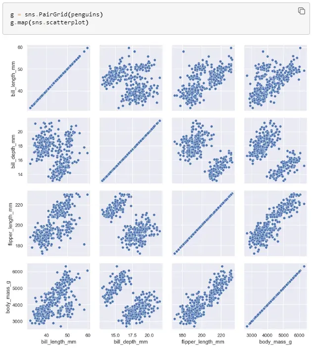
https://seaborn.pydata.org/generated/seaborn.PairGrid.html
14. FacetGrid( ): The FacetGrid function is used to create multiple plots on the same figure, where each plot shows the same relationship conditioned on different levels of a categorical variable. This function is useful for exploring the relationship between variables for different categories.

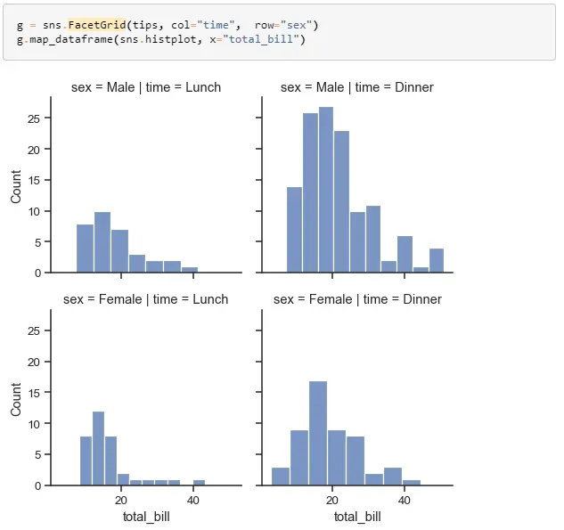
https://seaborn.pydata.org/generated/seaborn.FacetGrid.html?highlight=facetgrid#seaborn.FacetGrid
15. regplot( ): The regplot function creates a scatterplot and fits a simple linear regression model to the data. This function is useful for visualizing the relationship between two continuous variables and fitting a simple linear regression model to the data.
These functions cover a wide range of data visualization needs, from univariate distributions to bivariate relationships and provide a rich set of tools for visualizing and analyzing any kind of data in Seaborn.
The high-level interface and attractive default styles make it easy to create informative and attractive graphics.
Thank you for taking the time to read it.
#seaborn #python