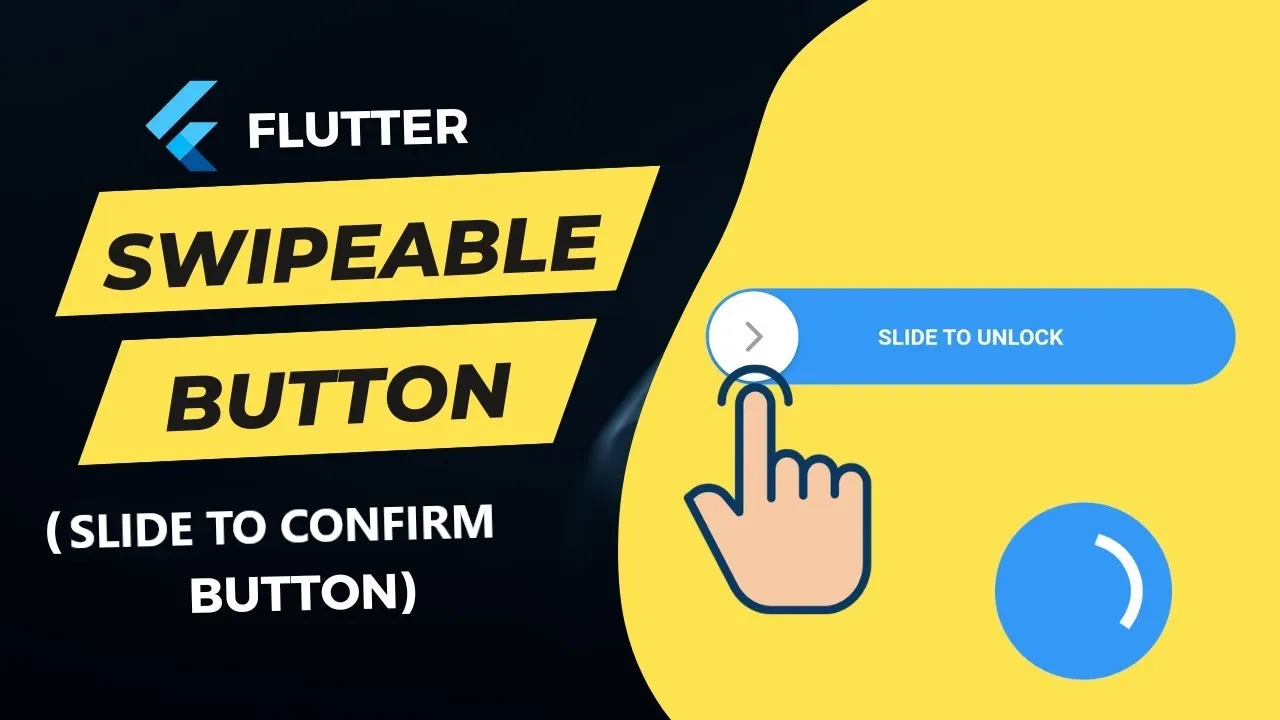
A Flutter Slider Activate A Callback When The User Slides It To 100%
A customizable slider that will activate a callback when the user slides it to 100%.
Installation
In the dependencies: section of your pubspec.yaml, add the following line:
slide_to_confirm: <latest_version>
Usage
import 'package:slide_to_confirm/slide_to_confirm.dart';

class MyWidget extends StatelessWidget {

    void confirmed(){
        print('Slider confirmed!');
    }

    Widget build(BuildContext context) {
        return ConfirmationSlider(
            onConfirmation: () => confirmed(),
        );
    }
}
Properties
- height
double: Height of the slider. Defaults to70. - width
double: Width of the slider. Defaults to300. - backgroundColor
Color: The color of the background of the slider. Defaults toColors.white. - backgroundColorEnd
Color: The color of the background of the slider when it has been slide to the end. By giving a value here, the background color will gradually change frombackgroundColortobackgroundColorEndwhen the user slides. Is not used by default. - foregroundColor
Color: The color of the moving element of the slider. Defaults toColors.blueAccent. - iconColor
Color: The color of the icon on the moving element ificonis IconData. Defaults toColors.white. - sliderButtonContent
Widgetor : The icon widget used on the moving element of the slider. Defaults toIcon(Icons.chevron_right). - shadow
BoxShadow: The shadow below the slider. Defaults toBoxShadow(color: Colors.black38, offset: Offset(0, 2),blurRadius: 2,spreadRadius: 0,). - text
String: The text showed below the foreground. Used to specify the functionality to the user. Defaults to"Slide to confirm". - textStyle
TextStyle: The style of the text. Defaults toTextStyle(color: Colors.black26, fontWeight: FontWeight.bold,). - onConfirmation
VoidCallback: The callback when slider is completed. This is the only required field. - onTapDown
VoidCallback: The callback when slider is pressed. - onTapUp
VoidCallback: The callback when slider is release. - foregroundShape
BorderRadius: The shape of the foreground (the moving element of the slider). Defaults to a circular border radius. - backgroundShape
BorderRadius: The shape of the background of the slider. Defaults to a circular border radius. - stickToEnd
bool: Bool that indicates if stick or not the cursor at end of slide
Example
View the Flutter app in the example directory to see a working example of how to use and implement the slider.
Screenshots


Use this package as a library
Depend on it
Run this command:
With Flutter:
$ flutter pub add slide_to_confirmThis will add a line like this to your package's pubspec.yaml (and run an implicit flutter pub get):
dependencies:
  slide_to_confirm: ^1.1.0
Alternatively, your editor might support flutter pub get. Check the docs for your editor to learn more.
Import it
Now in your Dart code, you can use:
import 'package:slide_to_confirm/slide_to_confirm.dart';import 'package:flutter/material.dart';
import 'package:slide_to_confirm/slide_to_confirm.dart';
void main() => runApp(MyApp());
class MyApp extends StatelessWidget {
@override
Widget build(BuildContext context) {
return MaterialApp(
home: MyHomePage(),
debugShowCheckedModeBanner: false,
);
}
}
class MyHomePage extends StatefulWidget {
MyHomePage({Key? key}) : super(key: key);
@override
_MyHomePageState createState() => _MyHomePageState();
}
class _MyHomePageState extends State<MyHomePage> {
int _counter = 0;
void confirm() {
setState(() {
_counter++;
});
}
@override
Widget build(BuildContext context) {
return Scaffold(
body: Stack(
children: <Widget>[
Container(
color: Colors.blueAccent.withOpacity(0.5),
),
Column(
crossAxisAlignment: CrossAxisAlignment.center,
mainAxisAlignment: MainAxisAlignment.end,
children: <Widget>[
Center(
child: Text(
_counter.toString(),
style: TextStyle(
fontSize: 38,
color: Colors.white,
),
),
),
Center(
child: Container(
margin: EdgeInsets.only(top: 50, bottom: 100),
child: ConfirmationSlider(
onConfirmation: () => confirm(),
),
),
),
],
),
],
),
);
}
}Download details:
Author: Friiiis
Source: https://github.com/Friiiis/slide_to_confirm
#flutter #android #web-development #web #ios #btn #ui #animation
1.10 GEEK